
1 Getting Familiar With Builder Terms
Here, you can see Elements — the building blocks a Builder course consists of. There’s a variety of different kinds of elements to choose from.
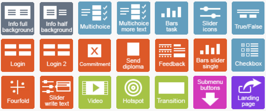
Elements form Modules. 1 course = 1 module

Long course modules can be divided into Submodule Structures that can be easier for a trainee to discern. In this case, the module structure is split into a Main Module and Submodules that branch from the main module. Submodules are usually structured in a way that they focus on a specific topic or subject area of a wider concept or course subject.
2.1 Login
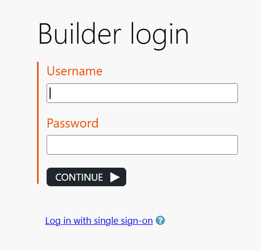
Log in with your personal username and password that you received via email.
Link: https://builder.apprix.fi/b/
If you lose your password, please contact helpdesk@apprix.fi and request a new one.
Alternatively, you can ask for a new password from a person in your company with user management permissions.
Once you get the new password via email, you are invited to change it.
Builder Login
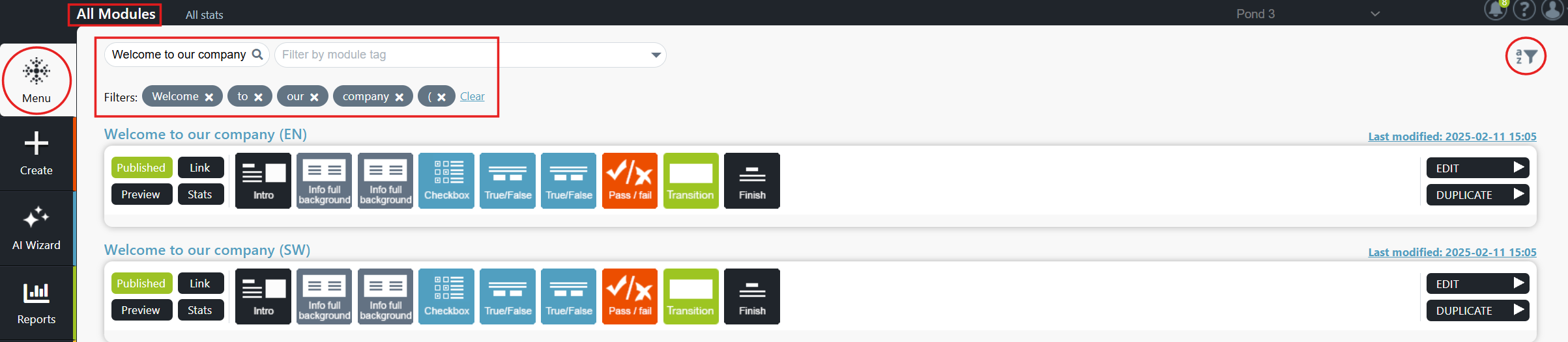
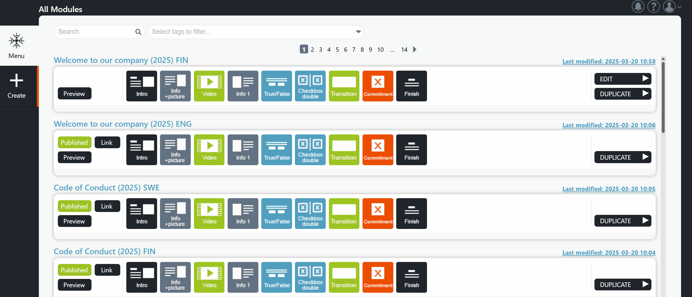
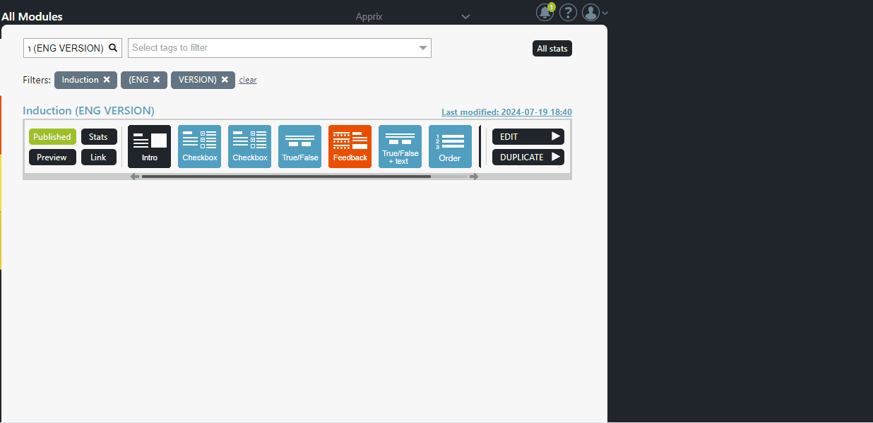
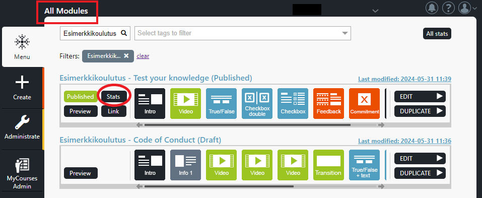
After logging in, you will arrive at Menu View, where all course modules in your organisation’s Builder account have been listed. In this view, you may:
- create a new module from Create located in the sidebar on the left
- copy an existing module from Duplicate located in the sidebar on the right
- search for modules with the Search bar or with Tags
- With tags, you can bookmark modules or module groups so that they are easier to find using the tag as a search criteria.
- For example, a language, a department, a branch or a course subject can be used as a tag.
- browse, edit and view existing modules you have editing or viewing rights to
- Next to published modules, you can find the Published button
- From the Preview button next to modules, you will be able to preview a module
- If you hold module edit or statistics viewing rights to specific modules, you may also find Stats buttons next to published modules where you can view module statistics.
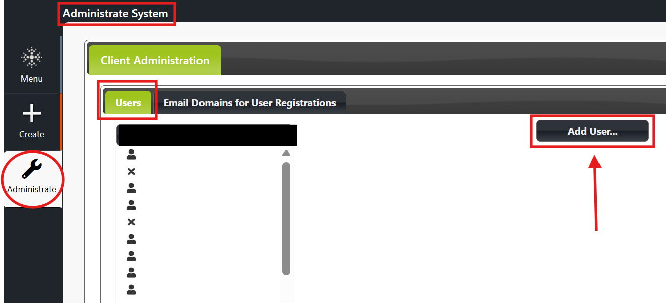
If you are an admin user in your organization, you may also find the Administrate button located in the sidebar on the left, from where you can edit user management settings.
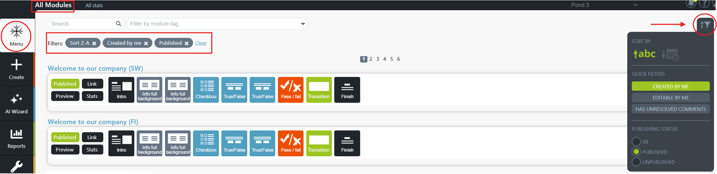
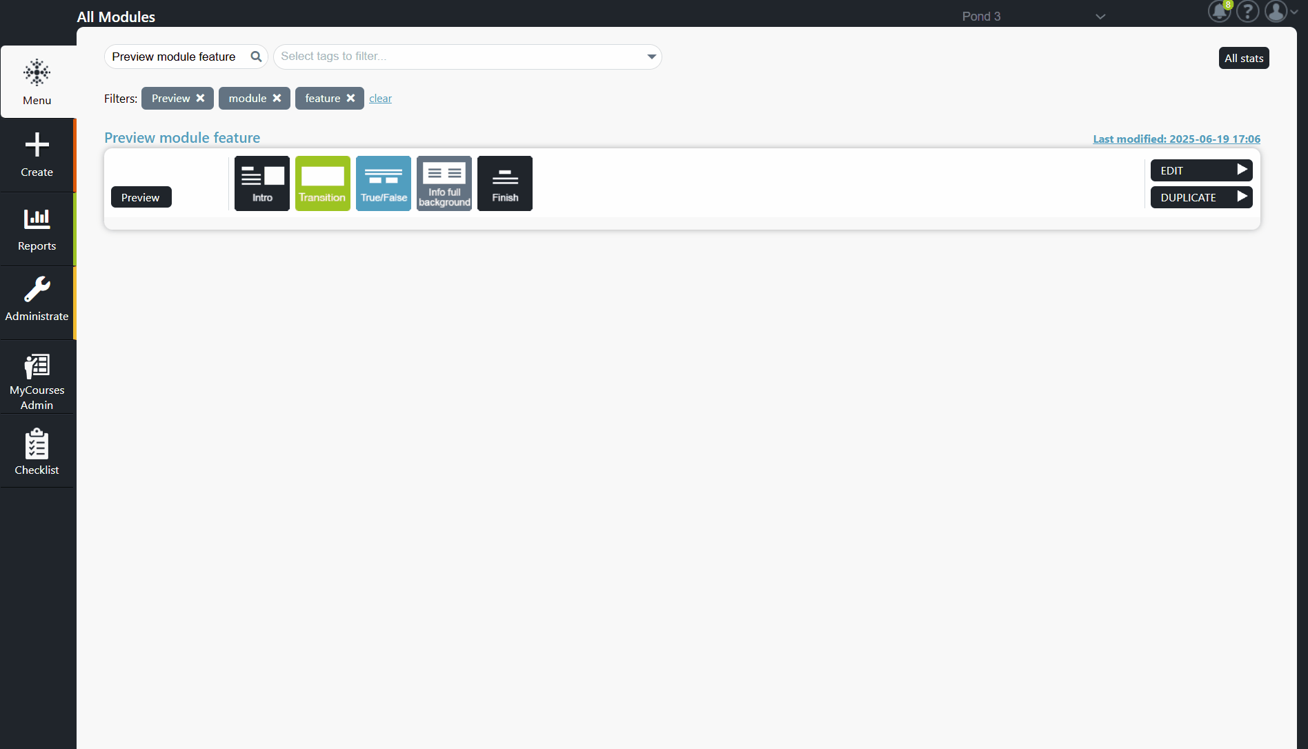
How to use Quick Filters tool to find your modules?
The Quick Filters tool helps you organise and filter modules and online trainings in Apprix Builder. It makes it easier to find the content you need quickly and efficiently.
What can you do with it?
With Quick Filters, you can:
- sort modules alphabetically or by date
- filter your own modules, i.e. the ones you’ve created
- filter editable modules, where you have editing rights
- filter modules with unresolved comments
- filter by publication status: all, published, unpublished
Where to find the feature?
You’ll find the Quick Filters tool in the top right corner of the Menu > All Modules window in Builder. Click the icon to open the filter menu. The selected filter(s) will appear in the filter text field at the top left of the Menu > All Modules window.
Tip: To narrow your search, try combining multiple filters — for example, your unpublished modules with unresolved comments.
Menu view with course modules filtered by name
Menu view with course modules filtered using the Quick Filters tool
Quick Filters tool

2.2.1 Change Password Function
You can change your password at any time by selecting from Menu view the “Change Password” option.
Change Password pop-up window will be opened. Fill in the requested credentials (old and new passwords) and press Continue. You will be informed that the password has been changed, and the Menu view will be opened.
Note! The new password should contain at least 8 characters, upper- and lower-case letters, number(s) and special characters.
How do you change your Builder password?
2.2.2 Administrate
If you are one of your organisation’s admins, you may find Administrate from the sidebar on the left hand side of Menu view where you can edit user rights within your organisation. From the sidebar button you can:
- create new users and edit user credentials
- change usernames, email addresses or passwords
- edit user rights
- Tip: If you are not certain which modules you should grant someone rights to, only grant rights to modules you are sure of.
How Can I Add a New User?
- You can create new user accounts and define roles and permissions from the Administrate button in the Menu view. (Please note that the Administrate window is visible only to Builder’s Administrators.)
- From the Administrate window, click the Add User button and fill in the requested information (first name, last name, user ID, and email address). Then press Save.
- A pop-up window is displayed. It informs that the login information was sent via email to the new user, who will automatically receive two emails: one containing the user ID and Builder link and the second containing the Builder’s password.
- Once the new user clicks the link in the email, they are asked to log in to Builder and change the password. The user can change the password by selecting the option ‘Change Password’ from account settings at the top of the Menu view.
- Note! The new password should contain at least eight characters, including upper- and lowercase letters, numbers, and special characters.
- Once the new password is entered and the user clicks on the Continue button, they will be informed that the password was changed, and the Menu view will be opened.
Note! Older Builder users can change their own password by selecting ‘Change password’ from the Menu view.
How Can I Assign the User Rights?
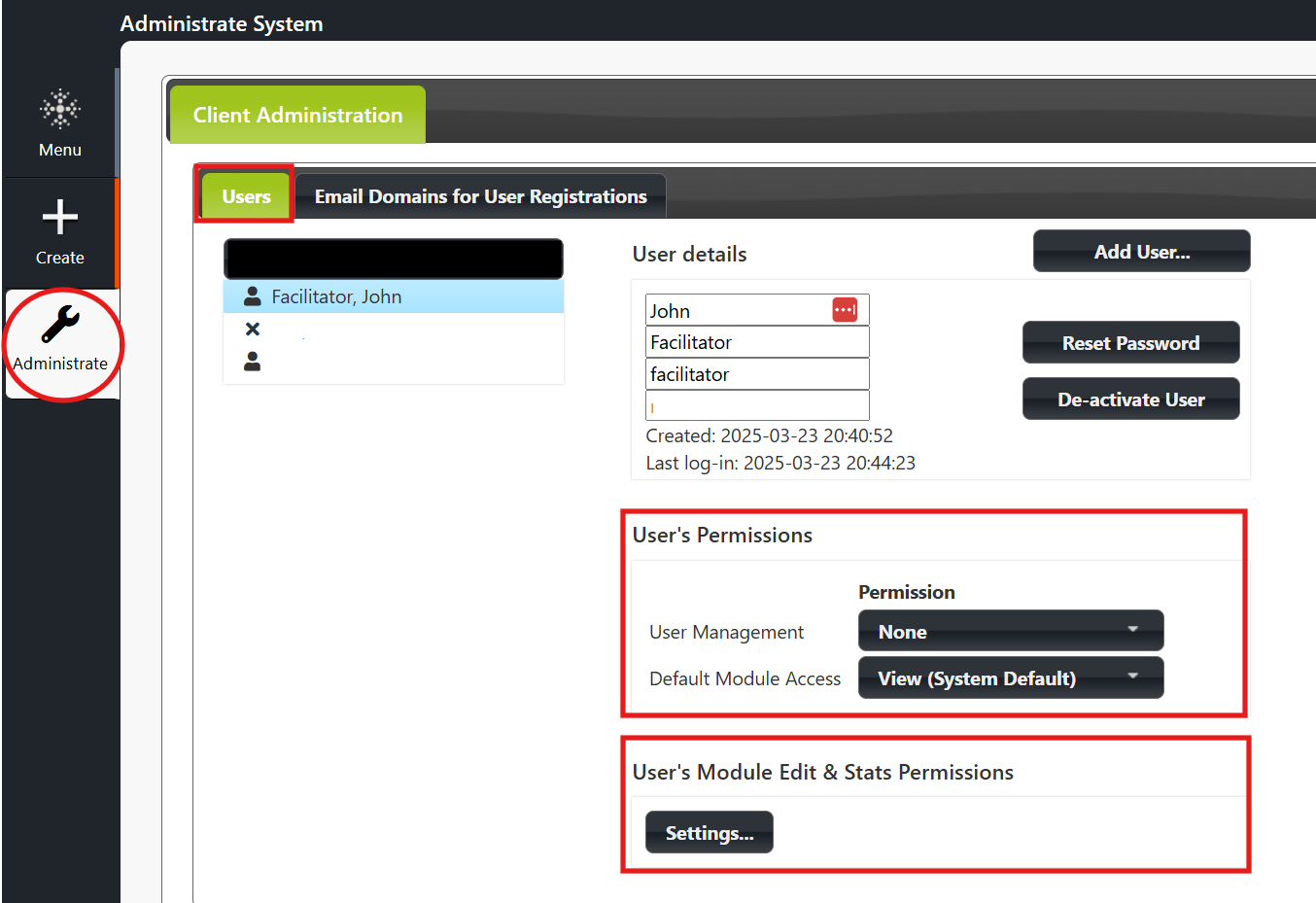
The Administrate menu allows you to assign users’ permissions. In the Users list, click on the user whose permissions you want to edit. You will now see his or her user name, under which you will see their user rights.
User’s Permissions menu (default options)
- User management:
- Edit option: the user has the right to add new users.
- None option: the user is not allowed to add new users.
- Default Module Access:
-
- None option: the user can only see their modules.
- View (System Default) option: the user has viewing rights to all existing and future modules but no editing rights.
- Edit option: the user has editing rights to all existing and future modules.
-
Administrative Rights
Assign the administrative rights by selecting the Edit option from the User Management drop-down menu. Available options: None / Edit
Module Viewing Rights
Assign the viewing rights for all existing and future modules to a user by selecting View on the Default Module Access drop-down menu. Available options: View / Edit
Module Editing Rights
Assign the editing rights for all existing and future modules by selecting the Edit option from the Default Module Access drop-down menu. Available options: None (System Default) /View/ Edit.
Separate Module Viewing / Editing Rights
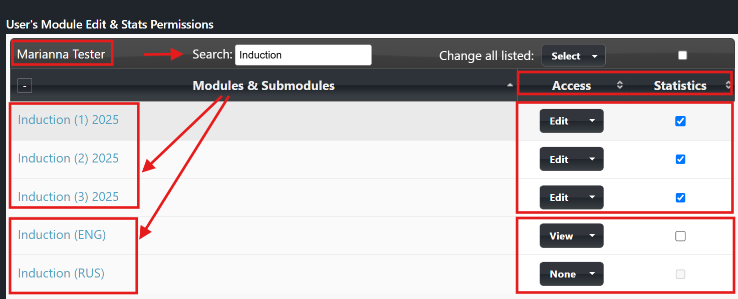
Alternatively, you can define which modules the user can view and edit.
All regular users can edit only their modules. However, to give a user editing rights to some specific modules, select them from the User’s Module Edit & Stats Permissions “Settings…” button. The User’s Module Edit & Stats Permissions window opens.
Select the Edit option from the module’s Access drop-down menu. Now, the user can edit the module—available options: None / View / Edit. At the same time, you can also give the right to view the statistics. If you do not want this, please deselect the Statistics option.
Builder will automatically save the settings.
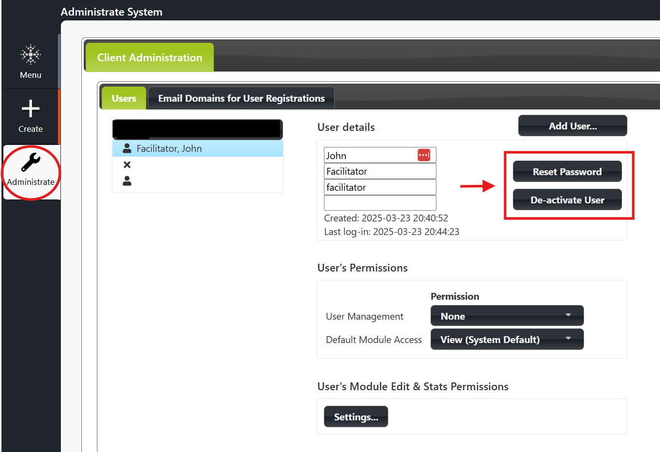
Deactivate / Activate a User
You can deactivate the user by clicking the username and then selecting the Deactivate User button. You can reactivate the user at any time by clicking again on the username and then selecting the Activate User button. You recognize that a user is deactivated since there is an “X” before the username.
Reset Password
Click the Reset Password button to reset the user’s password. Two emails will then be sent to the user. The emails contain the user’s new password, user ID, and Builder link. The user can then choose the Change Password option to change her/his password at any time.
How can you add a new user?
Click the “Add User…” button in the Administrate view.
User’s Permissions menu
How do you assign permissions to a new user?
Edit permission for individual modules (User’s Module Edit & Stats Permissions menu)
How do you reset the password and/or deactivate the user?
3 Creating, Editing and Duplicating Modules
3.1 Creating a New Module (Create Option)
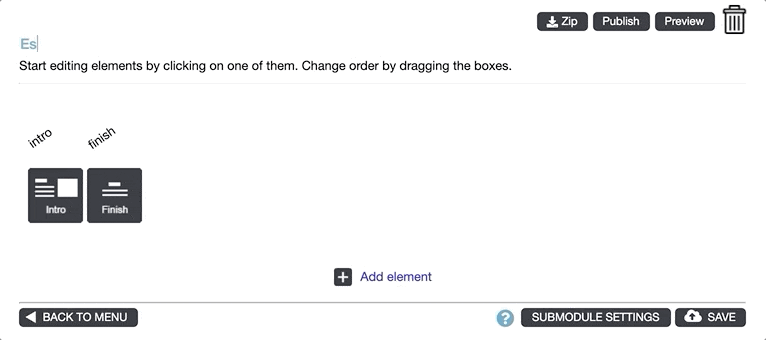
Create a new module by clicking Create on the left side of the Menu view and then choose a template (if more than one available).
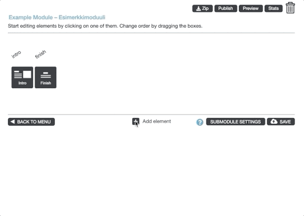
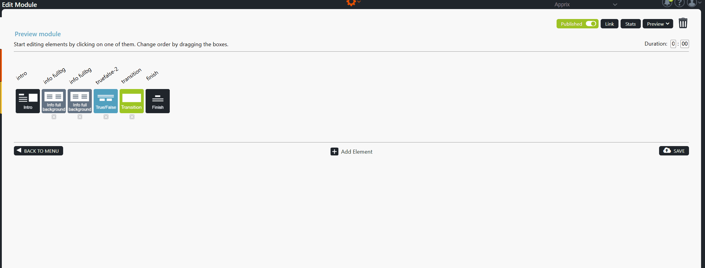
You can now see the first and last elements, Intro (first element) and Finish (last element), which cannot be deleted.
Note! Intro and Finish elements will always stay as the first and last elements. The placement of these elements cannot be changed, only the elements between them.
Click on the images to enlarge them.
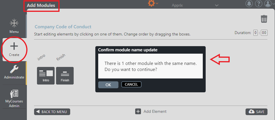
3.2 Naming a Module
Name your module on the top left by clicking the text. Press Save when done.
It is always a good idea to name your module first when starting to edit a new module. This way, you can easily find it in the Menu view if you need to interrupt your session and continue later.
Click on the images to enlarge them.
3.3 Duplicating a Module (Duplicate Option)
You can copy an existing module by clicking the Duplicate button in Menu view.
Builder will duplicate the module, which you can edit later as you wish. If the module has submodules, tags or other features enabled, (e.g. Points, Audit Module, IP Guard, Email Registration) these will also be copied.
Remember to rename your duplicated module.
Click on the images to enlarge them.
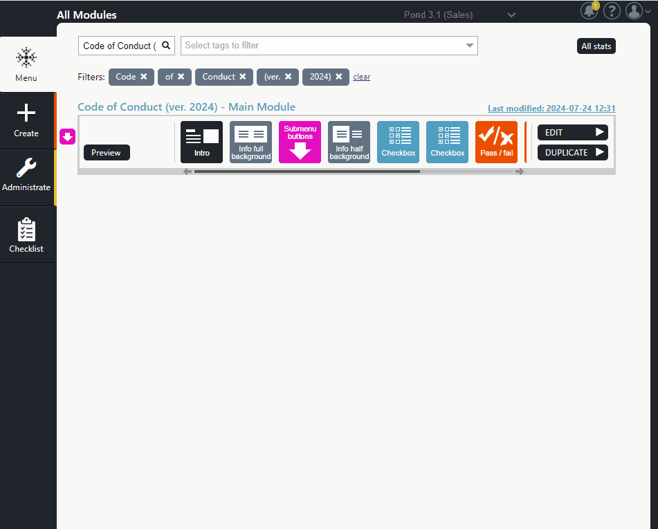
3.4 Creating a Submodule Structure (Main Module + Submodule[s])
When Is It Recommended to Create a Submodule Structure?
If you need a Table of Contents (submenu) for your module and the possibility to split the module’s content into different sections or subject areas (submodules), you can use the Submodule functionality. A submodule structure consists of a main module and submodules that are connected to the main module.
The benefits of using submodules:
- In long modules, it is easier for the trainee to perceive the whole training content.
- Editing the module is easier since the content is divided into submodules rather than one long module.
- You can specify whether the submodules are mandatory or optional.
- You can easily add or remove submodules from the training’s content.
- The trainee can go through the course in parts, completing only one or more submodules in one session if the submodule structure contains a Login element or if the possible SSO feature is switched on in the module.
- In this case, the trainee can continue to go through the training starting directly from the uncompleted submodules when returning to the course.
- A Login element is placed in the main module before the Submenu Buttons elements that functions as the menu for submodules.
Click on the images to enlarge them.
A main module that contains two submodules.
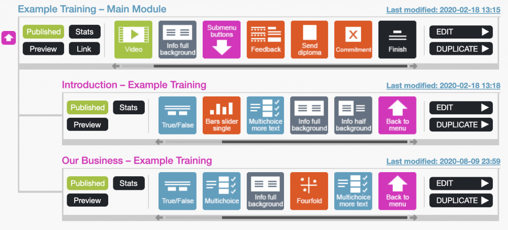
The Submenu buttons element in Published mode.

Creating a Submodule Structure
Submodule structures can be created in many different orders but in this example, we will start from the main module and proceed to creating submodules.
Step 1: Creating the main module
- Create a module. Name the module in a way that it describes the subject or purpose of the course.
- To make it easier to discern and further work on the structure later if the structure is taken apart, add the word “Main Module” in the name. For example “Safety Training – Main Module”. Click Save.
- Add the Submenu buttons element to your module by clicking Add element and selecting Submenu buttons from the list of elements.
- Open the Submenu buttons element, write the menu title and some brief instructions (for example, Here you can find the sections of this training. You can go through these in one or in multiple sessions by re-login. However, we suggest you go through at least one section at a time. You can go to the end of the training once you have completed all sections.)
- In the Submenu buttons element, select Edit submenu settings to add the submodules.
- Add the needed submodules by clicking the Add button. You can also name the submodules by clicking the text fields. Use the handles on the left to drag buttons into a different order, if needed.
- Click the Trash icon if you need to remove a submodule.
- If you wish that the trainee performs the submodules in order, select Yes button at the top of the window.
- If you wish that all submodules must be completed before the trainee is able to go forward with the training, select Yes button at the top of the window.
Step 2: Convert modules to submodules
Submodules are created from normal modules.
- Create and name the module in a way that it describes the content or subject area of the submodule.
- To make it easier to link the submodule back to the main module if the structure is taken apart later in time, add the name of the module structure after the name of the submodule. For example: Introduction to Safety – Safety Training”
- You can now edit the module’s content or continue with it later.
- Select Change to submodule from the Submodule Settings menu.
- Note! If the module you are trying to change to a submodule is in Published mode, Submodule Settings button is hidden. You need to Unpublish the module if you wish to change the module to a submodule.
- The most convenient way to link the submodules to the main module is to link all submodules at once. Select Not now, link to a menu later button at the lower right corner.
- Your submodule is an orphan now.
- Note! The Intro and Finish elements have been automatically hidden from the submodule, as the main module has the beginning and end to structure.
Step 3: Link submodules to the main module
Once you have created the main module and submodules, you can link the submodules to your main module.
- In your main module, open the Submenu buttons element.
- Select Edit Submenu Settings option from the gear icon on the top of the window. Add as many buttons as needed by selecting the Add Button.
- It is recommended to name the buttons to match the names of the submodules (For example: Introduction to Safety – Safety Training submodule’s button would be named “Introduction to Safety”.
- If possible, add a time estimate for how long it approximately takes to complete the module.
- Then select Add next to the first button. You will see a view of all unlinked submodules. Click on the submodule you want linked to the main module.
- Link the rest of the submodules accordingly.
Step 4: Editing
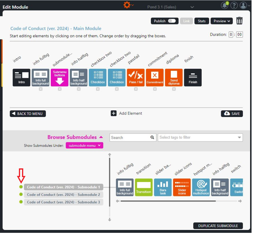
- You can edit your submodules by selecting the main module’s editing mode and then Browse submodules on the bottom.
- Click on the name of the submodule to edit it.
- You can go back to the main module by clicking its header (main module’s name) in the upper left corner (in light blue colour).
Note! Remember to publish the main module and all submodules separately. Unpublished submodules are not visible in the submodule menu (Submenu buttons).
How do you insert the “SubMenu buttons” element in the main module, and how do you edit its submenu settings?
How do you change a module to a submodule and then link it to its main module?
How do you publish the submodules linked to a main module?
A green ball appears next to the published submodules in the submodule list.
4 Element Functions in Module Edit View
4.1 Adding Elements to a Module (Add Element Option)
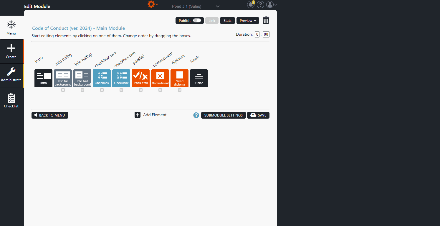
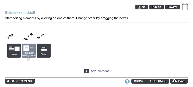
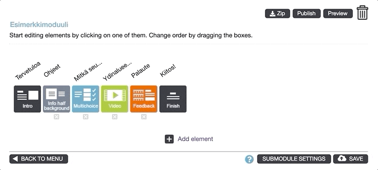
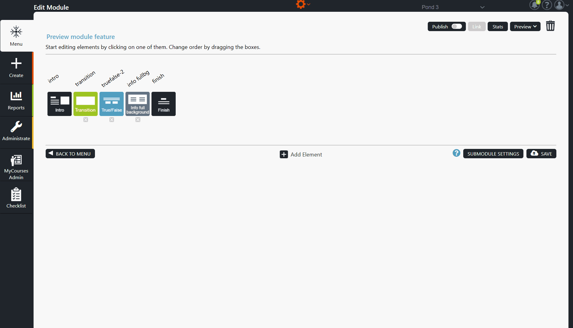
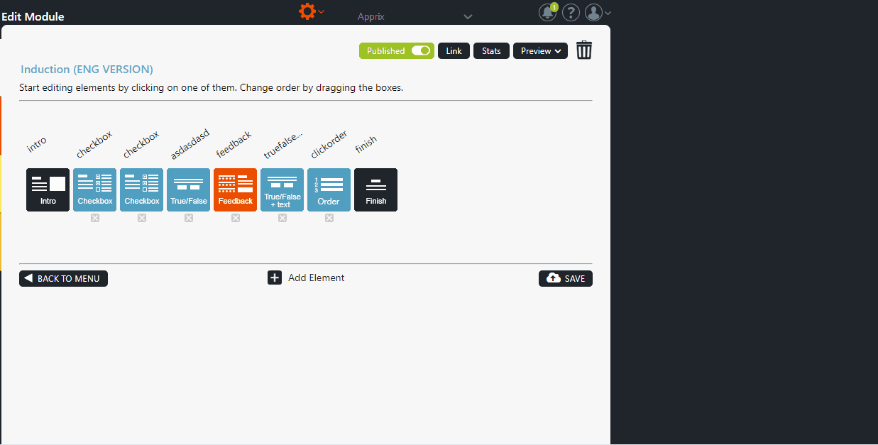
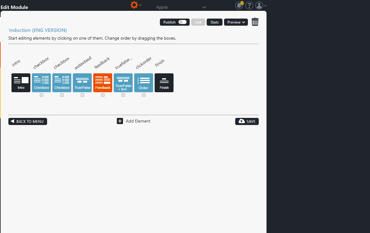
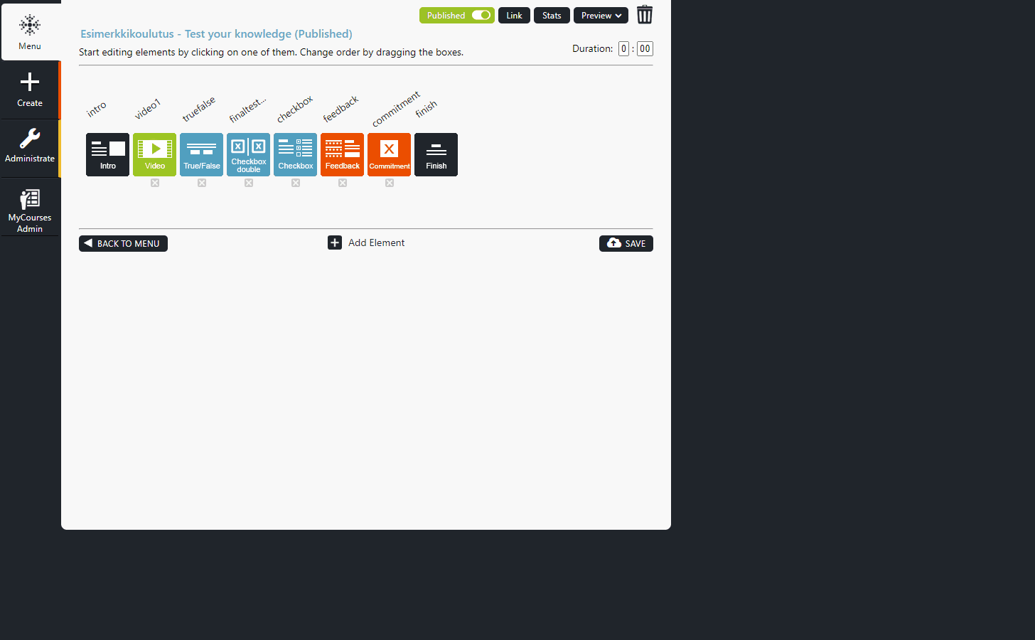
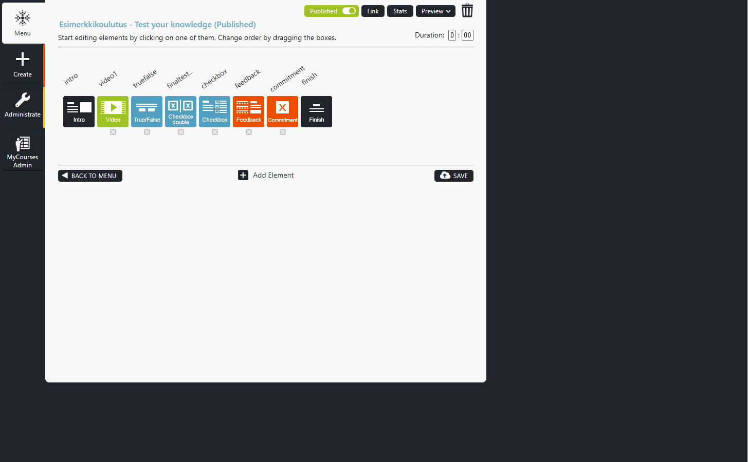
Click Add Element button in the middle of Edit Module view. This will open the Element library. From there, you can select an element one at a time by dragging and dropping them to the module, between the Intro and Finish element.
You can also change the order of the elements simply by dragging them left or right when editing a module.
To remove an element, click the X icon below the element.
You can preview elements functions by hovering the mouse over the info icon located in top left corner of the elements in the Element library.
Note! Make sure to save the changes in your module structure by clicking Save.
Click on the images to enlarge them.
4.2 Naming the Elements
Name the elements by clicking the text above the element. It is recommended to name the elements in a way that they describe the contents of the elements, for example, using the title used in the element content. This will make it easier to find the correct element later.
When you’re finished editing titles, make sure to save your changes by clicking Save.
Click on the images to enlarge them.
4.3 Arranging the Elements
You can change the order of the elements simply by dragging them left or right between the Intro and Finish elements when editing a module.
Make sure to save the changes in your module structure by clicking Save.
Click on the images to enlarge them.
4.4 Previewing Elements (Element Preview Option)
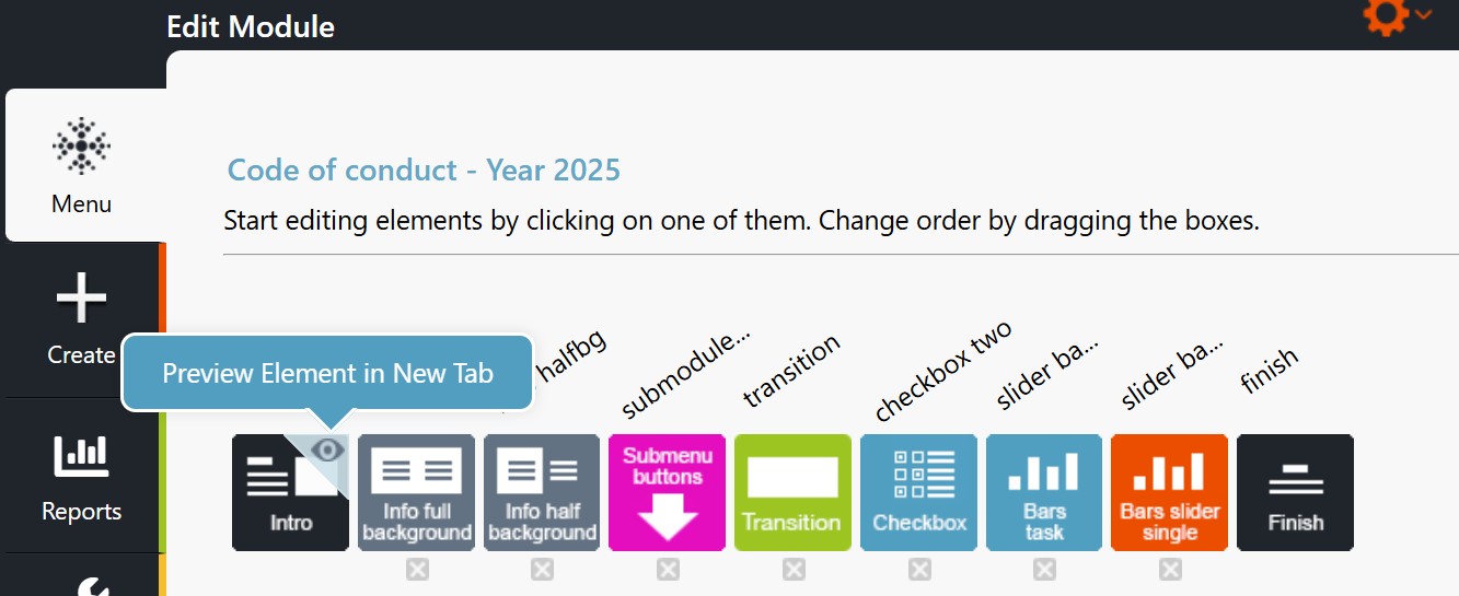
You can preview a single element by:
- Clicking the eye icon in the upper right corner of the element in the “Edit Module” view.
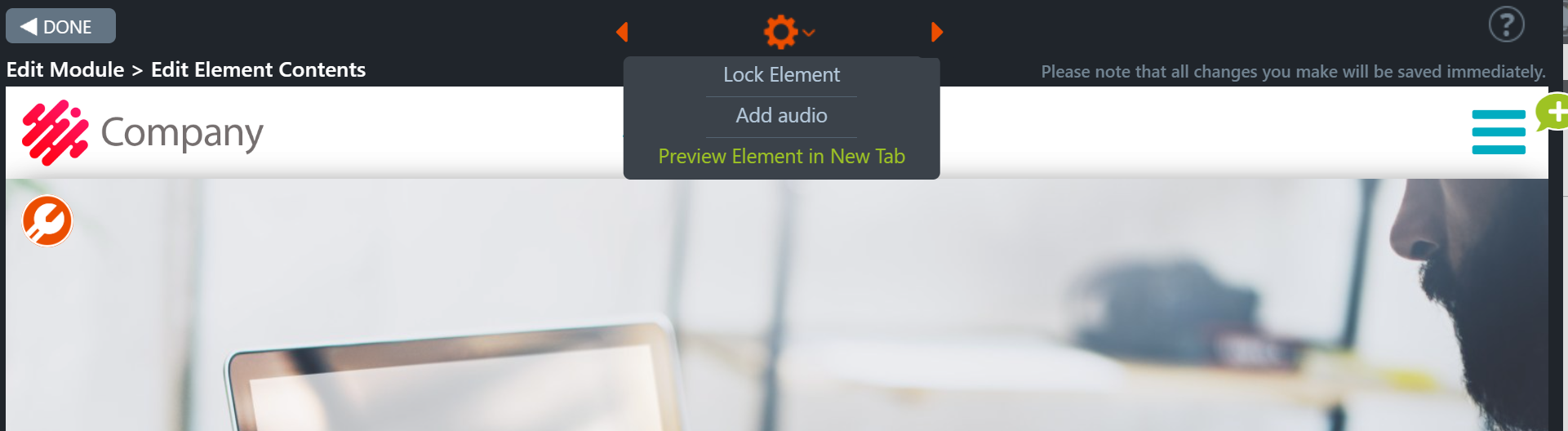
- Selecting the option “Preview element in new tab” from the gear icon at the top of the element in Edit mode.
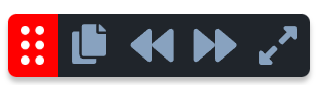
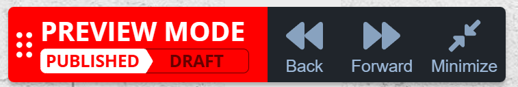
Preview Toolbar
- The Preview toolbar appears when the element is in Preview mode. The forward and backwards buttons allow easy navigation within the module.
- The forward and backwards buttons on the Preview toolbar do not allow you to move backwards from the intro element or forward from the finish element.
- The size of the Preview toolbar changes when clicking the Minimise/Maximise buttons and remains the same when switching tabs.
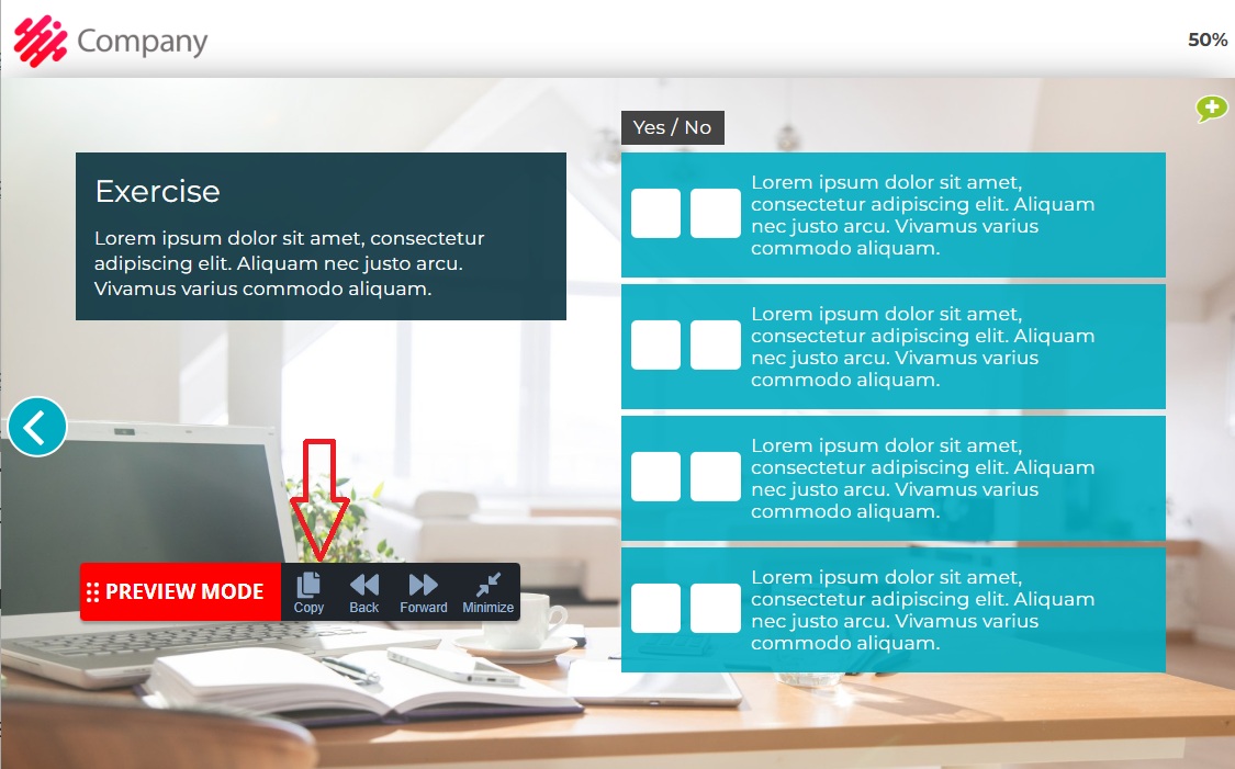
- The Copy button is displayed in the preview bar if the user is logged in as a facilitator to the same tenant as the module.
- The element and its content are copied by pressing ‘Copy’ in the Preview toolbar.
- How do you then attach the copied element? Select the module where you want to attach the copied element. From the orange gear at the top of the Edit Module, choose ‘Paste element & content‘, and the element will be copied with its content to the end of the module before the Finish element.
- The Preview toolbar will display Draft and Published buttons for tenants with the Draft feature enabled when the module is published. These buttons show the active state with a white background. When either button is clicked, the module moves to the Intro element.
- The Preview toolbar can be dragged across the entire browser window. Note: If dragging is not enabled (this feature is unavailable for all customers), the drag icon (dots on the left side) will be missing.
Additional information
4.6 Copying Elements with their content
https://faq.apprix.fi/builder-help-en/#copying-elements
How are elements previewed?
Preview Toolbar (Max, Min, Draft)
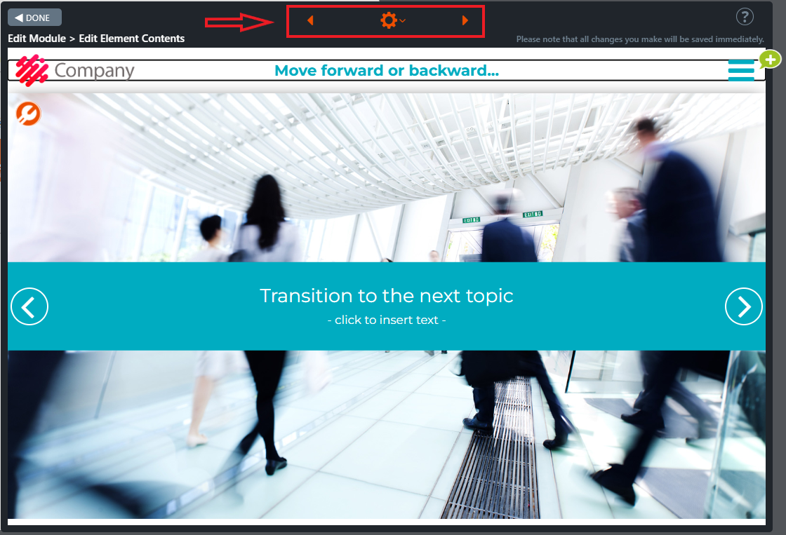
4.5 Navigating between elements when editing their contents
At the top of the element’s editing mode, orange arrows appear on either side of the gear icon. These arrows allow you to move between elements in edit mode. This makes creating and editing content even easier!
How do you browse elements in edit mode?
4.6 Copying Elements with their content
This feature allows elements and their content to be copied from one module to another or within the same module.
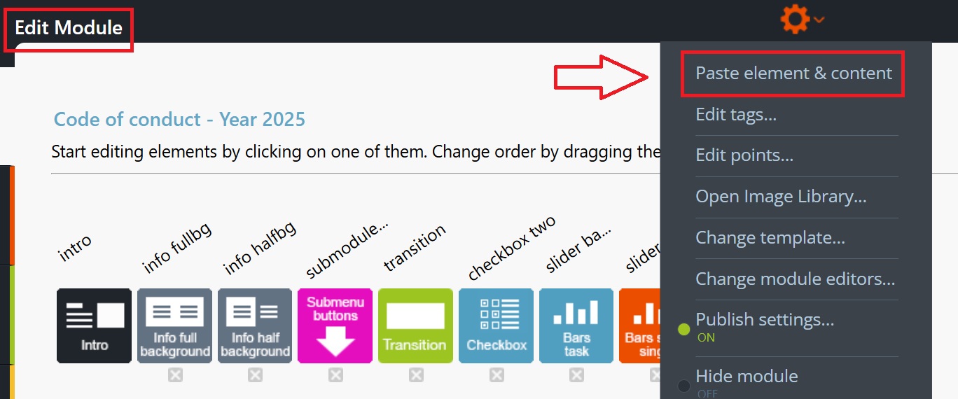
How do you copy and paste an element?
You can copy an element in Preview mode by pressing ‘Copy’ in the Preview bar, which copies the element’s content. Select the module where you want to add the element. In the Edit module, press ‘Paste element & content’ from the orange gear icon at the top, which pastes the element as the last one in the module, before the Finish element.
Additional information about the feature
- With the Copy feature, you can copy one element at a time.
- The ‘Paste element & content’ button appears behind the Edit module’s gear icon when an element has been copied to the browser’s memory.
- Elements that cannot be copied are intro, submodule_menu, pass/fail (fail), and finish. The Copy button for these elements appears greyed out.
- An entry is added to the audit log when an element is added. This applies only to customers who have Auditing Tools enabled and the Audit Module feature activated in the module for the marking to be visible.
- Elements can be copied from published and draft modules and pasted into a draft module.
- The element to be added must be of the same module type. Otherwise, an error message is displayed.
- Why is this? Each module type contains an entirely different set of elements, possibly different logos, colours, fonts, and integrations.
How do you copy the element?
How do you paste the element?
5 Editing Element Contents
5.1 Editing Text in Elements
Click the element icon in the Edit Module view to open the element and edit its contents.
Edit all titles and text areas by clicking them. You can bold, italicize, underline, and change the color of the text from the text toolbar.
You can also create links by clicking the Insert/edit link button.
Copy the link inside the browser URL box if you want to create a hyperlink. Write an informative link title text (e.g.: Click here to read more about…) into Text to display field.
Tip! Keep the texts as concise and simple as possible.
Click on the images to enlarge them.
5.2 Setting a Header Title
The Header Title field is located at the top of every element. You may set the header title in two ways: for the whole module or only for a single element or a group of specific elements with the same topic or theme. The header title is intended to provide additional information about the module (for example the course module name), a broader theme or a specific topic if set only for a single element or a specific, consecutive group of elements.
A common way to use this feature in submodule structures is to enter the name of the training in the main module and the names of the chapters as the header titles in submodules (= chapters). For example the main module header title could be “Safety Training” and the submodule titles follow the chapter names for the duration of the submodule chapter, for example “Safety Principles” and “Work Tasks That Require Special Attention”.
Editing Instructions
Setting a header title for an entire module
- If you wish to set a header title that will appear in every element added in the module, enter the desired header title in the header title field at the top of the Intro Element.
- From the Intro element, it will be automatically copied to every element following the element.
- Set the header title similarly to modules that will be transformed into submodules/linked to a main module – the header title will remain in the Intro element even though the element will be hidden when the module is transformed into a submodule.
- If you wish to set a header title for a submodule that has already been linked to a submodule structure (linked under a main module), you must first unlink the submodule from the main module (change it back to a normal module) to reveal the hidden Intro element.
- If you wish to link the submodule right back to the main module after setting the header title and the submodule has already been published, remember to unpublish the module first to reveal the Submodule Settings button after which re-linking should be possible.
Note!
When the header title is set through the Intro element, it will only appear in the Intro element in Edit Element Contents view. If you wish to preview the header title in other elements, try viewing the module in preview/published mode and the header title should appear in all of the elements.
Setting a header title for a specific element
- Open the element where you wish to place the header title.
- Enter the desired header title in the header title field at the top of the element.
- The header title will now only appear in this specific element.
Click on the images to enlarge them.
Setting a header title for the entire module through the Intro Element:
Setting an element-specific header title:

5.3 Adding Images to modules and elements
In the Image Library, you can add and remove the images you need in the module elements.
Images format and size instructions
- JPG format is suitable for images. Full background images should be 1600×900 or 1920×1080 pixels (JPG quality 8).
- You can also upload larger JPG files. If the file size is over 550kb (max 20 MB), they will be automatically optimised for web use.
- PNG format also allows vector images, graphs, slides, and screenshots of user interfaces (or transparent images). If an uploaded PNG file is over 550kb, it will be converted to JPG.
5.3.1 Adding images to modules
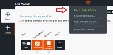
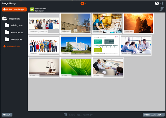
You can add or remove images that you need in the module by choosing the Open Image Library… option from the gear icon in the Edit Module window.
Once you click the ”Open Image Library...” button the Image Library window opens.
If you need to upload an image from your files, first decide if you want to place it accessible to everyone in the Image Library.
Click Upload new image. Choose the image from your files and then press Open. The image is now available in the Image Library. If needed, you can insert the image into the desired subdirectory by moving the image with the mouse.
Note! The parameter “Show uploaded file in library” cannot be unticked when the Image Library is opened from the module’s gear icon.
Click on the images to enlarge them.
5.3.2 Adding images to an element
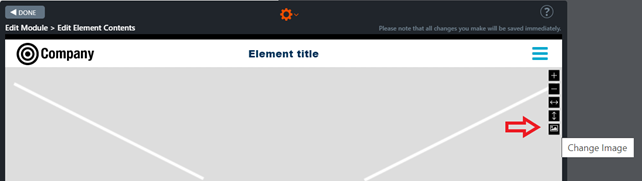
When you need to add an image to an element follow these instructions:
- Open the element. The element must be in Edit mode (”Edit Module > Edit Element Contents” window).
- Open the Image Library by moving the mouse on the right side of the background image on top of the image toolbar and by clicking the lowest icon Change image.
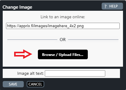
- In the new pop-up window click Browse / Upload Files… Now you can see the Image Library.
- Choose the image by clicking on it.
- In case you need to upload an image from your files, proceed as described in the previous chapter.
- Once the desired image is available in the Image Library click it and press Insert Selected at the bottom right of the window. The chosen image appears as a ”background image” in the element.
- You can zoom in and out of the image with the mouse scroll gear or by using the + and – buttons on the image toolbar. The second lowest button in the image toolbar fills the image area vertically and the middle one fills it horizontally.
- You can also move the image by dragging it.
Click on the images to enlarge them.
5.3.3 How does the Image Library work?
The Image Library has a folder structure. You can add, rename and delete folders by clicking on the Image Library gear icon.
In the Image Library, you can:
- add and remove images
- add, rename, and delete folders by clicking on the Image Library’s gear icon
- add or remove tags from the images
- add an image into a subfolder and drag it from one subfolder to another
- search for the images by their names or tags (works across folders and shows which folder the image is in)
- choose whether to show 50/100/all images
- sort and filter when searching for the images (filters are preserved when searching and changing folders)
- hide image names
- upload images of any size
Click on the video to enlarge it.
5.4 Uploading Files and Linking Files to Elements
You can upload a document (pdf, excel, word format etc.) to an element by following the instructions below.
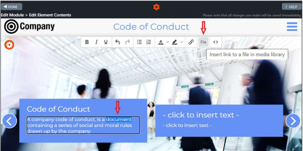
- Select the text in the element where you would like to insert the file link (in the picture at the right the word “document”) and select from the text editor File.
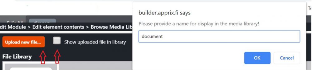
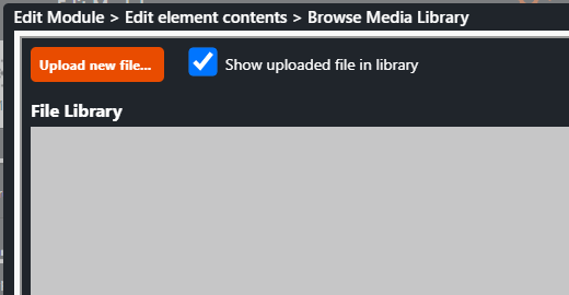
- The Browse Media Library pop-up window is opened. Click Upload new file… button and select the file that you need to upload. In case you would like to show the uploaded file in the library tick Show uploaded file in library button.
- Once you have selected the file, a pop-up window will be displayed. Enter the text that you would like to see as the file link text in the element, as in this case “document”, and press OK. The text will now appear in the element text.
- To test the link, click the text in Preview Mode. A new tab with the uploaded document will be opened.
Click on the images to enlarge them.

Follow these instructions to add files and links that are to be available to trainees throughout the module.
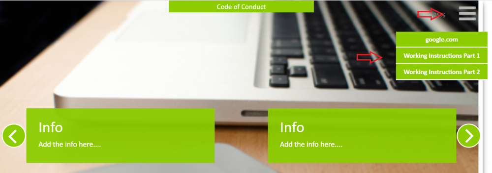
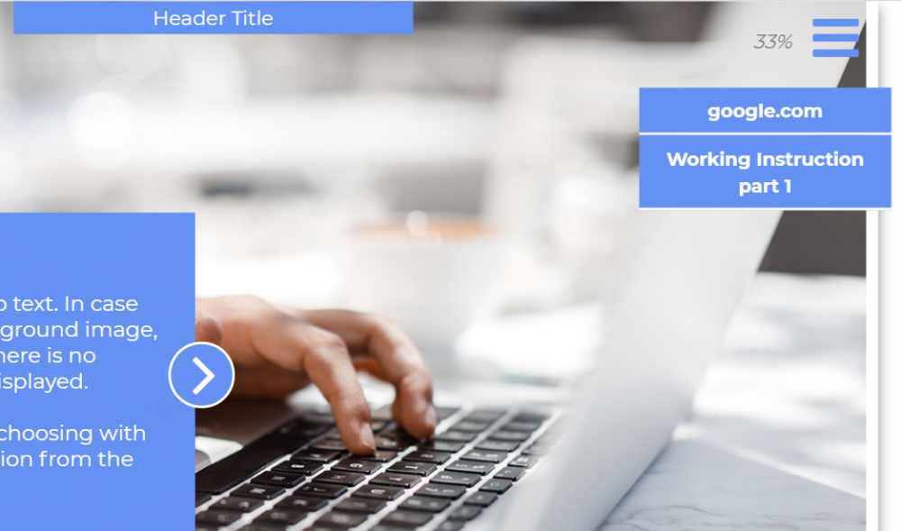
What Is the Hamburger Button?
The hamburger button (aka hamburger menu) is placed at the top right corner of an element. Clicking on the button opens a list of files and links, ready to be used by trainees during the training.
Editing Instructions
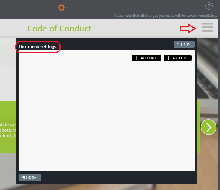
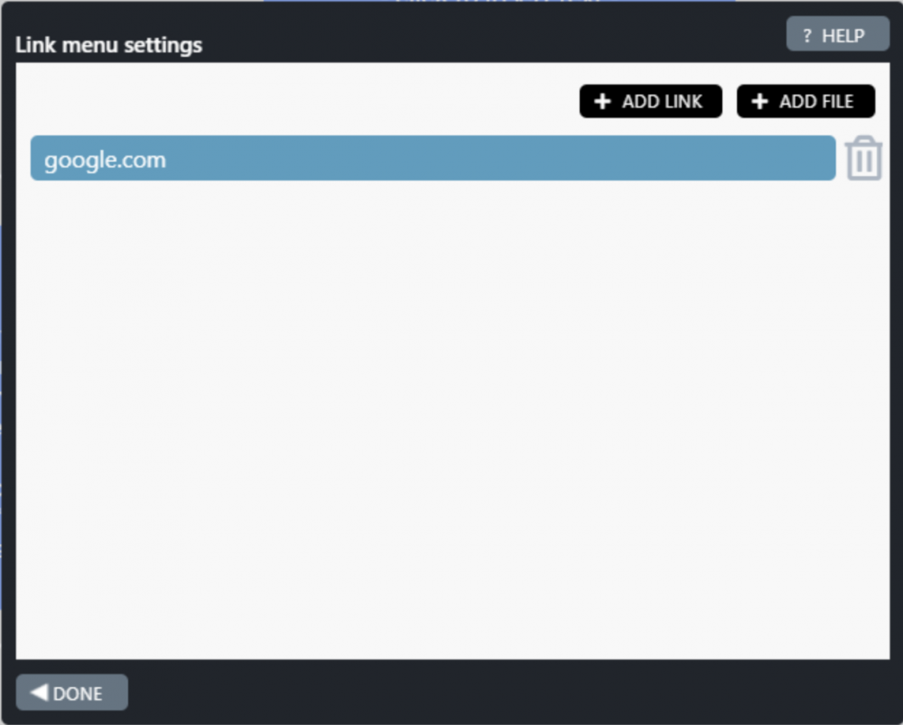
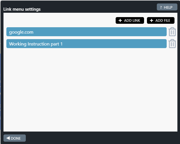
Clicking on the hamburger button opens the Link Menu Settings pop-up window. In this window, links (e.g. HTTPS://www.google.com/) and files can be added (pdf, doc/docx, xls/xlsx, ppt/pptx, txt/csv, zip) into the hamburger.
Note!
Links and files
- placed in or removed from the hamburger button of any element are updated accordingly in all elements in the module automatically.
- added in the main module are not updated in the submodule and vice versa, since these are module-specific.
+ ADD LINK Button
- Click the + ADD LINK button if you need to add a link(s) into the hamburger. The Browse Media Library pop-up window will be opened. In this library, you can find a list of available links added previously.
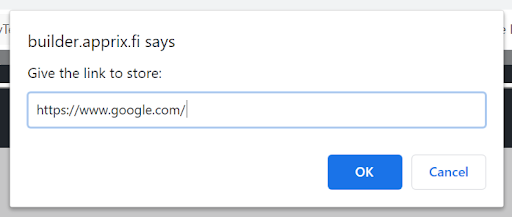
- If the link that you need is not included in the library yet, click the orange Add new link… button. A new pop-up window is opened; it requests to provide a name for the link to be displayed in the media library. Enter the name of the link, e.g. google.com and press OK.
- A new pop-up window is opened, it requests to give the link to be stored in the media library. Type the link name, e.g. https://www.google.com/ and press OK. The pop-up window and the Browse Media Library are closed.
- In the Link Menu Settings, click the + ADD LINK button again. In the Browse Media Library pop-up window, select the needed link and click Insert Selected button at the bottom right side of the window. The link now will appear in the Link Menu Settings pop-up window.
- Select Done if you do not need to add more links. The link is now available in the hamburger button.
+ ADD FILE Button
- Click the + ADD FILE button if you need to add a file into the hamburger button. The Browse Media Library pop-up window will be opened. In this library, you can find a list of available files, added previously.
- If the file that you need is not included in the library yet, click the orange Add new file…button.
- Note! Tick the box Show uploaded file in library if you wish that the file is included in the File Library.
- The File Explorer window is opened. Select the file to be included in the media library.
- A new pop-up window is opened; it requests to provide a name for the file to be displayed in the media library. Enter the file name and press OK. The pop-up window and the Browse Media Library are closed.
- In the Link Menu Settings, click the + ADD FILE button again. In the Browse Media Library pop-up window, select the needed file and click Insert Selected button at the bottom right side of the window. The file will appear in the Link Menu Settings pop-up window.
- Select Done if you do not need to add more files. The file is now available in the hamburger button.
Files and links included in the Link Menu Settings are now available in all elements of the module. If you need to remove a file or a link, click the Trash Can icon on the right side of the link/file name.
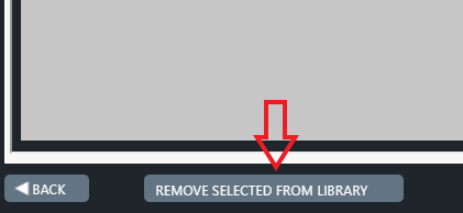
If needed, you can also remove a file/ link from the Media Library, by selecting the file/link and clicking REMOVE SELECTED FROM LIBRARY button at the bottom left side of the pop-up window. Note that the file/link will be removed only from the Media Library, but not from the module(s), if the file/link is stored in the element Link Menu Settings pop-up window.
Click on the images to enlarge them.
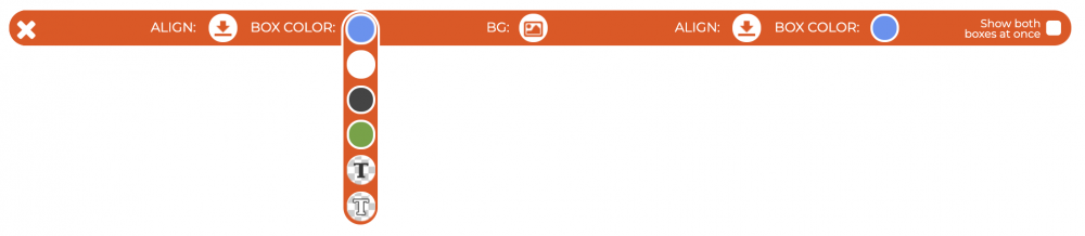
5.6 Settings Bar in Info Elements
In Edit Element Contents view, you can find the Settings bar on the top left corner in several info elements, such as
- Intro,
- Info Full Background and
- Info Half Background
The purpose of this tool is to allow you to adjust the position (top, middle, bottom), color and background color of the text boxes. Note that the Settings bar is only visible in Edit Element Contents mode.
Tip! You can also choose to show both boxes at once.
- Click the tool button. The Settings bar will appear on the window.
- Adjust the settings by hovering the mouse on top of the bar and when ready, close the bar by clicking the X on the left side.
Settings bar
5.7 Adding an Audio File (Add Audio Option)
The Audio feature can be activated in the following elements: Info Half Background, Info Full Background, Transition and Hotspot
Choose the element where you would like to add the audio file and Add audio from the gear icon at the top of the element.
Note! If the Audio option is not activated in the element by default, please contact helpdesk@apprix.fi
The Audio player is displayed at the bottom of the window.
Click the Audio player. Change Audiofile pop-up window is displayed.
Note! You can choose several options in this pop-up window:
- Autoplay: plays the audio automatically when the user enters the element.
- Loop: repeats the audio file in a loop
- Position: chooses where the audio player should be shown in the element.
- Alt text: shows text when the user clicks an icon next to the player. This is especially important when using voiceovers or speech for users without audio.
Click the Browse /Upload files… button in the Change Audio window.
The Audio Library pop-up window appears. To save the audio file to the library, click Show uploaded file in library and then click the Upload new audio file… button.
The pop-up window is opened. Select your audio file and Open button.
In the “builder.apprix.fi says” pop-up window, enter the name of the audio file and press the OK button.
Note! Only .MP3 or .MP4 files are allowed. Maximum audio size is 100 megabytes.
The audio file is now available in the Audio player at the bottom of the element’s window. You can play the audio by clicking the forward button.
If necessary, you can remove the audio by selecting Remove Audio from the gear icon at the top of the element.
How do you add an audio file?
6 Module Functions and Changing the Module Publication Mode
6.1 Previewing the Module
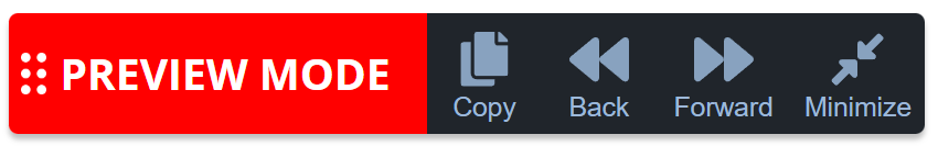
To preview the module from the course participant’s perspective, click the Preview button in the bottom left corner of the module within the ‘All modules‘ view. The preview will open in a new tab. Review the entire module, and if necessary, leave a comment on the page by clicking the green bubble on the right side of the window or edit the elements in Edit mode. While previewing, you can navigate forward or backwards using the buttons in the red ‘Preview mode‘ box located in the bottom left corner. You can return to the module’s editing view by clicking the Edit button in the All Modules view on the homepage.
Note! You can recognise the Preview link by its suffix: &skip&nostats.
Note that there is a difference between the Preview buttons in the All Modules and Edit Module views:
- In the All Modules view, the Preview button displays the module directly in a new tab.
- In the Edit Module view, the Preview button contains a drop-down menu with two options: Preview Share and Preview Open.
Note! A submodule structure is an e-learning course that contains the main module + one or more submodules. All submodules must be published before you can preview them in the Submenu buttons element in the main module. Publish the submodules by opening each in the Edit Module view and clicking the Publish button. A light green circle will appear next to published submodules in the submodule menu list.
Preview Link (“Open” and ”Share”) options
There are two different options in the drop-down menu of the Preview button in the Edit module view:
- Open: Select this option to open the module preview in a new tab.
- Share: Select this option when you want to deliver the module’s preview link to external users for testing purposes.
Note!
- If you wish to share the main module and all its submodules, open the sharing pop-up window in the main module.
- If you wish to share only one submodule, open the sharing pop-up window in that submodule.
How do I share the module link from the Share module preview pop-up window for testing purposes?
- Select from the Edit Module view module’s Preview -> Share
- Activate the Share feature by clicking the Enable preview sharing… button.
- Fill in a password that is at least six characters long, including lower-case letters, upper-case letters, and numbers. You can also use the “Generate password” button.
- Select an end date from the calendar. It can be up to one month from today, and you can change it later if needed.
- Select the Copy link and message button, and forward its content to an external user for testing.
- Select the Save
After these steps, the preview does not require any further identification from the external user.
The IP Guard feature restricts external testers’ use of the preview link. Therefore, the feature must be disabled during testing for external users to preview the module.
Be sure to re-enable the disabled IP Guard feature after testing!
How to preview the module?
How do you preview an element using the ‘Preview Element in New Tab’ option?
How to share the module’s Preview link?
6.2 Publishing the Module
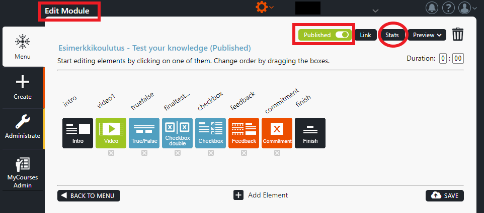
When you are satisfied with the content of your module, publish it by clicking the Publish button in the upper right corner of the Edit Module view. The text of the Publish button changes to Published. A Stats button appears to the right of the Link button, from where you can view the module’s performance statistics.
If the training includes the main module and its submodules, provide the main module link as the e-learning link.
Note! Do not share the Preview link with the eLearning participants, as it allows them to jump over the module elements/pages, and does not save their performance data in the statistics. The Preview link is intended to be used for preview purposes only. You can recognize the Preview link by its suffix: &skip&nostats.
Note! Unpublish the module by turning the Published button off.
If you have the Drafting feature enabled, you have also to choose whether to save or reject the draft version before unpublishing the module.
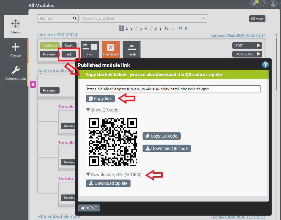
Sharing the Published Link
The published module link can be found behind the Link button. The link button is activated when the module is published.
The Link menu includes:
- Published module link.
- QR code of the link.
- Published module zip package (SCORM).
From this link menu, you can copy the link and QR code of the module, and download the QR code and the module’s zip file (SCORM).
How do you publish a module and copy its link?
How do you share the published link from the ‘All Modules’ view?
What is the difference between the published and preview link?
6.3 Statistics tool
When a module has been published, it starts collecting data. You can view module statistics by clicking the Stats button on the left side of published modules in All Modules or the Edit Module view. Statistics gather all performance data in an up-to-date manner.
Note! Collecting user data requires that the module have a Login element or another authentication method (e.g., Email Registration, Consumer Login, SSO/Single sign-on, or Tax number check) in the module settings (see the “User Authentication” tool from the gear icon in the module editing view).
Note! The data are collected separately for each module and submodule.
Functions in Stats Window:
- In the Overview, you may view a summary of module statistics.
- Duration is the time that the trainee has spent in the module.
- You may view all trainees who have successfully passed the module from the Users tab.
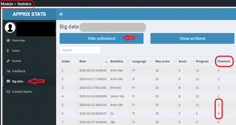
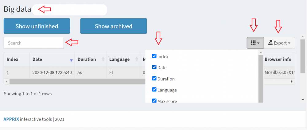
- The Big Data view shows the statistics of all end-users who have attended the course.
- Show Finished button: shows only successfully finished attempts (Finished = 1)
- Show Unfinished button: shows both finished and unfinished attempts (Finished = 0)
- Show Archived button: if an element containing an exercise (e.g. True / False, CheckBox) has been removed from the module after publication, the data collected by this exercise(s) will be displayed in the statistics when this option is selected.
- In the Big Data view, click the Export button to filter and export the data you want to analyze.
- You may also use the Search field to filter data.
- The progress column shows the trainee’s progress in the module (e.g., 3 = the third element in the module).
- If the user moves backwards in the module and logs out, Builder will save the last “location” where s/he has been (the element) in the statistics.
- If the user has progressed to the end of the module (until the Finish element), it will be marked “Finished = 1.” In this case, “Finished = 1” does not change even if the user moves backwards and logs out afterwards.
- Score / Max. Score column: user points/max. possible points in the module.
- The score is reset if the user returns to the module later on and starts the module again.
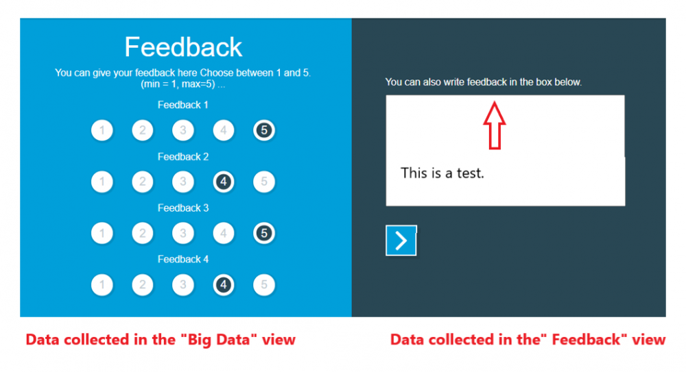
- Feedback tab: If the Feedback element is added to the module, feedback from the trainees will be shown in the Statistics Feedback view.
- Note! The free-form, written feedback shown in the Feedback view has been entered in the open text field at the right side of the Feedback element.
- Open the Big Data view if you wish to view all feedback in the Feedback element.
Tip! If your organization needs even more detailed, customized reports, consider the Extended Reports feature.
Click on the images to enlarge them.
If the module was successfully completed, the value in the Finished column is 1. If the module was not completed successfully, the value in the Finished column is 0.
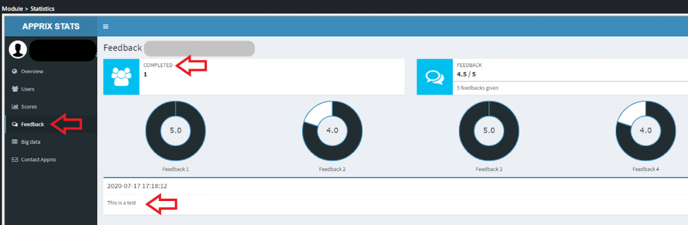
In the Feedback view, you can see the feedback of the trainees that have successfully completed the training.
Feedback element, the statistics of which you may view from the Feedback tab.
6.3.1 Scores Visualization tool
The purpose of the Scores tool is to provide a combined place where you can easily see the level of competence of the course participants either as an overview, based on task types, user data, or time period.
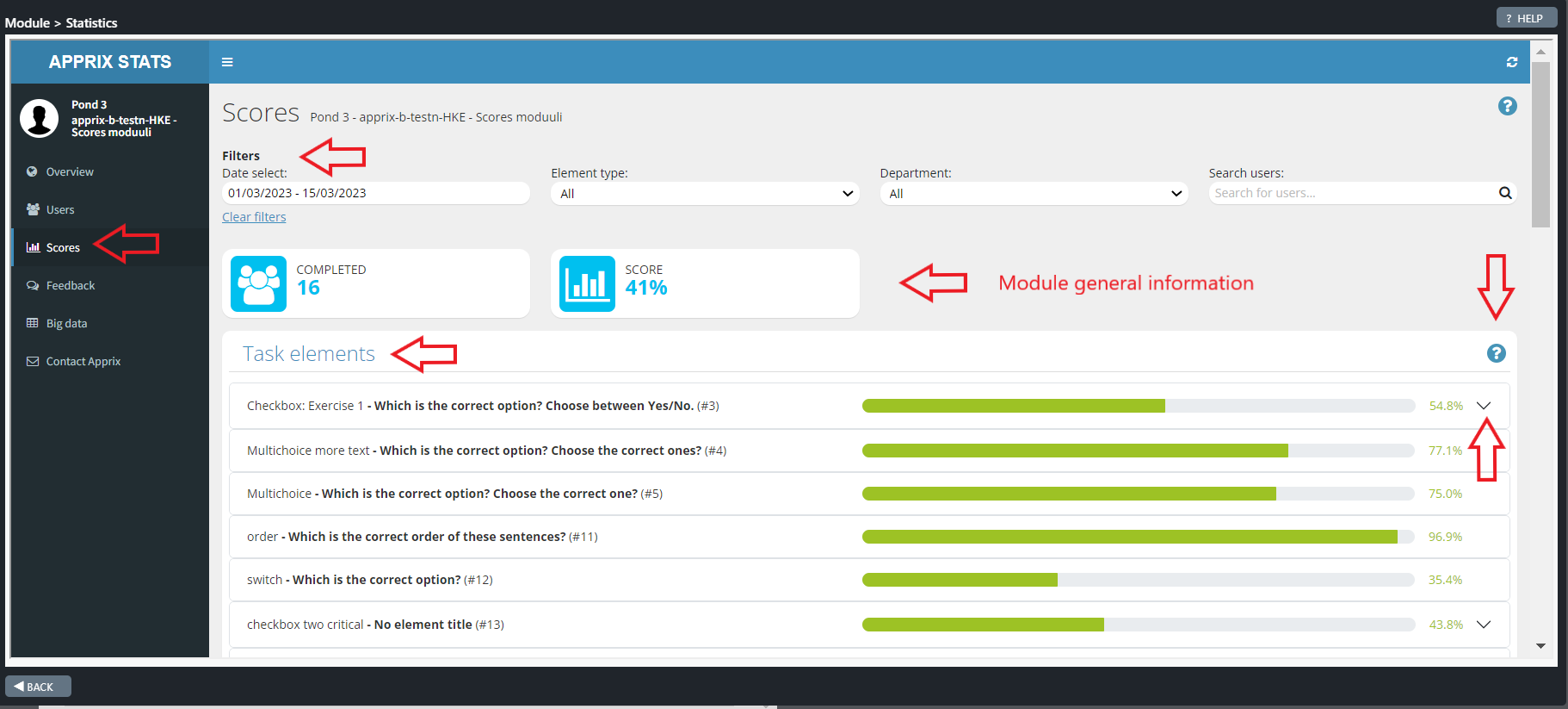
You will find the Scores tool by pressing first the module Stats button and then from the Apprix Stats window by choosing the Scores button at the right side of the window.
Scores ”Filters”
At the top of the Scores window, you can find the Filters tool.
With this tool you can filter the data using the following criteria:
- Date select – filters the data of the completed courses based on the course completion date, pre-defined time periods, or your own selection. Default value: From the Date of the first-course completion – To this date. The filtered data is visible if at least one-course completion is found.
- Element type – filters the data of the completed courses based on task element selection. Default value: All. The filtered data is visible if at least one-course completion is found.
- Department – Refers to the “department” user information collected from the Login element. Visible if such a value is found in at least one of the trainee’s data.
- Location – Refers to the ” location” user information collected from the Login element. Visible if such a value is found in at least one of the trainee’s data.
- Manager – Refers to the “manager” user information collected from the Login element. Visible if such a value is found in at least one of the trainee’s data.
- Search users – In this field, you can search for the data of all those who have completed the course. The user data collected may vary for different customers. User information can be, for example, name, e-mail, department, workplace, manager, Tax number, company ID, or user ID.
- Clear filters – This button resets all selected filters to their default values.
Note! All filters show completed tasks only.
Module general information
The module’s general information shows the number of participants who completed the course and the average score they received out of the maximum number (in percentage). Note! The data displayed is affected by the selected filters.
Click on the images to enlarge them.
Scores tool’s view
6.3.2 Scores Cards
Task elements
By default, task-type elements are the only elements that collect points (with a few exceptions), so this card shows all the scoring elements in the module if they are not separately visualized.
Note! The statistics are shown for completed tasks only.
The left side shows:
- Element name (the text displayed above the element in the Edit Module view),
- Title of the element (in the Edit Module view the title of the element or the name of the question)
- Element page number (#n).
If there are separate questions within the element (e.g. Checkbox element), they appear under the element as separate rows (there can be also exceptions since the element can be customized).
If the percentage could not be calculated, N/A = Not Available will be displayed. If the question is not to be scored, but in text form, the number of answers is shown instead of a percentage.
Note!
- Since many elements are customized, if you would like to see other task-type elements visualized, please contact Apprix.
- A question mark will appear on the N/A row if the percentage could not be calculated. When you move the mouse over the question mark, the help text appears.
Percentage calculation formulas
1) (Used when the element’s maximum score is > 0, e.g. Checkbox element)
Element score =
(Total score of the course participants * maximum score of the element) / (number of answers * maximum score of the element) * 100.
Note! If the score of the element in the Edit Points tool is 0, i.e., no “real points” are awarded, then the maximum score is the same as the number of tasks, i.e., it is assumed that each task is worth 1 point.
2) (Used when the element’s Edit points score is 0)
The score of the element’s single question =
(Total score of the course participants * maximum score of one question) / (number of performances * maximum score of one question) * 100.
Click on the images to enlarge them.
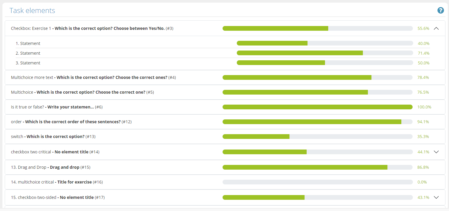
Task elements
6.3.3 Scores Charts
Slider bars task
This chart shows the correct, average, and maximum values of the given answers.
Chart header left margin:
- The element name is in blue (the text displayed above the element in the Edit Module view)
- The element name in bold (slider_bars_task)
- Element page number (#n).
Chart upper right corner
- “n completed” – how many course completions are included in the element (the number can be different depending on the used filter).
- The info button opens a modal when the mouse cursor is placed over it. The modal shows further information about the card.
Chart
- The bars reflect the average of all those who completed the course.
- The green line and number placed on the bar represent the correct answer.
- The text below each bar refers to the title set for the individual bar in the Edit view of the element.
- When placing the mouse cursor over the bar (or pressing with a mobile device), the modal that appears tells the average and maximum values.
Slider bars single
This chart shows, the average and maximum values of the given answers
Chart header left margin:
- The element name is in orange (text visible above the element in the Edit Module view)
- The element name in bold (slider_bars_single)
- Element page number (#n).
Chart upper right corner
- “n completed” – how many course completions are included in the element (the number can be different depending on the used filter)
- The info button opens a modal when the mouse cursor is placed over it. The modal shows further information about the card.
Chart
- The average value of the bar reflects the average of the responses of all those who completed the course
- The text below each bar refers to the title set for the individual bar in the Edit module view of the element.
- When placing the mouse cursor over the bar (or pressing with a mobile device), the modal that appears tells the average and maximum values.
Fourfold
This chart displays the responses of the course participants in a heatmap style. The more spots are on top of each other, the stronger appears the spot color.
Chart header left margin:
- The element name is in orange (text visible above the element in the Edit Module view)
- The element name in bold (fourfold)
- Element page number (#n).
Chart upper right corner
- “n completed” – how many course completions are included in the element (the number can be different depending on the used filter)
- The info button opens a modal when the mouse cursor is placed over it. The modal shows further information about the card.
Chart
- The legends above the diagram indicate the color of the answers to each statement in the diagram, and by pressing them, you can show or hide the answers to each statement.
- When you move the mouse cursor over a spot, it shows how many spots are in the same position (answers: n) and what are their coordinates.
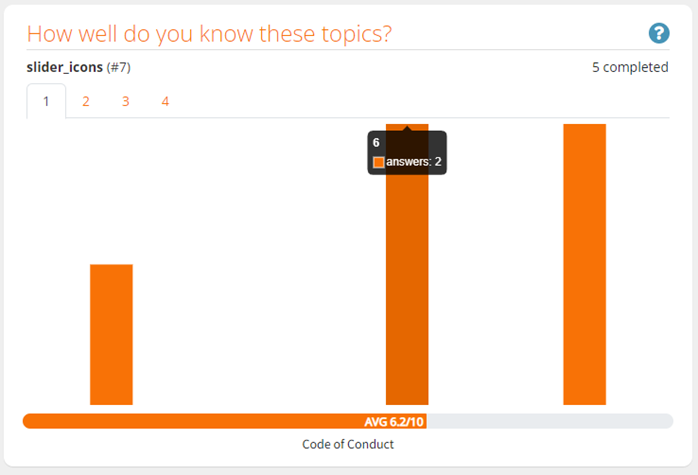
Slider icons
The Slider icons chart shows how the answers are distributed on a scale of 0-10. When you move the mouse cursor over the bar, it shows how many course participants have answered in each case, e.g. two-course participants have given the answer 6. The leftmost bar reflects the answer number 0 and the rightmost one 10. The lowest possible value is 0 and the highest is 10.
Chart header left margin:
- The element name is in orange (text visible above the element in the Edit Module view)
- The element name in bold (slider_icons)
- Element page number (#n).
Chart upper right corner
- “n completed” – how many course completions are included in the element (the number can be different depending on the used filter)
- The info button opens a modal when the mouse cursor is placed over it. The modal shows further information about the card.
Chart
- The text below the horizontal bar is the name of each question given in the Edit module view of the element.
- The tabs shown below the headings are the different questions for the element. You can browse the answers to the different questions in the element by changing the tab.
- The orange horizontal bar describes the average score of all “n” course participants.
- When you hover over it, a modal appears showing the value corresponding to the bar and the number, of the course participants who answered it.
- The text below the horizontal bar is the name of each question from the Edit module view of the element.
Slider write text
Slider writes text (slider_ability) chart shows how the answers are distributed on a scale of 1-5. When you move the mouse cursor over the bar, it shows how many course participants have answered e.g. the number 2. The leftmost bar reflects the answer number 1 and the rightmost 5. The smallest possible value is 1 and the largest is 5.
Chart header left margin:
- The element name is in orange (text visible above the element in the Edit Module view)
- The element name in bold (slider_ability)
- Element page number (#n).
Chart upper right corner
- “n completed” – how many course completions are included in the element (the number can be different depending on the used filter)
- The info button opens a modal when the mouse cursor is placed over it. The modal shows further information about the card.
Chart
- The tabs shown below the headings are the different questions for that element. You can browse the answers to the different questions in the element by changing the tab.
- The orange horizontal bar describes the average score of all “x” course participants.
- When you hover over it, a modal appears showing the value corresponding to the bar and the number of the course participants who answered it.
- The text below the horizontal bar is the name of each question from the Edit view of the element.
Tips!
- The element is removed from the Scores view if you remove it from the module.
- If the facilitator changes the content of a task element in an already published module, the statistics of correct answers may be distorted. We suggest you create a new element and delete the old one.
- If you use a filter that gives no results, a clear message will be shown on the screen.
Click on the images to enlarge them.
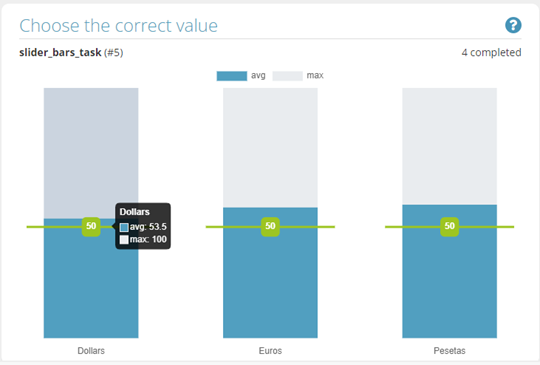
Chart: Sliders bars task
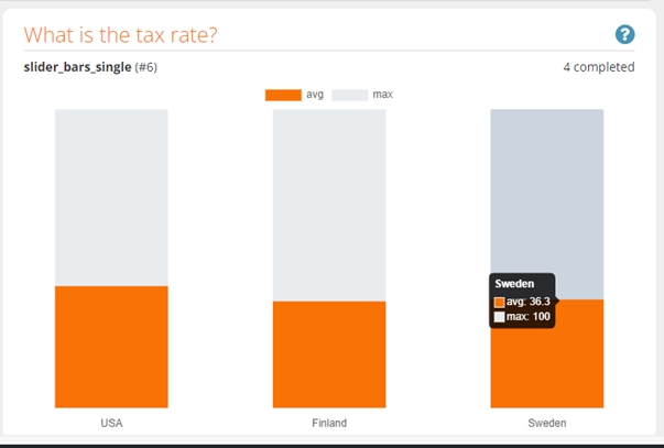
Chart: Sliders bars single
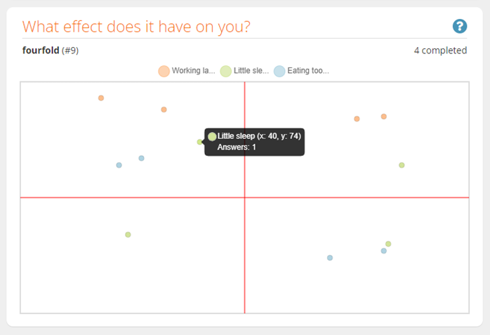
Chart: Fourfolds
Chart: Slider icons
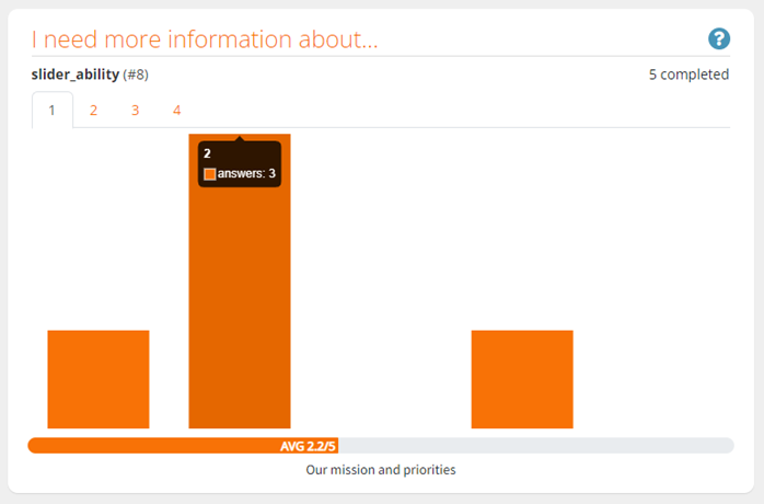
Chart: Slider write text (slider_ability)
6.4 Renaming a Published Module
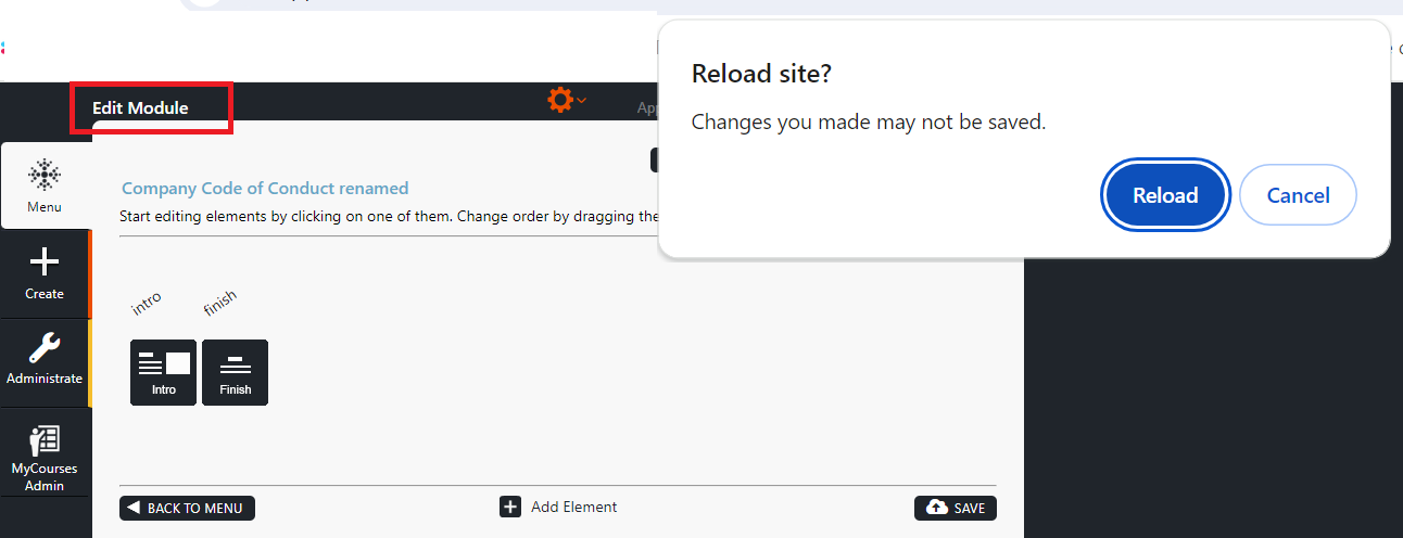
In the Edit Module view, you can rename a module by clicking on its name and start editing. When the name is completed, click the Save button. A green pop-up window, “Saved!” will appear in the bottom right corner of the window.
Reload the page if you don’t want to save a newly updated but unsaved module name. A message “Do you want to reload the site?” will appear, then click the Reload button.
Note!
– You can rename a module with the same name as an existing or “soft deleted” module. In these cases, you will be notified that a module with the same name already exists.
– The performance data will be kept in the same statistics table if you rename the module.
Click on the images to enlarge them.
6.5 Unpublishing a Module / Hiding a Module From Published Mode (Unpublish Option)
If you need to unpublish a module but keep it in Builder, move the cursor on top of the Published button. By clicking it, the button’s title is changed to Unpublished. Builder will then ask if you really want to unpublish the module. Choose between OK/Cancel.
In case you decide to unpublish a module, please remember that the module will not be accessible until it is published again.
Click on the video to enlarge it.
6.6 Deleting a Module
If you want to permanently delete the module, click the trash bin icon on the top right. Builder will prompt a message asking if you are sure you want to delete the module.
Note! You cannot restore a module after it has been deleted. If a module is unpublished or deleted, its statistical data will still be available under All Stats option.
Nevertheless, if you or someone in your organization has deleted a module by accident, please contact Apprix at helpdesk@apprix.fi to restore the module.
Click on the video file to enlarge it.
6.7 Downloading a Module as a Zip File
If the module needs to be exported from Builder to another environment or otherwise stored outside Builder, click the Link button. The “Published module link” pop-up window will open.
From here, you can:
– download the contents of the module as a zip file to your computer
– view the QR code
– copy or download the QR code of the module
– download the zip file (SCORM).
How do you download the module’s contents as a zip file to your computer?
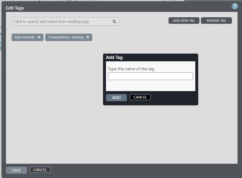
6.8 Grouping Modules and Facilitating Module Search with Tags (Edit Tags Option)
You may search modules with module identifier Tags using the Select tags to filter search bar in Menu view. When searching modules with Tags, only modules marked with the specific Tag will show up as search results in Menu view. For instance, a language, a business unit, a worksite identifier number, a city or other information that you wish to use as an identifier for specific modules can be used as a tag.
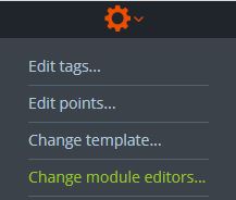
- Create a tag for a module in Edit Module view by first clicking on the orange wheel icon and choosing Edit Tags.
- In the Edit Tags window, choose ADD NEW TAG if you wish to create a new tag. Enter the name of the tag in the ADD TAG window and click ADD. Exit by clicking SAVE.
- Please note that if you are unable to create a tag, it may already exist. Check this by searching the tag using the Click to search and select from existing tags search bar.
- When a tag has been successfully created, it can be added to other existing modules as well.
- If the tag has already been created, search for the tag you wish to add by using the Click to search and select from existing tags search bar and select the tag from the list that opens. Click SAVE.
- Deselect the selected tag by clicking on the cross icon (X) on the right side of the search bar.
- If you wish to remove a selected tag from the module you are currently editing, click on the cross icon (X) on the right side of the name of a selected tag.
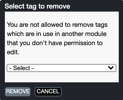
- If you wish to permanently remove an existing tag, click REMOVE TAG and choose the tag from the list in the Select tag to remove window. Click SAVE.
- Please note that you can remove a tag only if you have editing access to every module that uses that specific tag.
Click on the images to enlarge them.
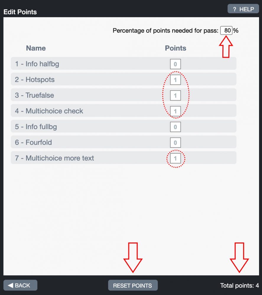
6.9 Editing Module Points (Edit Points Option)
You may find the Edit Points option by clicking the module’s gear icon and by selecting Edit Points.
Points calculation is done automatically as a percentage, which means that you do not normally have to edit the points yourself when creating your module. The maximum score is always 100%, and it is divided automatically between tasks.
If you wish, you can change the relative importance of tasks. By default, each task has one point, meaning the same weight in importance. You can make any task more important by giving it a higher value. You can also remove a task from the score calculation by giving it a value of zero points.
Note! From the Edit Points pop-up window, you may also choose what is the percentage limit trainees have to achieve to pass the course module.
If a module has a final quiz or test with a Pass/Fail element at the end and only the test score should be noted in the points calculation, remove points from all other elements except elements included in the test. Edit the pass limit percentage if needed.
Click on the images to enlarge them.
6.10 Change Template
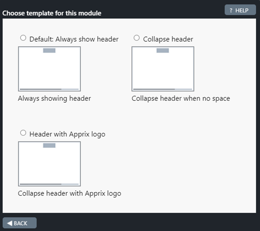
If your module has more than one template, with this option you can change the template. Click on the round buttons if you wish to change the template.
Click on the images to enlarge them.
6.11 Change Module Editors
In this pop-up window, you can add or remove the module’s editors so that any module owner can manage the course permissions.
Permissions are given in the edit window of the module. The module editor must already have editing rights to manage the rights of others.
Editors can be retrieved either by name or by email. After a few characters, Builder will display a list of matching users.
Note! This is a customer-specific feature. Please contact Apprix HelpDesk or your Apprix Account Manager, if you would like this feature enabled.
Click on the images to enlarge them.
7 Elements
What are Elements?
Course modules consist of elements. There are several different types of elements in the element library that you can add between the Intro and Finish elements that form the module’s frame. Your module is the masterpiece in-between them!
The best way to get familiarized with the elements is to preview them in the Element Library. Click the Add Element button in Edit Module view. Hover your mouse on the i-icon in the top right corner of elements to see previews of elements in the library.
Element categories include:
- Info elements: These elements consist of mostly text and they have limited interactivity.
- Task elements: E.g. Multichoice, True/False, Bars, Checkbox elements
- Please note that task elements are not suitable for gathering opinions or experiences as a correct answer needs to be defined.
- Gathering signals: E.g. Fourfold, Slider icons and Feedback elements that gather opinions and experiences in a questionnaire type manner. These elements can also be used for educational purposes. As an example of these use cases, have a look at the descriptions of Slider icons and Bars elements.
- Other elements for more specific purposes: E.g. hotspot, video, dialogue, and transition elements.
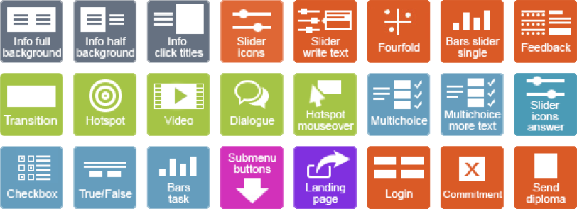
In addition, you may find elements like Submenu Buttons or Landing Page to build module structures and create pages for module links.
Please consider that modules containing merely info elements are quite easy to browse through without really understanding or internalizing the content. With a little effort, your content can be transformed into a more compelling task form that allows the trainee to truly stop and think about the correct answers and what he/she has learned from the course experience. With the help of statistics, you will be better informed about the level of knowledge and understanding amongst the trainees in terms of your course topic. You can also fit long chunks of content in multiple choice tasks that trainees have to read thoroughly to be able to give the correct answer.
If you can think of real-life situations or concrete examples that speak to the trainees – even better! Try to think about the key points of your content and make the trainee stop and focus in those parts with excersises and questionnaires.
7.1 Intro and Finish
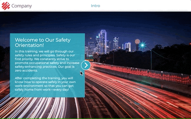
Intro and Finish elements are added to a module automatically. These elements cannot be removed, as they provide the technical functions needed to start and finish the module. In a submodule structure, these elements are located in the beginning and end of the main module.
In the Intro element, write a brief welcome and an introduction that includes
- The aim of the module (Why should this module be completed and how does completing this module help the trainee in his/her daily work?
- The duration of the module (Approximately, how many minutes does it take to complete the module?)
- Are the trainees required to retake the module after a certain time period?
- Other general instructions, such as
- Information about the strucure of the module (e.g. “The course consists of infos and exercises that test your knowledge on module topics.”)
- A mention of the final test or quiz testing the gained knowledge on given topics (if applicable).
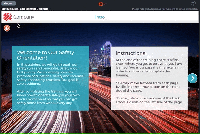
In the Finish element, you may thank or congratulate the trainee for completing the module and inform them on the possible following steps in the training process. You may also share relevant sources of information or contact information for further information on the topics discussed in the module.
Click on the images to enlarge them.
Element settings in Edit Element Contents view:
Finish element
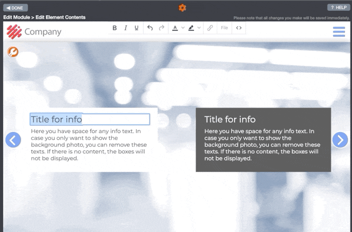
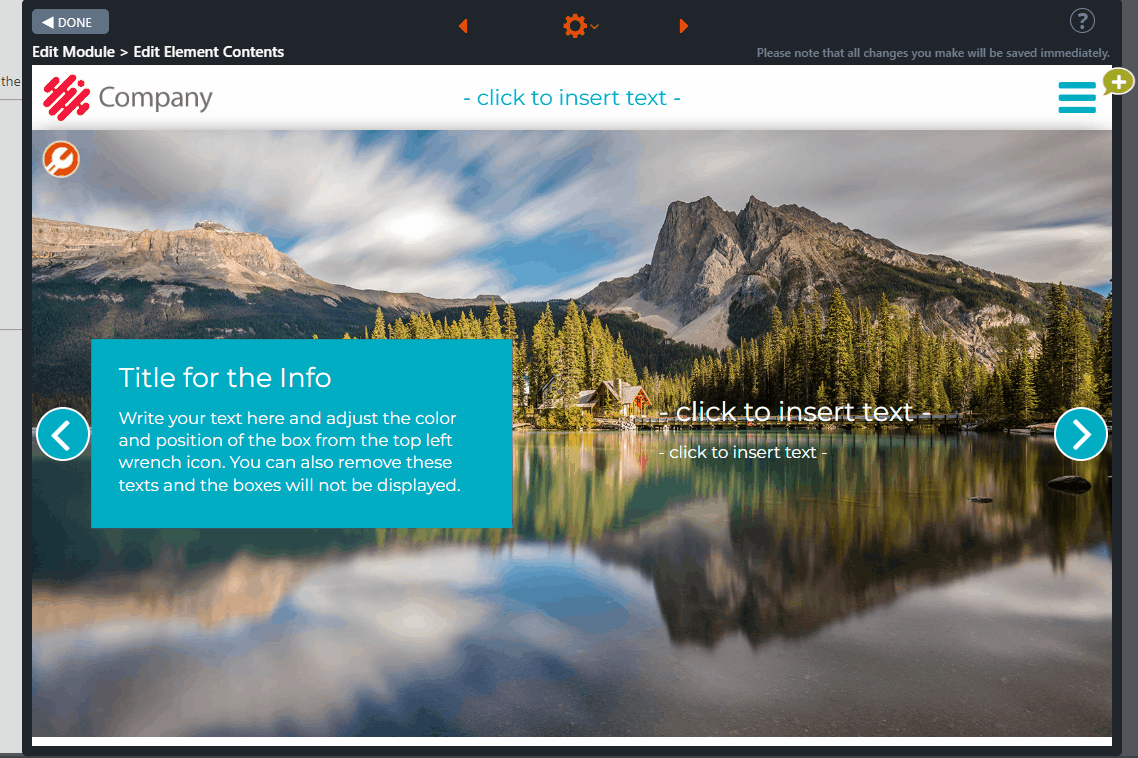
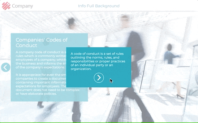
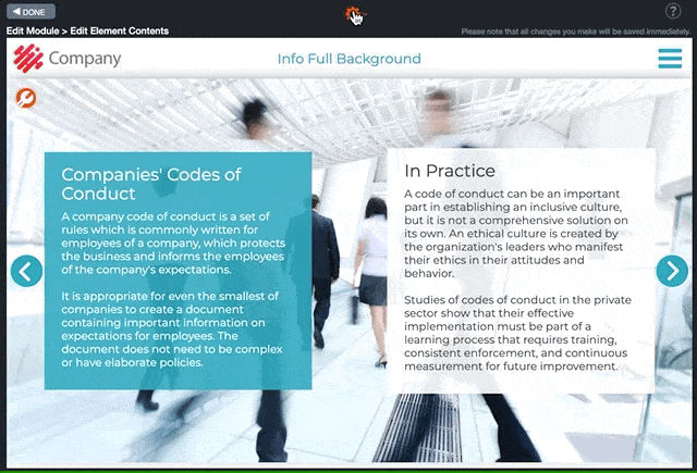
7.2 Info Full Background
Info Full Background is an element used for different text and image pages. Commonly, there are two or three info boxes that change size according to the length of the content.
Please note that if you leave a title or text field empty, they will not be visible in the training.
From the orange gear icon at the top left corner in Edit Element Contents view, you can also
- change the position of the text boxes (up, down, middle)
- choose the colors for text boxes from your organization’s brand colours
- choose to use a background color for the entire page
- hide the boxes entirely and use the photo as a background for text as well.
You may also use the element only as a photo without any text (e.g. graphs). You can use a full background image, or place a smaller image in just a part of the page.
Tip: It is recommended to keep the texts as concise as possible. If you end up using several info elements in a row, consider using a task element in between or, for example, a Hotspot element to make the module more interesting and reduce repetition.
Click on the images to enlarge them.
Element settings in Edit Element Contents view:
7.3 Info Half Background
Info Half Background is an element used for different text and image pages. You may use the element as half page images and half page text areas. There are two text areas in the element that change size according to the length of the content.
Please note that if you leave a title or text field empty, they will not be visible in the training.
From the gear icon toolbar located at the top left corner of Edit Module Contents view, you may change the position of the text boxes (up, down, middle) and also choose to use the element as either
- two half-page text areas with background colors according to your organization’s brand colors
- remove the text backgrounds altogether and use photos as text backrounds
- use a photo on one side and text on the other
- use photos without any text on both sides
Tip! It is recommended to keep the texts as concise as possible. If you end up using several info elements in a row, consider using a task element in between or, for example, a Hotspot element to make the module more interesting and reduce repetition.
Click on the images to enlarge them.

Element settings in Edit Element Contents view:

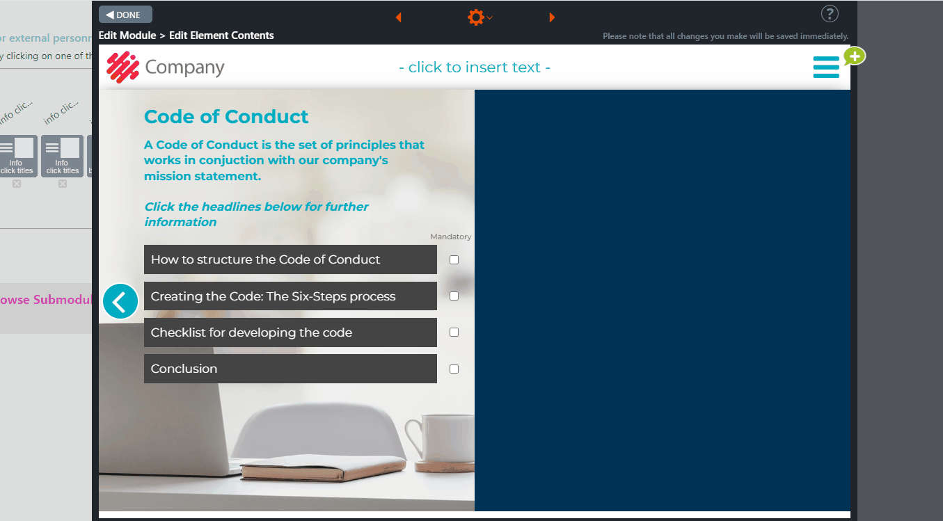
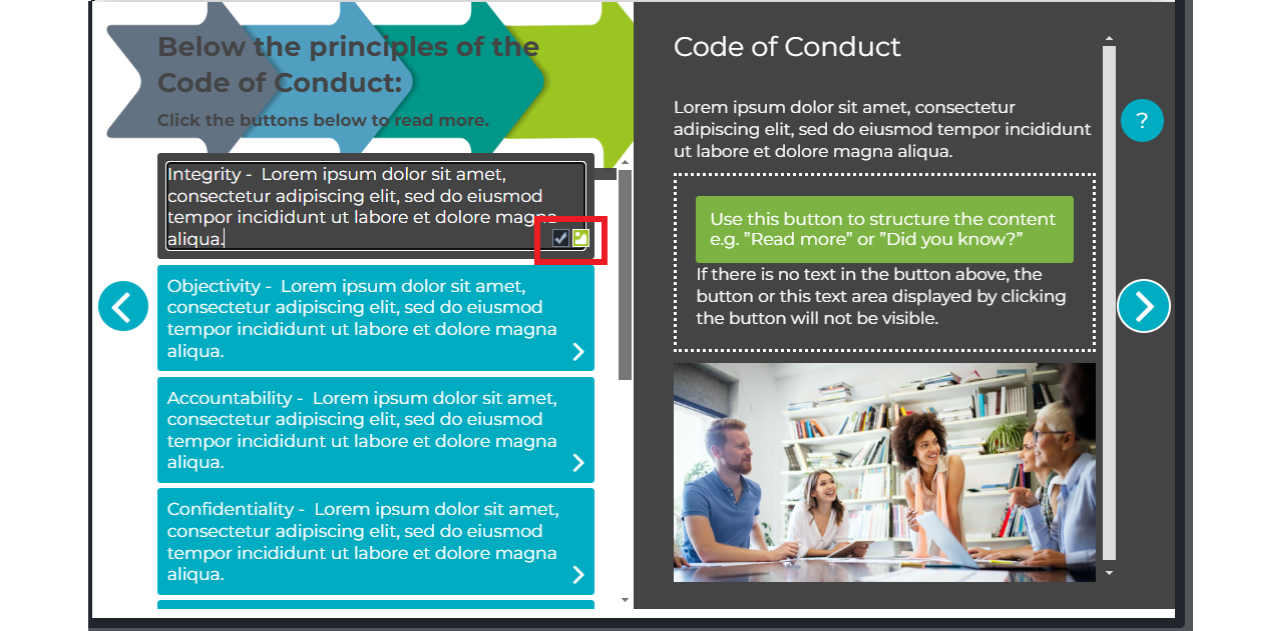
7.4 Info Click Titles
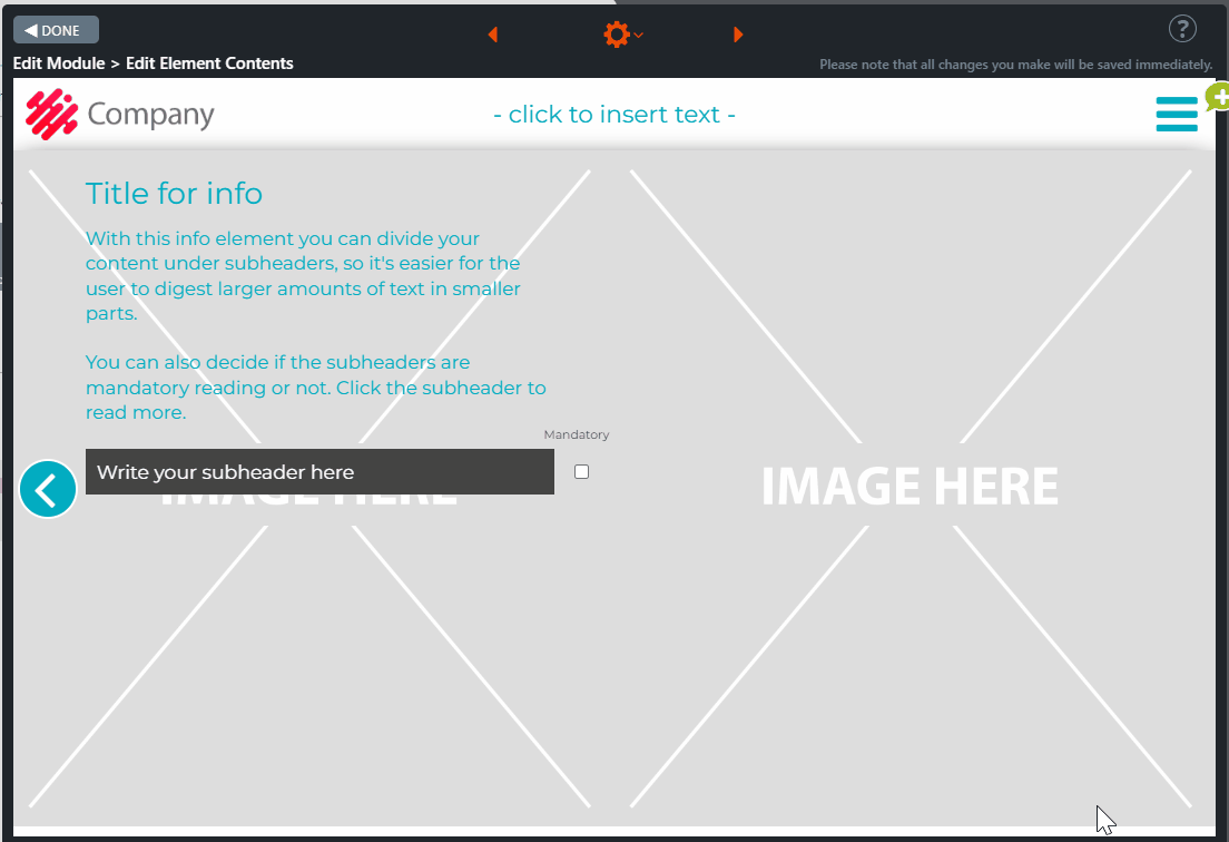
Info Click Titles is an element in which you can divide a longer text or subject area as a main header, lead text and several subheaders that provide additional information on the topic (or subtopics) when clicked. Dividing a complex or broad topic into a main chapter and sub-chapters will make it easier for the trainee to grasp. You can also choose which subheaders are mandatory and must be clicked open before continuing.
When activated, every clickable subheader has a field for a subtopic title, body text, and an information box that can be utilized to structure the body text, e.g., by providing additional information on the subtopic.
The trainee reads the main info on the left side of the element, then s/he clicks the subheader buttons and reads the additional information of each chapter on the right side of the element.
Editing Instructions
- Write the main title and the main topic in the left text area of the element.
- If the left side of the element does not have a solid colour background automatically installed, add a background image by clicking the Change image icon from the top right corner on the left half of the element.
- Add a background image on the right side of the element that supports the topic addressed in the element.
- Click the Element Settings option from the gear icon at the top of the Edit Element Contents view. In the window, add the needed subheaders.
- New subheader buttons will appear on the left side of the element. Enter a title for each subheader.
- Click the uppermost subheader button. A small Mandatory icon appears on the right side of the subheader button.
- If you select the Mandatory icon, the subheader button will become mandatory (the trainee must click it open before proceeding from the element).
- Add the subheader title on the right side of the element and provide additional information on the topic in the body text field below.
- You can also use the button below to add information the user isn’t required to read before continuing. Use this button to structure the content, e.g.,” Read more” or ”Did you know?”
- After the trainee clicks the button, the text appears below the button. Use this text box to provide additional information related to the topic.
- If there is no text in the button or its text area, neither will be visible.
- Removing the text from the button and its text field can free up more space for a longer body text. In this case, the button and its text field will not be visible, making more space for body text available.
- Repeat these steps for each subheader button.
Click on the images to enlarge them.
Element settings in Edit mode
Element in Preview mode
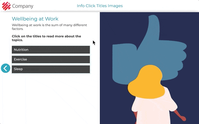
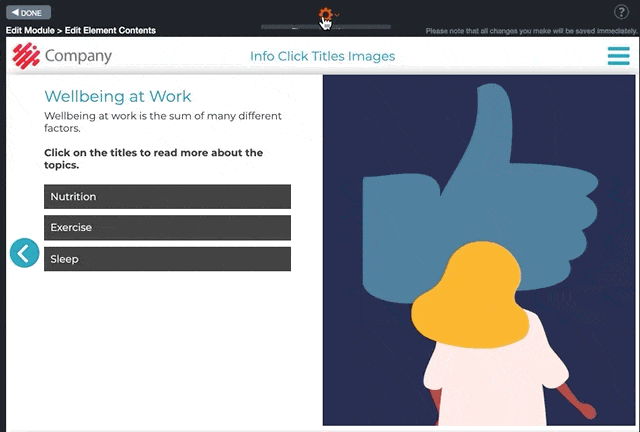
7.5 Info Click Titles Images and Click & Scroll
Info Click Titles Images
Info Click Titles Images is an element in which you can divide a longer text or subject area as a main header, lead text and several subheaders that provide additional information on the topic (or subtopics) when clicked. Dividing a complex or broad topic into a main chapter and sub-chapters will make it easier for the trainee to grasp. You can also choose which subheaders are mandatory and must be clicked open before continuing.
When clicked, every subheader opens a field for a subtopic title and a body text on the right side of the element.
In addition, you may choose one of the following to appear under the subtopic:
- An editable button and an information box under the body text are needed. The information box can be utilized to structure the body text, e.g., by providing additional information on the subtopic. The button in this could be “Did you know?” or “Read more about the subject.” Leaving the button and its text field empty will not be visible to the trainees.
- An image field is needed for an image that supports the information provided in the subtopic body text.
The trainee first reads the main info on the left side of the element, then clicks the subheader buttons one by one and studies the additional information appearing on the right side of the element.
Editing Instructions
- In the left half text area of the element, write the main title and the main topic or lead text.
- If the left side of the element does not have a solid colour background automatically installed, add a background image by clicking the Change image icon from the top right corner on the left half of the element.
- Add a background image on the right half of the element that supports the topic addressed in the element.
- Click the Element settings option from the gear icon at the top of the Edit Element Contents view. In the window, add the needed subheaders. New subheader buttons will appear on the left side of the element. Enter a title for each subheader.
- Click the uppermost subheader button. Two small icons, Mandatory and Image, appear on the right side of the subheader button.
- If you select:
- The Mandatory icon, the subheader button will become mandatory (it has to be clicked open by the trainee before proceeding from the element)
- The Image icon opens an image field below the text box area on the right side of the element. Use the image field to add an image supporting the text’s message above. Please note: when selecting the Image icon option, the button under the subtopic body text and its text area will be hidden.
- Add the subheader title on the right side of the element and provide additional information on the topic in the body text field below.
- If you didn’t select the Image option, you can also use the button below to add information the user isn’t required to read before continuing. Use this button to structure the content, e.g.,” Read more” or ”Did you know?”
- After the trainee clicks the button, the text appears below the button. Use this text box to provide additional information related to the topic.
- If there is no text in the button or its text area, neither will be visible.
- Removing the text from the button and its text field can free up more space for a longer body text. In this case, the button and its text field will not be visible, making more space for body text.
- If you didn’t select the Image option, you can also use the button below to add information the user isn’t required to read before continuing. Use this button to structure the content, e.g.,” Read more” or ”Did you know?”
- Repeat these steps for each subheader button.
Click & Scroll
The Click & Scroll element enhances the Click Title images element. It allows you to add texts and images with up to 20 clickable subheading buttons on the left side of the element and longer texts and images on the right side.
Note!
- Both sides of the element are scrollable.
- If the element contains so much content that a scroll bar appears on the right side of the subheader body text, the course participant must scroll down to ensure they have seen all the content. Only then will the move forward button appear on the subheader.
On the right side of each subheading button, there are two icons:
• Mandatory: If you wish users to click and check the content of the subheading before continuing, activate the icon on the left side. Please note that if a subheading is marked as mandatory, it will only be considered complete once the user scrolls to the end of the text.
• Image: To add an image at the bottom of the subheading, activate the icon on the right side.
Editing instructions.
The instructions for editing the element are identical to the Info Click titles Images element.
Element in Preview mode.
Element settings in Edit mode.
Mandatory and Image icons
7.6 Hotspot
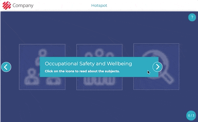
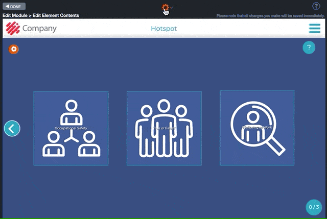
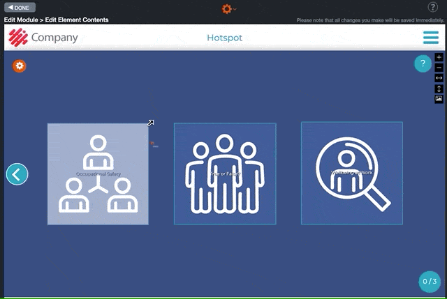
Hotspot is one of the most versatile elements. You can add clickable fields (items) on top of a background image, and choose what the user sees after they click it: a text, an image, a video, a true/false task or a combination of the previously mentioned options.
Common uses include:
- Clickable icons or headers
- Map with marked areas for further information
- History timeline with clickable years
- Mosaic image – a combination of clickable images of different topics
- Screenshot of a software or a bill where the trainee is taught to interpret it by clicking marked areas in the photo.
- Photo of an industrial workspace where the user is asked to identify hazards
From every clickable field/item opens a window. From the icon menu on the left side of the window, you can select the following content options:
- Text (title and/or body text)
- Photo
- Video
- True/False task
- Or a combination of the above options
In addition, you can select whether it is mandatory to click open a hotspot field/item before proceeding from the element.
How Can I Add a Photo to a Hotspot Item?
A photo can be added to hotspot items similarly as to any other element with a photo field. Read more about adding photos here.
How Can I Add a Video to a Hotspot Item?
Videos can be added to hotspot items similarly as to the Video element. Read more about adding videos here.
How Can I Change a Hotspot Item as a True/False Task?
True/False function can be used similarly to the True/False -element. You can change the correct answer from the gear icon on top of Edit Element Contents view.
Click on the images to enlarge them.
Element settings in Edit Element Contents view:
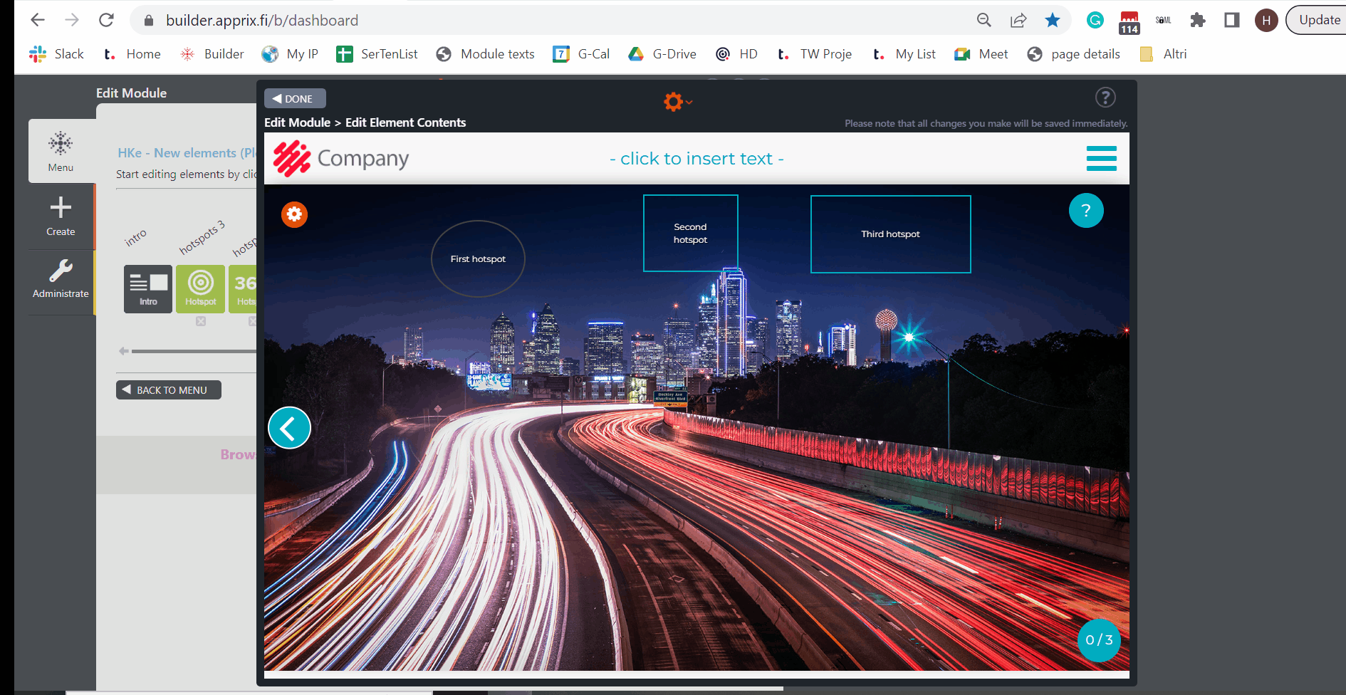
7.6.1 Hotspot 3
The hotspot is one of the most versatile elements. This version, “HotSpot 3,” is similar to the Hotspot element, with a couple of new features added.
Each hotspot opens a window containing text, image, video, a true/false option, or a combination of the options mentioned above. When all windows have been clicked, the ”Move forward” button appears on the right, and the trainee can move to the next element.
You can find more information about the Hotspot element in Chapter: 7.6 Hotspot
Editing Instructions
Start by adding a background image to the element. Then click Element Settings from the gear icon at the top of the element editing window. Add the required number of clickable items (hotspots).
Next, edit one clickable hotspot at a time:
- Choose a color
- Edit the title
- Edit the shape and position by dragging it to the right place.
- Edit its content according to 6 HotSpot instructions.
Move the mouse to the left of the hotspot. You can choose its colour.
Click the gear icon at the upper left corner of the element view.
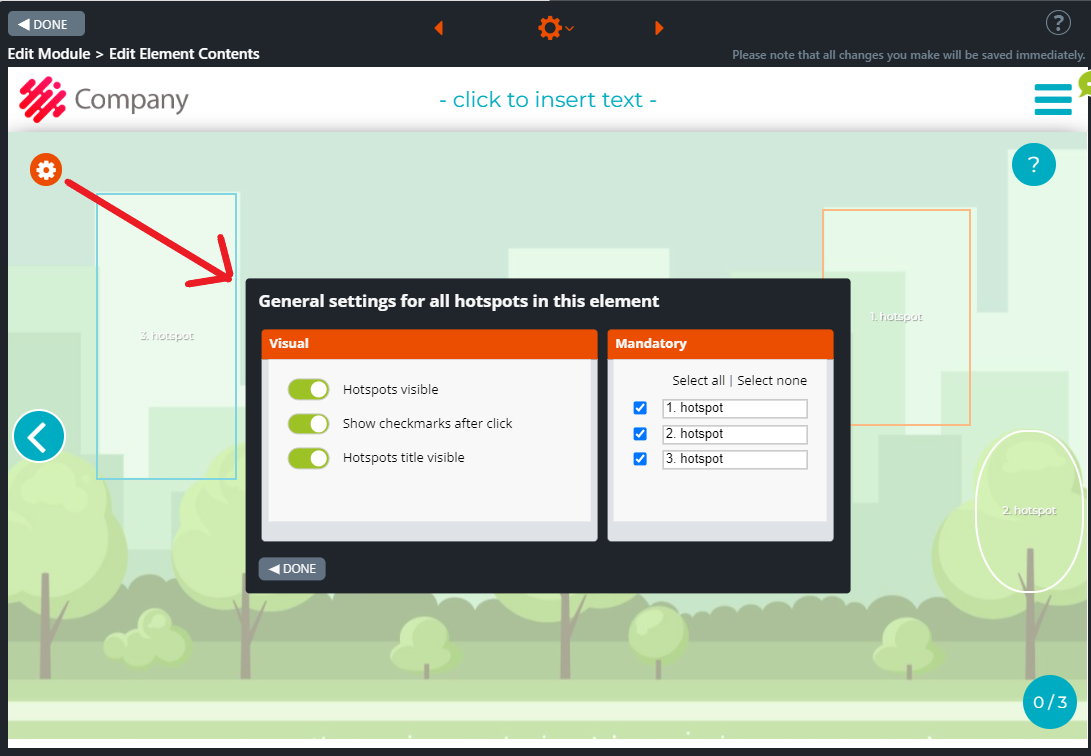
The Settings window opens. In this window, you can select the following options:
- Visual options: Hotspot visible, Show checkmarks after clicking, hotspot title visible.
- Mandatory options: Select all / Select none
Click on the images to enlarge them.
Move the mouse to the left of the hotspot. You can choose its colour.
Settings window
7.7 Hotspot Mouseover
Hotspot Mouseover is an interactive info element. The element allows you to place multiple hotspots wherever you wish on top of the background image.
In this element, the trainee first reads the task instructions and/or other relevant information from an introduction box and then hovers the cursor over the hotspot items for further information about the element topic. A text box with additional information will pop-up near each item. Hotspot items can be moved around and placed on top of a mere background image. Alternatively, the hotspot items can be placed on top of boxes with header texts that have been added in the background image beforehand.
Editing Instructions
- If you wish to show an introduction at the beginning of this task, write the introduction and task instructions in the Introduction box.
- You can also leave the box empty. In this case, the box will not appear to the trainee.
- Add the background image by clicking the Change Image icon at the right side of the window.
- Click the Element settings option from the gear icon at the top of the Edit Element Contents window.
-
- In the window, add the needed items.
- Drag the hotspot(s) from the top left of the element and place it/them anywhere on the background image.
- You can adjust the size of the hotspot by grabbing it from its edges.
- Finally, you can add a title and body text for each hotspot by clicking on the item.
- Write a detailed explanation on each element subject in the hotspot text boxes.
Click on the images to enlarge them.
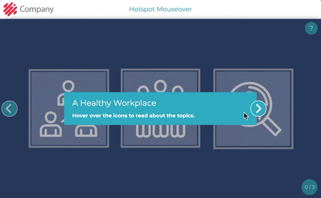
Element settings in Edit Element Contents view:
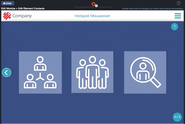
How can I use the element? Here is an example.
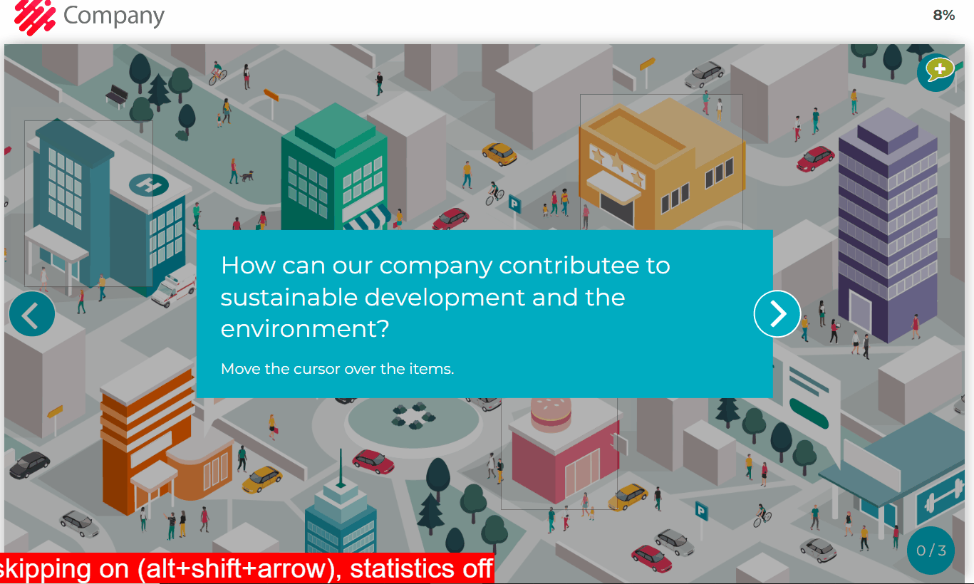
7.8 Hotspot Multichoice
Hotspot Multichoice is a multiple-choice task element. With this element, the trainee first reads the information related to the exercise from an introduction pop-up window and then the question and additional information from the infoboxes.
The trainee answers by clicking the options (hotspots) that s/he thinks are correct.
After the options are selected, the trainee clicks the move forward arrow at the right side of the element. A correct icon is displayed on the correct hotspot(s). If an explanation has been added in edit mode, a small pop-up window that contains the explanation of why the hotspot is correct or incorrect appears near the hotspot.
If an explanation has been added, the trainee may receive a summary box at the end of the exercise summarizing the question result. If the box is left empty in Edit mode, the trainee just receives the move forward button.
Editing Instructions
- Write the introduction and the summary of the task in the Introduction and Summary boxes if you wish to show an introduction at the beginning and a summary at its end. You can also leave the boxes empty. In this case, the boxes will not appear to the trainee.
- The Hotspot Multichoice element allows you to place the multiple-choice options on top of the background image wherever you wish.
- Write the question or the scenario for the task in the text boxes. You can remove the text if you only want to show the background image. The text boxes will not be displayed to the trainee if there is no content. Please note that for editing purposes, you will still see empty boxes with the text “- click to insert text -“. If you want to hide the boxes in Edit mode, click the Hide Infos round icon on the top right.
- Add the background image by clicking the Change Image icon from the top right corner of the background image.
- Click the Element settings option from the gear icon at the top. In the pop-up window, add the needed items and set the options as correct or incorrect.
- Drag the hotspot from the element’s centre and place it where it is needed.
- You can adjust the hotspot size and roundness from its edges.
- Change the shape using the handle on the right side of the hotspot item.
- Add an answer text for each option separately by clicking on the hotspot. Write a detailed explanation of why the option is correct or incorrect in each hotspot.
- If you leave this text box empty, the trainees will not see it when they check their answers.
- Click the orange tool icon at the top left of the window. The Settings Bar will appear, allowing you to adjust the position and colour of the text boxes.
- The Hide hotspot option is available under the bar on the left.
- You can find the Intro/Summary round icon on the top right of the element.
- To make editing the element easier, you can hide the infoboxes while editing by clicking the Hide/Show Info round icon on the top right.
Click on the images to enlarge them.
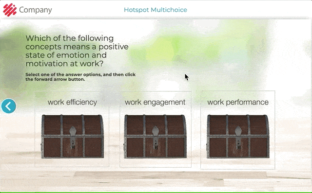
Element settings in Edit Element Contents view:
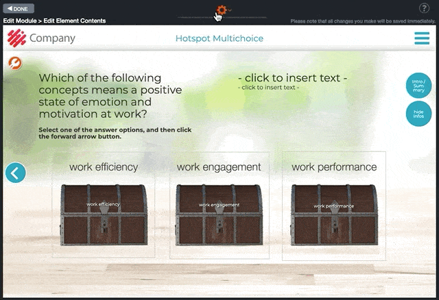
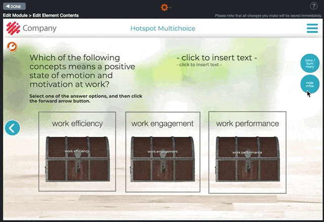
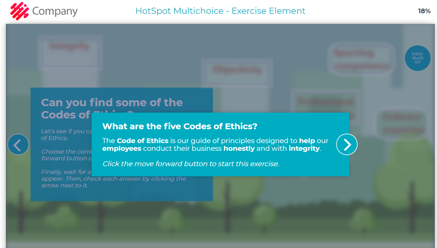
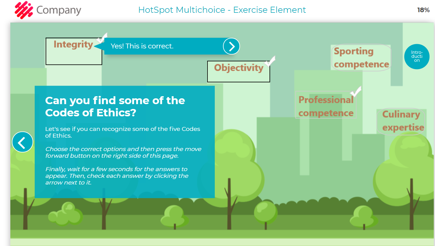
7.9 Multichoice
Multichoice element is a multiple choice task where you can ask a question or provide a statement and give it two or more answer options from the gear icon on top of the Edit Element Contents view. Answer options can be added, removed, rearranged and marked as correct or incorrect. If the Shuffle function is switched on, options will be mixed every time the element opens in Preview or Published mode.
Common uses for the element:
- Options or statements where one or more options are correct.
- Real-life situation – What should you do next? How do you react?
- A person (e.g., a customer or colleague) asks: What do you answer?
- An employee describes their work – Which of our business units are they describing? (For example, in a sales course, the descriptions say how they support sales in their business unit.)
In the answer text, it’s recommended that you explain to the user why those specific options were correct or incorrect and add additional information on the chosen topic.
Note! The points of the multichoice element must be set manually in the Edit Points window. For example, if there are 3 options and 2 of them are correct, the number of points in the Edit Points window for the element should be 2.
Click the orange gear icon on the Edit Module view to access the Edit Points option.
NEW! Element Multichoice 2.0 – Switch page layout feature
If you want longer question-and-answer texts, click on the tool icon on the top left corner to switch the element layout to two pages.
Element in publishing mode.

Element settings in Edit mode

NEW! Element Multichoice 2.0 – Switch page layout feature
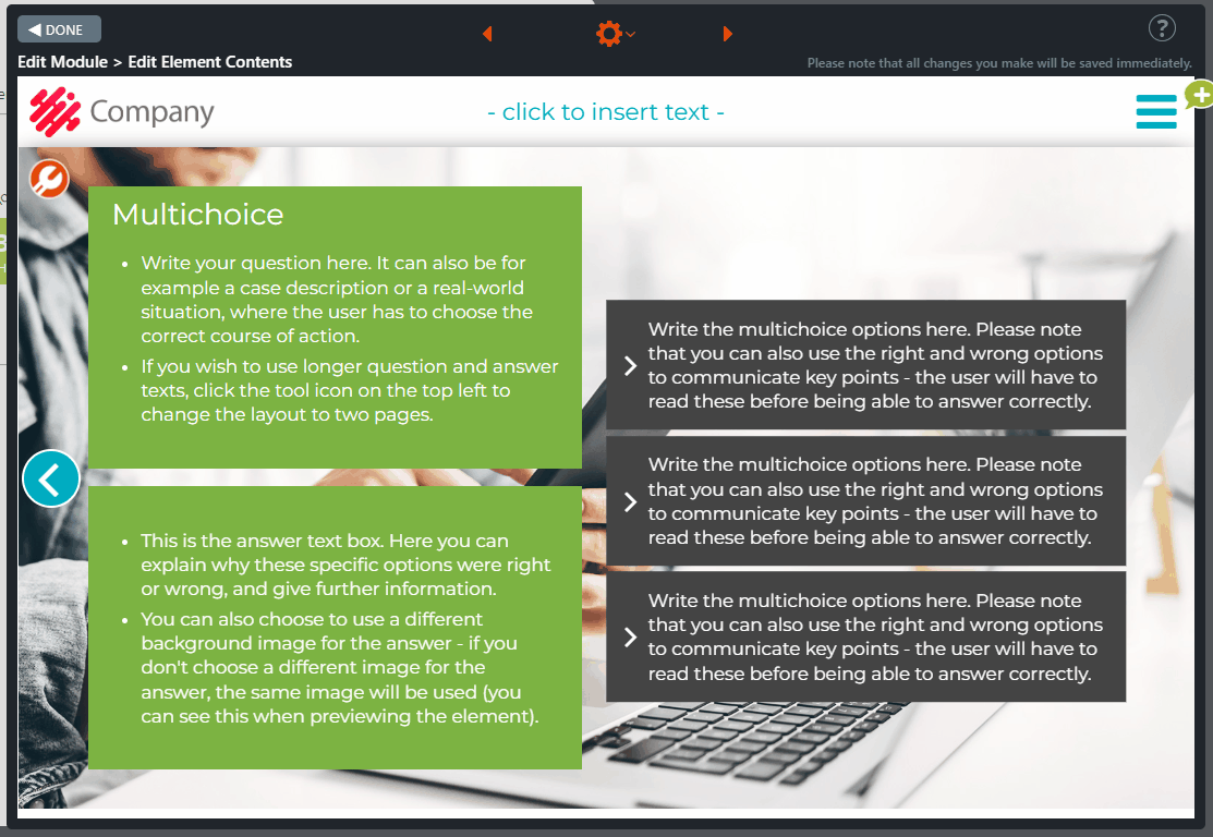
7.10 Multichoice Critical
This is an upgraded version of the Multichoice element. You can choose the critical statements the trainee must answer correctly in this element. If, for example, the trainee has answered correctly in all but one of the critical questions, she will get an error message in the Pass/Fail element and will have to repeat the test.
Common uses for the element:
- Real-life situation – what should we do next?
- Someone asks a question: how should you respond?
- An employee describes their work – which business unit are they describing?
Editing Instructions
- Select the number of items from the element “Element Settings…” on top of the element behind the orange gear icon.
- Fill in the statements and choose their values (correct/incorrect).
- Fill in the info boxes on the left.
- Click the Exclamation point- button. The “Settings for this element” pop-up window opens. All statements are listed in the pop-up window.
- Choose which statements, if any, should be categorized as “critical”. If the trainee answers the critical question incorrectly, he/she will fail the test and have to repeat it. For this reason, the Multichoice critical element should be followed by the Pass/Fail element since it is this element that informs the trainee if they have passed the training or not.
Note! Please also remember to assign the percentage of points needed to pass the training. You can do this in the module’s “Edit Points …” tool.
Click on the images to enlarge them.
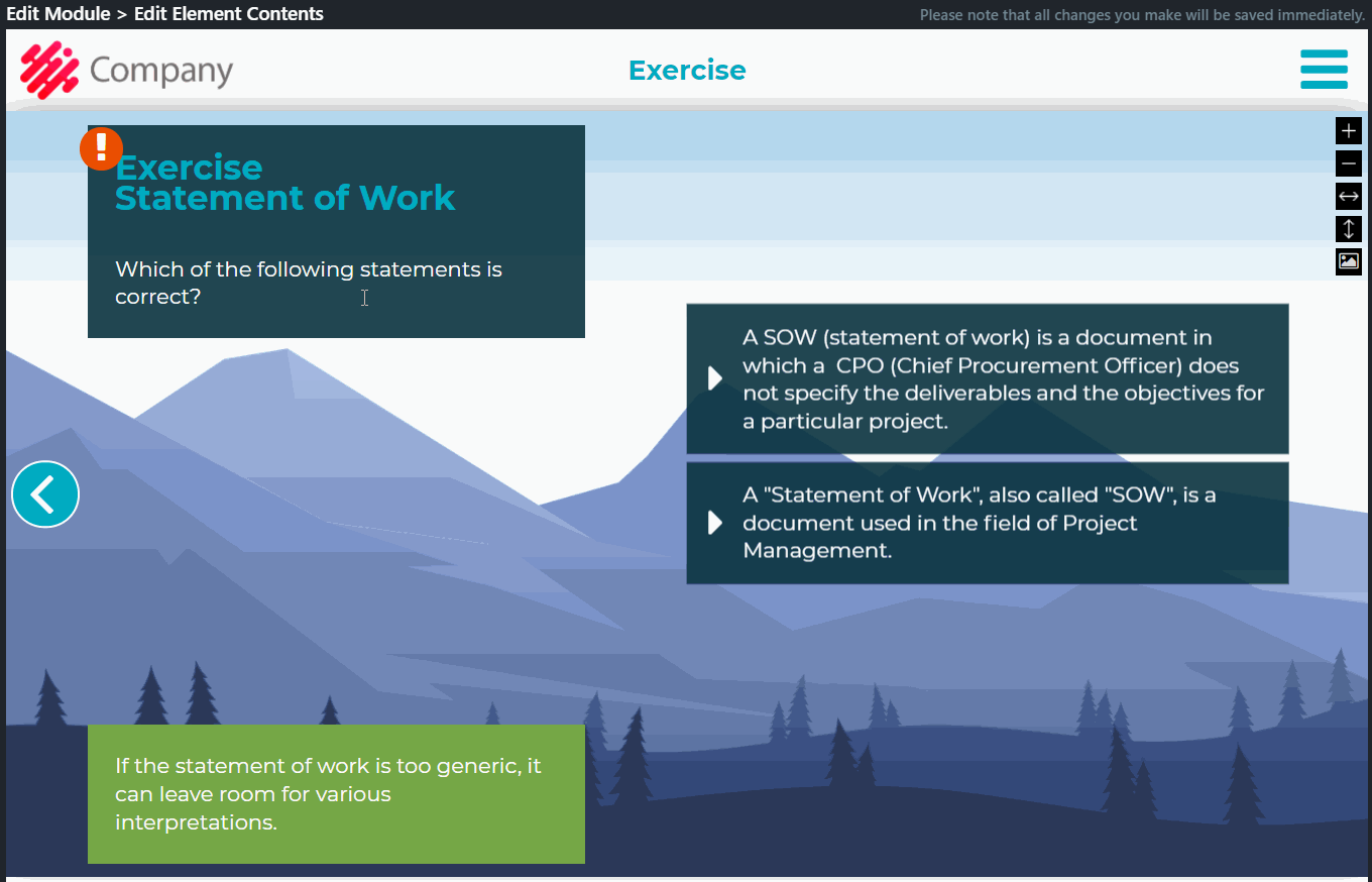
7.11 Multichoice More Text
The Multichoice More Text element is a multiple choice task with more space for answer options and a longer answer text than the regular Multichoice element. In this element, you may ask a question or provide a statement and give it two or more answer options from the gear icon on the Edit Element Contents view. Answer options can be added, removed, rearranged and marked as correct or incorrect. If the Shuffle function is switched on, options will be mixed every time the element opens in Preview or Published mode.
Common uses for the element:
- Options or statements where one or more options are correct.
- Real-life situation – What should you do next? How do you react?
- A person (e.g., a customer or colleague) asks: What do you answer?
- An employee describes their work – Which of our business units are they describing? (For example, in a sales course, the descriptions say how they support sales in their business unit.)
In the answer text, it’s recommended that you tell the course participant why those specific options were correct or incorrect and add some additional information on the chosen topic.
Note! Multichoice More Text element’s points must be set manually in the Edit Points window. For example, if there are 3 options and 2 of them are correct, the number of points in the Edit Points window for the element should be 2.
Click the orange gear icon at the top of the Edit Module view to access the Edit Points option.
Click on the images to enlarge them.
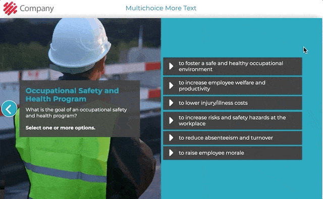
Element settings in Edit Element Contents view:
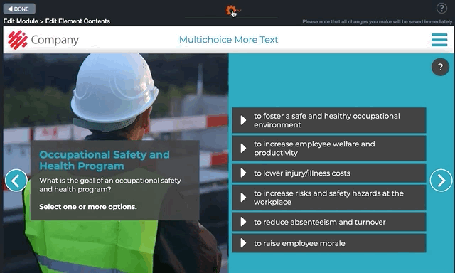
7.12 True/False
In the True/False element, you ask a question or provide a statement which can be set as correct or incorrect from the gear icon in the Edit Module Contents view.
Common uses for the element:
- True or False statements
- Yes or No questions
- Do / Don’t statements
Tip! These tasks are among the easiest to create because you don’t have to create incorrect options. When you have longer info paragraphs, see if you can create a statement from the beginning and use the rest of the paragraph as an answer text.
Click on the images to enlarge them.

Element settings in Edit Element Contents view:

7.13 Checkbox
In the Checkbox element, the trainee is presented with several statements or questions at once, and the trainee chooses the correct option from two options (e.g. Yes/No, True/False, Do/Don’t). Each statement/question has its own answer text so you can fit a lot of content in the element.
One of the most common uses is the final test of a course. In the Checkbox element, you can use a larger pool of questions and randomly show only a few (Shuffle option).
From the gear icon in Edit Module Contents view, you may set the task questions or statements as correct or incorrect, add and delete them and change their order.
“Answer Mode” Options
To activate the Answer Mode option, click the gear icon on the left side of the window.
Option 1. The Answer Mode is switched off
- Click each item tick box. An answer text pop-up window will appear.
- Edit its content.
- Write additional information about the topic in the statement here. Note that the content will be the same regardless of the given answer (e.g. True/False).
Option 2: The Answer Mode is switched on
- Switch on the Answer Mode by clicking the blue button on the Setting Bar.
- When you click on the item tick box, the Answer text pop-up window will open. At the top of the pop-up window, the RIGHT and WRONG options will appear. Type the answers for the different options.
NOTE! If the Answer text pop-up window is left empty, no pop-up window will be displayed after the employee has ticked the answer box.
Click on the images to enlarge them.
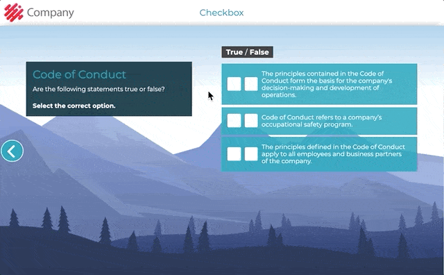
Element settings in Edit Element Contents view:
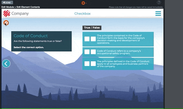
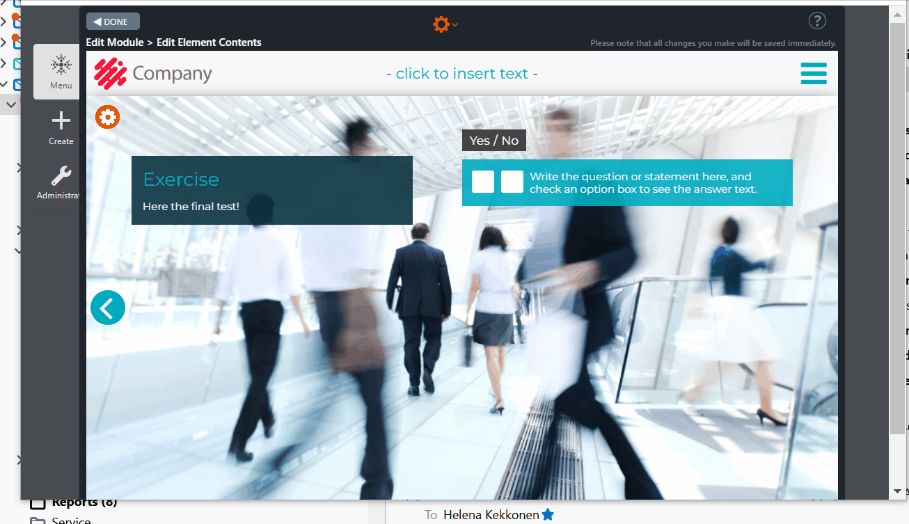
7.14 Checkbox Critical
This is an upgraded version of the Checkbox element. In this element you can choose the critical statements that the trainee must answer correctly. For example, if the trainee has responded correctly, with the exception of one critical answer, s/he will be notified in the Pass / Fail element and will need to repeat the test.
Editing Instructions
- Select the number of items from “Element Settings…” on top of the element behind the gear icon.
- Fill in the questions / statements and choose their values (e.g. yes/no, true/false).
- Fill in the info box on the left and click the “answer mode” tool if needed (for more info, please check the information under the CheckBox element).
- Click the Exclamation point- button. “Settings for this element” pop-up window opens. All questions/statements are listed in the pop-up window.
- Choose which of the questions, if any, should be categorized as “critical”. This means that if the trainee answers the critical question incorrectly, s/he fails the test and needs to repeat it. For this reason, the Checkbox critical element should be followed by the Pass/Fail element, since it is this element that informs the trainee if s/he has passed the training or not.
Note! Please, remember also to assign the percentage of points needed for passing the training. You can do this in the module’s “Edit Points…” tool.
Click on the images to enlarge them.
Element in preview mode
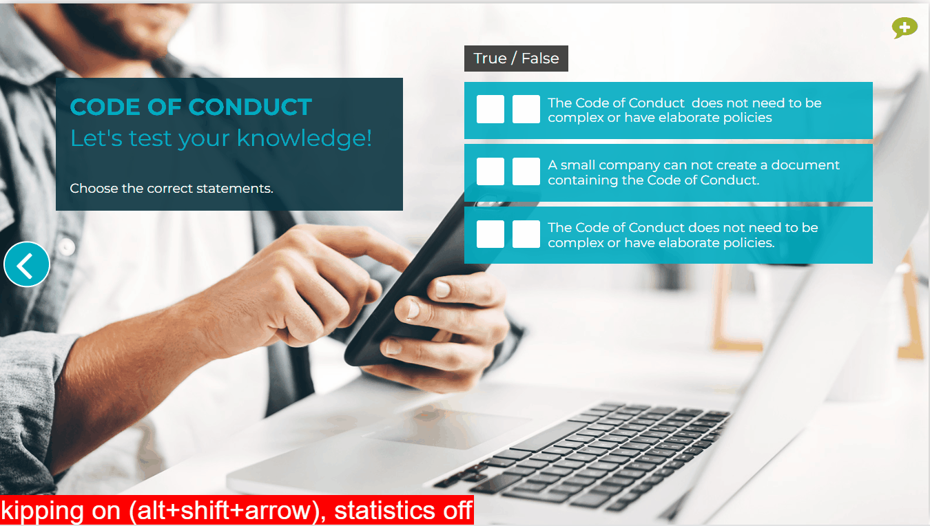
Element in edit mode
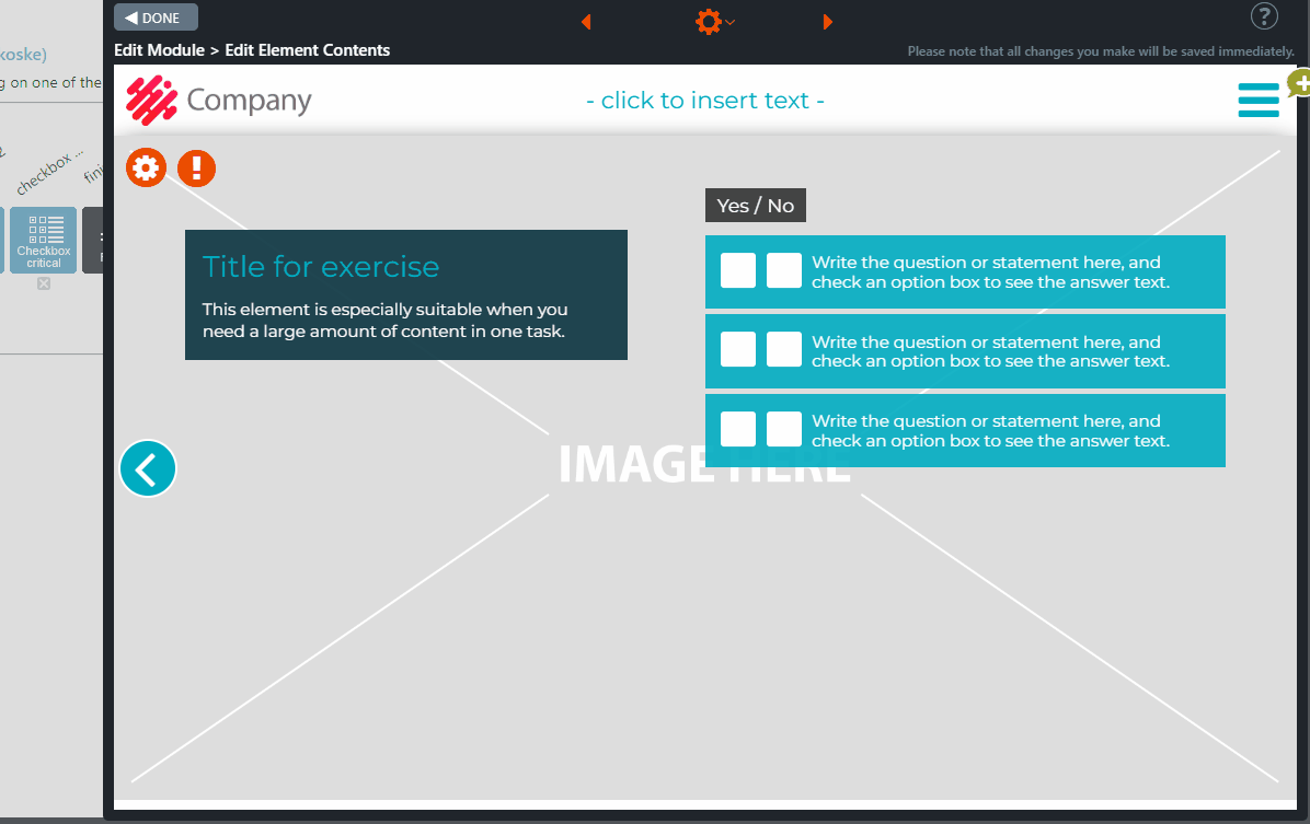
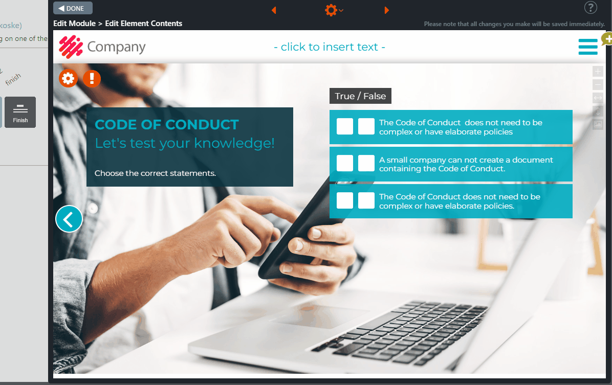
7.15 Two-Sided Checkbox
The Two-Sided Checkbox is an exercise element that is commonly used in tests with the Pass / Fail element.
The employee must choose the correct statement from two options. A text box with additional information is displayed after each selection.
Editing Instructions
- Write the introduction and task instructions in the Introduction box, if you wish to show an introduction at the beginning of this task.
- You can also leave the box empty. In this case, the box will not appear to the employee.
- Add the background image by clicking the Change Image icon from the top right corner of the element.
- Click the Element settings option from the gear icon at the top of the element.
- In the pop-up window, add the needed items and choose the correct option.
- Edit the statements.
“Answer Mode” Options
If you want to activate the Answer Mode option, click the gear icon on the left side of the window.
Option 1. The Answer Mode is switched off
- Click each item tick box. An answer text pop-up window will appear.
- Edit its content.
- Write here additional information about the topic in the statement. Note, that the content will be the same regardless of the given answer (e.g. Left/Right).
Option 2: The Answer Mode is switched on
- Switch on the Answer Mode by clicking the blue button on the Setting Bar.
- Click on the item tick box, and the Answer text pop-up window will be opened. On top of the pop-up window, the RIGHT and WRONG options will appear. Type the answers for the different options.
NOTE! If the Answer text pop-up window is left empty, no pop-up window will be displayed after the employee has ticked the answer box.
Click on the images to enlarge them.
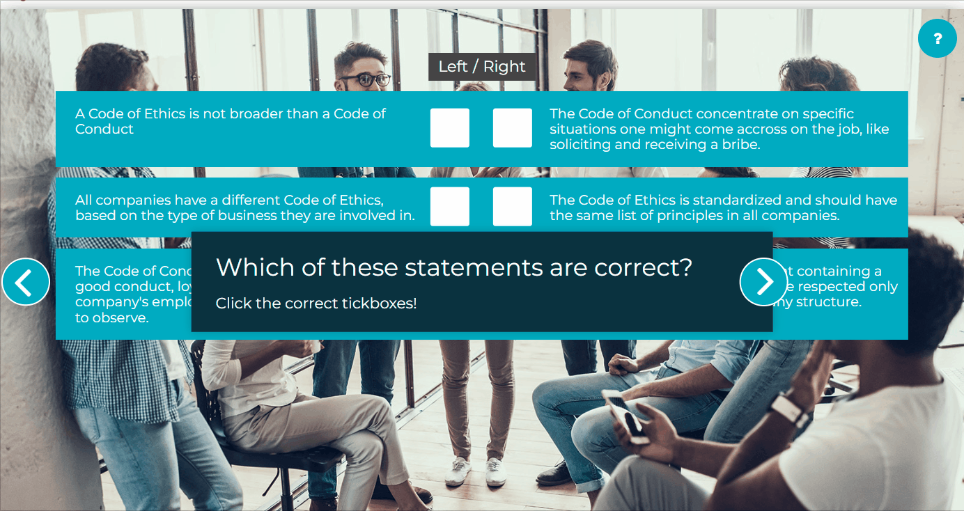
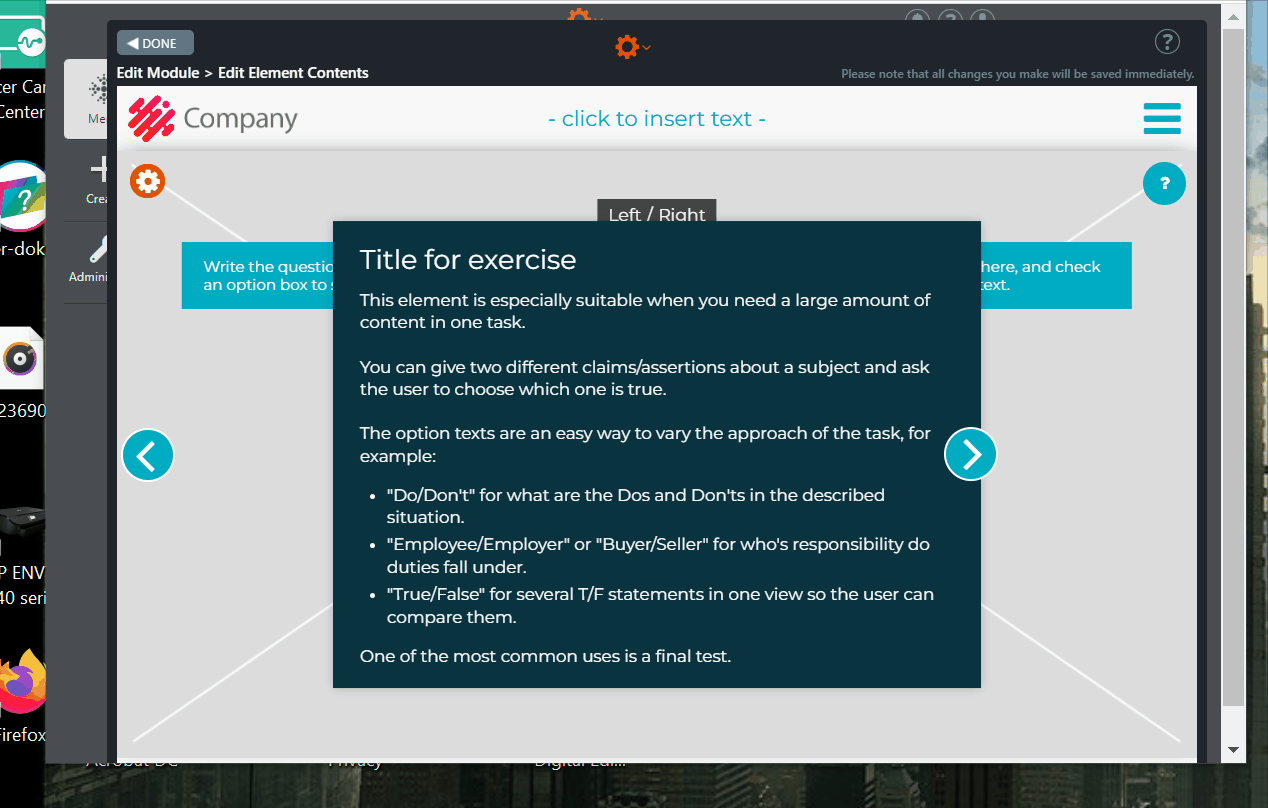
7.16 Slider Bars Task
This is an exercise element. The Slider Bars Task element can be used for tasks where the user is asked the correct number between a minimum and a maximum.
Some common uses:
- Business gifts: How many euros is acceptable in different situations.
- How many euros can you use to buy something without a manager’s permission?
- How many percent something is?
- A calculation where the user should know the correct answer.
In the bar are available the min and max number. The trainee first reads the first question and then moves the slider bar accordingly. The correct answer will be displayed on the bar and a pop-up window with additional information will appear. All the bars will appear on the screen, one at a time.
The selected numbers will be stored in the statistics.
Editing Instructions
Add the background image by clicking the Change image icon from the top right corner of the element.
Click the Element settings option from the gear icon at the top. In the pop-up window add the needed bars. New bars will appear on the element. Enter a title at the bottom of each bar. Assign the correct, minimum and maximum number for each bar by clicking the box on the top right side of each bar.
Write now the question and ask the user to move the bars accordingly. Some common uses are: business gift limits, purchasing limits, percentage of people or business, amount of yearly work accidents.
Note! To take mobile users into account make sure the scale of the bar fits the answer, for example if the correct answer is 5, make the max value 20 rather than 100.
Click the ”info” button at the left bottom of each bar. A pop-up window will be opened. Write the answer text for the bar here. Let the user know what the correct amount is and why. This element allows you to add a lot of further information. This content is shown after the user has moved the slider bar.
Note! You don’t always have to teach the user the correct answer. You can motivate a user to read a longer answer text by first asking something they don’t know yet. In this case, make sure to tell them that this isn’t a test about their knowledge.
Click on the images to enlarge them.
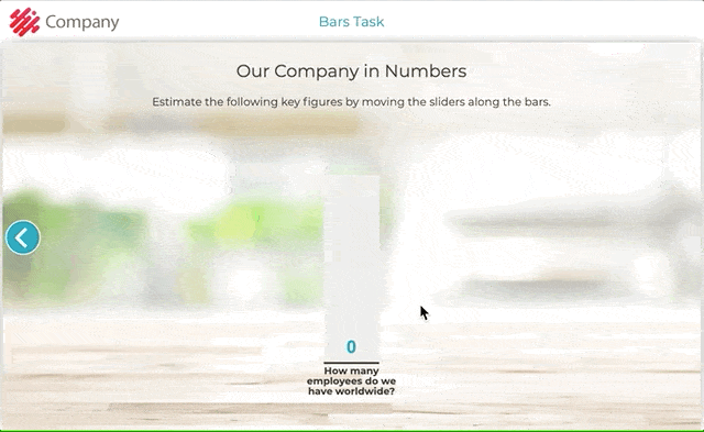
Element settings in Edit Element Contents view:
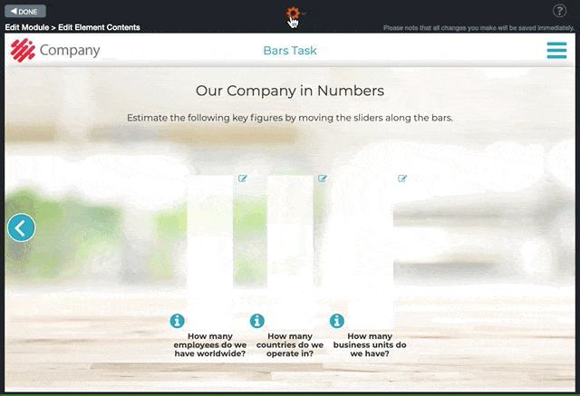


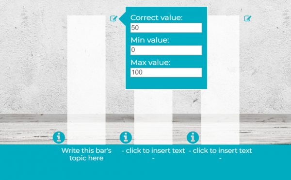
7.17 Slider Bars Single and Bars Survey
The Slider Bar Single element can be used e.g. in a survey. It allows the user to evaluate several different, possibly interconnected topics. There are no correct answers – the idea here is to gather opinions and evaluations.
A pop-up window with a question is displayed. The user slides the bar to answer to the given question. All the bars will appear on the screen, one at a time.
The selected values will be stored in the statistics.
Tip! If your course deals with a topic where you know there will be some resistance to change, it is recommended to begin with a positive mindset. Ask the trainee to evaluate how much they think the features of a specific change will benefit them in their daily work. As you are introducing the change, the trainee is already considering the positives.
Editing Instructions
Add the background image by clicking the Change image icon from the top right corner of the element.
Click Element settings option from the gear icon at the top. In the pop-up window add the needed bars. New bars will appear on the element. Enter a title at the bottom of each bar.
Write now the question / scenario and ask the user to slide the bars accordingly.
Click the ”info” botton at the left bottom of each bar. A pop-up window will be opened. Write the text for the bar here. This element allows you to add a lot of information. This content is shown before the user will move the slider bar.
Add the Header Title, if needed.
Bars Survey element
The Bars Survey element is like the Bars Slider Single. It allows the course participant to assess various topics.
Depending on the element’s settings, the facilitator can determine whether to show the course participant the average of other participants’ answers at the end of the exercise.
The elements in published mode
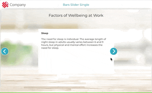
Element settings in Edit mode
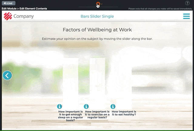
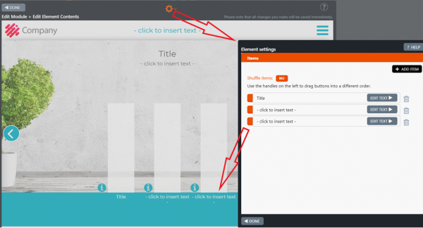
Bars survey options
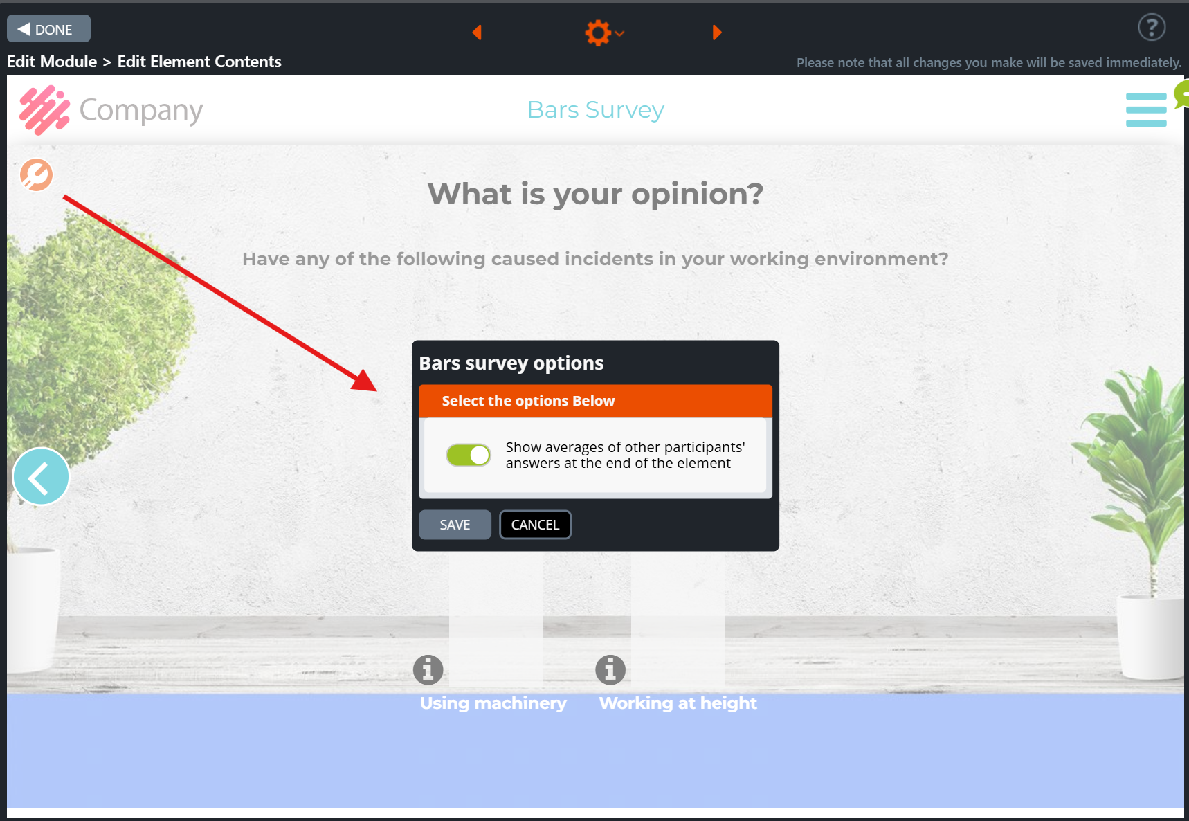
Bars Survey – The average of other participants’ answers
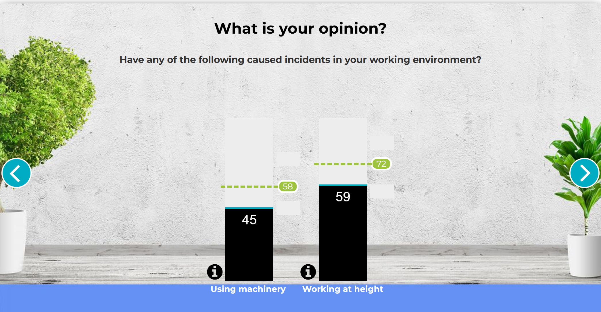
7.18 Slider Icons
In the Slider Icons element, the trainee evaluates several topics with a slider. Each slider includes a box with additional information after the evaluation has been made. If you leave an additional information box empty, it will not appear when viewing the module in Preview or Published mode.
Some common uses:
- How familiar are you with the following terminology?
- How often do you come across the following in your own work?
When you first ask about the trainee’s knowledge on a topic or how close to their daily life the topic is, they’re more likely to read the additional information that comes after.
Editing Instructions
- Add the background image by clicking the Change image option from the right-hand side of the element.
- Write an intro and instructions for the trainee on the top of the window.
- Choose Element Settings option from the gear icon at the top
- Add and edit the required items (the text will appear on the left side of the window).
You can edit all texts and add also additional information in the info boxes by clicking the forward icon at the right side of each bar.
Click on the images to enlarge them.
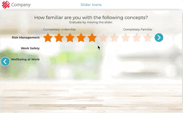
Element settings in Edit Element Contents view:
Forward icon opens the additional information text box
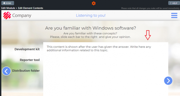
7.19 Slider Write Text
The Slider Write Text element is similar to the Feedback element when it comes to trainees evaluating topics on a scale from 1 to 5. The main difference is that if the user places the slider under a specific point, they can write additional information on that topic.
The most common use is as an ability or knowledge mapping in the end of a course to inquire if the trainee feels he/she has the required knowledge about the topics, or if the trainee feels he/she needs further information.
You can also gather interesting data by using the same question and topics after a certain time period. For example, to see how well the trainees think a strategy topic has been implemented in Q1 compared to Q3.
Click on the images to enlarge them.
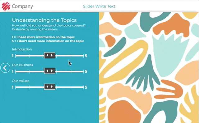
Element settings in Edit Element Contents view:
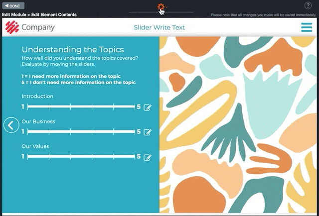
7.20 Fourfold
In Fourfold element, you can ask the user to consider and evaluate topics from a specific point of view. The trainee will have to drag the numbers on the right to the fourfold field on the left side of the element based on his/her opinion on the statements. For example, to identify ideas that are easy to implement yet have a big impact, or to see if users think some goals are unobtainable.
Common topics are:
- Strategy implementation,
- Development ideas,
- Personal development,
- Risk assessment,
- Task prioritisation,
- Preparedness for different situations.
You can also change the background of the fourfold field to fit the topic, for example a risk assessment matrix or a graph.
Editing Instructions
- First add the background image.
- Then write an intro and instructions for the fourfold exercise.
- Choose Element Settings option from the gear icon at the top of the window and add the required items.
- You can edit all of the element’s text fields, fourfold table axel headers (X&Y) and also add additional information about the table and its contents by clicking the info icon at the bottom left corner of the fourfold table area.
- Move all the numbered items on top of the fourfold. A text box will appear.
- Add some extra information or a summary about the task in the text box. The text box will appear to the trainees after they have moved all the numbered items on top of the fourfold table. If you leave the text box empty, it will not appear.
Click on the images to enlarge them.
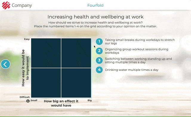
Element settings in Edit Element Contents view:
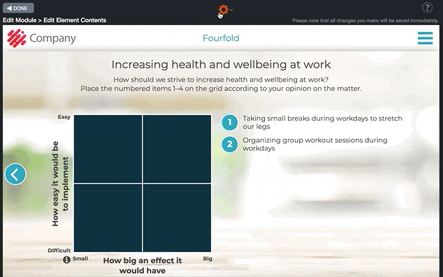
7.21 Feedback
It is recommended to include a Feedback element at the end of each course. Most users fill in the numbered feedback from 1 to 5, and about 1% write open feedback.
Most often the questions are related to the user’s experience of this specific course and its content. This allows the next versions of the course, and any other courses you create, to serve the future trainees better.
View the module statistics every now and then to browse the feedback. In the open feedback, trainees can for example inform you of a mistake in the content, a need for a language or a localised version, or even new ideas for the course.
Editing Instructions
- Add the background image by clicking the Change image option from the right-hand side of the element.
- Write the instructions for giving feedback.
- Choose Element Settings option from the gear icon at the top of the window and add/edit feedback statements.
Click on the images to enlarge them.
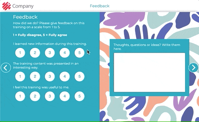
Element settings in Edit Element Contents view:
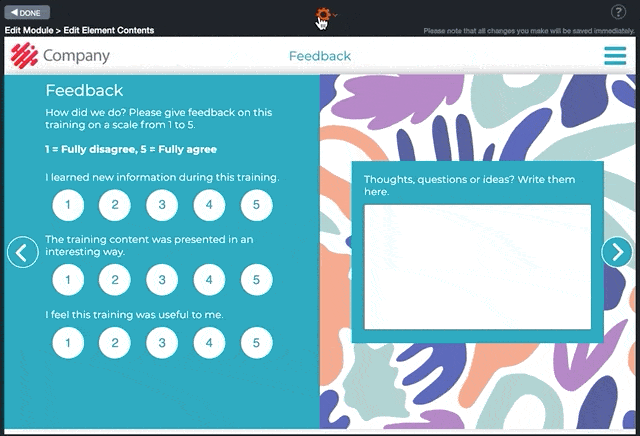
7.22 Feedback Open Text
Feedback Open Text is a feedback element. In this element, you can ask from one to three questions, which the trainee may answer.
Editing Instructions
- Click the Element settings option from the gear icon at the top of Edit Element Contents view. In the window, add and edit your questions (max. three questions). Now the boxes will appear on the right side of the element.
- Write the title and any additional information about the survey in the text box on the left side of the element. In case you only want to show the background image, you can remove the text. If there is no content, the text box will not be displayed to the trainee. Please note that for editing purposes, you will still see the empty box with the text “- click to insert text -“.
- Add a background image by clicking the Change image icon from the top right corner of the image field.
Click on the images to enlarge them.
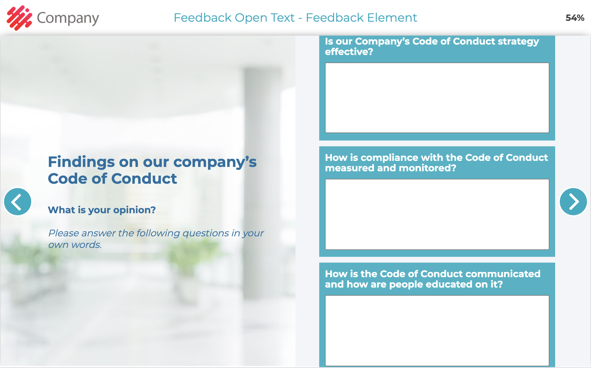
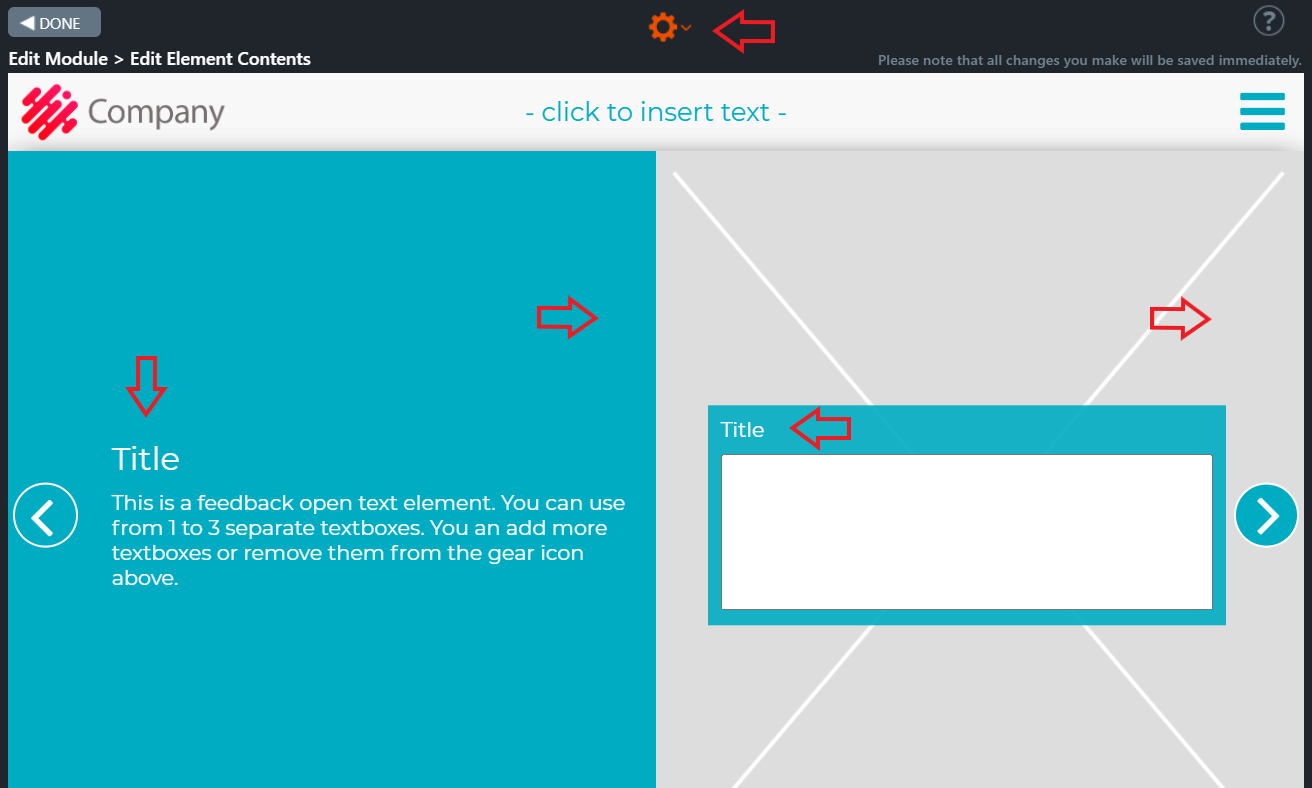
7.23 Commitment
In the Commitment element, the trainee must give his/her commitment by ticking the box to proceed and finish the training.
The element can be used for example to ask the trainee to commit to following instructions or guidelines presented in the training and to commit to asking help from a superior if anything is unclear. Just like everything else, commitment data is saved to the course statistics.
Editing Instructions
Add the background image and edit the commitment text.
Click on the images to enlarge them.
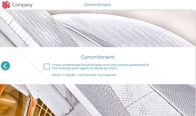
7.24 Video
You can embed a video directly into the Video element by copying the embed code from a streaming service (e.g., Vimeo, YouTube, Dream Broker).
NOTE! Builder does not support embedding YouTube playlists; it only embeds individual videos.
You can include an introduction text to the pop-up window at the beginning of a video, where you can direct the trainee to focus on specific topics. One great way to get people to pay attention to a video is to add a task element after the video and tell the users in the introduction that they will be asked a question about the video topics afterwards.
Keep the videos as short as possible. If a video is longer than 1 to 2 minutes, consider cutting it into two or more parts and adding tasks in between.
In the upgraded version of the Video element, the trainee can see the move forward button several seconds after the video has started or at the end of the video. You can define when the move forward button is shown to the trainee.
You can specify a setting to automatically show the move forward button or after a delay. After embedding the video in the Video element, the forward button setting changes as follows:
- The forward button automatically appears when a video ends up on supported video playback services such as Youtube and Vimeo, embedded videos, and Builder uploaded videos.
- For other videos, such as Microsoft Stream or DreamBroker, the default setting is to show the button with a default delay of 10 seconds.
7.24.1 How Can I Add a Video From Vimeo?
We recommend our customers upload embedded videos from Vimeo. Apprix has a business account where we can upload our customers’ videos in a way that allows them to be viewed only via a hidden link. For more information, please contact helpdesk@apprix.fi. If your company does not have a Vimeo account and you would like to upload a video to your module, please follow these steps:
- Deliver the video(s) to Apprix, preferably in MP4 format.
- We will upload the videos hidden into the Apprix account in Vimeo and the module using the Vimeo embed code.
If your company has a Vimeo account, you can submit the video embed code to Apprix or copy it directly into the video element field.
7.24.2 How Can I Add a Video From YouTube?
- Choose the element Video and click to open it.
- Click the screen Add your video here. Pop-up window Change Video/Audio will appear.
- Choose the Paste video embed code/iframe tab.
- Open the video from YouTube and choose the arrow button Share underneath it.
- Choose Embed option
- Copy the code
Choose the Video element tab Paste video embed code/iframe, if not done before, and paste the embed code.
Tips for YouTube
Option Show player controls allows users to control video playback, volume, and settings. Untick Show player controls, if you do not want to allow users to control video playback, volume, and settings.
Privacy-Enhanced Mode is a new option that YouTube added to the embed preferences that improves privacy when embedding videos on third-party sites.
Note! With the changes to YouTube’s embed settings in Autumn 2018, video suggestions at the end of the video can no longer be blocked.
7.24.3 How Can I Add a Video From My Computer?
- Choose the element Video and click to open it.
- Click the screen Add your video here. Pop-up window Change Video/Audio will appear.
- Choose the File tab and click Browse/Upload Files.
- The Browse Media Library pop-up window is displayed. If you want to save the video file into the library, first click Show uploaded file in library.
- Click Upload new video file… and give a name to the video file. Then, upload it from your file.
Almost all the latest browsers support MP4 video format. For more information about MP4 videos, please check the following link:
https://caniuse.com/#feat=mpeg4
The maximum size for uploaded videos is 100MB.
7.24.4 How do I optimise the video file size for web use?
If you don’t use a video service that optimises your videos for you but want to upload them directly as files to Builder, you should optimise the video files for web use yourself first. Here’s how to do it with Handbrake, a free open-source program.
You can download the software from: https://handbrake.fr/
Instructions for use:
File
- Start the program and select the video file from the “Open” button or drag the video file onto the program
- Put the name and location of the new file you want in the “Save as” field.
-
- Note: Use the .mp4 file extension instead of .m4v
Summary Tab
- Tick “Web optimised” to allow the video file to load for the user in sections
Dimensions Tab
- Select either 1080p or 720p from the Resolution Limit drop-down menu (the latter if the video is more than a minute long)
-
- Note: “Width” must be an even number.
- Select “Quality: Constant Quality” between 23-30 RF (see below* for further guidance).
- Select “Framerate: Same as source (variable framerate)”.
When everything is ready, press the top button: Start Encode!
*Note! The quality/file size can be changed using the Constant Quality slider in the Video tab:
- The numbers are “backwards”, so 23 is good quality, and 30 is bad.
- Below 20 is unsuitable for web use, and above 30 is already too poor.
- Even small changes can make a big difference if needed (and logarithmically, i.e. 20-21 makes a more significant difference than 29-30),
- In 720p video, between 20 and 23, there can be a 1/3 difference in file size, so it’s worth a few passes to experiment, especially with long videos (if you can’t split the video into several smaller videos or if you know that your target audience needs a very light video file size).
7.24. 5 What if the browser does not support MP4 video format?
Almost all modern browsers support MP4 video format. You can also upload a webm or Ogg video file alongside an MP4 file to support other browsers like Opera Mini.
To upload multiple video files with different formats simultaneously, please click the “Upload new video files…” button, which opens a file picker window (File Explorer on Windows, Finder on macOS). Select multiple files, e.g. MP4 + webm files, to upload while holding the CTRL key on Windows or CMD key on macOS and confirm the selected files. The maximum size for each uploaded file is 100MB.
Note! Be sure always to add the MP4 format. You cannot add webm or ogg video files without the MP4 format.
Click on the images to enlarge them.
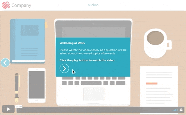
In the upgraded version you can define when the move forward button is shown:
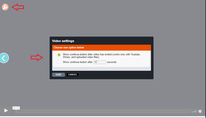
Element settings in Edit Element Contents view:
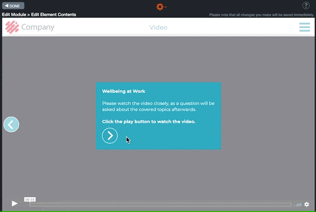
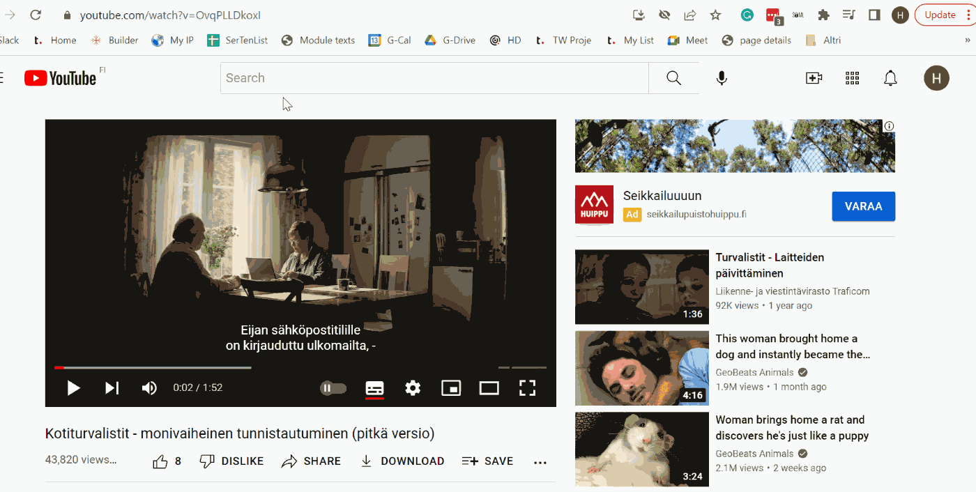
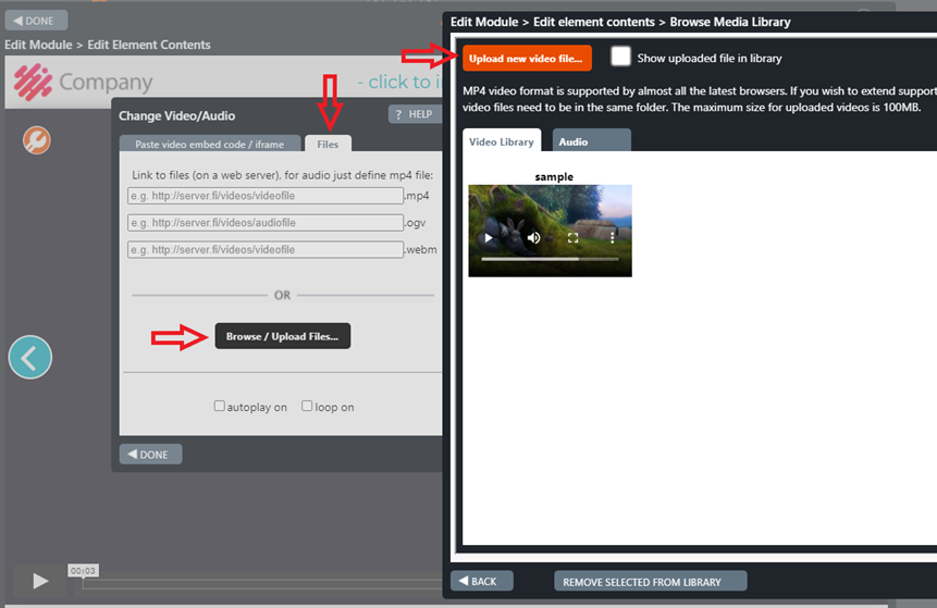
7.25 Transition
The Transition element can be used as a transition from one topic to another. An element with slight visual differences helps the trainee to categorize the contents under different topics in their mind.
In addition to the topic header, you can also add a brief description on what the next topic is going to entail.
Tip! You can also list all the topics like in a contents page, and highlight the topic the user is going to next. This is a great way to tell the trainee where they are in the course. If you do this, add the topic list to each transition only after you have finalized the course structure to avoid unnecessary work.
Note!
If needed, you can lock the element and add an audio file by clicking the gear icon at the top of the element.
In the enhanced ‘Transition’ element, you can set the background and/or box colours by clicking the tool icon in the top-left corner.
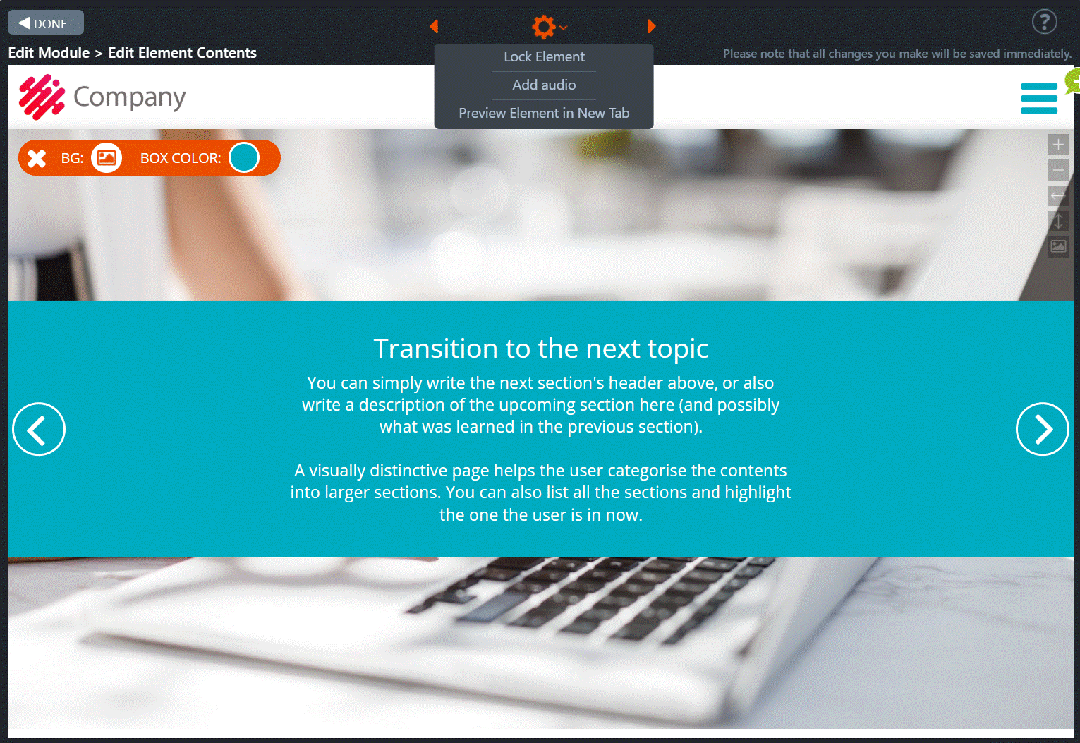
Transition element
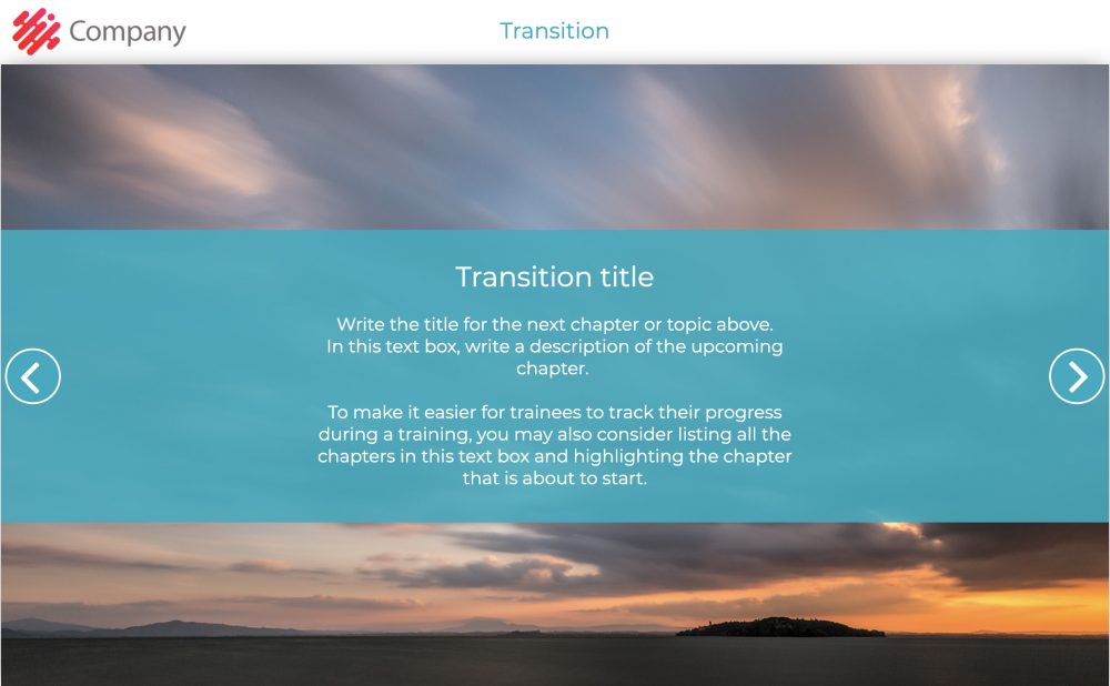
7.26 Dialogue
The Dialogue element allows you to create different kinds of real-life situations. For example, use a photo of two people talking or a person on the phone, and create a dialogue by adding speech bubbles.
This works best when combined with a task afterwards, for example a dialogue with a scenario (e.g. a problematic situation, a sales conversation), and a Multichoice element afterwards to ask the trainee what should be said or done next.
You can also use the element to place text boxes more freely on top of a background image.
Editing Instructions
You can start by adding the background image of the Dialogue element. Click then the Element settings option from the gear icon at the top in Edit Element Contents view. Add all needed dialogues and drag them in the desired order.
Now edit one speech bubble at a time:
- Select the colour.
- Choose the tail position.
- Edit the dialogue content (if haven’t already from the gear icon).
- Choose the shape of the dialogue.
- Choose the shape of the tail.
From the tool icon at the top left, you can set the Dialogue settings. You can choose between showing dialogues one by one or all at once.
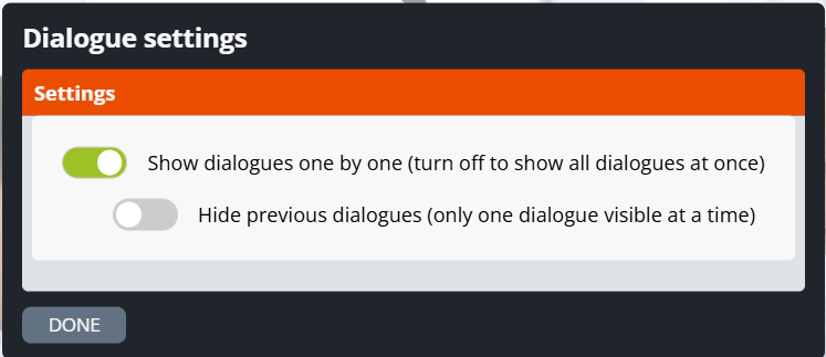
Dialogue example.

How to edit a speech bubble.

7.27 Diploma and Diploma & Send Form
Diploma
The Diploma element allows the trainee to download, open in a new browser tab or send a printable diploma or certificate to his/her email.
Diploma & Send Form
How does the Diploma & Send Form element differ from the Diploma element?
In this element, it is possible to define the email addresses to which an email will be sent whenever a trainee arrives at the Diploma & Send Form. The email contains basic information about the trainee, the module and the data collected by the Login element.
Editing Instructions
- Click the gear icon in the upper left corner of the element view.
- The Settings pop-up window opens. In this window, you can define 1–3 email addresses to which an email message will be sent whenever a trainee arrives at the Diploma & Send Form element.
On the right is an example of an email with basic information about the course author, the course module and the data collected by the form in the Login element that has been added to the module.
Click on the images to enlarge them.
Diploma element
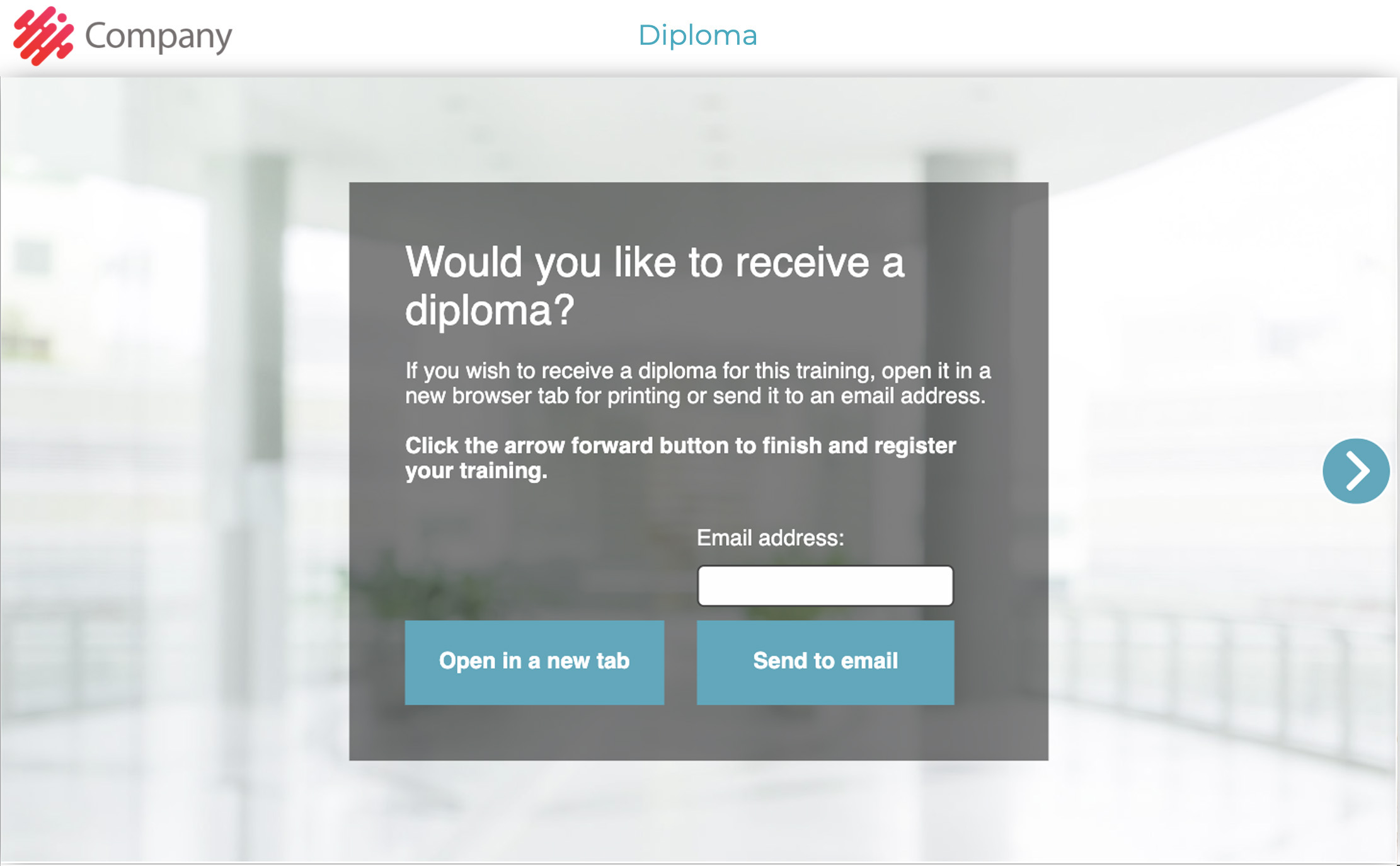
Diploma & Send Form in Element Edit view
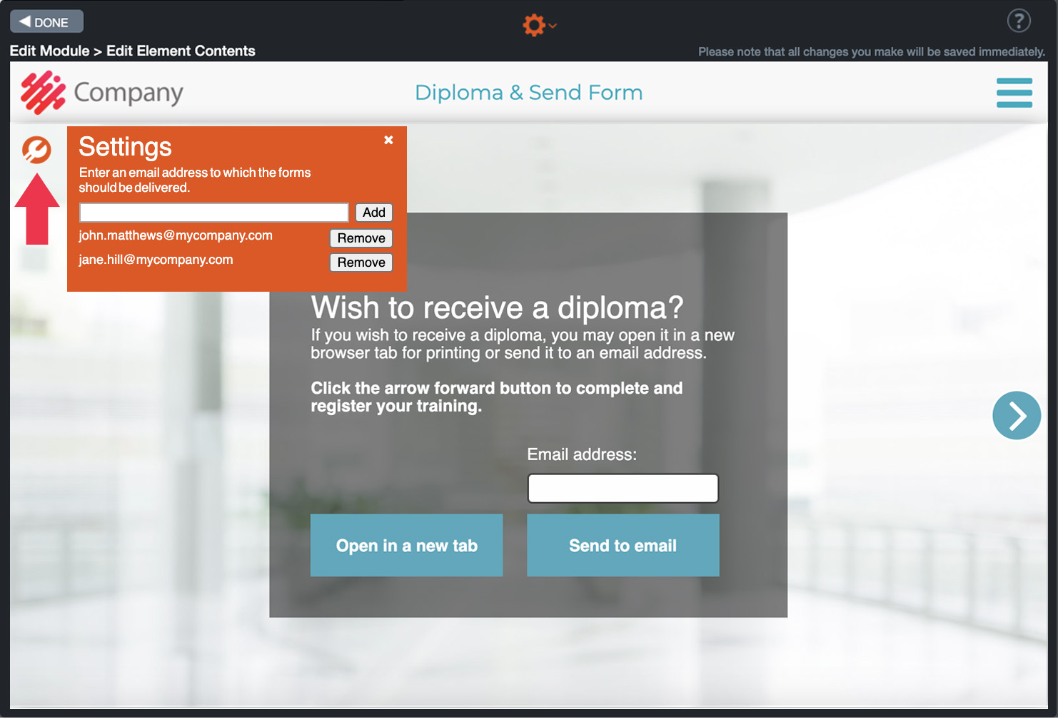
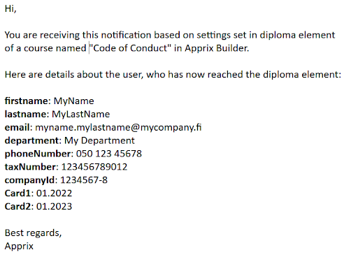
7.28 Diploma autoforward
When the trainee arrives in this element, they can do the following:
- If the element is placed at the end of the main module, before the Finish element, the trainee can
- Move forward to the end of the module, by using the move forward button.
- Select “Open a new tab” button. In this case a new tab is opened. The new tab contains the diploma. The diploma can be saved or printed. Note, that in the first tab the trainee is moved automatically from the Diploma to the Finish element.
- Insert the email address and press the “Send via email” button. The trainee will be then moved automatically to the Finish element.
- If the element is placed at the end of the submodule, the trainee can
- Move forward, by using the move forward button. In this case the trainee will be moved to the Submenu buttons element, in the main module.
- Select “Open a new tab” button. In this case a new tab is opened. The new tab contains the diploma. The diploma can be saved or printed. Note, that in the other tab the trainee is moved from the Diploma element to the main module Submenu buttons – element.
- Insert the email address and press the “Send via email” button. The user will be then moved automatically to the main module Submenu buttons – element.
Editing Instructions
This element should be placed:
- in the main module before the Finish element
- in the submodule at the end of the submodule.
Edit the text boxes, if needed.
Click on the images to enlarge them.
Diploma autoforward element
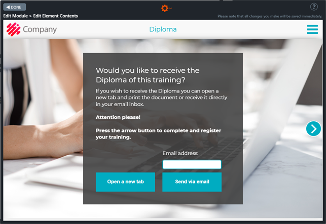
7.29 Login
Login elements are always customized for the individual needs of each client. Some Login elements may include integrations, but most often they only gather additional information about the trainees for statistics purposes. User authentication and course access are usually defined separately in the module’s settings (e.g. SSO, IP guard, Email registration).
Please note that the trainees need to be identified so that a Builder module is able to collect identifiable data about them. Usually, this is achieved by a module-specific access setting such as SSO, but if your Login element has been customized to ask for a unique identifier (e.g. email, tax ID), you may be able to use it for the same purpose. You may find additional information about your customized Login element by going to the element’s Edit Element Contents view.
Tip: The Form element offers an improved version of the Login element.
You can find more details at the link below:
https://faq.apprix.fi/builder-help-en/#form-element
Click on the images to enlarge them.
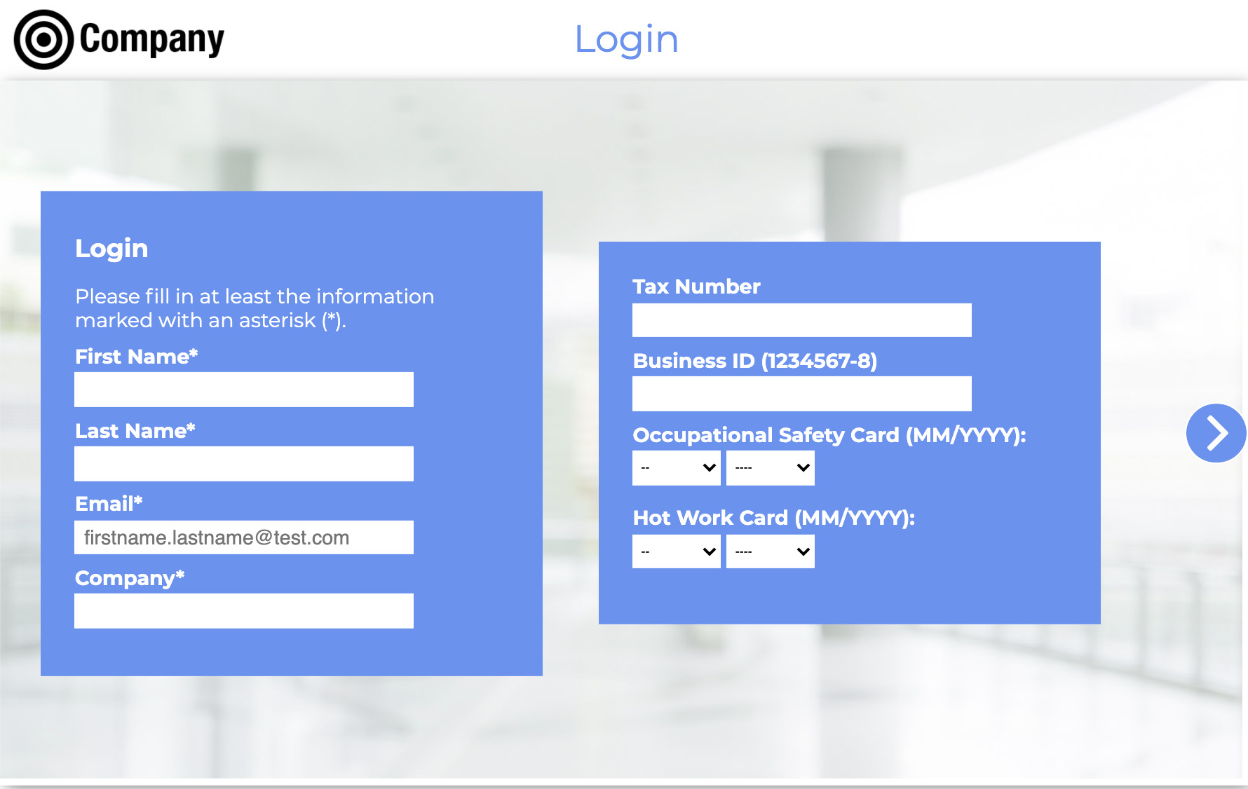
Element settings in Edit Element Contents view:
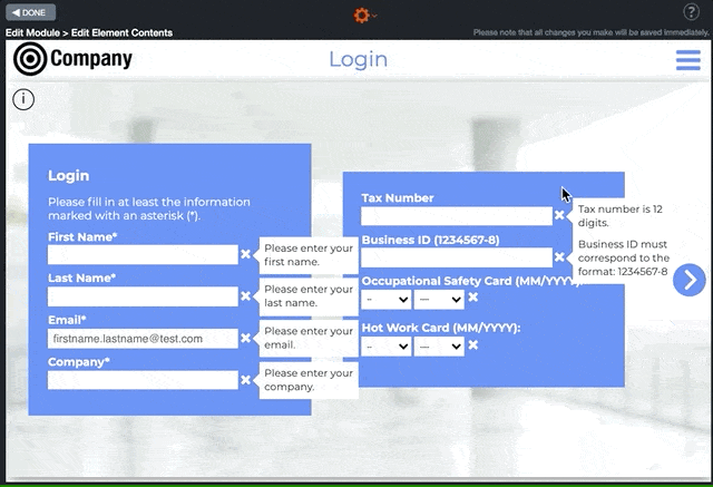
Group Login element (Login 2)
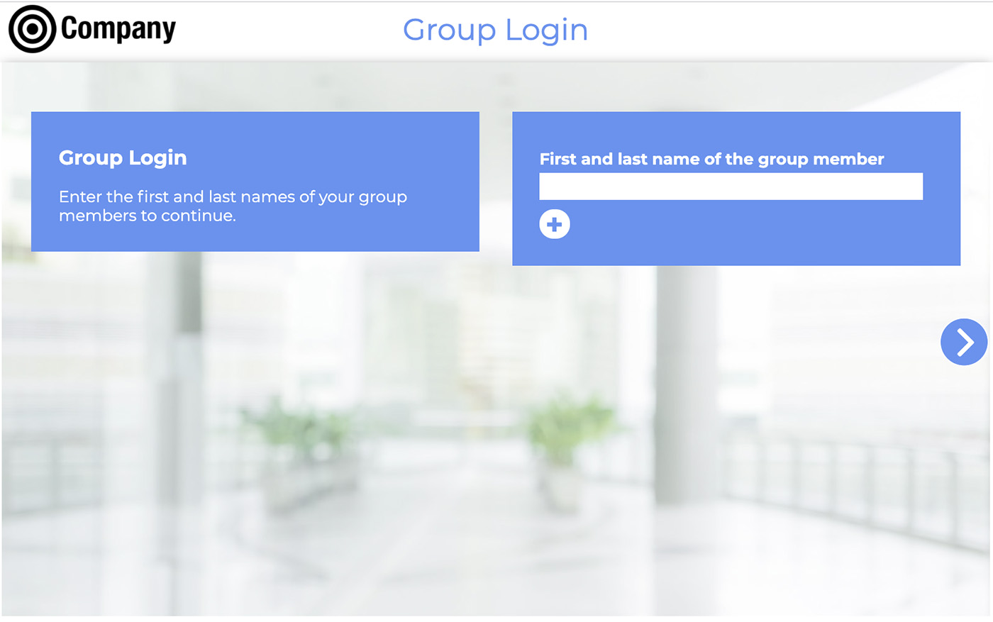
7.30 Pass/Fail and Pass/Fail Always
Pass/Fail
With the Pass/Fail element, you can inform the trainee that they have not passed the training test and indicate the next step. Generally, this element is added to the module after the test exercise elements at the end of the module (e.g. Check Box, Multichoice, Multichoice More Text, True/False) before course summary elements, such as Feedback, Commitment, Slider Write Text).
If a module has a test at the end and other module points need not be counted, remove points from all other elements except elements included in the test from the Edit Points… tool. In this manner, only test points matter regarding passing the course. In a submodule structure with a test at the end, the elements included in the test and the Pass/Fail element are usually placed after the Submenu Buttons element in the main module.
Note! The Pass/Fail element should not be added as the last element before the Finish element, as it will not work correctly.
As an additional feature, the Pass/Fail element can be customized to work so that it can be added at the end of each submodule. With this approach, the submodules are the test areas that must be passed to continue the course. In this case, there is no test at the end of a submodule structure (in the main module), and all submodule points need to be considered for passing a submodule. Place the Pass/Fail element at the very end of every submodule. The trainee will only be redirected to the submodule menu (Submenu Buttons) when they successfully pass the submodule. If not, the trainee will be redirected back to the beginning of the submodule until they get enough points to pass the submodule.
After the trainee has used all of their retries, they fail the course module and must start the course from the beginning. The trainee’s final test performance will be stored in the user data. To filter out failed course attempts, this data can be collected using an authentication method (for example, Login element, Email Registration, Tax number check).
Note!
The module statistics are not stored in Preview mode, so the Pass/Fail and Failure elements do not work there. Points are only calculated in Published mode. Why does Builder work like this? The statistics should record the student’s performance, not the module’s testing data.
Editing Instructions
- Open the Pass/Fail element in the Edit Element Contents view.
- You can start by adding the element’s background image.
- Then click the gear icon at the top left, which opens the settings menu.
- The Pass/Fail settings pop-up window will open. From here, you can choose the following options:
- from which element the trainee will restart the test
- the number of retries allowed.
- To select the element where the trainee will be redirected to retry the training exercises, click one element with a light grey background; the arrow should move next to it.
- The maximum retry count can be changed from the dropdown menu in the orange area.
- If the maximum retry count is set to 0, the trainee will have to restart the course after failing to get enough points from the module’s exercises.
- If the maximum retry count is larger than 0, the trainee will be moved from the Pass/Fail element to the retry element 1-5 times before the trainee has to restart the whole course/module.
- Click Done when ready.
In the Edit Element Contents view, you can change the content of the info boxes.
Note that these texts will be displayed to the trainee in case they fail the test:
- The top text is always displayed when the trainee fails the training (You did not get enough points to pass the training this time).
- The middle text appears when the trainee has one more attempt left (You can try the test one more time by clicking the button below. After that, you will be redirected to the beginning of the training).
- The bottom text appears when the trainee has to start the training from the beginning (You didn’t pass the final test on your two tries and will now have to start the training again. Click the button below to restart the training).
Note! You cannot edit the x/x points since these are the trainee’s test points and the max points that come automatically from Builder after finishing the test.
Note!
- From the gear icon on top of the Edit Module view, click Edit Points to check and set the correct…
- number of test points
- and percentage of points required to pass the exam.
- If Hotspot elements have been added to the module and contain one or more True/False items, the points for these items can be found in the Edit Points window.
- Please note that the Pass/Fail element does not calculate or recognise these points.
- This means that if the Pass/Fail element is used in a module, for the Pass/Fail element to calculate the module points correctly, you need to assign zero points (0) to Hotspot element(s) in the Edit Points window since the Edit Points feature counts the number of Hotspot element’s items. Still, Builder does not use them when calculating the final points in the Pass/Fail element.
- If you duplicate, add or remove items from a module/submodule containing the Pass/Fail element; please double-check the element from which the new retry should start from the Pass/Fail element’s settings (gear icon on the top left corner of the element view).
Pass/Fail Always
How does the Pass/Fail Always element differ from the Pass/Fail element?
The Pass / Fail Always element appears also after a successful test (when a trainee gets enough points to pass the test). In the element, the trainee sees the number of incorrect and correct answers as x points out of points.
Editing Instructions
- Click the gear icon on the upper left corner to access the settings as in the Pass/Fail element (see instructions above for the Pass/Fail element).
- Edit the text that is displayed when the trainee has not passed the test and the text that is displayed when the trainee has passed the test.
Click on the images to enlarge them.
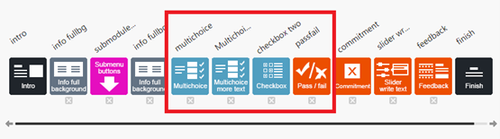
Note! The two pages below will appear only if the trainee has not passed the test.
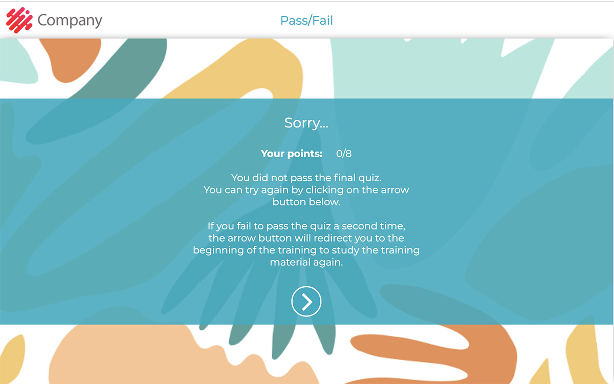
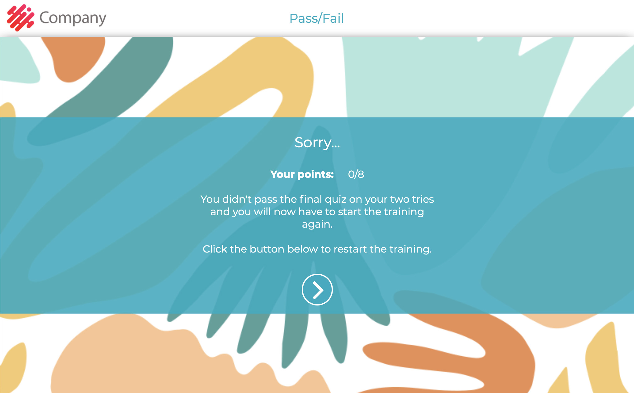
Pass/Fail element settings in Edit Element Contents view:
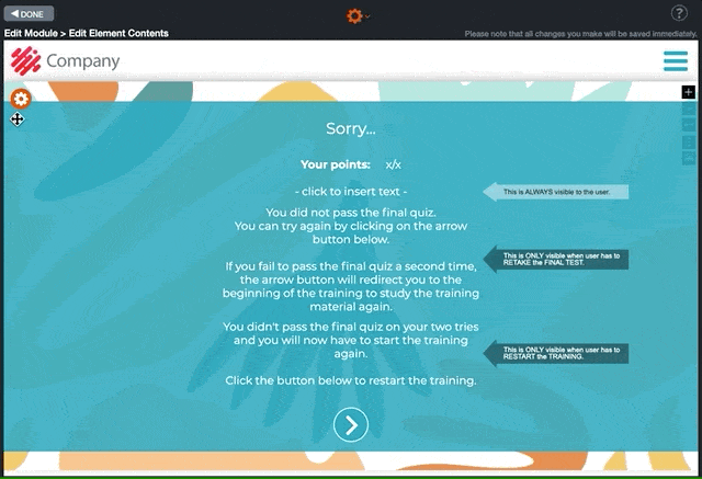
In the Edit Element Contents view, you can change the content of the info boxes that will be shown to the trainees if they fail the test.
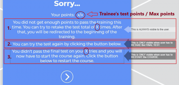
How to update the test points?
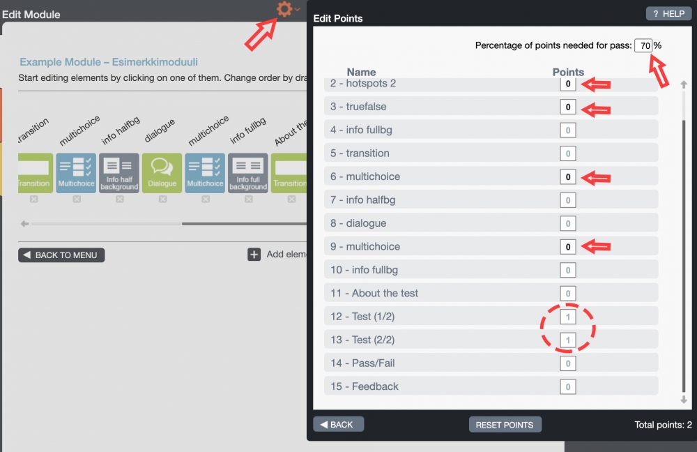
“Retry from here” arrow in the Pass/Fail element.
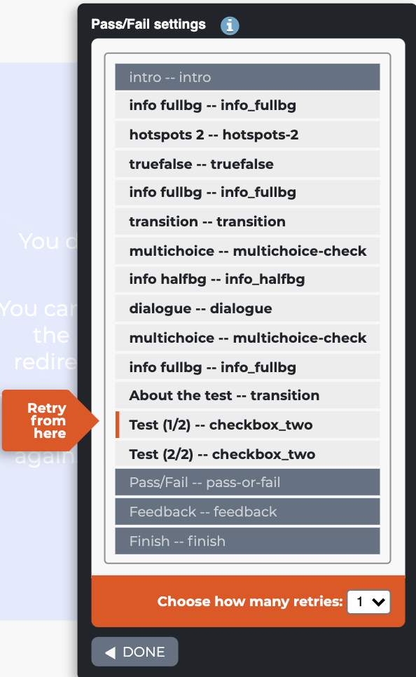
7.31 Submenu Buttons
The Submenu Buttons element is a contents menu page located in the main module from where the trainee can access submodules. The element is usually added right after module instructions (usually Intro and Login elements). When a submodule has been finished, the trainee returns to this element. When all submodules have been finished, the trainee can continue the main module and proceed to finish the training.
Read more about the benefits of using submodules and when it is recommended to create a submodule structure here.
Click on the images to enlarge them.
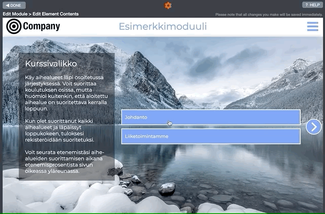
7.32 Landing Page
The Landing Page aims to centralise a collection of e-learning courses. This element allows you to organise several e-learning courses by topic and language. It doesn’t track which courses users have completed; it just lists the e-learning courses that are available.
By default, a landing page module contains only the Intro and Finish elements and the Landing page element between them. The trainee cannot continue to the finish element because s/he is supposed to attend one of the courses listed on the landing page instead. The trainees do not need to finish this module.
Every time the trainee selects a course, a new tab in the browser is opened. Please note that if statistical data needs to be collected from the courses, the e-learning course should contain the Login element or an authentication method (e.g., Email Registration) should be activated. In other words, statistical data cannot be collected from the Landing page module, as it is collected directly from the e-learning courses linked to the Landing page.
Editing Instructions
- Start by adding the Landing page image or a company logo.
- Write about how the landing page works in the introduction box and its purpose.
- Click the gear icon. The Landing Page Settings pop-up window is displayed.
- From the Landing page settings pop-up window, you can select the number of columns (max 5). The columns represent the training category types, e.g. Personnel, HSEQ, Contractors, etc
- Once you have selected the number of columns, the Columns header and Colour options will appear on the pop-up window. Edit the header title and choose the colours. Press the Save button. Now, the columns that you have selected are displayed in the Landing page window.
- You can add buttons to columns by clicking the Add button. After you have clicked the + Add button, the box Header here appears under the image. Click the Header here box. The Button settings pop-up window will open.
- Write the course header (course name), e.g. “Code of Conduct.
- Tick/untick the Disable button. This will disable the course button for the users.
- You can add the text displayed here once the user hovers over the box. For example, if the course is not yet available, in the Mouseover text box you could write the text “Not yet available” or “Available on (date here)”
- Add language abbreviation, e.g. EN (English), FI (Finnish), EE (Estonian), etc.
- Add the course link you get from Builder. If needed, you can also add any other training or document links.
- You can add another link using the same course button. For example, if you have multiple language versions of the course, you can add them all under the same course button (for example: “FI”, “EN”, “EE”.
- Save all your changes by pressing the Save button.
- You can delete the whole button (course) by pressing the Delete button.
- If you don’t want to save your changes, you can close the pop-up by pressing Cancel.
Please note the following:
Course languages
In the example, the course is available in EN (English) and FI (Finnish).
As displayed in the video clip on the right, a pop-up window opens when the user clicks the course button. The trainee can now choose his/her preferred language version of the course from the list. The course will open in a new tab.
Disabled courses
Suppose you want to inform trainees that a course will be available soon. You can add the course to the Landing Page, tick the Disable button, and write the needed information in the Mouseover text field, e.g., “The course will be available by the end of March 202x.”
When the trainee hovers with the mouse over the course, the Mouseover text, e.g. “The course will be available by the end of March 202x“, is displayed, no pop-up window with the list of languages will open, and the course background colour is faded.
An example of a Landing Page element.
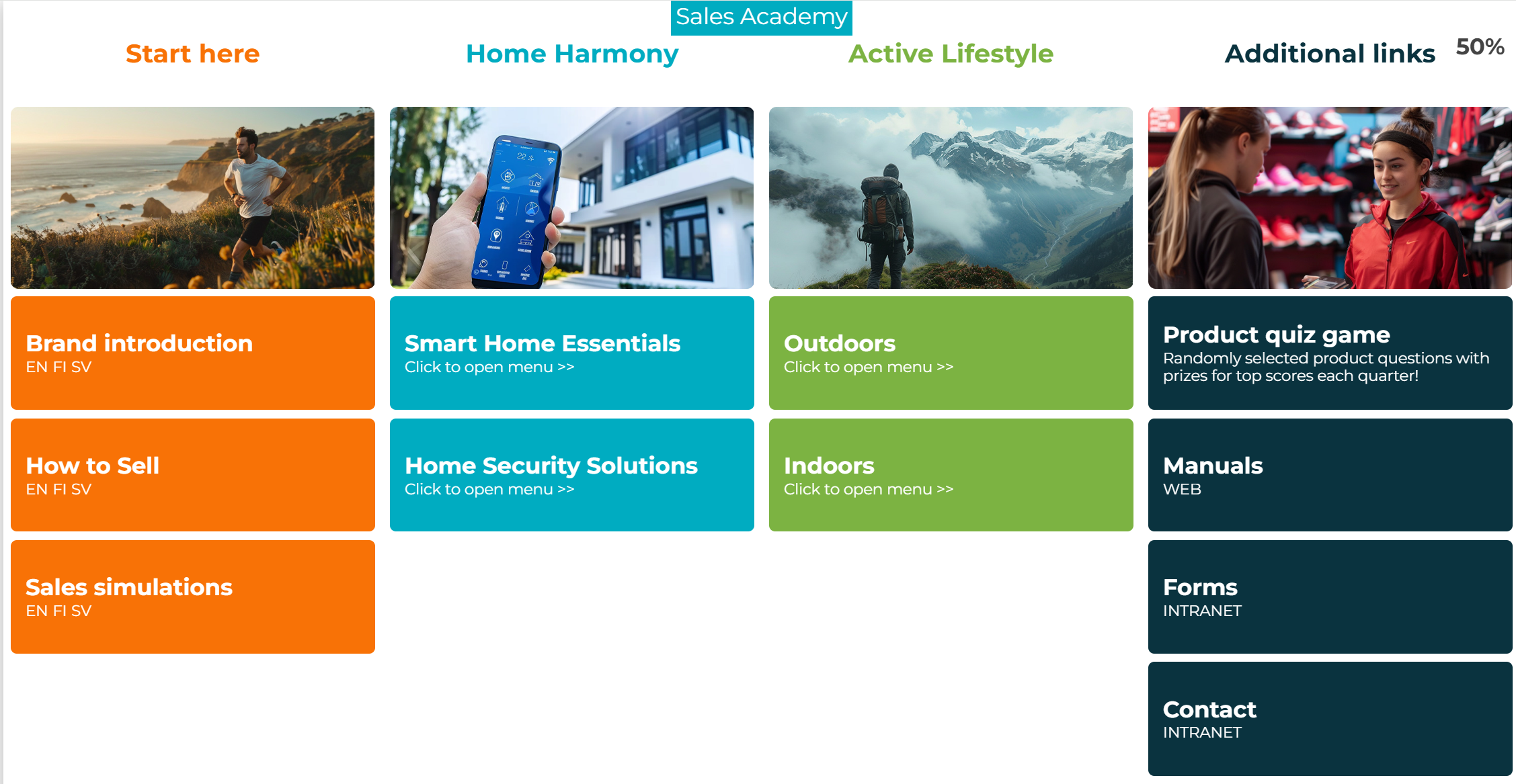
Landing Page -Button Settings
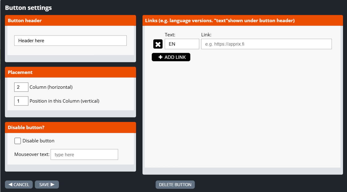
How do you start building the Landing Page element?
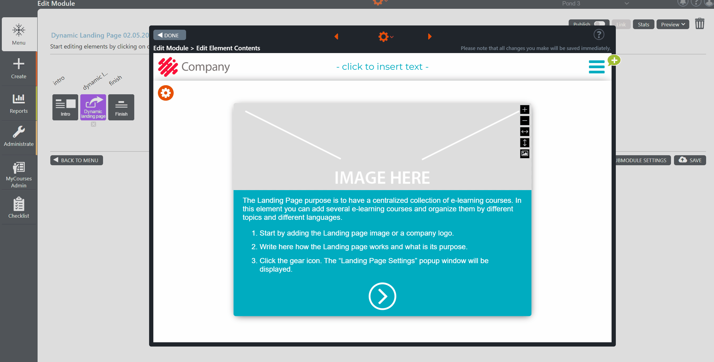
How do you add a new button (course) to the Landing Page element?
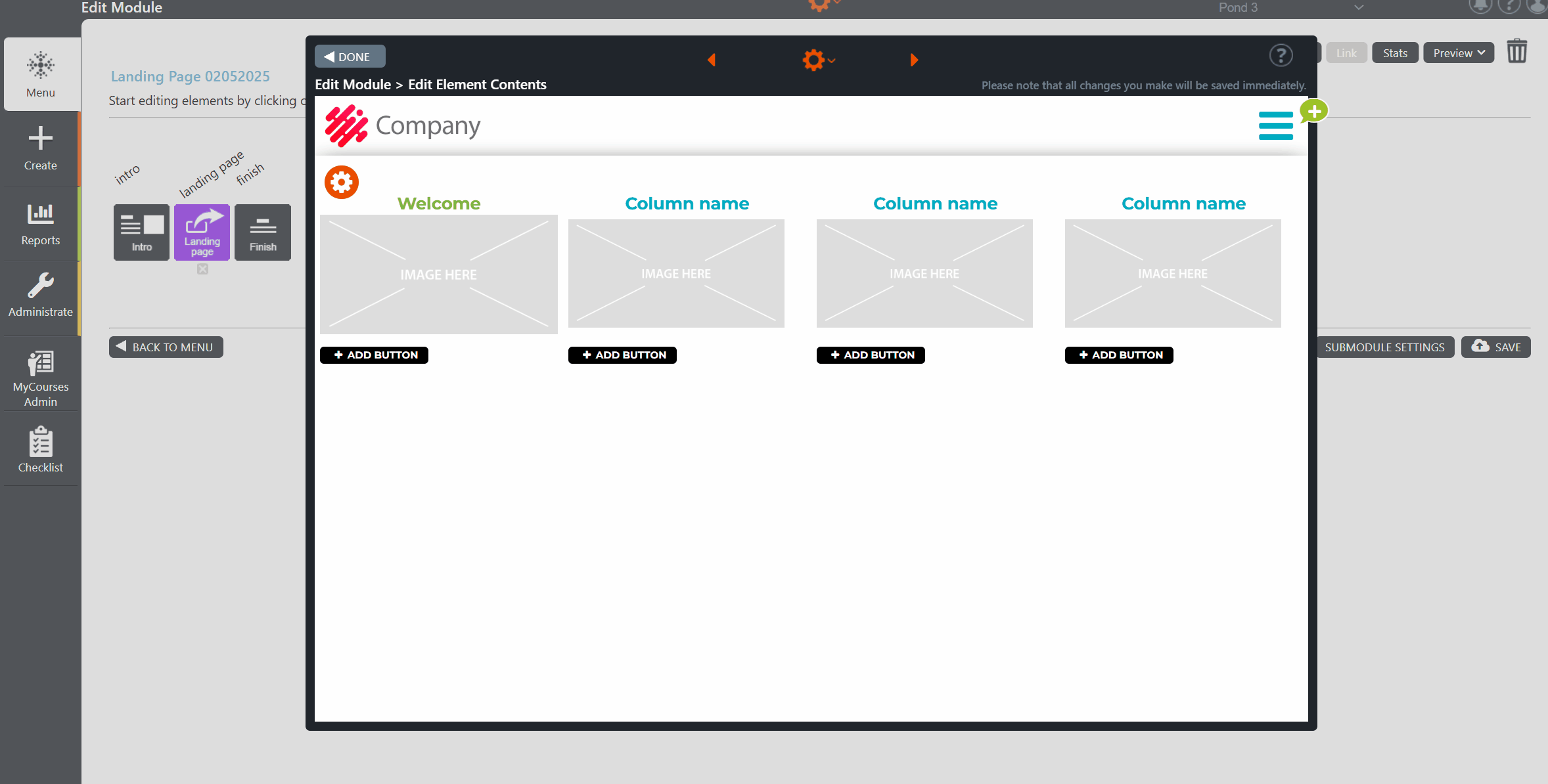
How do you preview the content of a Landing Page element?
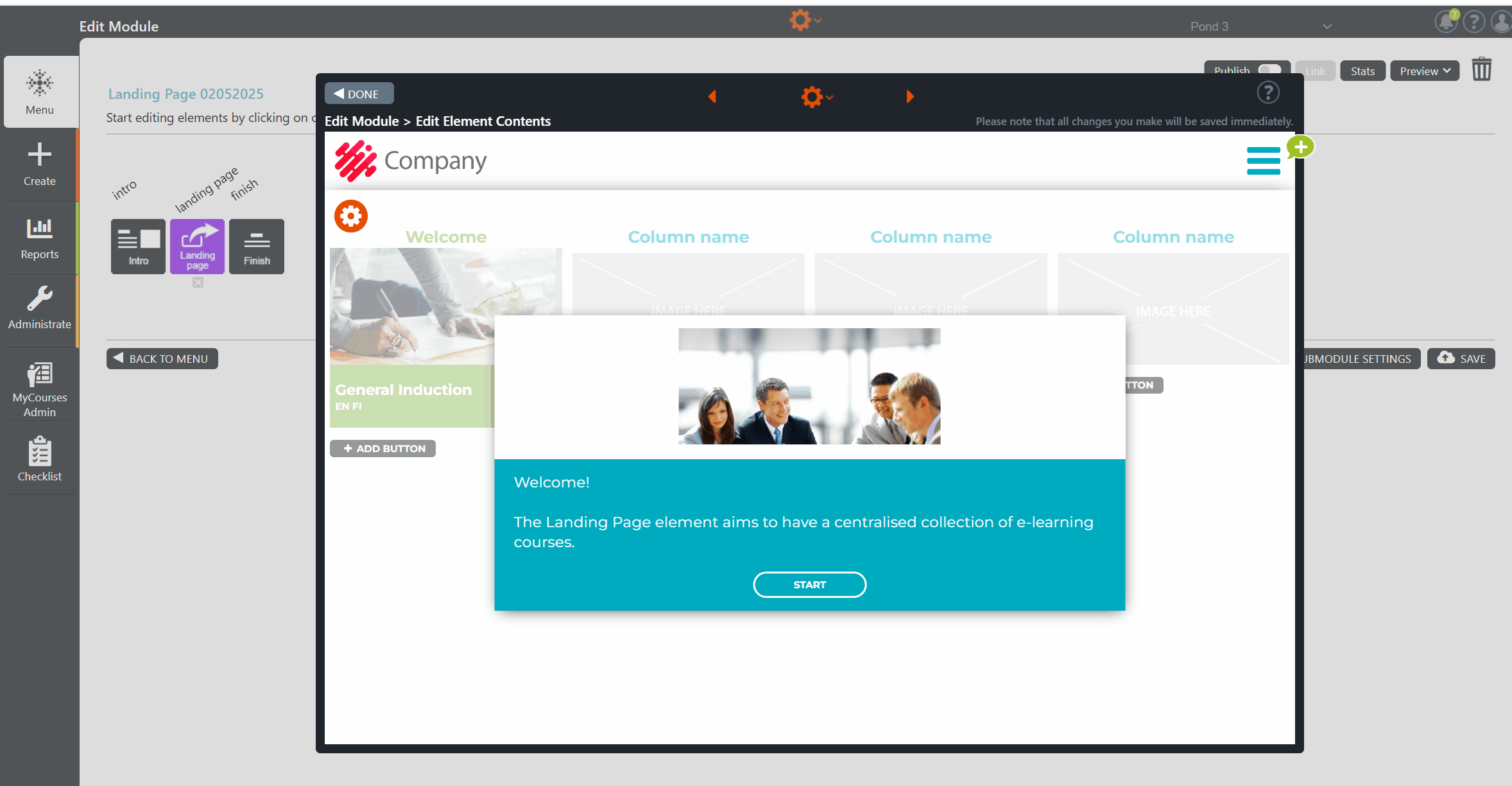
You can also use this element to store links and documentation.
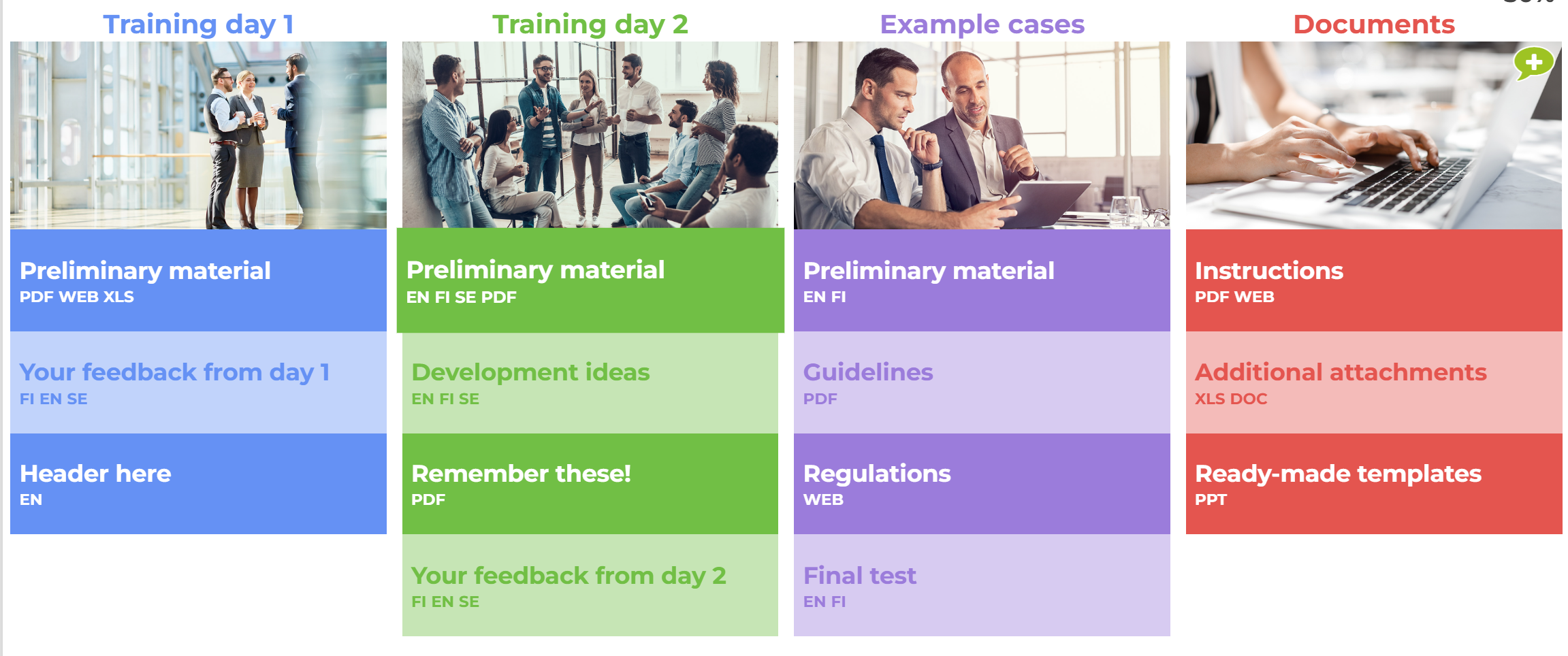
7.33 Dynamic Landing Page
The Dynamic Landing Page element is an enhanced version of the Landing Page.
Note! In the Dynamic Landing Page, the facilitator can also choose whether another course must be completed before the one they are editing.
This element can be customised. Please do not hesitate to contact your account manager for additional information.
Editing Instructions
The default editing instructions for the Dynamic Landing Page element are the same as in the Landing Page element, with the following addition:
If another course must be completed before the selected one, choose the column and button of the course that should be completed first. Notify the user in the mouse-over text field that the other course must be completed before this one.
For further information about this element, please click this link.
Dynamic Landing Page -Button Settings
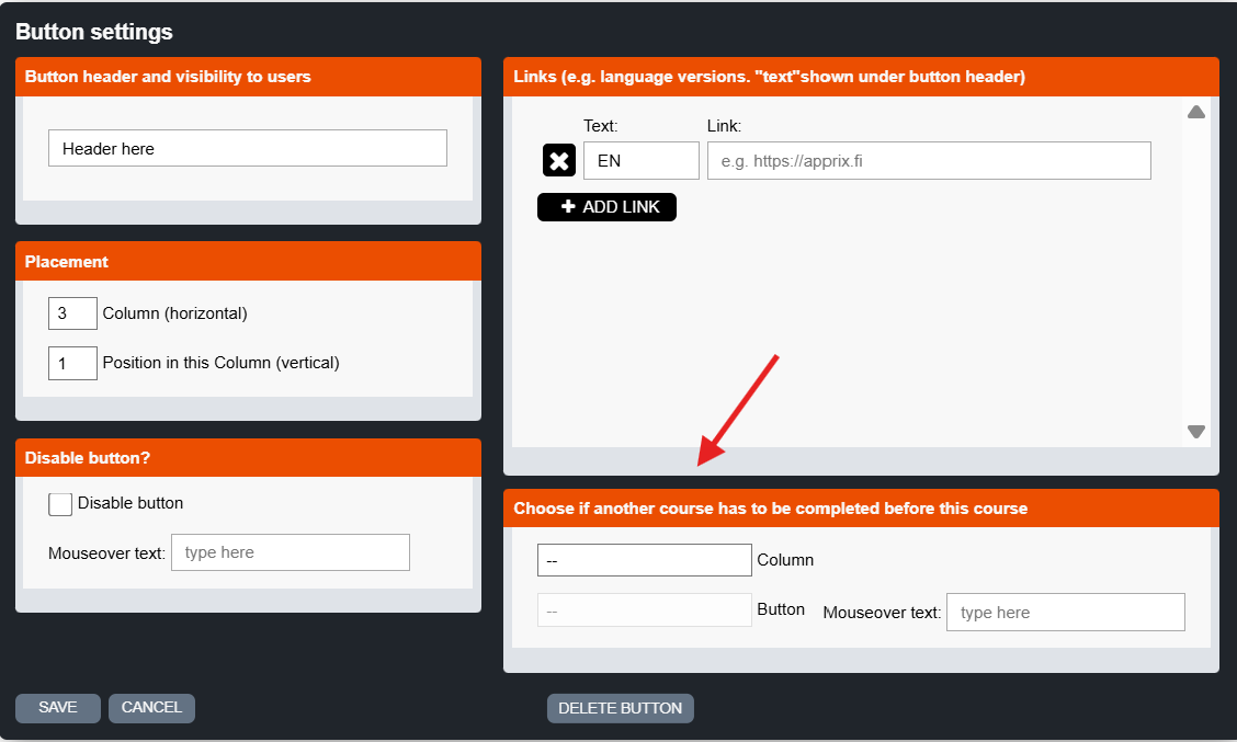
How does the feature “Choose if another course has to be completed before this course” work in the Dynamic Landing Page element?
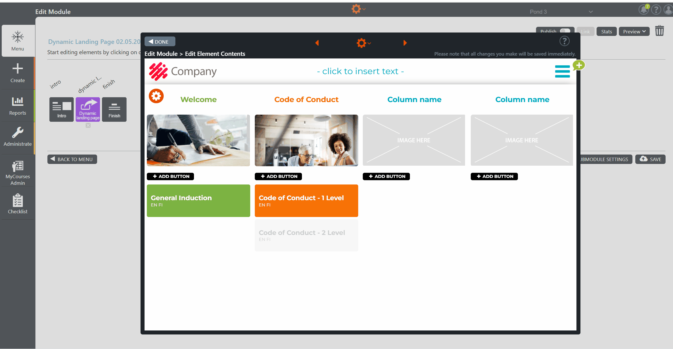
7.34 Drag and Drop
Drag and Drop is a task element. In this exercise, the course participant associates the cards in the deck of cards on the left with the correct card/answer on the right. If the answer is incorrect, the card is placed back in the deck on the left and an error message is shown. If the answer is correct, the card remains where it was inserted, and the next card will be revealed.
When all the cards have been successfully inserted, a message box with further information about the exercise is shown to the participant at the left side of the window.
Editing Instructions
- Use the Introduction text box to provide a detailed introduction to this exercise. If this is unnecessary, clear the text, and the participant will go directly to the exercise.
- You can add, edit, and, if necessary, remove the items by clicking the gear icon at the top of the window and choosing the Element Settings option.
- In the Element Settings, choose the Shuffle items option “Yes” from the pop-up window, if you wish to shuffle the items in Preview/Published mode. Please note that the cards are placed in chronological order in Edit mode.
- First, edit the topic titles. Then, hover the mouse over the right side of each topic box to reveal the Change image icon. Click on the icon and select an image from the Image Library.
- Edit each card’s content on the left side and move it to its correct place.
- If you move one card to the wrong place, an error message will appear at the bottom of the page. Edit it if needed.
- To add the element’s background image, move the cursor to the window’s top right corner and click the lowest icon, Change image.
- When all the cards are dragged and dropped successfully, a new box will appear on the left side of the window. Write here any additional information about the task (e.g. All correct! …. )
How does the “Drag and drop” element work?
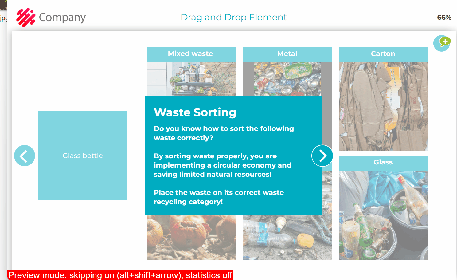
How do you edit the element?
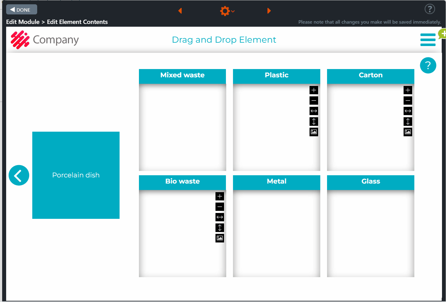
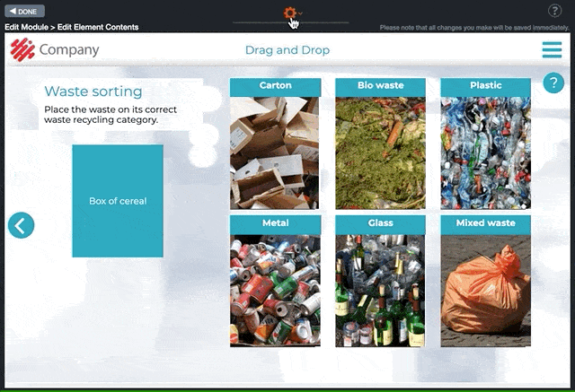
An example of how to use it.
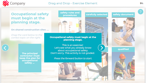
7.35 Switch
Switch is a task element. In this element, the trainee has to answer questions or statements by choosing one of the three available options, e.g. “Never“-“Sometimes“-“Always“. After the trainee has answered all the questions/statements, s/he clicks the move forward arrow button on the right side of the page. The correct answer will appear for each question including a message containing further information about the question topic. The trainee can check the details of the questions again by pressing the “i” icon.
Editing Instructions
- In the introduction box, write the exercise instructions and their purpose. If you leave the box empty, it will not be visible to the trainee.
- Add a background image by clicking the Change image icon on the right side of the element.
- Click the Element settings option from the gear icon at the top of Edit Element Contents view. The Element Settings window will be opened.
- Add all the needed items. Edit the questions/statements for the exercise.
- Add the option texts on top of the switches, e.g. “Never”-“Sometimes”-“Always”
- Set the correct options.
- It is also possible to add an image below each switch option text.
- In the Info icon next to each text box, write any additional information related to the topic. This text content is shown after the trainee has provided their answers.
- Click the orange tool icon on the top left of the element window. The Settings Bar, which allows you to change the color of the text and answer boxes, will be displayed. Change the colors according to your preference.
Click on the images to enlarge them.
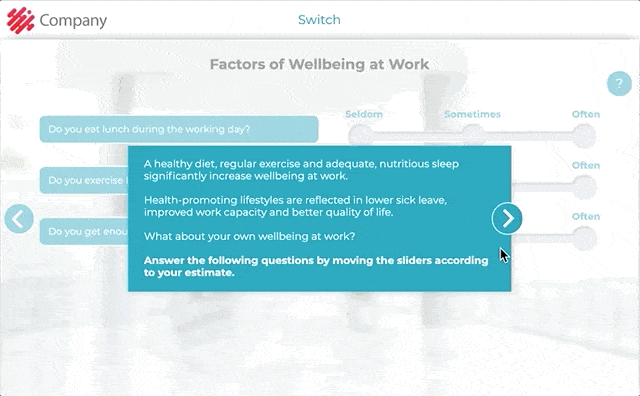
Click on the images to enlarge them.
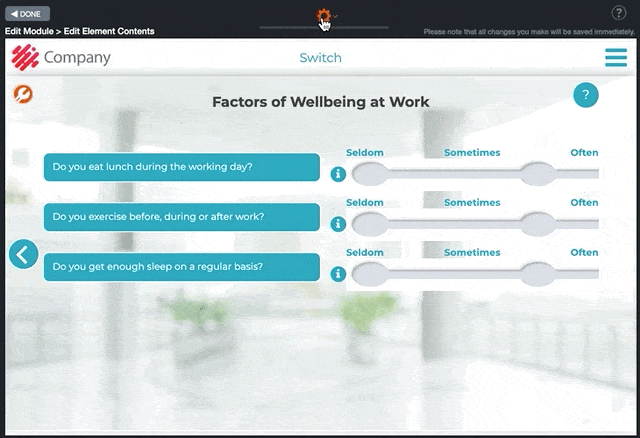
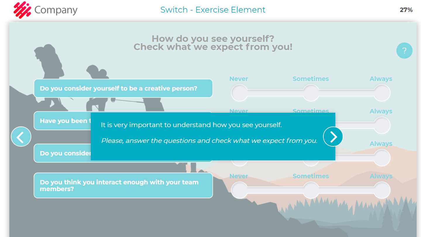
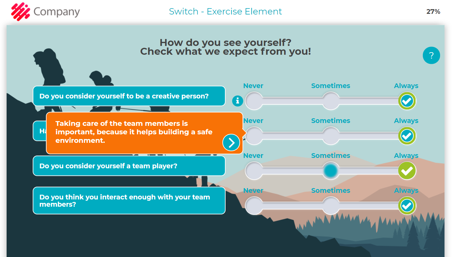
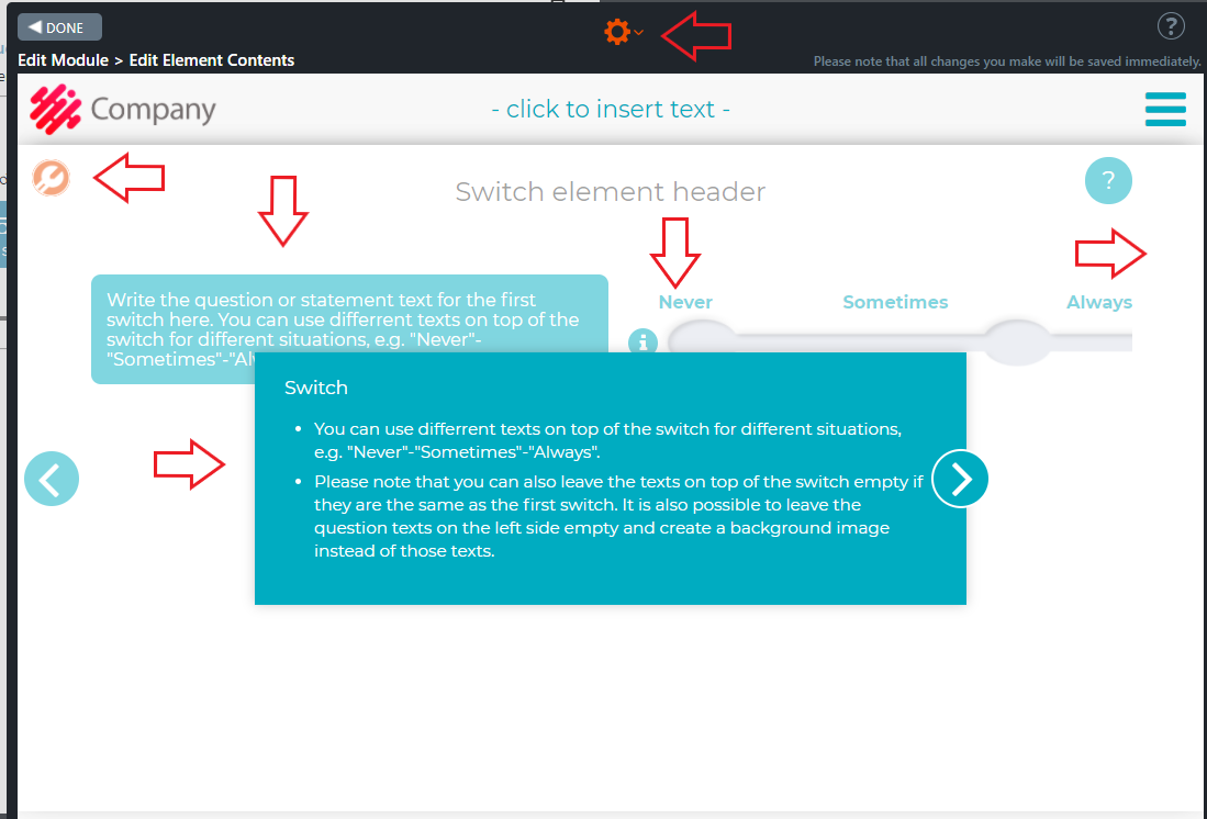
7.36 Survey Multichoice
Survey Multichoice is a survey element. In this element, you may ask questions which the trainees must answer by choosing from the available options. Once the options(s) have been selected, the trainee clicks the move forward arrow button on the right side of the element. An info message/summary will be displayed. In this message, you may thank the trainee for providing feedback or/and give additional information about the topic.
Editing Instructions
- Write the title and question/scenario for the survey in the text box on the left side of the window. In case you only want to show the background image, you can remove the text. If there is no content, the text box will not be displayed to the trainee. Please note that for editing purposes, you will still see empty text boxes with the text “- click to insert text -“.
- Click the Question mark icon on the top right of the window. A text box is opened.
- In the text box you may thank the trainee for providing feedback or give additional information about the task.
- You can also leave the box empty. In this case, the box will not appear to the trainee.
- Add the background image by clicking the Change image icon from the top right corner of the background image field.
- Click Element settings option from the gear icon at the top of Edit Element Contents view. In the window, add and edit your survey questions. New option boxes will appear on the right side of the element.
- Click the gear icon on the top left of the element. The Option settings window is opened.
- In this window, you may set the minimum number of options the trainee has to select.
- Click the Question mark icon on the top right of the window. A text box is opened. In the text box, you may thank the trainee for providing feedback or give additional information about the task.
- You can also leave the box empty. In this case, the box will not be visible to the trainee.
Click on the images to enlarge them.
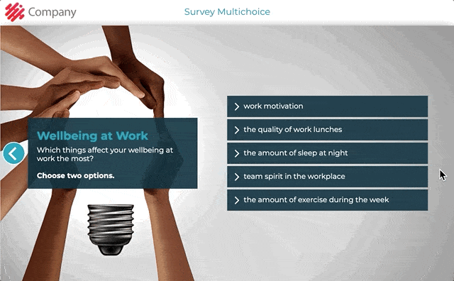
Element settings in Edit Element Contents view:
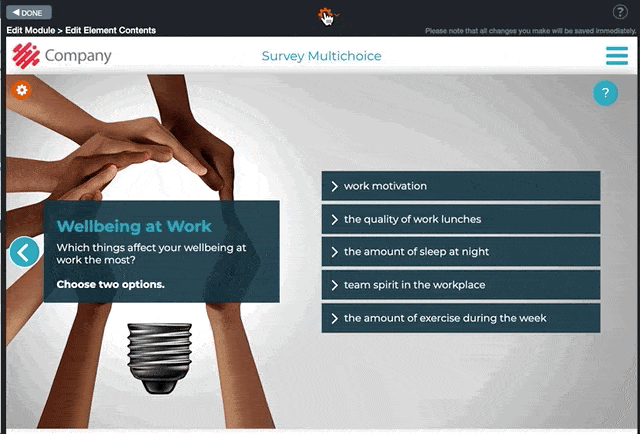

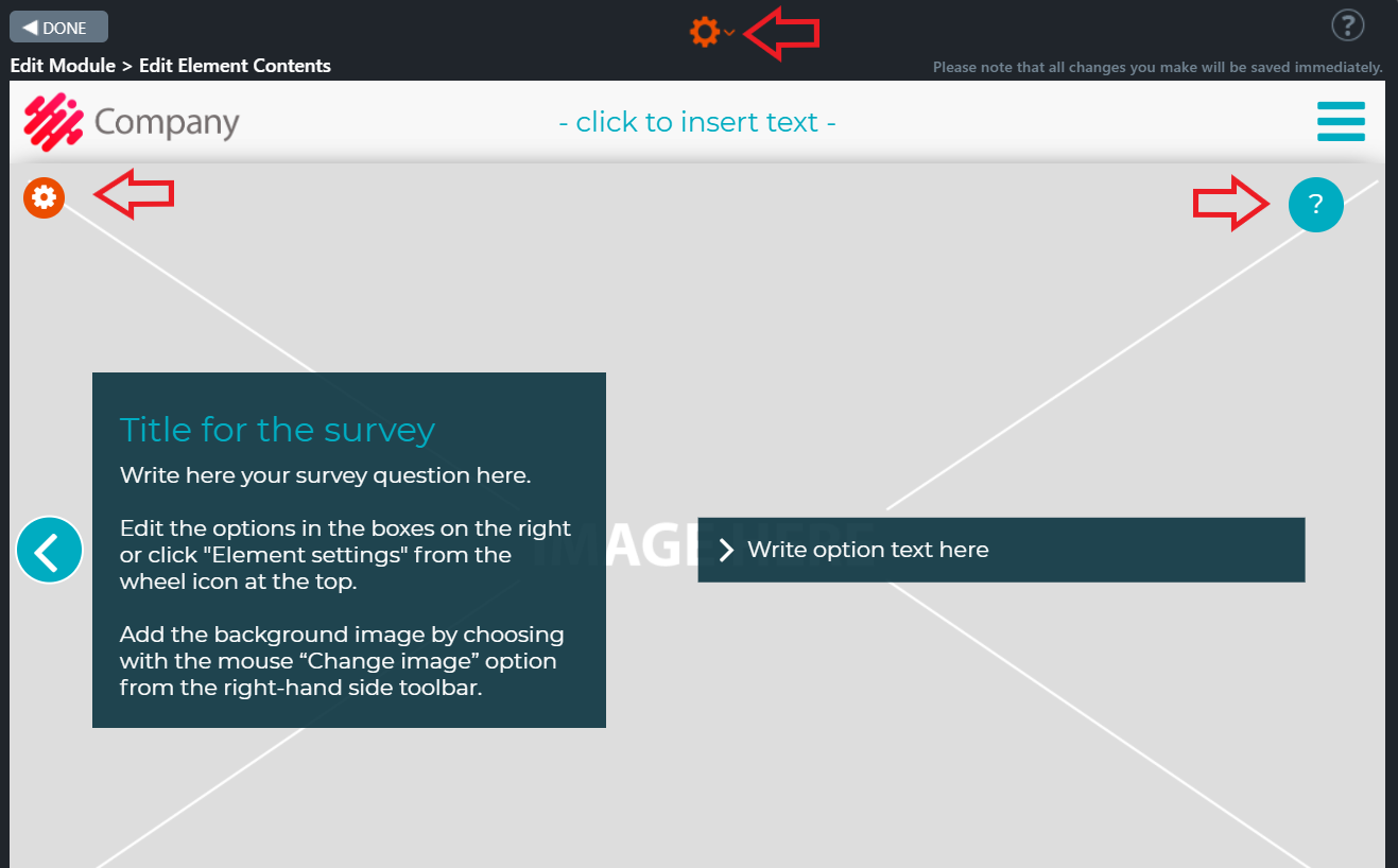
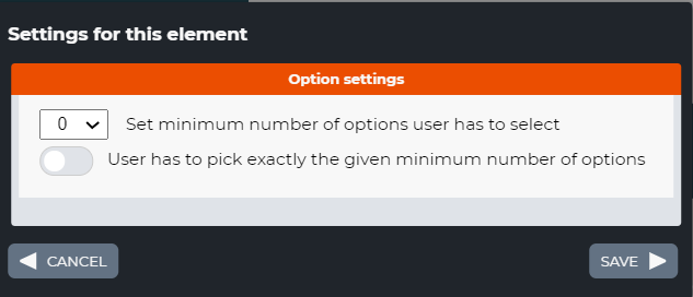
7.37 Survey Table
Survey Table is a survey element. In this element, you may ask several questions which the trainee must answer by choosing from two available options. At the beginning, an info message is displayed explaining the task instructions and giving additional information about the topic.
Once the options have been chosen, the trainee then clicks the move forward arrow button on the right side of the element. A new view is opened. In this new view, the differences between the options in the first and second columns are explained. Also additional information about the topic is given.
The survey result (number of options chosen from the first and second column) is revealed and additional information is displayed below the results.
Editing Instructions
- Add a background image by clicking the Change image icon from the top right corner of the background image.
- Click the Question mark icon on the top right of the element view. A text box is opened. Write the title and the scenario for the survey in the text box.
- In case you only want to show the background image, you can remove the text. If there is no content, the text box will not be displayed to the trainee. Please note that for editing purposes, you will still see an empty text box with the text “- click to insert text -“.
- Click the Element settings option from the gear icon at the top of Edit Element Contents view.
- In the window, add and edit your survey questions. New option boxes will appear on the right side of the element.
- Write the titles of the questions and options in the Column fields.
- Write the questions and their options texts (e.g. Option A, Option B). Write the answers too, if needed.
- Click the forward button on the right side of the survey table. A new element view is opened.
- In the new view, the results of their selections are shown to the trainee.
- Write any additional information about the survey results in the upper text box.
- In case you only want to show the background image, you can remove the text. If there is no content, the text box will not be displayed to the trainee. Please note that for editing purposes, you will still see an empty text box with the text “- click to insert text -“.
- The results of the survey will be listed in the text box in the middle.
- Write any additional information in the lower text box.
- If you leave the box empty, it will not be visible to the trainees.
Click on the images to enlarge them.
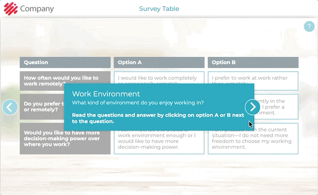
Element settings in Edit Element Contents view:
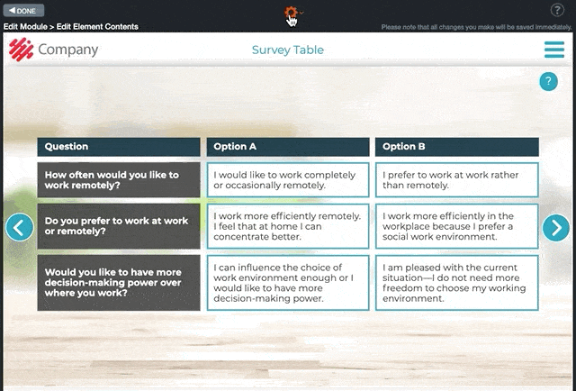
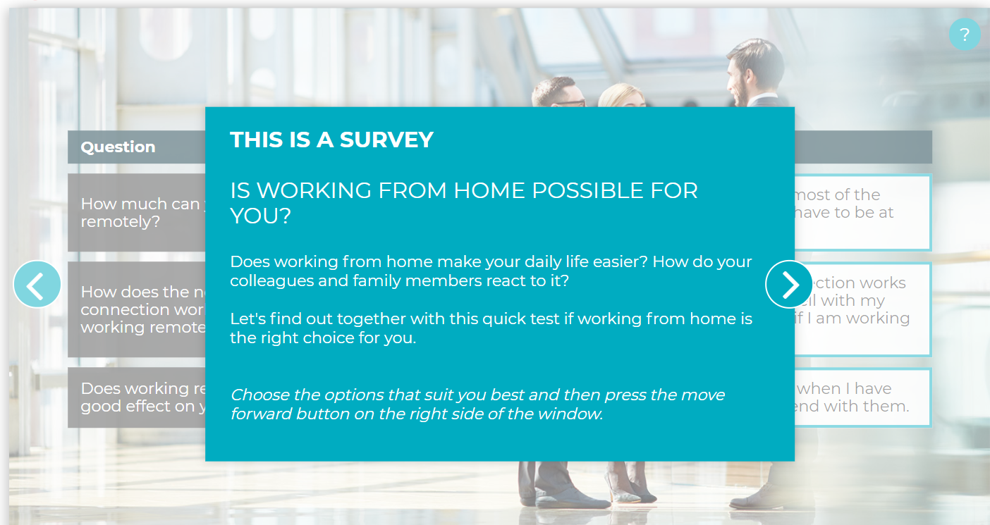
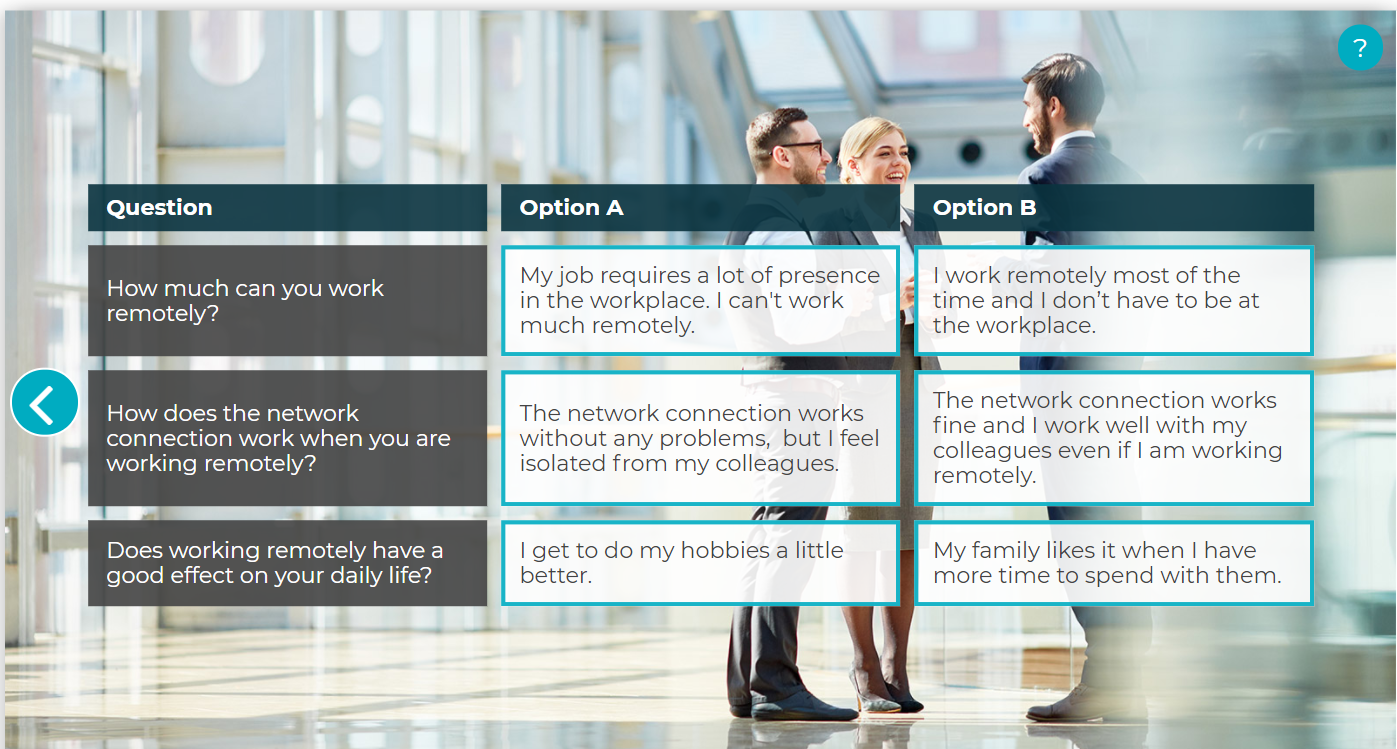
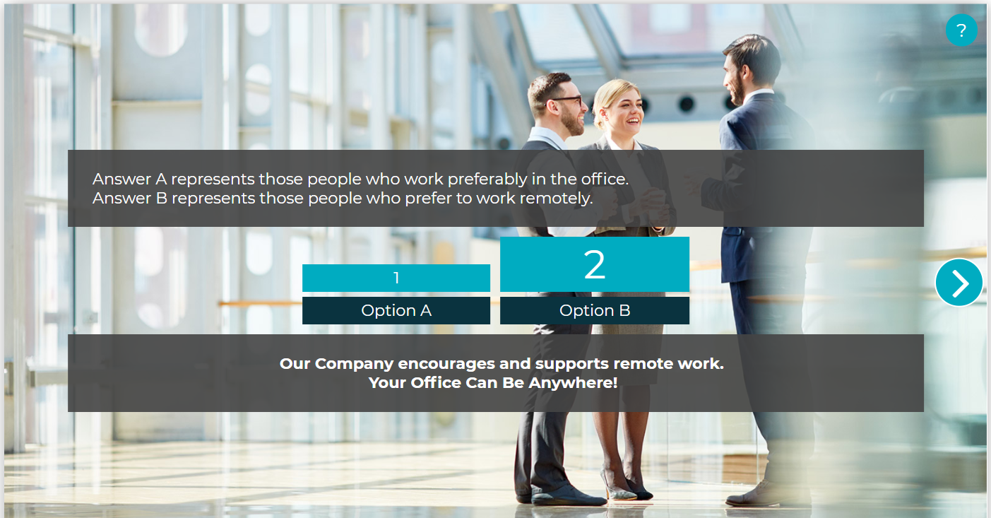
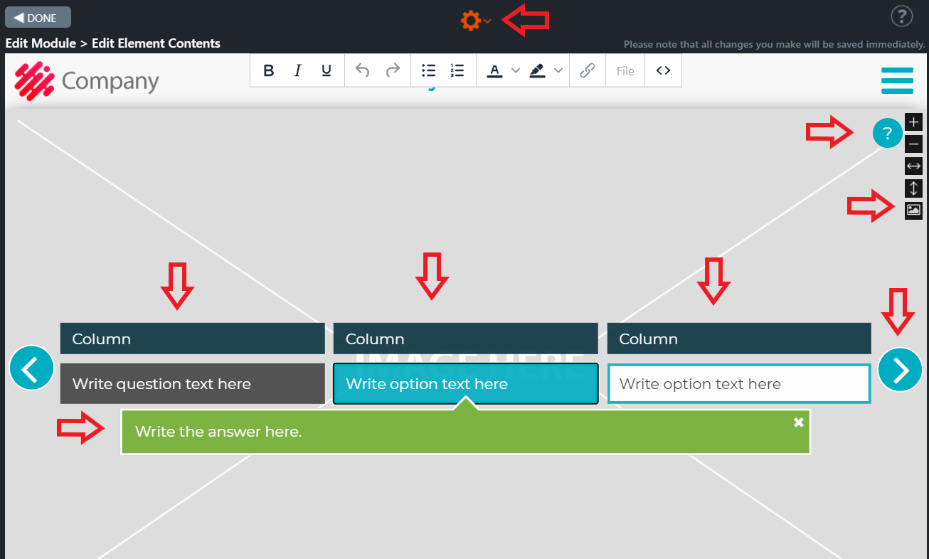
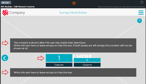
7.38 Order
This is an exercise element. In this element the trainee has to select the correct order of the listed steps by clicking on the text boxes at the left side of the element.
An exercise example could be:
What should you do in the event of a fire?
In the event of a fire, the following steps should be taken to ensure the safety of all building occupants.
Select the steps in the correct order.
For example in this case the order should be ”Save ”, ”Alert”, ”Estinguish”, “Limit”, “Call” and “Guide”.
In case that the trainee chooses the wrong item an error message is shown.
After the trainee has chosen correctly all the steps, the move forward button will appear at the right side of the window.
Editing Instructions
A pop-up window with some instructions is first displayed in the element. If needed, you can add here additional information about this task. In case that it is not needed, you can remove its content. In this case the pop-up window will not be displayed in Preview nor Published mode.
Add, remove and edit the items by clicking the gear icon at the top and by choosing “Element Settings“.
Once you add an item in the Element settings two boxes will appear in the element: one on the left side (see: ”1 task” button) and the text box at the right side (see: ”1 answer” – ”Here you can write an answer text”) of the element.
Name each task, e.g. ”Save ” on the left and on the right give an extended description of the same task.
Give instructions for the exercise in the upper left box.
E.g.: What should you do in the event of a fire?
In the event of a fire, the following steps should be taken to ensure the safety of all building occupants.
Select the steps in the correct order.
Choose option ”Shuffle items” ”YES”, if you wish that the items are shuffled.
Edit, if needed the ”Wrong order message”.
Add the background image by choosing the “Change image” option from the right-hand side toolbar.
Add the Header title, if needed.
Click on the images to enlarge them.

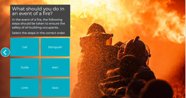
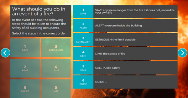
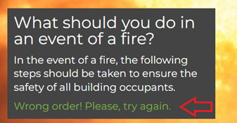
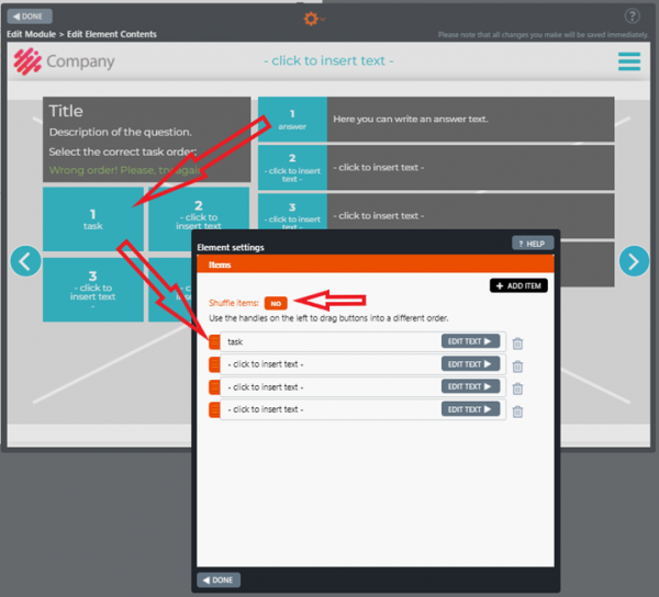
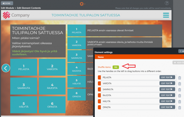
7.39 Order Expand
Order Expand element is similar to the Order-element, with the addition of a couple of new features. In this element you can use up to 8 items (in the Order element max 6 items) and in the text boxes you can add a long text that grows or shrinks when you click on it.
Click on the images to enlarge them.
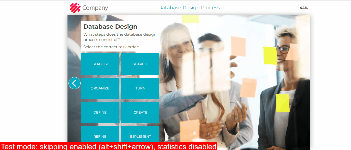
7.40 Competence and Competence 2
In this element, the employee can add their valid certificates of qualification (e.g. Occupational Safety Card, Electrical Safety Certificate, Fire Work License) from a list of qualifications the employer requests.
The employee clicks the plus icon on the left to add a card/qualification. A drop-down menu opens as a modal from which predefined qualifications can be selected. After the card selection, the employee fills in the card number and validity period (month and year).
Note! The card number is a free text field (letters can be entered, if necessary)
Clicking the trash button deletes the selected card. Once all cards and related information have been entered, the employee can click the forward button.
Note! The employee can select only one qualification at a time, so the content of the drop-down menu is reduced depending on whether the options have already been selected.
The last item in the drop-down menu is “Something else, what?” a text field where the employee can enter a specific qualification not listed in the menu.
Note! Each qualification has a “mandatory” or “optional” option. If the qualification is “mandatory,” then the Builder will display it directly in the element, and the employee will not be able to delete it by pressing the trash button since the trash icon is not available in case the item is mandatory.
Editing Instructions
- Fill in the fields and give the needed instructions to the employee.
E.g.:
Fill out your qualifications
To be able to work in this area, you must have at least a valid occupational safety card.
Fill out the card number and their validity period below. When ready, press the Move forward arrow to proceed.
- Choose the Element Settings option from the gear icon at the top
- Add and edit the required items (the text will appear on the left side of the window).
E.g.:
-
- Occupational Safety Card
- Electrical safety certificate
- Firework license
- Update the content of the item ”Jokin muu, mikä?” (”Something else, what?” ), if needed.
- Select from the item’s tool icon the option ”Mandatory” if needed.
NOTE! Suppose the card/qualification is “mandatory.” In that case, the item is displayed directly in the element, and the employee cannot delete it by pressing the trash button.
- Click on the Move forward arrow. A message box is displayed. This box shows the employee if one or more certificates have expired after clicking the “FORWARD” button.
- Write the instructions for the employee in case one or more certificates have expired.
Note!
The data entered in the Competence element is not saved in the statistics if the module does not use a user authentication method, for example, a Login element, Email Registration, SSO, or Tax Number Check.
Competence 2
Competence 2 is an enhancement of the Competence element.
A wrench icon is at the top left of the Competence 2 element. Click it. The Competence options window will be opened. Here, you can select the following options for all rows:
- Card number column
- All cards at once
- “Other, what?” as the last row.
The employee adds his/her valid competence certificates to the list of qualifications the employer requests.
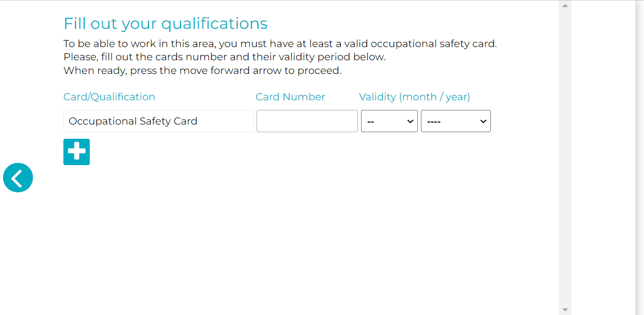
List of qualifications. Some or all of these may be mandatory.
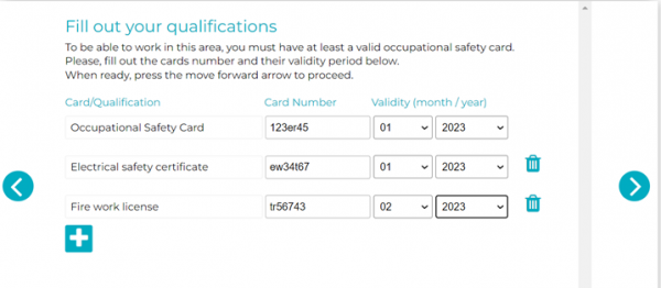
The notification appears when the user has pressed the right arrow button.
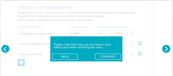
How to edit the Competence card?
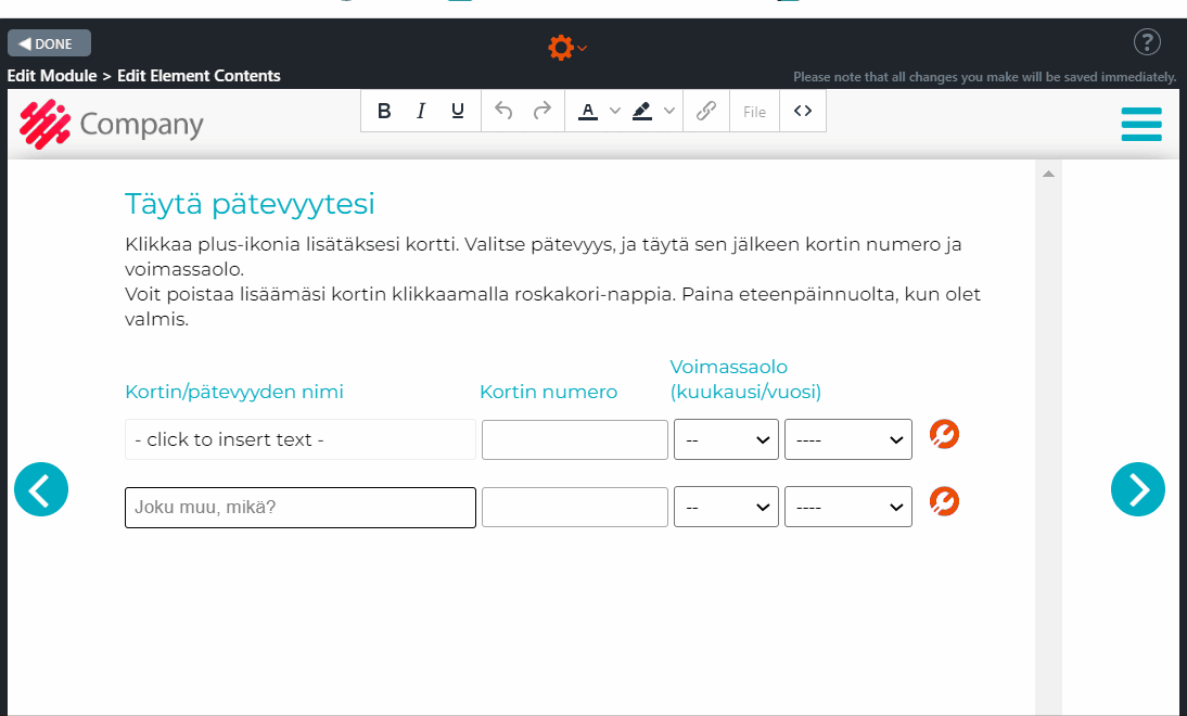
Competence 2 – Competence options
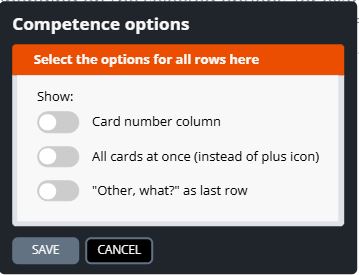
7.41 Upload
With the Upload element, an employee can upload their own photo for an ID card to the Apprix server.
Clicking the “1 Select Image” icon opens the file directory on the computer/laptop where the employee can download the photo. If the employee is using a mobile phone or tablet, they have the following options: “Take a picture or video”, “Picture library” and “Browse”.
Note! The picture must be in JPG / JPEG, PNG, GIF, or SVG format, and the file size can be up to 1MB.
When the image is successfully downloaded, it will appear above the “1 Select Image” icon. Now the employee can click the “2 Send Selected Image” icon. If the file format is incorrect, an error message will be displayed.
If an employee does not want/ can’t upload their photo, they can click the “I will not send my image in advance” checkbox.
When the employee has successfully submitted the image or has decided not to submit it, they click the Forward button on the right to continue.
NOTE! If the employee has not submitted the photo, the access manager can take a photo of him or her on site.
Editing Instructions
Add the background image and edit any fields as needed.
Click on the images to enlarge them.
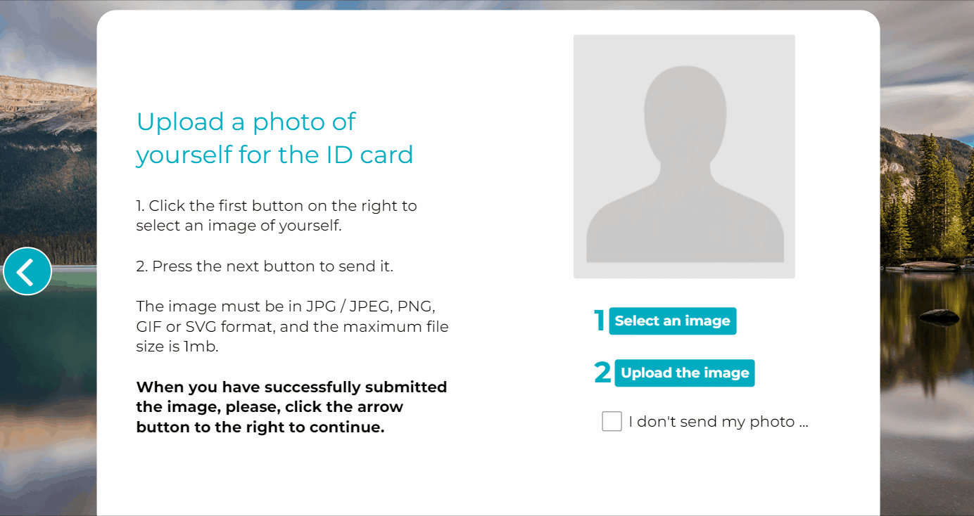
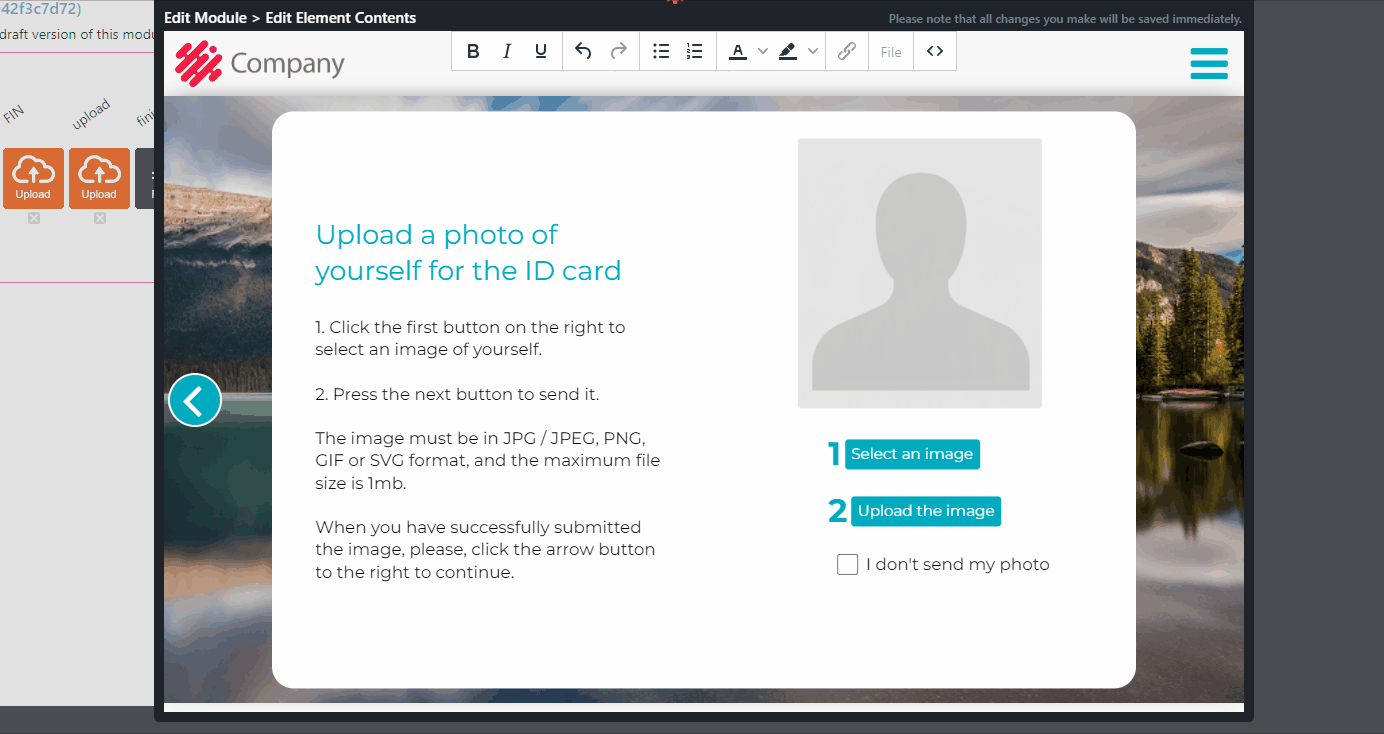
7.42 Hotspot 360°
Hotspot 360° element is very similar to Hotspot 2, but it uses as a background image an equirectangular 360° image instead of a two-dimensional one.
This element can be used when it is needed that the trainee focuses on certain topics available in the clickable hotspots on top of the equirectangular 360° background image. The clickable hotspots may contain text, image, true/false questions and/or video files.
The trainee can jump between hotspots by clicking the move forward button on the right side of the window. In Published mode, once all mandatory hotspots have been selected, the move forward button will move the trainee to the next page of the training.
Editing Instructions
- Add the equirectangular 360° background image by moving the mouse and choosing “Change image” from the right-hand side toolbar.
Image requirements:
- Equirectangular 360° image
- Please, note that 360° images will not be optimized automatically, so it is recommended to do it manually before uploading the image: the size should be around 6000×3000 to 8000×4000 pixels to achieve great quality with an average internet speed.
- Drag the clickable hotspot to the correct place on top of the image.
Note! You can change the color and icon of the hotspot from the paintbrush icon, and adjust its position by clicking the move icon.
- Add hotspots by choosing from the gear icon on top the option “Element Settings…”.
- Click each hotspot to edit its content. The clickable hotspot may contain text, image, true/false question, video file and mandatory/not mandatory option.
- Select from the tool icons on the left the general settings for each hotspot in the element.
Click on the images to enlarge them.
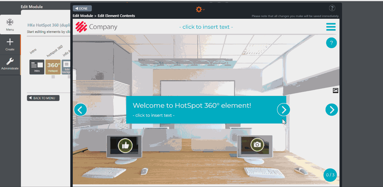
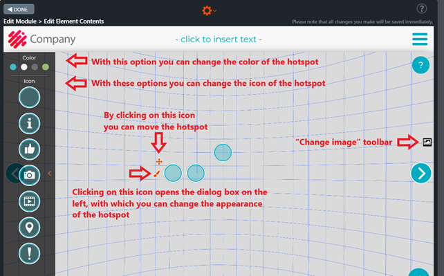
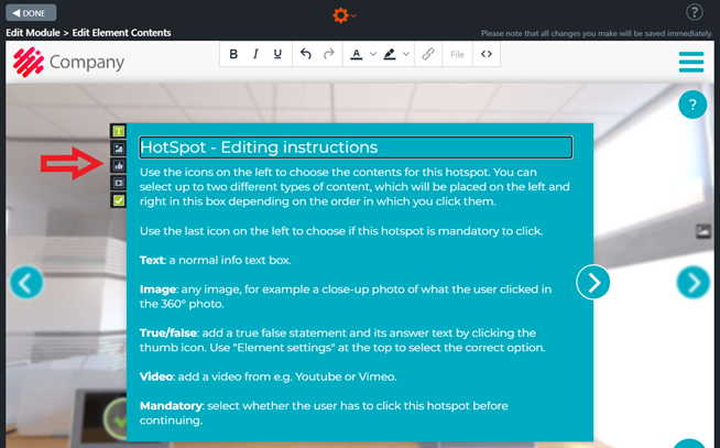
7.43 Checkbox Three
Checkbox Three-element is commonly used in final tests.
The element contains statements or questions answered by clicking on one of the three checkboxes on the right side of each question box. After answering the question, a mark will appear on the clicked checkbox indicating whether the answer was correct. At the same time, a text box containing further information, e.g., about the correct answer, will open.
After all the checkboxes have been clicked, a summary box will open with further information.
Element editing instructions
- Click the element icon in the Edit Module view to open and edit the element’s contents.
- Write the title of the exercise on the upper text field.
- Write the instructions and question or statement for the learner in the lower text field.
- Edit the labels of the checkboxes if needed. For example:
- “Always” / “Sometimes” / “Never” (in case of giving business gifts)
- “Low” / “Medium” / “High” (in case of risk evaluation)
- “Employer” / “Employee” / “Contractor” (in case of responsibilities)
- Add the required question boxes by clicking the Element settings option in the orange wheel icon at the top of the element’s Edit The question boxes appear on the element.
- Assign the correct answer to each item by clicking the button’s left or right side.
- Write the question or case description in each question box. The question boxes will be shown to the user one by one.
- If needed, write the answer text and add further information about the topic on each answer text box at the right side of the element.
- After all checkboxes have been clicked, a Summary text box will appear. You can add a summary for this task here.
- Note! These will not be shown if you leave the answer text boxes and/or the summary box empty.
Click on the images to enlarge them.
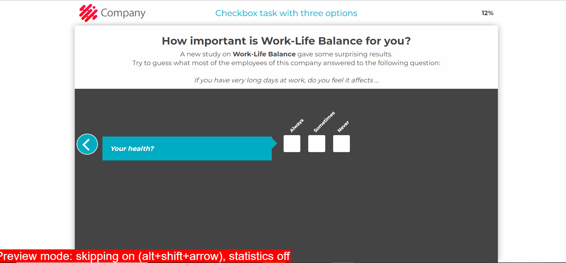
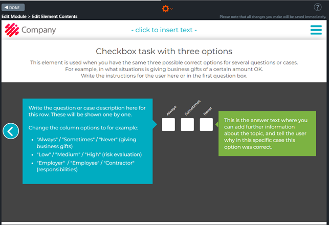
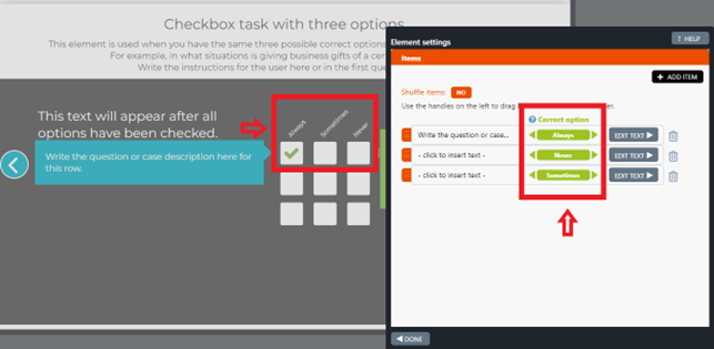
7.44 Process
The Process element shows the learner the steps to complete a specific task or process.
In the beginning, it is explained how the Process element works. In practice, they have to read the instructions attached to the background image of each step. Once the learner has read the instructions and clicked on the hotspot or icon, they will move on to the next phase of the process.
In each slide, the course participant can move forward by clicking on the hotspot or back to the previous slide by clicking the arrow button on the page’s left side.
Once the process is completed, there are instructions on how to continue the course.
Element editing instructions
- Plan the steps that you want to show to the learner.
- Open the element in Edit mode.
- Type Introduction and Process Summary in the Introduction box to display the introduction at the beginning of this process. You can also leave the box blank – in this case, the text box will not be visible to the person running the course.
- Each background image, i.e. a step in the process with an explanation, appears in Edit mode at the bottom of the element.
- Click the Element settings option in the orange wheel at the top of the element’s Edit view. The Element settings window opens.
- Add the necessary items, i.e. steps in the process.
- Click on the slide below one by one. A new window will open each time.
- You can add a background image by clicking on the Change Image icon at the top right corner of the image. The image will also appear on the slide at the bottom of the page.
- Add the text of the step in the process in each text box.
- Select each text box’s position, shape, size and colour using the text box tools.
- Adjust the position, shape, size and colour of each hotspot.
- Remember that you can stretch the hotspot size so that the icon goes inside the box. The icon will remain in the same position relative to the hotspot where it was placed. The submenu hotspots element works in the same way.
- As you move the mouse, a brush appears to the left of each hotspot.
- Click on the brush. A bar with icons and colours to apply to each hotspot will appear on the left side of the window. Note that the droplet-shaped icons move while the round icons are stationary.
- Test the options and choose the most appropriate for you.
- When you reach the last background image, a summary text box will appear on the right. In summary, you can summarise the process you have just explained to the learner and give instructions on continuing the course.
- Remember that leaving the summary text box blank will not appear on the last background image at the end of the process.
- You can hide the background image bar by clicking the arrow in the middle.
Example of using simple gif animation in a Process element
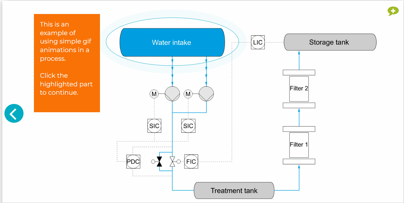
Process element settings in edit mode
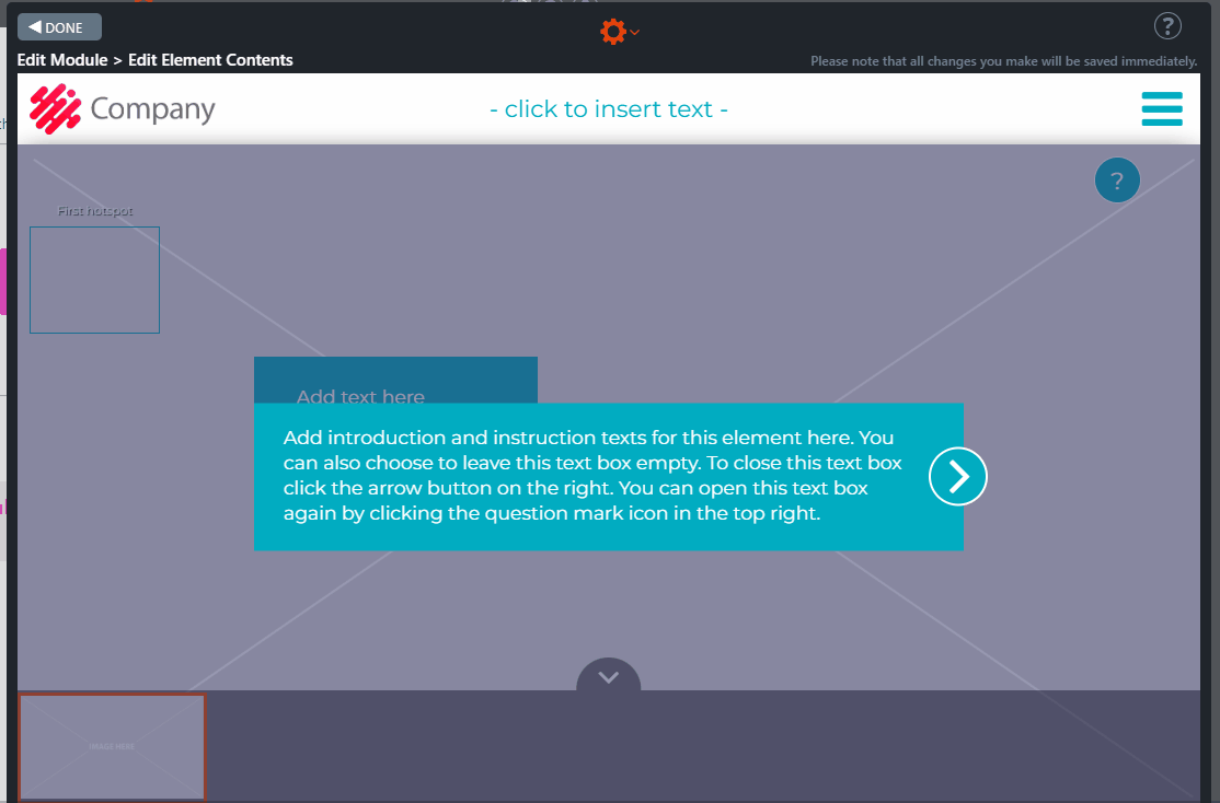
Process element in edit mode
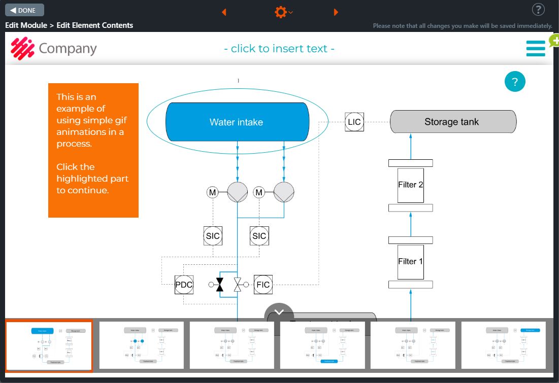
7.45 Submenu hotspot
The submenu hotspot element is similar to the Submenu button element, except the hotspots replace the text boxes at the right of the element and are placed above the background image as needed. In other words, each hotspot works as a submodule.
In the beginning, it is explained how the element works and how and in what order the learner should proceed through the chapters. A “Done” icon appears on the hotspot whenever a chapter is completed.
A pop-up window will inform the learner how to proceed when all chapters have been completed.
Note! The Move Forward button will appear based on the settings, and each chapter can be completed more than once.
Editing instructions
- Open the Submenu hotspot. The element must be in Edit mode (” Edit Module > Edit Element Contents” window) to be edited.
- Open the Image Library by moving the mouse on the right side of the background image on top of the toolbar and clicking the lowest icon, Change image.
- In the new pop-up window, click Browse / Upload Files… Now you can see the Image Library. Choose the image to be displayed in the element.
- Edit the contents of the two pop-up windows opened in the element (Introduction and Summary). The Introduction pop-up window can be later found by clicking on the icon with the question mark. This appears as soon as the course participant opens the element. The bubble icon (Summary) will appear once the course participant has completed all the chapters on this page.
- Choose from the module’s gear icon option “Edit Submodule Menu Settings…“. The Submenu settings pop-up window is opened.
- Choose here the settings (“Submodules have to be completed in the order defined below” and “All submodules have to be completed before being able to go forward“) and the number of buttons (hotspots) that you will need in the element by clicking the black “Add button.”
- Rename each button (hotspot). The hotspots will appear at the upper left side of the element.
- Drag each hotspot and place it where it is needed.
- Adjust the hotspot size from its edges.
- Change the shape of the hotspot using the handle on the right side of the item.
- Move the mouse to the top of the left side of the hotspot. A brush will appear.
- Click the brush. A list of icons and colours you can use for the hotspot will appear on the left side of the window.
- Choose the icon and colour that you want for the hotspot.
- Repeat these steps for each hotspot.
And finally
- Link the submodules to the Submenu hotspot element
- Publish the submodules and the main module.
How to link a submodule to a module?
- Create the module’s content that will be later used as a submodule.
- Click in Edit mode on the “Submodule settings” button and then choose the “Change to Submodule” option.
- The “Change to submodule” pop-up window is opened. Click on the module where you would like to link your new submodule.
- The “Submenu settings” window is opened. Choose the item where you would like to link the submodule and click the correct “Select button.” The new submodule is now linked to the main module.
Click on the images to enlarge them.
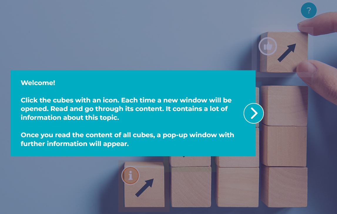
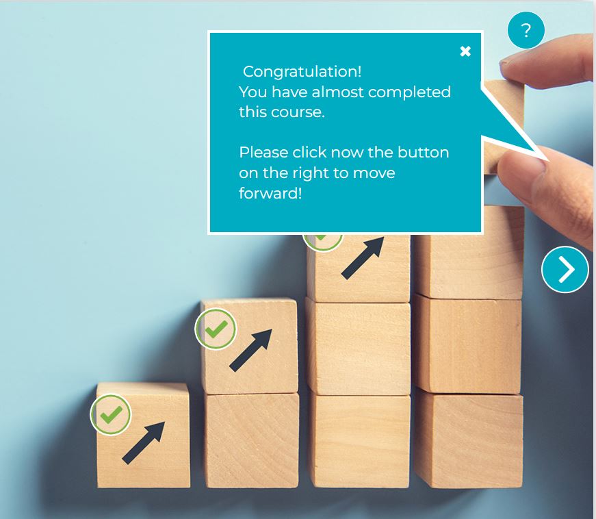
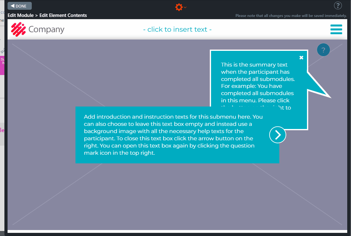
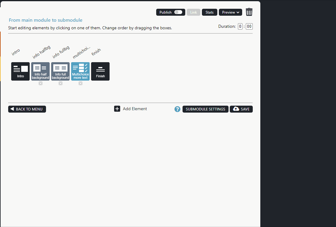
7.46 Pictures & Captions
The Pictures & Captions element shows the steps to complete a particular task or process or can be used to check the details of a specific statement.
First, it explains how the element works.
On the right side of the element, there is a list of text boxes containing explanations of the topic.
A new image opens each time a new text box is clicked.
Each text box contains a short text explaining the corresponding image.
A “Done” sign appears on the text box when clicked.
Note! Each text box can be clicked more than once.
The sum of the text boxes is shown at the bottom right, and the topic title is at the top right.
Element editing instructions
- Plan the different steps.
- Open the element in Edit mode.
- Type the introduction in the text box. You can also leave the text box empty – in this case, the text box will not appear.
- Add each text box by clicking on the Element settings option in the orange wheel icon at the top of the element’s edit view. The Element settings window opens.
- Add the required items, i.e. steps by clicking the “Add item” button.
- Each item or step will appear in Edit mode on the right side of the element.
- Click on the text box one item at a time. A new empty background image will open each time.
- Add a new background image to each item by clicking the Change Image icon in the top right corner of the background image.
- In each text box, add the text of the step.
Click on the images to enlarge them.
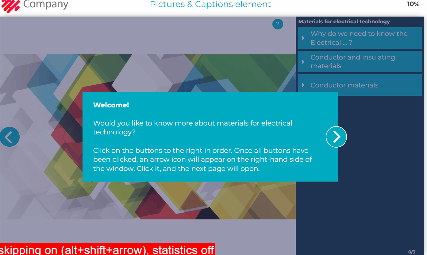
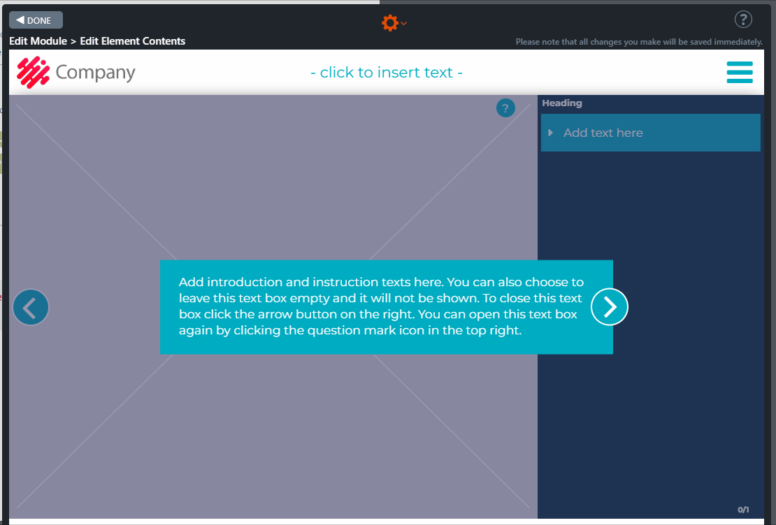
7.47 Document embed
The purpose of the Document Embed element is to make the trainees read the documents embedded in the training material during the training.
Note! Adding exercise elements after the Document Embed element is good practice to ensure that course participants understand and assimilate the document’s content.
Element editing instructions
This element works on the same principle as the embed code for the video element.
- In the text box, type a short introduction to the embedded document. In this text box, you can tell your students they will be asked questions about key points after the content.
- Add the embed code by clicking in the middle of the element. The Embed code pop-up window will open.
- Find the embed code for the document in the service (Google Drive/SharePoint/etc) from which you want to embed the document.
- Paste the embed code into the Embed Code pop-up window and click the Save button.
- Click on the wrench icon in the top left corner of the element. The “Embed element options” pop-up window will open.
- Specify the delay in seconds, after which the Move Forward button will appear on the right side of the element. Then click “Save.”
Note!
Make sure that the content to be embedded is visible to the users:
- Please check with the Apprix HelpDesk(helpdesk@apprix.fi) that the embedded content is on the Apprix list of allowed domains. If you still want to upload content from your preferred domain, please provide the HelpDesk with the URL. Alternatively, you can provide the entire embed code, as the URL will be found there naturally. If the domain is missing, Apprix will add it to the list of allowed domains.
- Make sure that the content you want to embed is viewable. By default, embedded content may have limited visibility, so depending on the service you use to embed the content, you may need to change the visibility settings. The settings may need to specify who can view the content and to which addresses the content can be embedded. In the case of Builder, add “builder.apprix.fi“as an allowed address if necessary.
Click on the video to enlarge it.
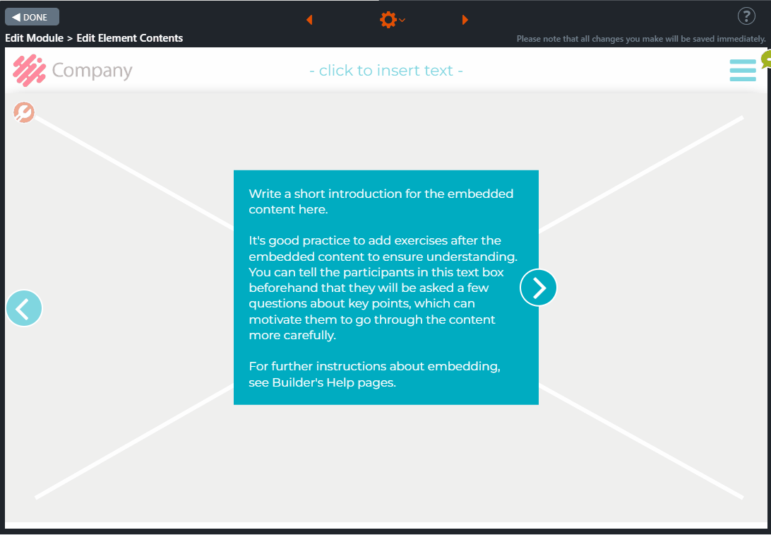
7.48 Fill-in Task
For example, this element can be used in the final test of a course when it is necessary to test how well the user has learned the module’s concepts, such as speed limits, safety distances, heights, lengths, and widths.
The element contains a series of questions (a maximum of 8 questions) that the user must answer by entering a value (number or text) in a white text box to the right of the question box.
Once the user has answered all the questions, a ”Next” button will appear on the right-hand side of the element. The user must click the button. To the left of the top question box, an answer text box with a comment and the correct value will appear. If the user has answered correctly, the row will be green. If the course participant has answered incorrectly, the row will appear in red.
A Next button is on the right side of the answer text box. When the course participant clicks the button, the answer text box will close, and the lower answer text box will appear. The course participant must repeat these steps until the last answer text box appears. When the course participant has reviewed the content of all the answer text boxes, the Next button will appear on the right-hand side of the element. Clicking this button will take the student to the next element.
Editing instructions
Start by adding a background image to the element. Then click Element Settings from the gear icon. Add the required number of items.
In the left text box, explain how the exercise works. On the right side of the element, starting from the left, enter the question, the correct answer (number or text) in the white box, and finally, the unit, for example, km/h, m, cm, etc.
Then click on the text field of the top question box. A text box with an arrow on the right side will appear. Type a comment and the correct value for the user.
Repeat these steps for each row.
Click the tool icon at the top left of the element, and then choose whether you want to allow only numbers or numbers and letters in the white box.
Note that in the white box:
- Commas and periods are considered to be the same character.
- If you only allow numbers, zeros after the decimal separator (comma/period) will be considered the same number, for example, “1.100” and “1.1”, and “1,100” and “1.1”.
- The answer must be correct if you allow characters and numbers, including the number of zeros after a period/comma.
The element in Published mode
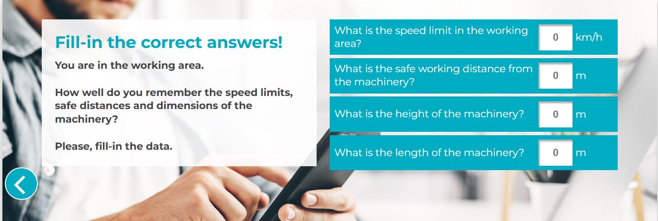
The user checks that the answers are correct
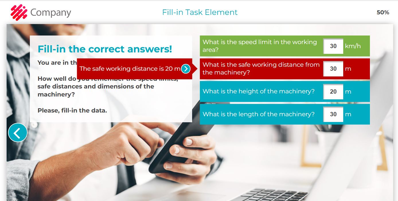
The element in Edit mode
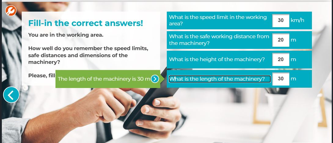
Do you want to allow only numbers or numbers and letters in the white boxes?
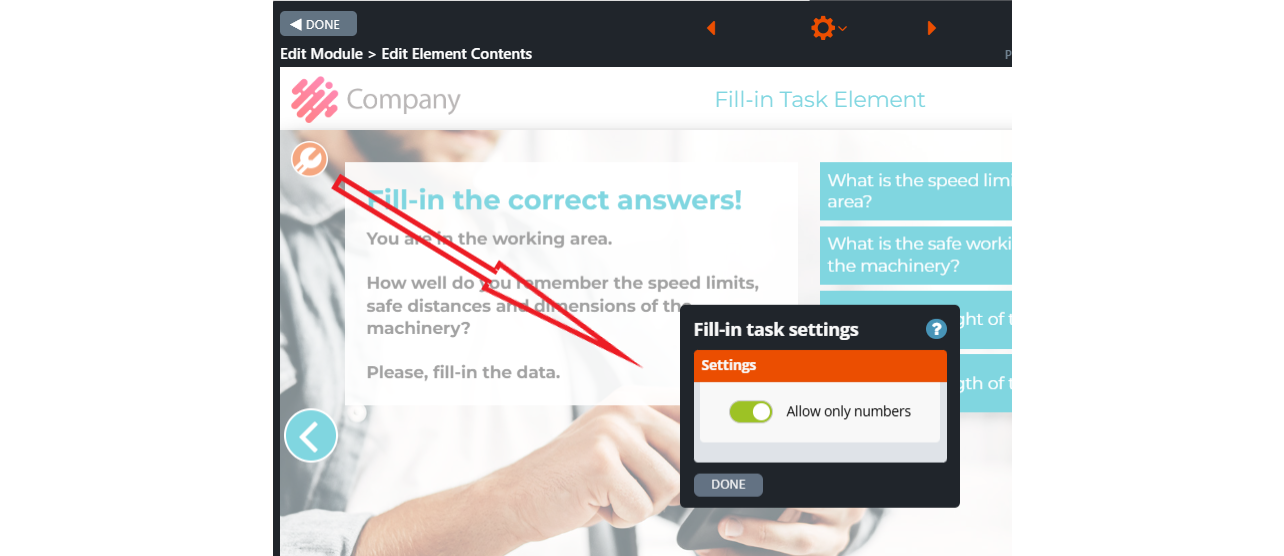
7.49 Phrases
Phrases is a task element in which the user drags buttons containing words in the correct order from the upper (initial) box to the lower one below it. A draggable button can include one or more words, and some buttons can be incorrect or not belong in the phrase.
After the user has transferred the necessary buttons to the lower box, s/he clicks the forward button on the right side to check whether s/he has entered the sentence correctly. The initial box is replaced by an answer box (red if the answer is wrong, green if it is correct), where the user receives feedback. The correct sentence appears in the lower box.
If the answers are 100% correct, the OK icon will appear. If the answer is incorrect, the Not OK icon will appear.
Here are some ideas on when to use this element:
- build the company’s mission or vision statement
- jobs that require exact phraseology, e.g. radio comms.
Editing instructions
Add a background image to the element that supports the topic at hand.
Click on Element Settings from the orange wheel icon at the top of the element’s edit view.
Add the necessary buttons in the Element Settings window. The buttons will appear on the right side of the element.
Give the buttons names in logical order, e.g. “A Code of Conduct“, “is a set of values“, “and principles“, “that guide“, “an organisation.”
If necessary, add incorrect items below the last correct one. For example, in this case, “A Code of behaviour “is a set of laws” and “that run“. In this example, the user should match the words that make up the following sentence: “A Code of Conduct is a set of values and principles that guide an organisation.”
Turn on the Shuffle function. If the function is not activated, the draggable buttons will appear in the same order in the initial box.
Click the move forward button. The green answer box will appear when you click it. Write the answer text here, providing more information about the correct phrase. The exact text will be visible also on the other red side.
In the left upper text box, give information about the phrase in question and the instructions for the participants, for example:
“Drag the buttons on the upper right to the box below in the correct order. Click the forward button when you are done to view the result.”
You can adjust the task difficulty by clicking the wrench tool icon at the top left corner. The Phrase element settings will then open.
If the option “Allow only the right number of words to be dragged” is activated in the Phrase element settings, the correct number of buttons will be displayed at the bottom right of the window. If the option is not selected, the move forward button will be displayed after moving the first button to the lower box.
Checking logic
The element calculates the percentage of correctness of the task (0-1, 1 = 100%). A percentage is entered in the statistics. The percentage is multiplied by the number of points assigned to the element to give the score obtained for the element.
The percentage is calculated by looking at three things:
- How many correct words the user has chosen
- How many incorrect words the user has chosen
- Whether the whole phrase is in the correct order.
The Normal option checking logic:
- If the whole phrase is correct, the task is 100% correct.
- If there are any errors in the answer (wrong order, too few or too many words chosen), the user is given 50% of the maximum points.
- From this 50%, a percentage is deducted for each wrong word dragged.
- From this 50%, each wrongly selected word is reduced by the percentage used to multiply the maximum score of the element.
- The proportional percentage for one wrong word is the same as for one right word, i.e. one wrong word reduces the same percentage as one correct word.
The element in Published mode
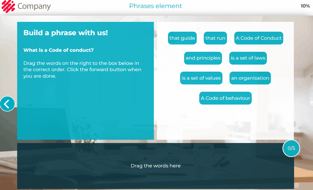
Element in Edit mode
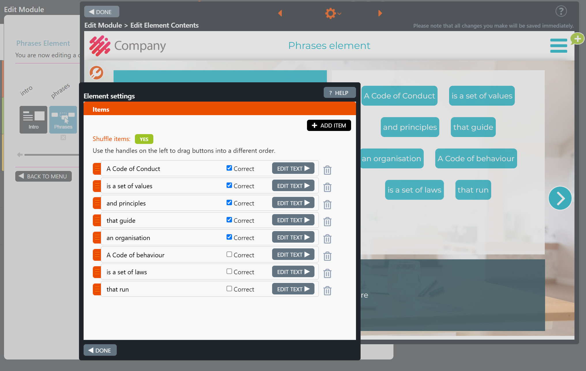
The element settings in Edit mode
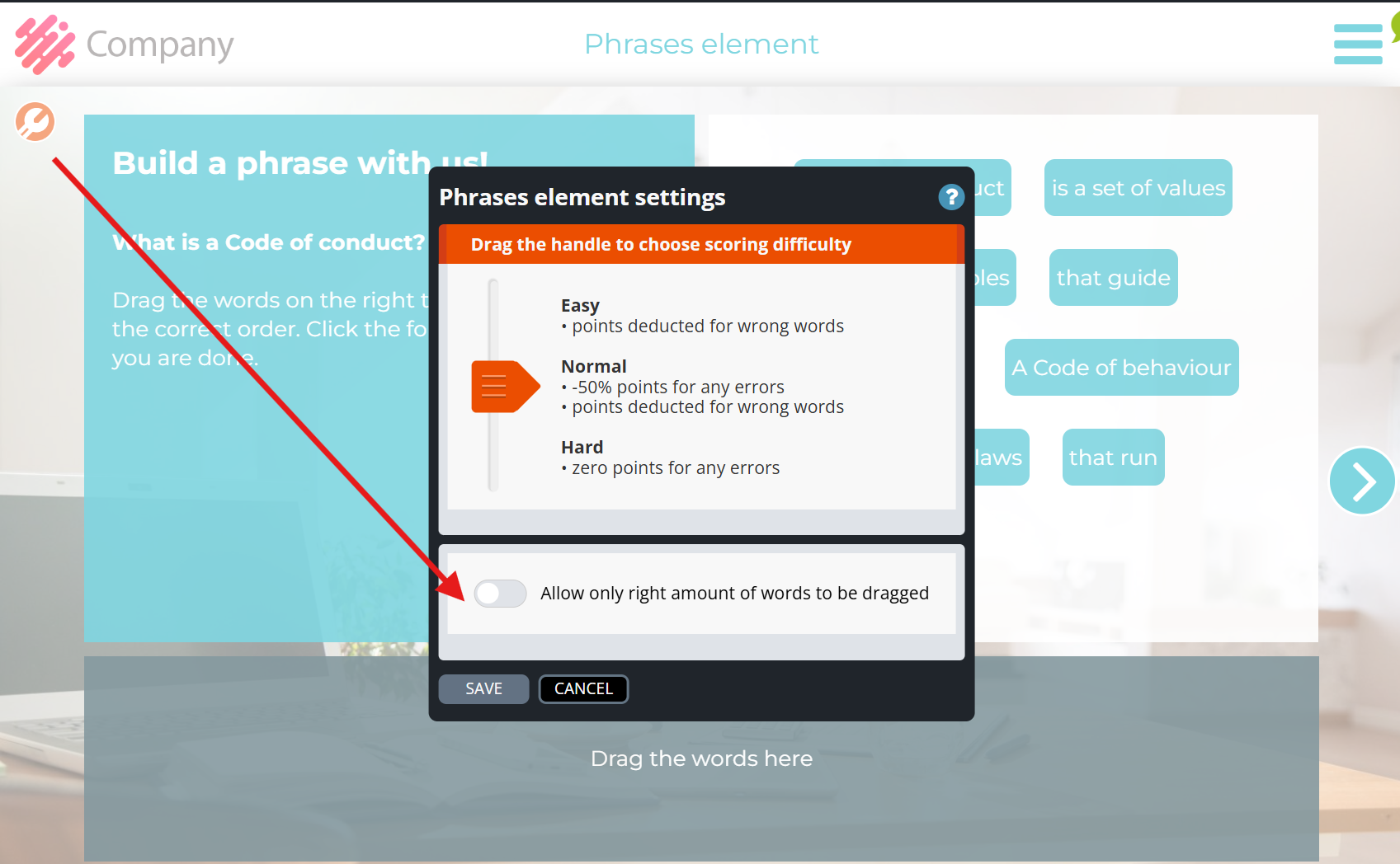
7.50 Comments
The Comments element allows the course facilitator to ask for open feedback and ideas from the course participants on the different topics covered during the training.
The course participant clicks on a chosen topic’s pen icon and writes their opinions, ideas, or feedback in the dropdown text box. After the participant has written their comment, the pen icon will be replaced by a Done icon to indicate that they have given their comment on that specific topic. Commenting on all topics is not mandatory. When the participant is ready, they can move to the next element by clicking the move forward arrow at the right side of the page.
Editing instructions
- Open the Comments element in Edit mode.
- If you wish to show an introduction at the beginning of this task, write the introduction and task instructions in the Introduction task box.
- You can also leave the Introduction task box empty. In this case, the box will not appear to the course participant.
- Add the background image by clicking the Change Image icon at the right side of the window.
- Click the Element settings option from the gear icon at the top in the Edit Element contents view.
- Add all needed task boxes and drag them to the desired places.
- Now edit one task box at a time:
- Select the colour and the shape.
- Choose the pointer position and its shape.
- Edit the content (if you haven’t already from the gear icon).
- Set additional Comments settings from the tool icon at the top left if needed.
-
- Hide text box (only show pencil icon): hide subject texts and only show round pencil icons. Note! With this setting, you can place pen icons on top of any background image, illustration, or slide screenshot to ask for written feedback on specific parts.
- Snap to grid: Move and resize subjects against the underlying grid. This feature makes it easier to arrange subjects together.
Note!
- The “Rate comments” element is suggested to be added after the Comments element so that other course participants can read and rate each other’s ideas.
- Course participants can give their opinions on a specific argument several times.
- The maximum number of characters allowed for any text box is 500.
- The module can contain one or more than one Comments element.
How are comments restored, and in which cases are they not restored?
Comments left by the participant can be edited while they are in the element. However, they will not be returned when the participant returns to the element; in this case, the participant will leave new comments. Previous comments will still appear in the Rate Comments element. Only the most recent comment left by the student on the topic will be shown in the statistics.
How does the course participant give the comments?
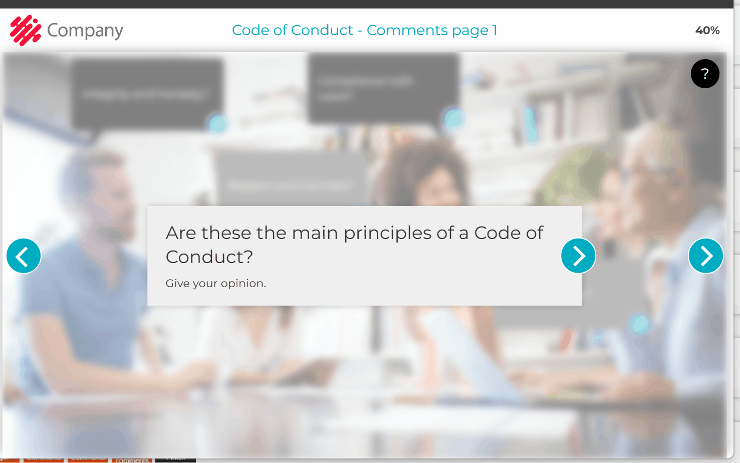
How to edit the task box?
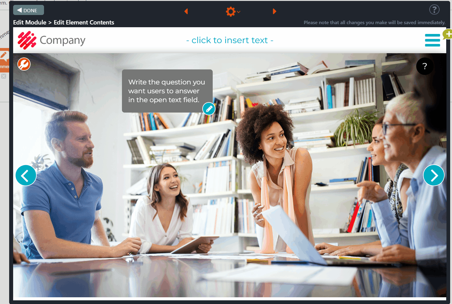
7.51 Rate Comments
The Rate Comments element is allocated after the Comments element. It displays the feedback and opinions the course participants inserted in the module’s Comments element(s).
Course participants can rate and view the comments and average ratings by clicking on the drop-down menu in the bar at the top of the page. After they click on the topic that they would like to rate, a pop-up window with five stars will open. Here, they can rate the comment.
Course participants can change the order of the comments by clicking on the right side of the bar.
By clicking the:
- Star – the comments are sorted from best rated to worst rated. (Default)
- Calendar – the comments are sorted from newest to oldest.
Note!
Topics are grouped by Comments elements in the drop-down menu. Therefore, it is advisable to name the Comments elements so that the topics displayed in the drop-down list clearly indicate to which Comments element they relate.
How does the participant view and rate the comments?
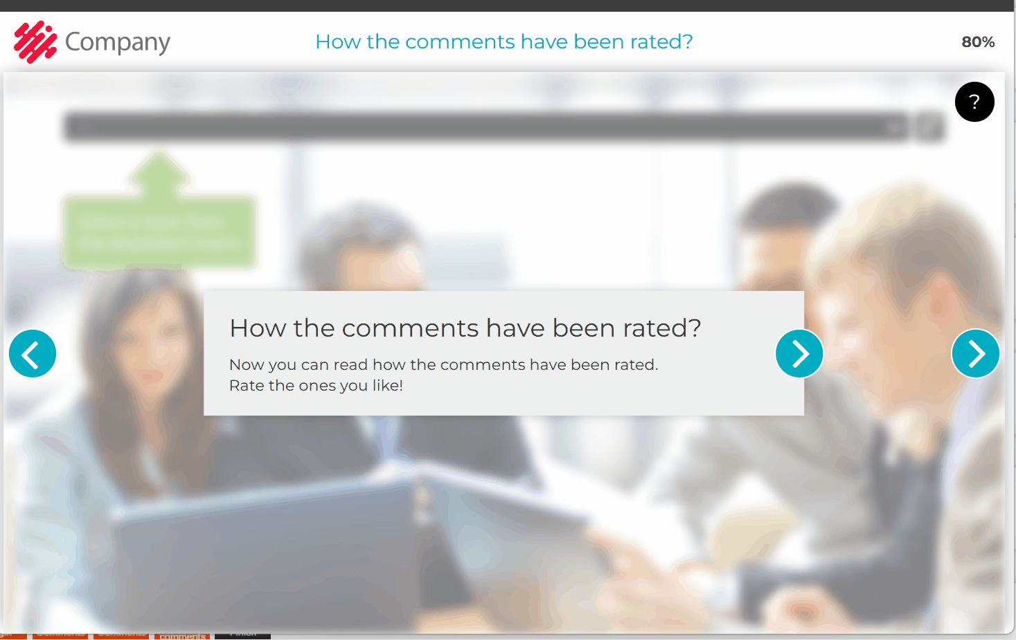
Remember to name the Comments elements!
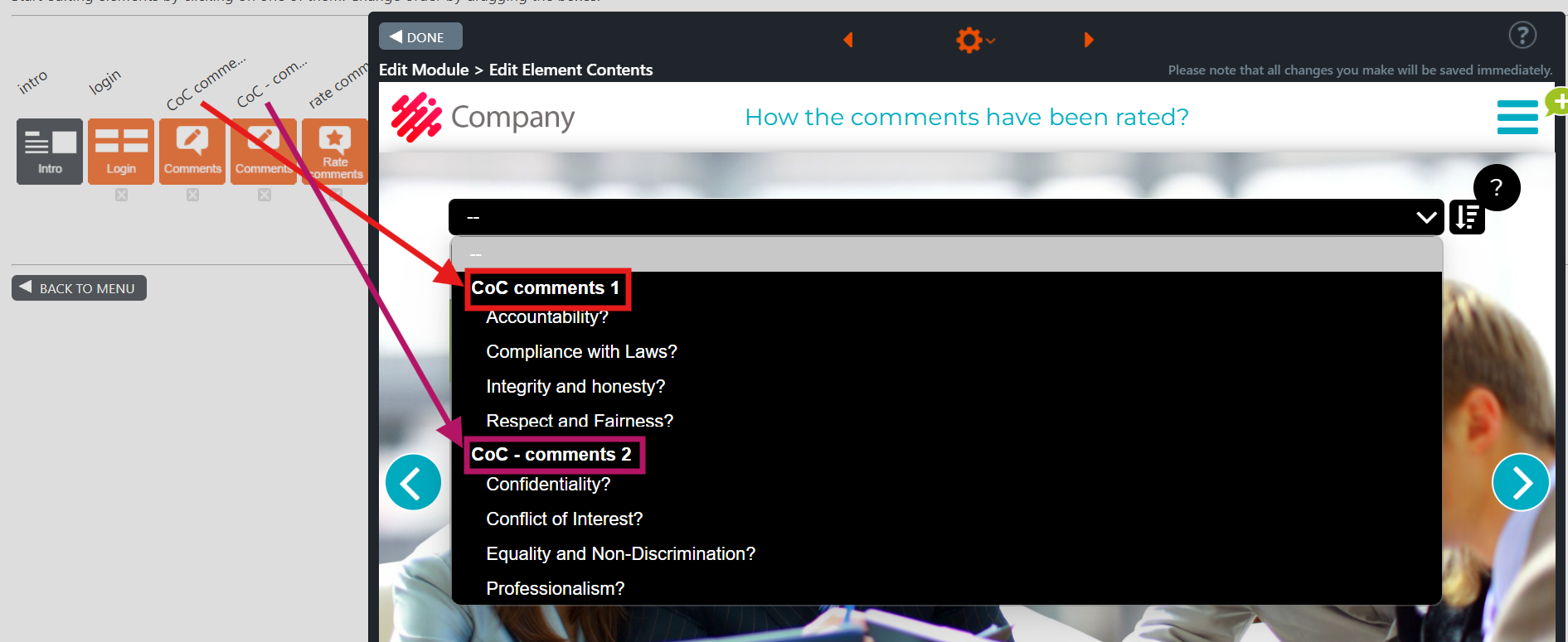
7.52 SCORM element and SCORM module type
You can use the SCORM element to embed content in a SCORM zip package file into a module. You can upload SCORM content as a zip file by editing the SCORM element and selecting the file from your device. The SCORM package can be your own or created by other parties.
Like any other element, the SCORM element can be used in a standard module type, but we recommend using only one SCORM element.
The difference between a SCORM module type and a standard module type is that you cannot add a non-SCORM element to the SCORM module type.
The intro and finish elements that appear in editing mode are not visible in preview and published modes for the SCORM module type. In other words, the trainee will see only the content of the SCORM zip package file when completing the course.
Note! If SCORM element uses a SCORM package created with Builder, the answers and points are recorded in the statistics of the course from which the SCORM package was created. For example, course A in Builder contains a SCORM element. The SCORM element includes a SCORM package created from course B in Builder. The answers and points given in course B inside the SCORM element, are recorded in the statistics of course B.
Editing Instructions
How do you create a module with the SCORM module type?
We recommend using only one SCORM element in a module that utilises the SCORM module type.
- Click the “Create” button on the left side of the page. The module type selection window will open.
- Select the “SCORM” module type and any desired template.
- Give the new SCORM module a name and click the Save button. The SCORM module is now created.
- Click “Add element.” Drag the SCORM element between the intro and finish elements to add it to the new module. Then click the Save button.
- Click the SCORM element. The element will open.
- Click the “Select file” button in the middle of the element. The “Open” window will open.
- Select the SCORM zip package file and click the “Open” button. You will then be notified if the file upload was successful. If the file upload is successful, the content of the SCORM file will be displayed in the SCORM element.
Note:
- In preview and publishing mode, the user is not shown the intro and finish elements of the SCORM module.
- Once the participant has completed the content of the SCORM element, the module will be marked as completed.
- You can add other elements if the selected module does not use the SCORM module type. If the module uses the SCORM module type, only the SCORM element is available in the list of elements.
- When previewing in preview mode a Builder training containing another Builder training embedded in a SCORM element, the embedded Builder training is also previewed in preview mode
Operation and information security of SCORM packages created in Apprix Builder
Generally, the latest completion data is sent when the user navigates to a different module page. When the user navigates to the final page (which, in practice, is usually the finish element), the course is marked as completed for the current completion. In addition, when a SCORM package is used and the user navigates to the final page, the system, such as an LMS, embedding the Builder course, is notified via the SCORM interface that the course has been completed.
When using a standard SCORM package (also referred to as an Online SCORM package), the content necessary for the course and the code required for the general operation of the Builder courses (including navigation) are loaded from the Builder domain. In addition, the package includes other files needed for the course at the moment of the creation of the package, like the uploaded files used in Builder course and the customer-specific code and its required files. When using a standard SCORM package, completion data is sent to Builder and Apprix statistics.
When using an offline SCORM package, all the data (including content), code, and other required files are included within the package. The offline SCORM package makes requests to the Apprix domain only to send completion data to Apprix statistics, not to Builder.
Requests made to Apprix domain use the HTTPS protocol to fetch and send data securely.
For further information about the SCORM, please check the Builder’s FAQ.
Zip/ SCORM files: https://faq.apprix.fi/en/
How do you create a module with the SCORM module type?
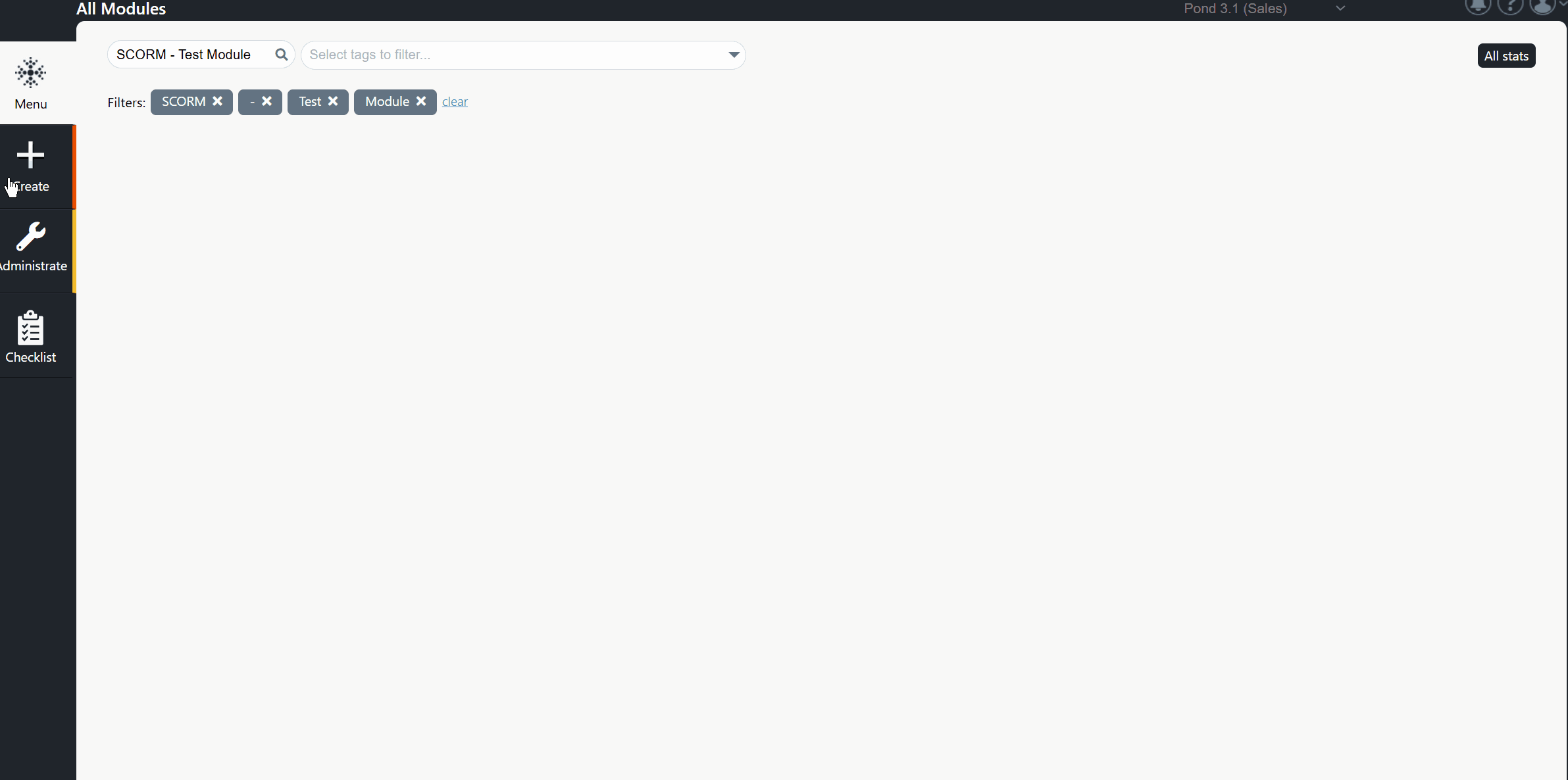
7.53 Checkbox Survey
Checkbox Survey is a survey element. It is particularly effective when multiple questions share the same response options. This element allows the user to evaluate several different topics. There are no correct answers—the idea is to gather opinions and evaluations.
A pop-up bar with a question/affirmation is displayed. The user clicks on one of the check icons to answer the given question. All the bars will appear on the screen, one at a time. A summary will be shown if available after the user has responded to all questions.
Note! The selected options will be stored in the statistics.
Tip! It’s best to start with a positive mindset when introducing a course topic that may face resistance to change. Encourage trainees to assess how the key aspects of the shift could enhance their daily work. By initiating the discussion, participants will consider the potential benefits as the change is introduced.
When using this element?
When a course participant is asked to provide a detailed opinion on specific topics.
Below are some everyday use cases when using three to five options:
- Satisfaction (from “Very dissatisfied” to “Very satisfied”)
- Likelihood (from “Very unlikely” to “Very likely”)
- Level of concern (“Unconcerned” to “Concerned”)
- Agreement (“Strongly disagree” to “Strongly agree”)
- Frequency (“Never” to “Always”)
- Awareness (“Very unaware” to “Very aware”)
- Familiarity (“Very unfamiliar” to “Very familiar”)
- Quality (“Very poor” to “Adequate” to “Very good”)
- Importance (“Unimportant” to “Important”)
Editing Instructions
- Write the survey’s title and question/scenario. If necessary, add a summary in the lower text box.
- Click the Element settings option from the gear icon at the top of the Edit Element Contents view. In the window, add and edit your survey questions/statements. New check icons will appear on the right side of the element.
- Click the wrench icon at the top left of the element. The Checkbox survey settings window opens. In this window, set the number of options the trainee must select (max 5). The chosen number of columns will appear on the right side of the element.
- Write the options in the text boxes on top of each column, for example: Quality “Poor – Adequate – Good – Very good”.
- Click a check button in each row. The text bar will open. If necessary, edit the statement/question.
- Click the Question mark icon on the right of each row. A text box will open. Add additional information for the question row here. Remove unnecessary text, and the question mark will not be shown to the trainee.
How does the Checkbox Survey element work?
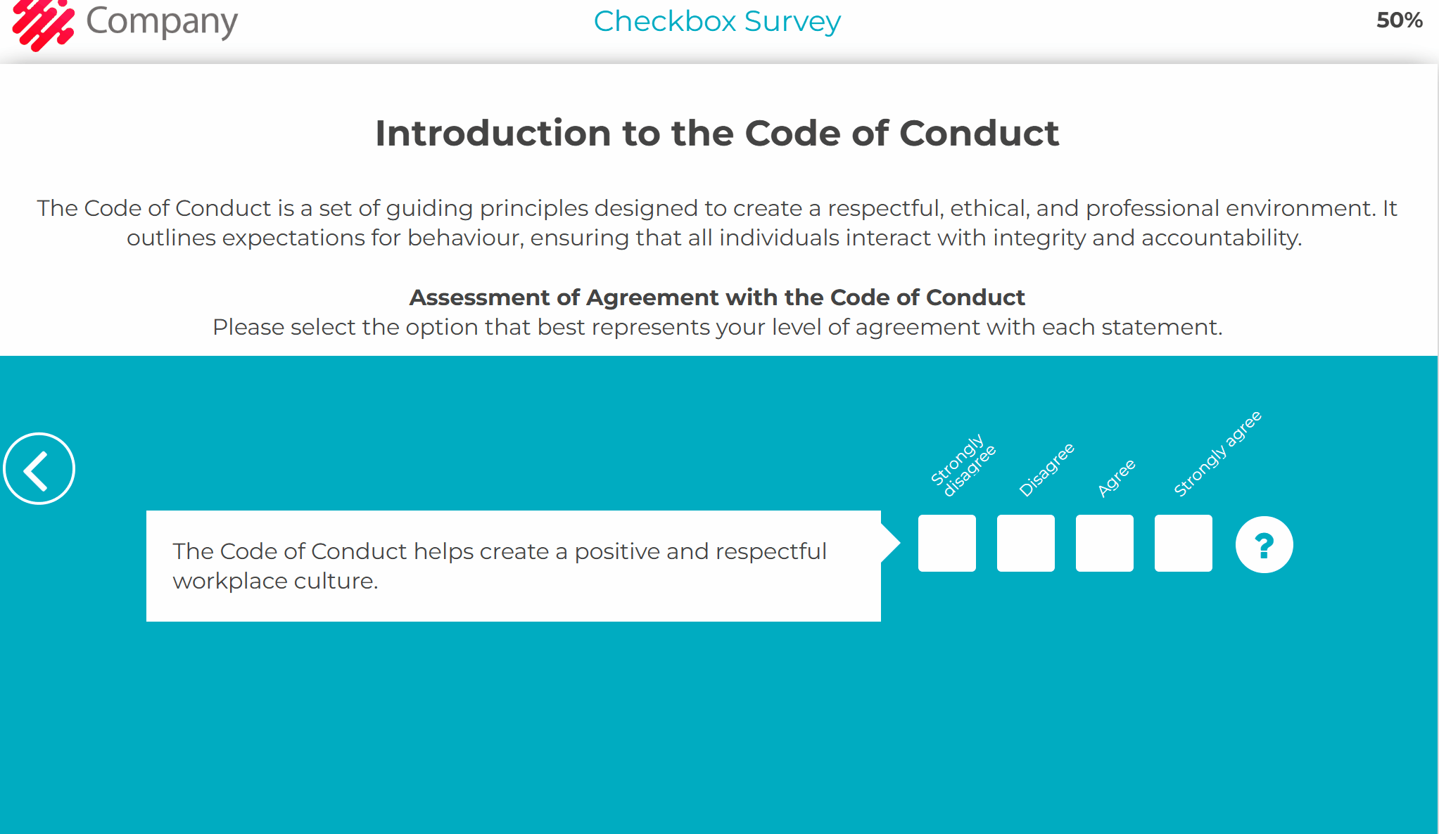
How to start editing the element?
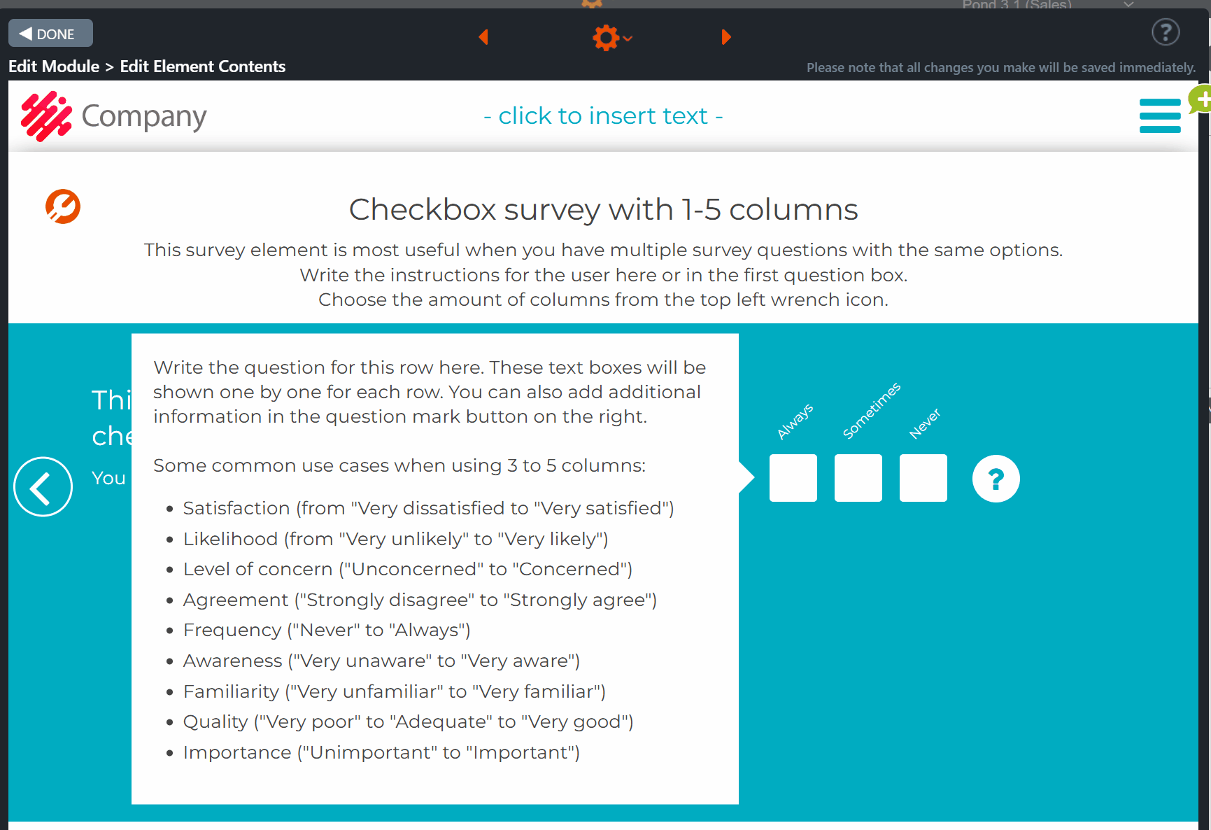
How do you complete it?
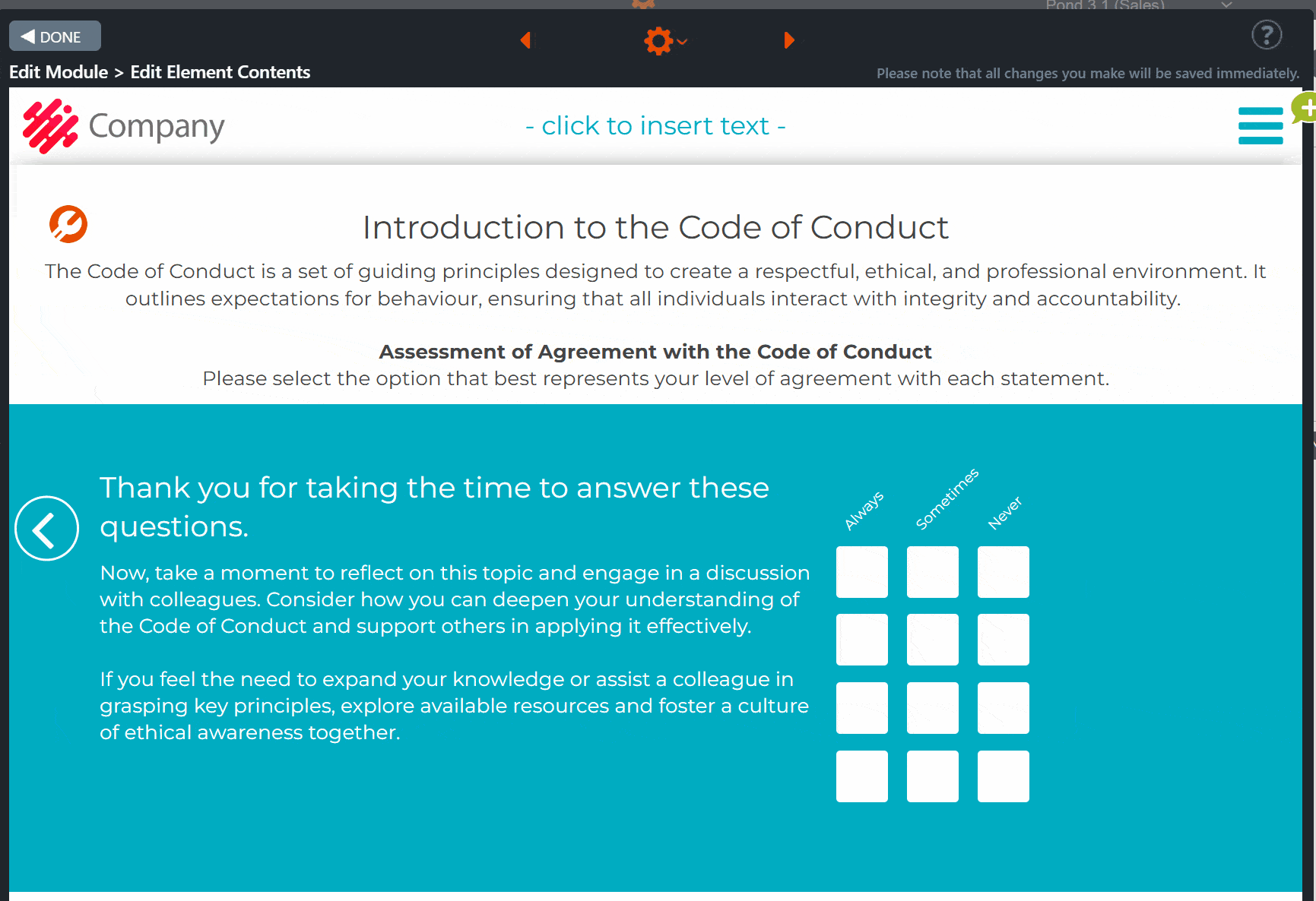
7.54 Form
The Form element is a powerful tool designed to help you easily and reliably gather specific information from the course participants within your e-learning content.
The most common use is to gather additional information not provided by the authentication method or details required only in a specific module. It includes ready-made, validated fields such as First name, Last name, Phone number, Date, Email, EU Business ID / VAT ID, and Finnish tax number. You can also add check boxes, select menus, or create custom fields without validation.
Editing Instructions
When you open the Form element, a pop-up window will appear. In it, you can set the element title and an introduction. If no introduction is required, delete the text to bypass the box.
Note! If the pop-up window contains text, it can be reopened at any time by clicking the question mark located at the top left side of the element.
In the middle of the element, a text box is displayed. Use the text box to add supplementary instructions, or remove the text if unnecessary. Add the background image to the element.
Access the “Element Settings” via the gear icon at the top of the element to define the number of items included in the Form. Available fields are, for example, First name, Last name, Phone number, Date, Email, EU Business ID / VAT ID, and Finnish tax number. The specified items will be displayed in the Form.
How to edit the items in the Form text box:
- Open Row Settings
- Click the tool icon in the upper row.
- The Row options pop-up window will open, where you can adjust the row settings.
- Select Field Type
- From the menu, click the arrow to choose a field type.
- For example, select First Name.
- An ID keyword suggestion pop‑up window will appear.
- Configure ID Keyword
- Click the suggested first_name field.
- The pop-up window will close, and the message “Field configured for participant identification” will appear in the Row options.
- Set Mandatory Field
- Check the Mandatory box if required.
- When selected, an asterisk (*) will appear at the end of the heading (e.g., First Name*).
- Edit Validation Message
- Hover over the upper tool icon.
- A text box will appear (in English by default) informing participants to check that no extra characters are entered in the First Name field.
- Change the language of the text box if needed.
- Repeat for Other Fields
- Follow the same steps for all additional items.
Note the following:
- The ID keyword suggestion pop-up window appears only when you choose the “First Name”, “Last Name” or “Email” options.
- Remember to include a link to a privacy policy when needed, if it was not already provided during the authentication phase.
Field Validation
- All standard field types in the select menu include format validation.
- When you edit the heading text, the validation message will appear for editing.
- Error messages should always be applied for field format validation. If no text is entered, the default English error message will be displayed.
- If you prefer, you can use the Custom field, which does not include validation.
Field ID
- The Field ID is used as the column heading in statistics.
- It can also be applied for features and integrations.
ID Keywords
- ID Keywords are reserved for special cases, such as collecting participant emails.
- These can be used with features like reminders.
- Any authentication method you enable for the module will override these keywords.
Form element – an example
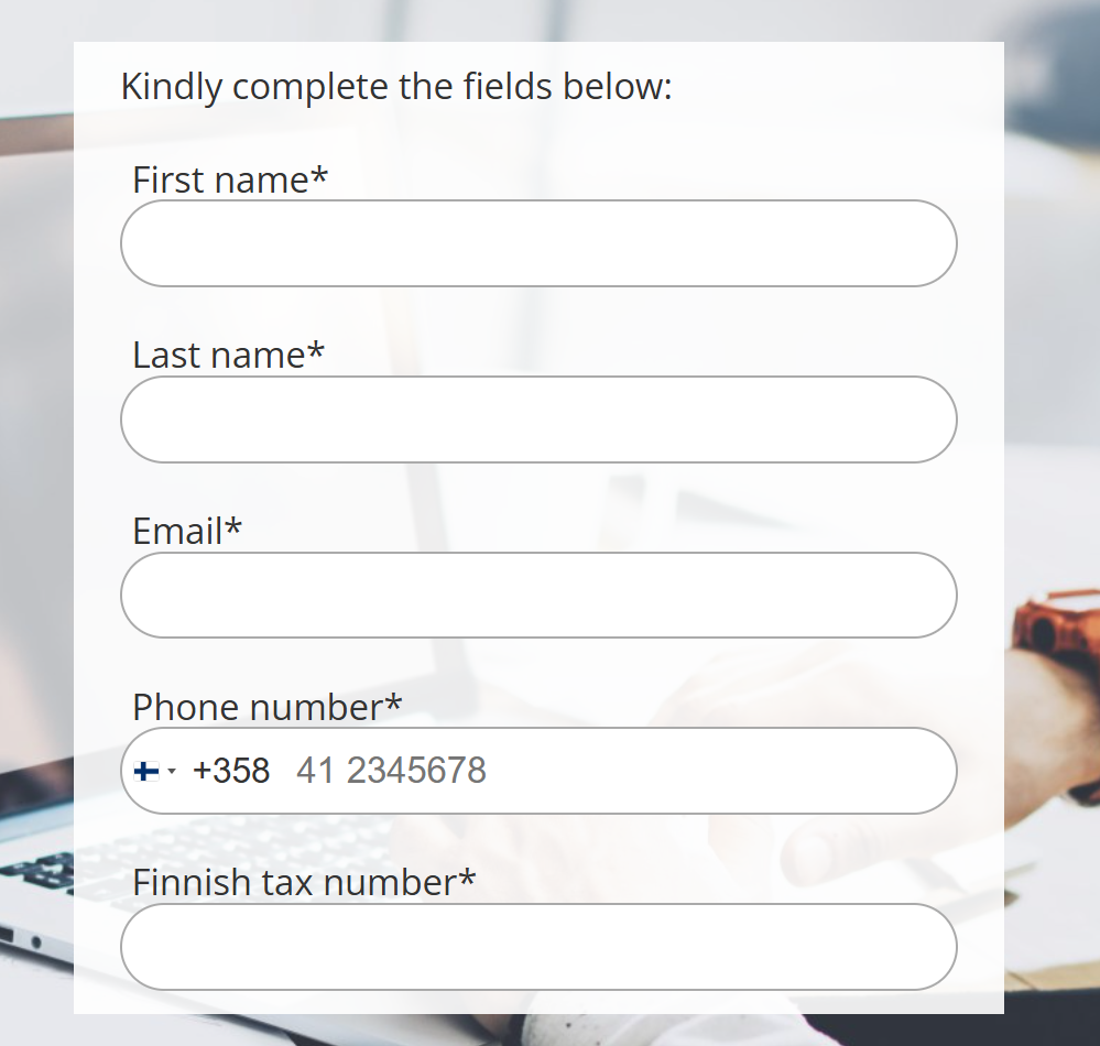
Row options – Choose a field type
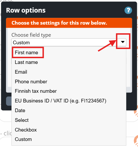
How to start editing the element? Case field type: “First Name”
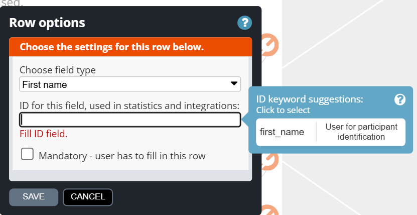
Editing the Form
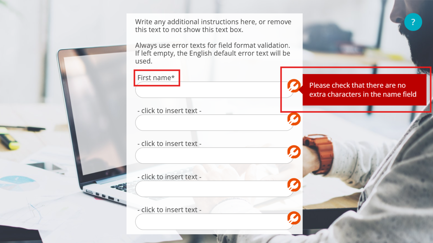
8 Additional Features
The deployment and operational costs of the following features are to be agreed upon on a customer-by-customer basis. Please inquire further about these features from your Apprix contact/Account manager.
The module settings menu in the Edit Module window is designed to make it easy for you to check which settings are on or off and which authentication method is in use in the module.
How does that settings menu work?
- The menu opens by clicking on the gear icon and closes when you click outside the menu or the gear icon again
- “Edit tags…”, “Edit points…”, “Change template…” options are at the top, and “About this module…” at the bottom. In between you can find all other customer-specific features.
- “Hide this module”, an upcoming new feature, and “Audit module” are the only modules that can be activated/deactivated directly in the menu by clicking them.
Customer Specific Features
Customer-specific features are activated in the settings menu.
Here is a possible content of the settings menu:
- Edit Tags
- Edit Points
- Change template
- Change module editor…
- User Authentication
- Audit Module
- Nagging ( previously “Participants and Reminders”)
- Expiration Settings
- Start new / Browse…
- About this module
Click on the images to enlarge them.
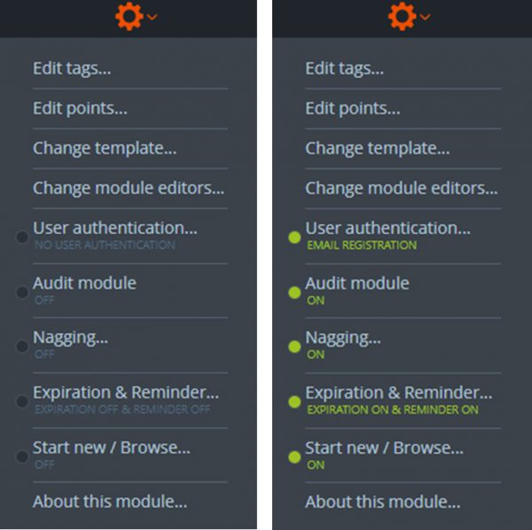
8.2 User Authentication
Below, you may find the user authentication methods for identifying course participants (trainees) that have already been implemented to be integrated with Builder.
If you wish to inquire about a possible implementation in your organization’s Builder client environment, please contact your Apprix contact/Account manager.
In the User Authentication settings you can choose the module’s authentication method.
Below a list of possible authentication methods:
No user authentication
- Allows the trainee to enter in the course without logging in with any of Builder’s login methods.
- Anyone with the link can access the module.
- Most often used when the module contains a login element inside it, or when the module can be done anonymously and does not contain sensitive information.
Email registration (previously “Personal passwords”)
- Allows the trainee to register to Builder and create a username and password.
- The same username and password can be used for all modules (with Email registration option switched on) after registration.
- Requires the trainee to use a valid and unique email address (or phone, if enabled).
- Most often used for external trainees and blue collar employees.
MyCourses LMS Sign-On
- Allows access to the module from Apprix MyCourses LMS.
- Requires the trainee to log in to MyCourses first with the allowed login methods configured for your organization.
- Used when the module is placed inside MyCourses as a course’s language module.
Sympa ID check
- Users must enter their Sympa ID, Local ID, first name and last name.
- IDs must be found in the system, and names must match the IDs’ information.
Flexim tag reader
- Trainees can log in using their Flexim tag on a tag reader.
- If a Flexim tag reader isn’t available, trainees can choose to log in using their employee ID, first name and last name.
- If using employee ID, it must be found in the system and the names must match the ID’s information.
Single Sign-On (SSO)
- Allow trainees to automatically log in with their company credentials.
- Requires the participants to have credentials in your internal system (e.g. Active Directory, Google Workspace).
- Most often used for internal (white collar) employees.
Tax number check (vero.fi)
- Trainees enter their tax number, first name, last name and birth date.
- Tax number must be found in the Finnish public tax number register. Please note that not all Finnish tax numbers are in the register – they must be added to the public register by the person or their employer.
- The first name, last name and birthdate must match the tax number’s information. Middle names are allowed instead of first names, and three typos are also allowed in the names.
- Used when the company requires workers’ tax numbers in the public register.
IP Guard
- Allows access only if the trainee is entering from a specific IP range.
- Most often used when a VPN is in use in your organization, to allow access only if trainees are logged in to the VPN first.
- In some cases also used to restrict access only to a specific location, e.g. a factory or office building. Please refer to your Builder instructions if this is the case.
- In some cases also used to identify whether or not to direct the user to Single Sign-On. Please refer to your Builder instructions if this is the case.
Click on the images to enlarge them.
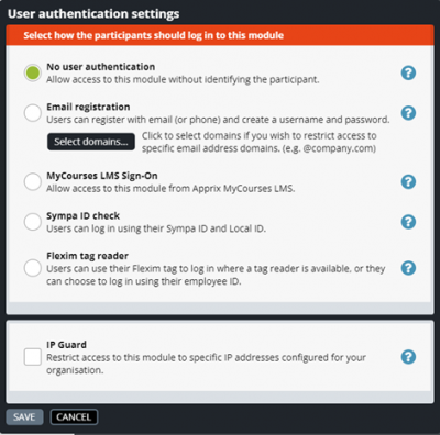
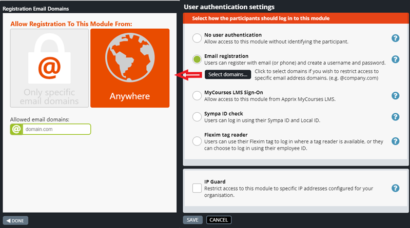
8.2.1 Email Registration 2.0
Email Registration 2.0 is an authentication mechanism that allows course participants to register with Builder and create a username and password. Once the course participants are registered, the same username and password can be used in all modules where email registration is enabled. Course participants must use a valid and unique email address (or mobile phone number) if the feature is enabled.
Login form
The login form is the first page a course participant sees when starting a course. The course participant fills in the email address and clicks the Next button. The system now checks whether the account exists or not.
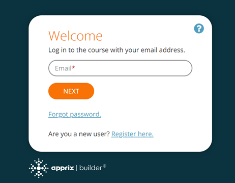
1. If the account does not yet exist
If no account exists when the registration form opens, the course participant can enter their details (first name, surname and password) and click the Register button.
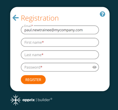
Note! The course participant's email address, phone number and login ID must be unique.
Available characters for the login are:
- Latin letters in both cases
- numbers
- characters -._@.
Depending on the tenant settings, the password's strength should be medium or strong.
Medium strength means that the password must contain the following:
- at least eight characters
- uppercase Latin letters
- lowercase Latin letters
A strong password, in addition, requires at least one character from this set:
!"#$%&'()*+,./:;<=>?@[]-^_`~
Note! Before registering, the course participant must confirm their email address or phone number with a PIN code.
A new pop-up window opens after the course participant clicks the Register button. It asks the student if they want to receive the PIN code by email or phone. Once they have chosen one of the two options, they will receive a PIN code, which they must enter into the form. They can then start the course.
Note! Course participants must authenticate within 10 minutes.
Pin-code verification
PIN-code verification can be done using the user's email or phone number.
The code contains six numbers generated randomly and stored within the user's session for 5 minutes. Within this time range, the code will not change. The user will receive the same code every time by clicking the Resend button until it expires. After that, the system will generate a new code. Please note that the previous code will not be valid anymore.
The input for number is the regular input field and supports all common text-editing features such as copying, pasting, editing, deleting, etc. When the user inputs six numbers, the verification process will automatically start.
2) If an account exists but the course participant has forgotten their password
The course participant clicks on the Forgot password link. A pop-up window will appear to recover the account. The course participant fills in their email address and clicks the Send PIN Code button. Once the PIN code has been sent to the email address, the course participant enters the code in a new pop-up window. A new password window will open, and the course participant can change their password here. Once the password has been changed, the course will open.
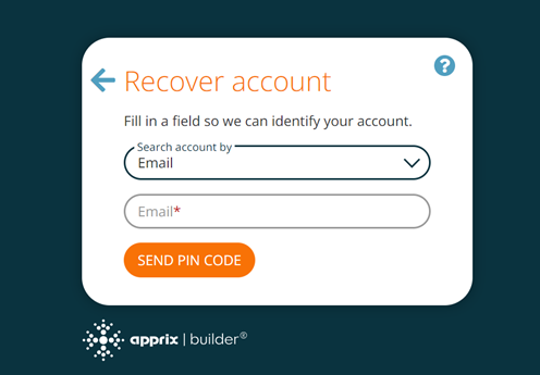
3) The course participant is registered and remembers their password.
The course participant enters an email address on the registration form and then clicks on the Next button. A new window opens. Here, the participant enters a password and clicks the Continue button. The course can now start.
Security Protection
The system has an internal firewall to detect and prevent suspicious user activity. The firewall used by Apprix includes several layers of protection.
8.2.2 Email One-Time PIN (OTP)
This login (authentication) method eliminates the need for course participants to remember passwords. Instead, they simply enter their basic information (first name, last name, and email address) in the Welcome window each time they start the course.
Activating the “Email One-Time PIN (OTP)” Authentication method
- Open the module in Edit mode.
- From the settings (gear) icon at the top of the module, choose User Authentication…. The User Authentication & Access dropdown menu will open.
- Select Email One-Time PIN (OTP). The chosen option will now appear in the gear icon dropdown menu.
How it works
- The course participants fills the basic data (email, first name, last name) in the Welcome window and then clicks the Send PIN code button. A PIN code is automatically generated by the Authentication platform.
- The PIN code is sent to the participant via email.
- The participant pastes the PIN code into the authentication pop‑up window.
- The course is ready to start.
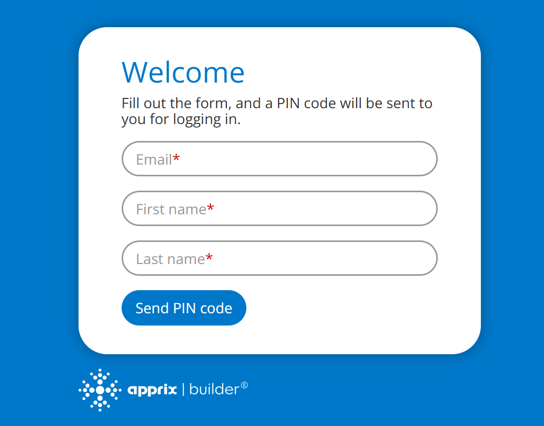
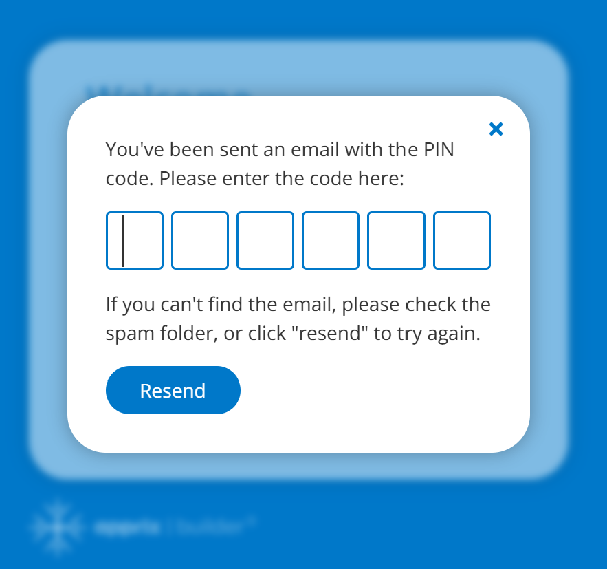
Important notes
- A new, unique PIN code is sent with each login attempt.
- The code must be entered within 10 minutes of receipt.
- The user does not need to complete traditional registration.
- This method preserves the login across other OTP-enabled modules during the same session.
- It is especially recommended for external course participants and operational staff.
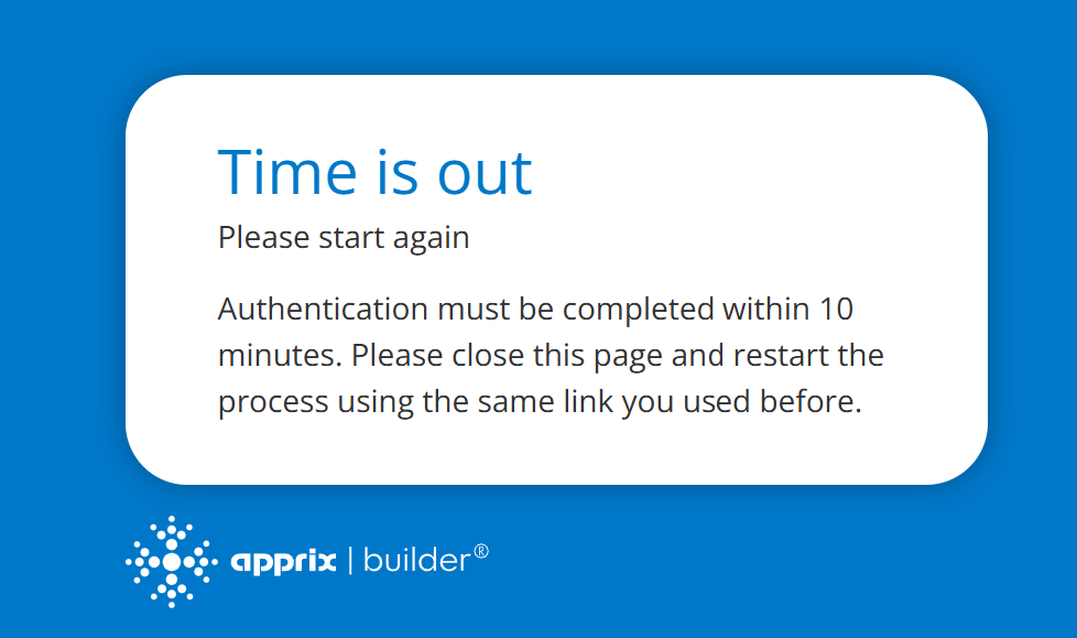
Course participants must authenticate within 10 minutes.
8.3 Audit Module
An Audit Module (Audit Trail) is a chronological set of records that provide documentary evidence of the activities occurred at any time in a module.
You can activate the Audit Module option by clicking the module’s gear icon and by selecting Audit Module. If you need to disable the Audit trail, please select the option Set
- If you wish to activate Audit Module: Click the module’s gear icon in Edit Module view and by selecting Audit Module.
- If you need to disable Audit Trail: please select the option Module Audit Off from the module’s gear icon again. When Audit Module is switched off, a pop up window informing this will appear.
- To view the recorded history of a module, please select About this module from the module’s gear icon in Edit Module view or from the Last modified… link on top of modules in Menu view.
- If the Audit Module option is switched on, the About Module pop-up window is displayed
- If the Audit Module is switched off, a pop-up window is displayed informing that the module auditing has not been enabled.
- Please note that it is possible also to export the collected data in PDF, CSV, and Excel format.
In the picture on the right side, you can see that the updates done to module’s texts and images are collected in the Module Change History.
User’s Permissions Settings
There are three types of user’s permissions:
- In this case, the user will be able to activate or deactivate all modules Audit Module / Set Module Audit Off parameters
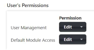
- Also in this case, the user will be able to activate or deactivate all modules Audit Module / Set Module Audit Off parameters.
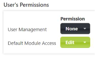
- In this case, the user is the owner of Module ABCD New. The user will be able to activate or deactivate only his/her module’s Audit Module / Set Module Audit Off parameters.
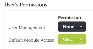
On the right side, you can see an example of the Module ABCDE change history.
- row: the module has been created by user Apprix Test2
- row: the Audit Trail functionality has been activated by the same user
- row: the hotspot element has been added to the module
- row: the info full background element has been added to the module
- row: the info full background element has changed the position (from 1 to 2)
- row: the hotspot element has changed the position (from 1 to 3)
- row: the Finish element has changed the position (from 2 to 4).
Tracked information
Below is a detailed list of what kind of information is tracked when Audit Trail is active:
- Element’s edited content (e.g. text, pictures, videos)
- Added, deleted and arranged elements
- Renamed element’s and/or module’s title
- Disabled/enabled personal password
- Published/unpublished modules
- Duplicated modules
Please, remember to reload Builder’s page so that the Administrate -> Client -> Features -> Audit / Full on Publishing (to display archived files also incremental to be on) setting is enabled.
Click on the images to enlarge them.
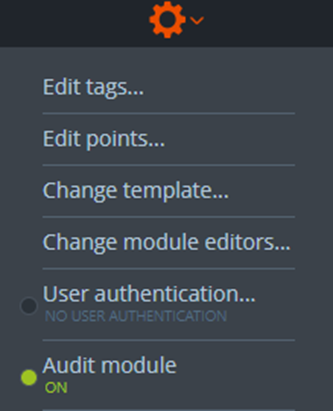
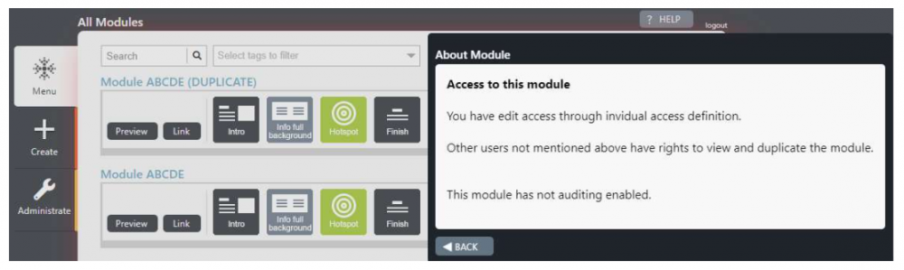
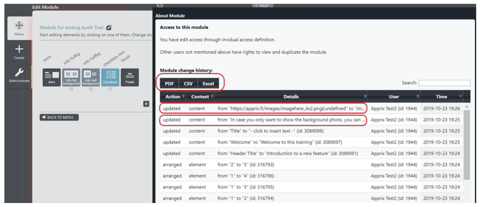
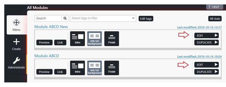
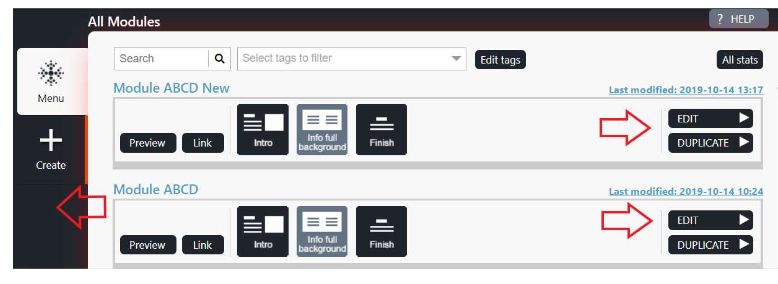
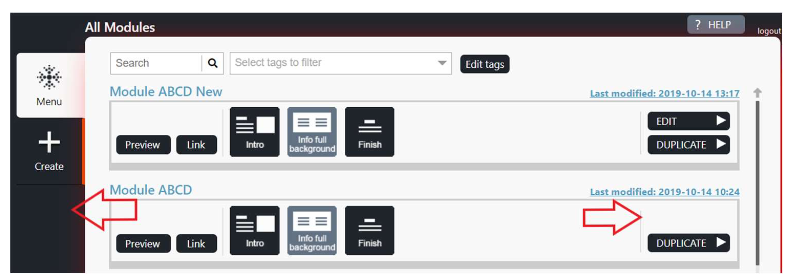
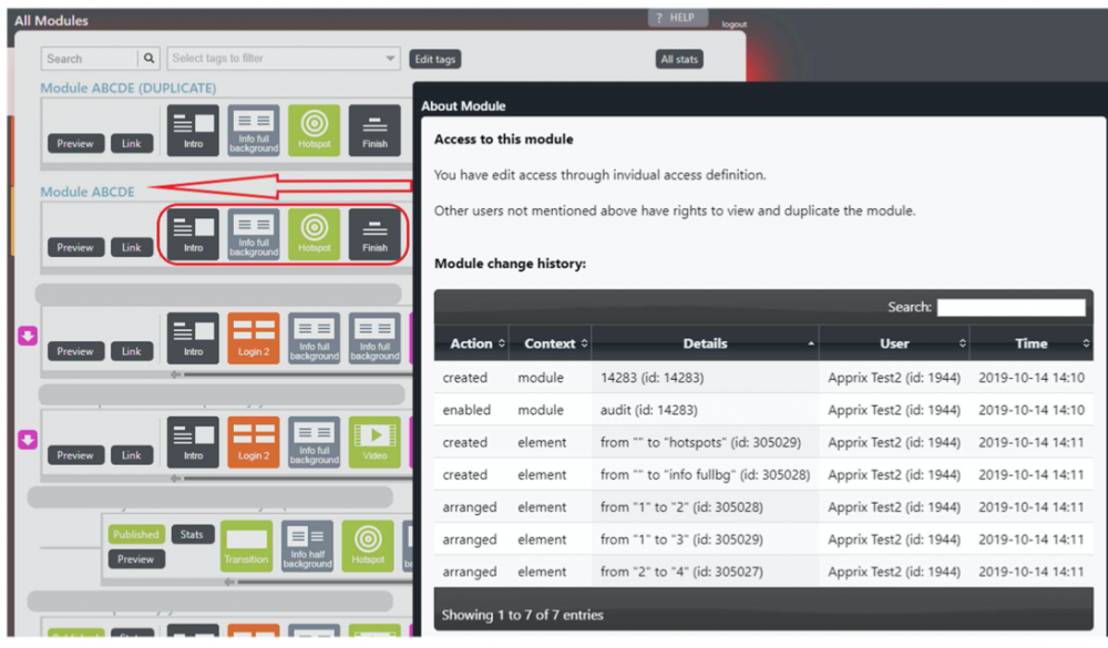
8.4 Nagging
Purpose of the Feature
With the Nagging feature (previously called “Participants and reminders”), you can invite people to complete an online course and remind those who still have unfinished courses that should have been completed already. Invitations can be sent manually or automatically, depending on the settings. The feature requires the email address of the person being invited.
Accessing the Feature
- The feature is available while editing modules.
- Click the gear icon of the module and select the option “Nagging…”.
- When the automatic reminder feature is enabled, the menu item displays the text “ON”.
Important Requirement: The module must be published before reminders can be sent.
Main Dialogue Overview
The Participants & Reminders dialogue consists of three main sections:
- Buttons to edit the participants list
- List of participants
- Buttons to send reminders manually or automatically
Adding Participants
- Click the “Add…” button.
- Enter one or more email addresses in the form.
- Each email address must be placed on a separate line.
Removing participants
- Select a row in the participants table.
- Click the “Delete…” button.
- To select multiple rows, use Shift+click or Ctrl+click.
Sending Invitations Manually
- Select one or more email addresses from the participants table.
- Click “Send reminders manually…”.
- A pop-up window appears: “Send Reminders To Selected Participants By Email”.
- Fill in the subject and body of the reminder.
- You can use placeholders that will be automatically replaced when the email is sent:
- ‘module‘ (inside the curly braces) will be replaced with the name of the module
- ‘link‘ (inside the curly braces) will be replaced with the link to the module.
- When the reminder text is ready, click “Send to … participants.
After sending
- The “Reminders Sent” column increases by 1.
- The “Last Reminder” column updates with the new date.
Sending Invitations Automatically
The process of inviting participants can be automated.
- Click “Automatic Reminder settings…” to open the settings window.
- Check the box “Use automated email reminders” to enable automatic invitations.
- Configure the following options:
- Frequency of reminders (how often they are sent)
- Maximum number of reminders per user
- Subject and body of the reminder email
- Click “Save” when the settings are ready.
After saving
- The “Reminders Sent” column increases by 1.
- The “Last Reminder” column updates with the new date.
Behaviour of Automatic Invitations
- All participants receive the same invitation email until they complete the module, or they reach the maximum number of reminders set.
- You can pause invitations for specific participants:
- Select one or more rows in the participants table.
- Click “Pause / Unpause…”.
Examples in the Participants Table
Look at the image on the right:
- teppo.testinen@apprix.fi → received 2 invitations, completed the module. No further invitations will be sent.
- jane.doe@gmail.com → received 3 invitations, not completed. May receive more depending on the maximum number set.
- erkki.esimerkki@gmail.com → received 2 invitations, then paused. Will not receive new invitations until unpaused.
- jack.testing@gmail.com has received 3 reminders, last reminder on the 09.11.2025
Additional information on automatic settings
Participants Table
- When automatic invitations are enabled, each new participant added to the table receives their first invitation immediately.
- The next invitation is scheduled according to the period set in the Reminder Settings dialogue.
- If a participant completes the module, no further invitations are sent.
- Paused participants do not receive invitations until unpaused.
Sending Period
- Increasing the period: all invitations are postponed accordingly.
- Decreasing the period: some participants may receive new invitations immediately, depending on the Last Reminder date.
Maximum Number of Invitations
- Increasing the maximum: participants who previously reached the limit may receive new invitations, depending on the Last Reminder date.
- Decreasing the maximum: participants stop receiving new invitations once they reach the new limit.
Nagging + Expiration features
If the Nagging and Expiration features are enabled at the same time:
- The Nagging feature can be used to remind the employee of an incomplete online course or to invite them to take the course.
- When the Expiration feature is enabled, the course performance expires after a specified time.
- If Expiration reminders are also enabled, a reminder will be sent to those who have a course that is about to expire.
- When the performance expires, Nagging reminders can be sent to the employee again.
Click the images to enlarge them
Sending invitations manually
Sending invitations automatically
The three main sections of the Participants & Reminders dialogue
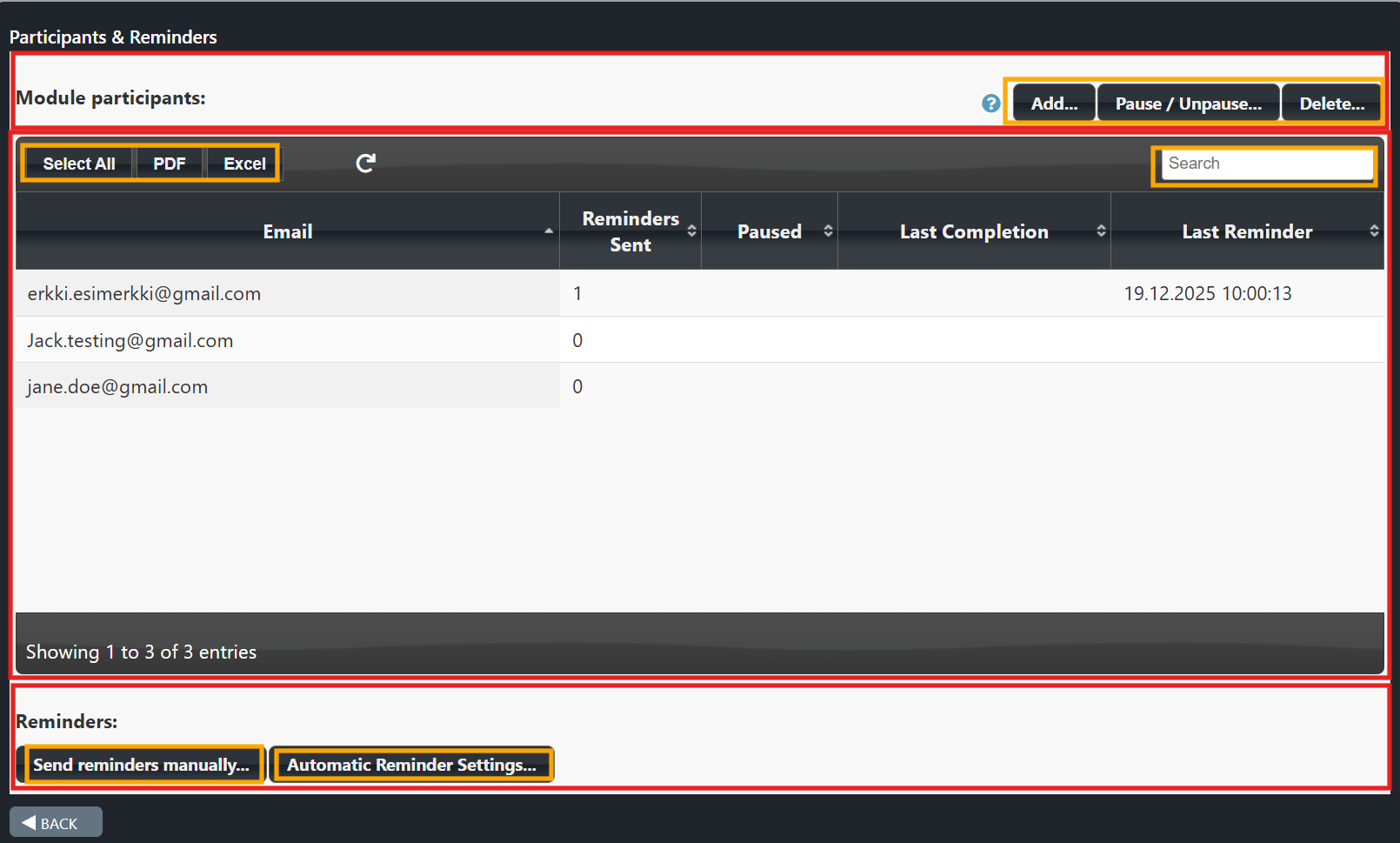
Examples in the Participants Table
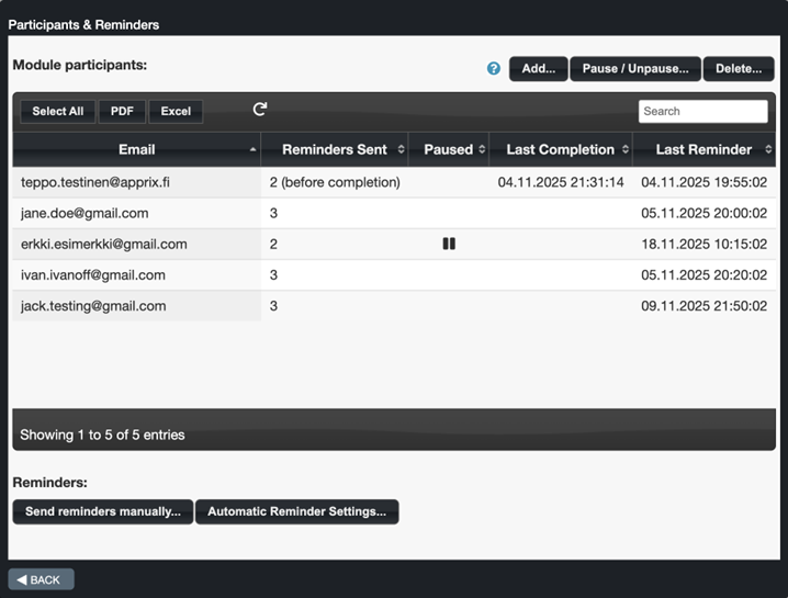
8.5 Expiration and Reminder
This feature informs, for example, an organization's staff and subcontractors that a course must be completed again after a certain period (e.g., Safety training once a year).
Expiration settings can only be enabled if trainees' information (e.g. email address, phone number, ID) are available. This information can be collected with the SSO, Email Registration or Tax Number Check identification methods.
Note!
The Expiration textbox is shown at the beginning of the course. Once the user has been authenticated (e.g. using one of the following authentication methods: Email Registration, SSO, Tax number Check), it contains a list of the user's previous course completions.
The Expiration feature has limited functionality with the Login element because the user is only identified in the Login element. Therefore, it is not possible to display a list of the user's course completions at the beginning of the course. However, the user will be reminded of an expiring course when the Reminder feature of the Expiration tool is enabled, and the course is authenticated with the Login element.
Expiration and Reminder Settings Window
From the gear icon at the top of the Edit Module view, choose "Expiration & Reminder".
Once the "Expiration & Reminder" option is selected, the Expiration and reminder settings window is opened.
From the left half of the window, you may enable the Expiration message. The Expiration message appears at the beginning of the course in the Intro element to remind the trainee about how long the course completion is valid for. The user can also enable the email Reminder feature from the tick box on the right half of the window if the Expiration & Reminder tick box is also activated.
Note! When the Remind user tick box is deselected, the settings will not be visible.
Expiration Settings (Left Half of the Window)
In the Expiration settings on the left side of the settings window, you may edit the content of the text boxes and set how long the course completion is valid for in days, weeks, or months. The content of the textboxes will be shown to the trainee at the beginning of the course, in the Intro element. If the trainee has already completed the course the lower textbox will be included in the message.
Earlier course completion dates are shown as in format "yyyy-mm-dd". If the training item is not valid anymore the date will be crossed out. The format of the text can be edited in the textboxes.
Reminder Message Before Course Expires Settings (Right Half of the Window)
If you need to send a reminder message to the trainees before their earlier course expires, this feature can be enabled by clicking the Reminder tick box at the top left of the settings window. The reminder can be set in days, weeks, or months. The time is calculated in days from the moment when the trainee's course validity period will expire.
E.g. The course was successfully completed on 16.09.2020, trainee's course validity period is set to 12 months and the reminder is set to be sent 1 month before the expiration date. The trainee will receive the reminder message on 16.08.2021.
The upper text box is for the email subject, the middle text box is for the email content. Tags (module name, module link, expiration day and company name) can also be used in the email message and these will be replaced with the corresponding content in the email. The format of the text can be edited in the text boxes. At the bottom, there is a field that can be used for sending test emails.
Note! Tags are inserted inside curly brackets
Available tags:
- module name =
- module link =
- expiration date =
- company name =
Note! In case the Reminder feature is integrated with company's HR system, reminders may be sent directly to the HR system. The trainees will receive the Reminder message via their internal communication channels.
How Does This Feature Work From a Trainee's Perspective?
When a trainee starts a course that has a validity period, a message will appear in the Intro element. The message contains the information entered in the feature settings (e.g. expiration time and reminder date).
- If the trainee:
- has not yet started the course, the course will start from the beginning
- did not complete the course, they can continue from where they left off earlier
- has already completed the course, they may start a completely new course which will be valid until the expiration period has elapsed.
- If there are previously completed courses, their dates will be shown in the message.
- The trainee will get a reminder message before their earlier course completion expires.
Note!
- When a module is duplicated, the Expiration and reminder settings are also copied to the new module.
- Reminders can be turned on or off a module-by-module basis.
Click on the images to enlarge them.
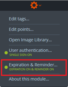
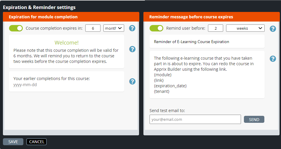
Expiration textbox: The course participant did not previously complete the course.
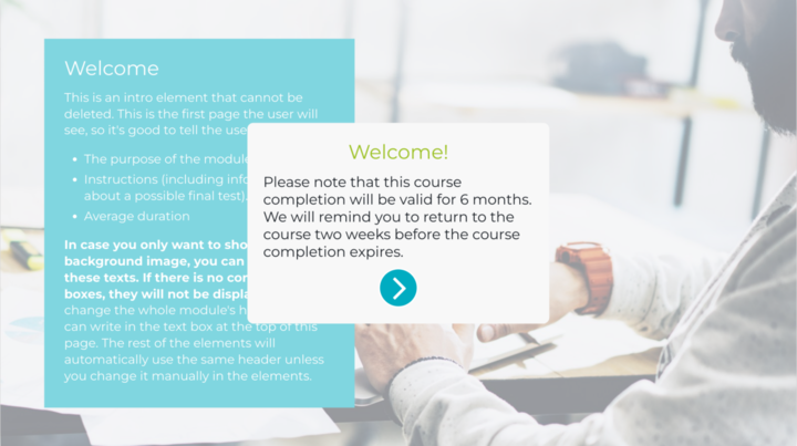
Expiration textbox: The course participant has completed the course twice. The first has expired, and the second is still valid.
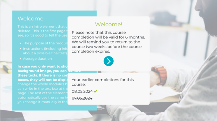
What is the difference between ”Expiration & Reminder” and ”Nagging”?
”Expiration & Reminders” and ”Nagging” are two separate functionalities. Their reminders work separately and are not related. The differences between the two functionalities are described below.
EXPIRATION & REMINDER
Reminders are ONLY sent to participants who have completed the training.
(Finished = 1)
The “login_method” field will be available in the module statistics once this feature is activated. This is the trigger that will send the reminder email to the participants, that have previously completed the training.
Below a list of “login_method that could be available in the module:
- SSO (login_method: sso)
- Consumer Login (login_method: cl)
- Login Element (login_method: login_element)
Please, check the login_method from the module statistics, when this feature is activated!
NAGGING
Reminders are sent to participants:
- who have not completed the training yet (Finished = 0).
- whose email addresses are on both the ”Participants and Reminders” email list and the statistics.
- whose email addresses are in the email list, but not in the statistics.
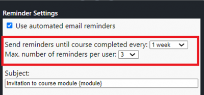
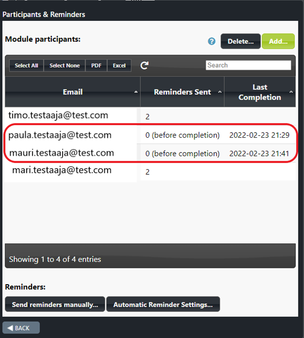
See the image above:
If all four participants are selected
- Paula and Mauri will not receive the reminder because they have already completed the training (Finished = 1 / “Last completion field” has a date).
- Timo and Mari will receive the reminder(s) because they have not started or finished the training (“Last completion” field is empty).
Note! If all four participants are selected and then “Send Reminder manually” is clicked, then Builder will display an error message, since the reminder is only meant for Timo and Mari (their “Last Completion” fields are empty)
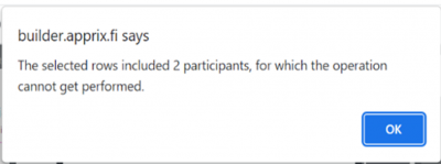
Note! Select “Automatic Reminder Settings” only with participants that have an empty “Last Completion” field.
8.6 Start New/ Browse
Start new / Browse functionality allows the end-user to complete or browse an already completed online course.
At the beginning of the course, by selecting the option “Browse course contents”, the end user can browse the course without entering any data in the statistics. By clicking the “Browse – click to skip” button the end-user can move forward in the course without doing the exercises or answering the questions.
Note! “Browse course content” option is displayed when the end-user has a completed and valid course. In this case, the end-user can also alternatively choose to start a new session by pressing the “START COURSE” button.
If the user:
- has not previously started the course, they will be able to complete the course without the “Browse course content” option, by choosing “START COURSE”-button
- has an incomplete session, they can continue the course by selecting the “CONTINUE” button
- has completed the course, they can start a new course by choosing the ”START COURSE”- option or they can browse the course content by choosing the “Browse course content” – option.
- has an incomplete session and a previously completed course, which has not expired, they can continue the incomplete session on the same statistics row by pressing the “CONTINUE” button or can browse the course by pressing the “Browse course content” button without entering any data in the statistics.
If the “Expiration settings” feature is used at the same time, a “Welcome” message will appear at the beginning of the training, stating when the course has been completed and whether it is still valid. If the course is no longer valid because it has expired, the “Browse course” option is not available and the completion info is overwritten.
How to use Start new / Browse feature
The Start new / Browse functionality requires end-user authentication before starting the online course (e.g., Consumer Login, SSO, Tax ID, or the end-user can enter via MyCourses).
When an identified end-user enters the module, they will be shown a modal on top of the Intro element. If the Expiration-functionality message is used, it is displayed at the same time.
Once enabled, Start new / Browse functionality can be found in the gear icon menu at the top of the Edit Module view. The functionality is activated on a module basis. Button texts can also be edited on a module basis.
Where can I see that the Start New / Browse feature is activated?
Click the button, and let’s start the course!

Didn’t you finish the course? No problem; click the Continue button.

Once you have completed the course, you can browse the content again! Great.

You can always add a reminder! Easy and convenient!
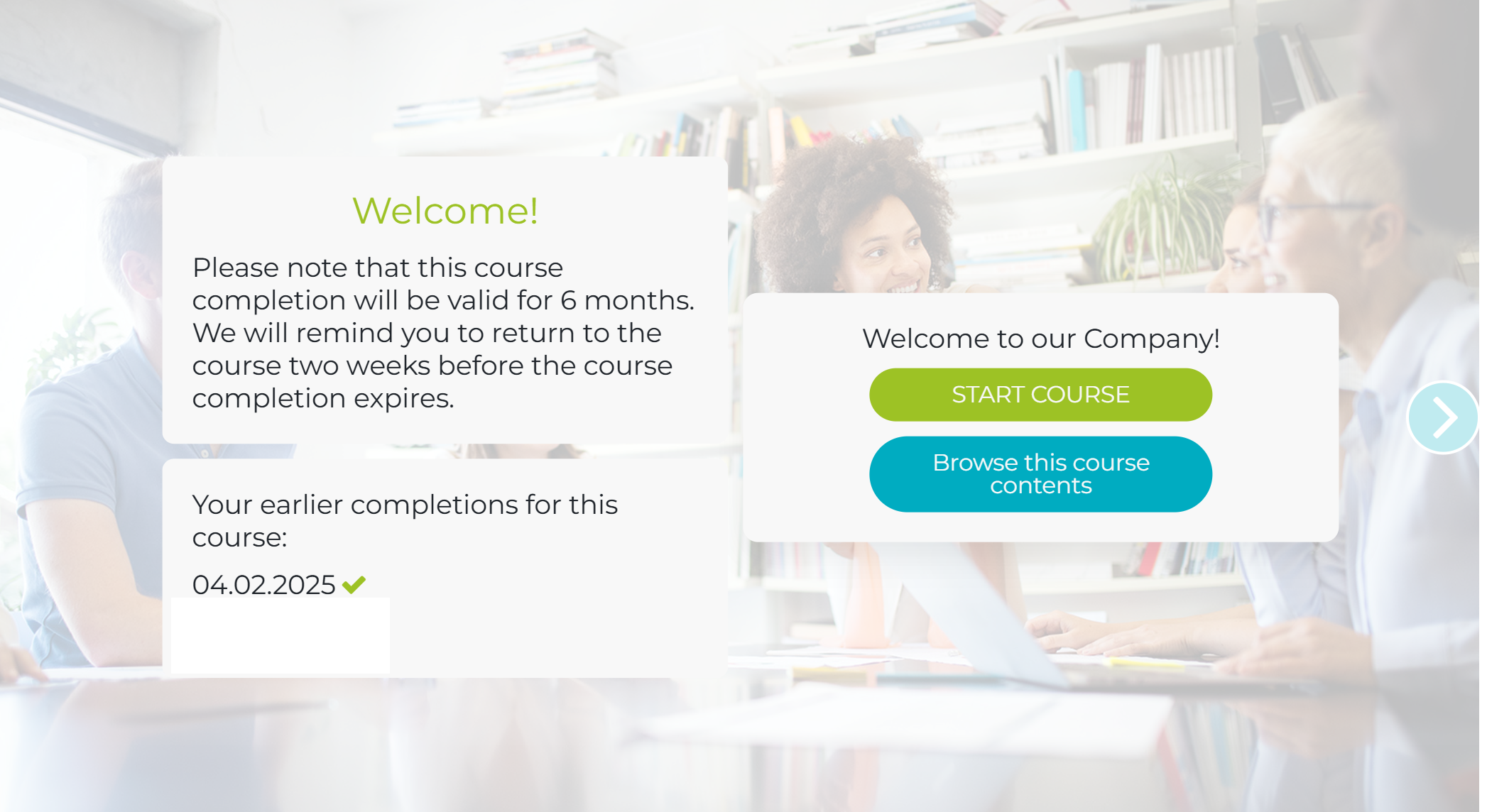
Easy settings!
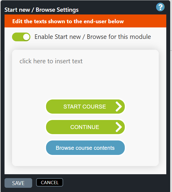
8.7 About This Module
In the About This Module pop-up window you can find the module’s creator, created and last modified dates, tag(s) and access.
If the Audit Module – feature is activated the About Module – view will show also the module change history.
Click on the images/videos to enlarge them.
How does the “About This Module” pop-up window work?
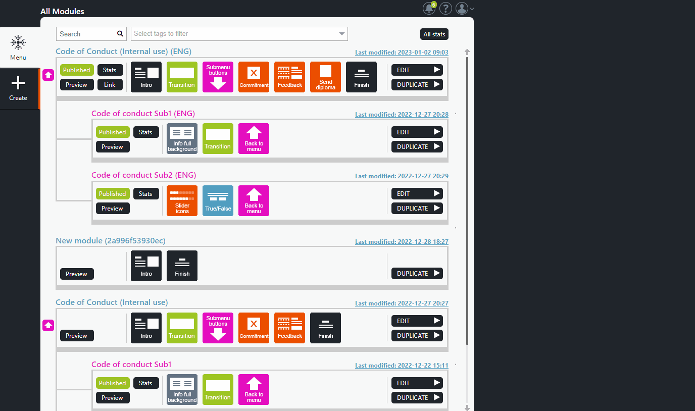
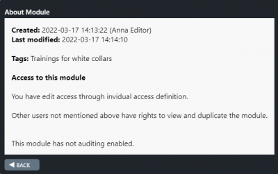
8.8 Extended Reports
The users’ access settings assigned in the Administrate tool located in the sidebar in Menu view determine what kind of reports the user has access to. Builder users with different levels of access may have access to different module’s (training courses) reports. Additionally, reports can be customized for specific purposes.
Access for viewing can be granted separately, e.g. for a manager to view his/her employees’ progress. Reports may also be extended to third parties and customized in a way that they can only view a separately defined content.
- A user with Builder administrator rights in your organization should first create the user in the Administrate tool, if not already done before, and activate the Extended Report by selecting the On option.
- From the Settings… option (see the Extended Report Settings pop-up window below) the administrator can choose which companies, modules, columns (e.g. date, score, user info) and date range the user can view.
- From the Modify list… option at the top of the window, the Administrator can add/remove companies from the COMPANY list.
- Please note that all updates are automatically saved!
-
Once the
Extended report
parameters have been activated by the Administrator, the user can activate the Report tool by clicking the Report option on the left side of the window.
- Now, the user can select the Filter option (on the top left side of the window), which allows to choose which data will be displayed in the report (e.g. companies, modules, data range).
- In the Report view, the user can also search data, choose which fields to view (Column visibility option) or export the data in CSV/Excel formats.
Note! Only published modules data is available in the report.
Access rights to the Extended Report are granted in Administrate → Users tool.
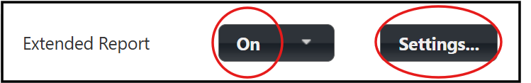
The Reports button will appear once the Access Rights for Extended Reports are granted.

In Extended Report Settings, viewing rights can be granted and customised per user via the Administrate menu, for example, to supervisors and third parties.
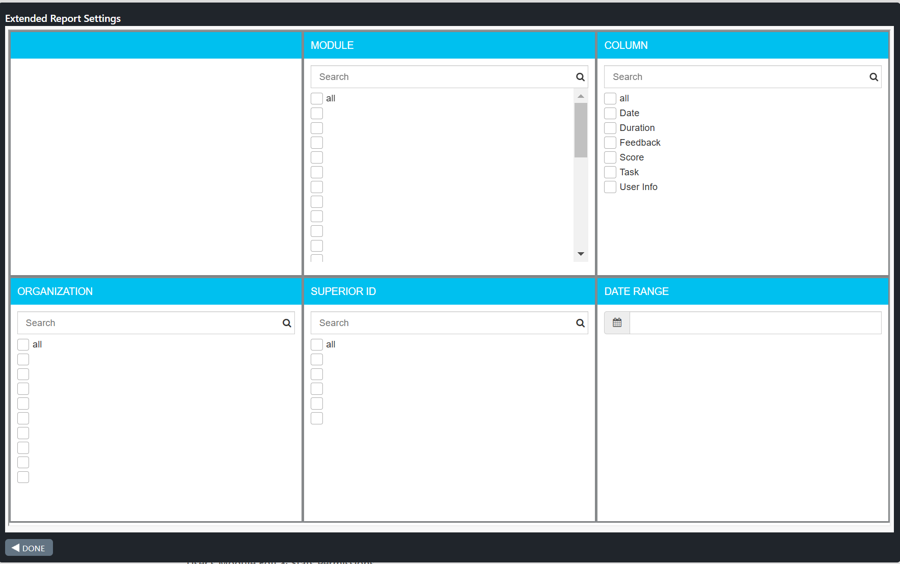
The user can use the Filter function to filter the report performance data. In the Reports view, the user can search for specific data, select which fields are displayed and download the data in CSV or Excel file format.
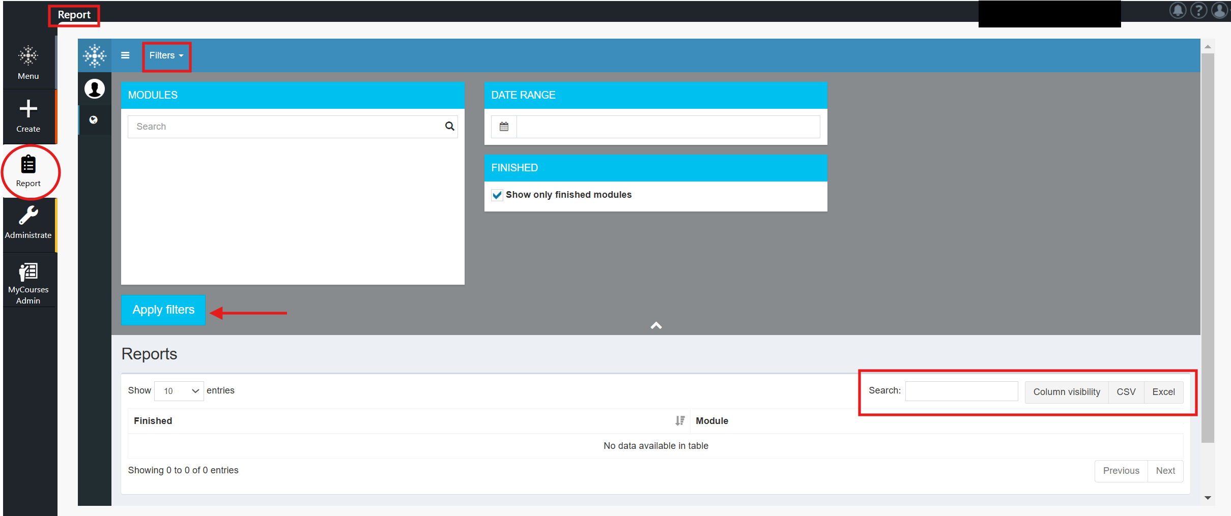
8.9 Drafting Feature
Drafting feature distinguishes the published module from a new draft version.
- It enables you to edit a draft version of a published module so that the original published module can still be used in its original format while you are making changes. The end users will not see any updates in the published version until you decide to publish the new draft version.
- If changes to the module are to be traced, the Audit Module feature should be activated in the module. This is done by selecting the Audit Module option from the module gear icon on the top of the window in the Edit Module view.
- Once the Audit Module is activated and the module is published, a snapshot of the current version is created.
- The snapshot can be viewed and compared with different publications or with a new draft version of the same module.
- This can be very useful if, for example, the authorities may require evidence that the training has followed given regulations during a certain period.
- With the Audit Module feature, traces of changes done in the module are left in a list that shows, for each change,
- what kind of change has been made,
- to which element,
- who has made the change
- and when the change was made.
- The list of changes can be exported to a file in PDF, CSV, and Excel formats.
Drafting Buttons
If the Drafting feature is enabled, the following buttons will appear in the Edit Module view after publishing the module:
- “Drafting” button at the top of the window. When you click on the Drafting button, a drop-down box opens. Here you can choose from two options: Publish draft and Discard draft.
- “Draft” pink button (contains draft-related instructions) on the right side of the window. You are now in front of the draft version of the module. End users can use the published version in its original form when you update its content. Note! End users will not notice the changes until you decide to release a new version of this module.
- “SAVE DRAFT” button at the bottom of the tab. Select this option whenever you want to save your changes to a new draft version.
Note!
- In the All Modules view, you will see the content of the module’s published version.
- In the Edit module view, you will see the DRAFT content of the module.
Drafting: ”Publish Draft” and ”Discard Draft” Buttons
When you click on the Drafting button, a drop-down menu opens. Here you can choose from two options: Publish draft and Discard draft.
- Publish draft: Select this button when you are ready to publish a new draft version of the module.
- Discard draft: Select this button if you want to discard your changes to the current draft version. This action reverts the changes back to the previously released version.
How to Use the Drafting and Audit Modules Features
If you wish to create a viewable version history for published modules:
- Activate the Audit Module feature from the gear symbol in the module editing view.
- Activate the Publish button in the module editing view once the module is ready to be published.
- After publishing the module, you can view the first saved version of the module in the version history by clicking the Last modified text link in the All Modules view, which will open the About Module pop-up window.
- Scroll down the About Module window, which contains the version history of the module. At the bottom of the window, you can see the Module Audits change history (saved at the time of publication), and below it you can see the newly published version of the module. Click the Open button and the newly published version can be viewed in the preview mode.
- When the module has been published, a pink Draft info bar appears in the upper left corner of the module’s editing view. The clickable info bar contains general instructions for using the Drafting If necessary, at this stage you can start editing a new draft version of the module. The original published version can still be used while changes are made to the new draft version. The changes will not be visible to those executing the module until the new draft version is released.
- Please note that in the All Modules view you can see only the published version of the module. It is possible to view the draft version only in the editing view of the module.
- Whenever a module is republished, a new version of the module will be added to the About Module window if the Audit Module feature is enabled.
- Note! If you duplicate a module with the Audit module feature activated, it is automatically activated in the new copy of the module as well.
Draft and Published Module Preview
By using the Preview drop-down menu, you can also open and share a preview link of either a published module or a draft version.
Preview options:
- Draft module preview: Share / Open
- Published module preview: Share / Open
Note! The same instructions apply to both “Share” and “Open” options as described in Chapter 6.1. Previewing the module.
Notice the difference in the suffix between the links:
- Published module link:
- https://test.xxxx.fi/b_dev/e/abcde/index.html?mid=edcba
- Preview link:
- https://test.xxxx.fi/b_dev/e/abcde/index.html?mid=edcba&skip&nostats
- Draft module preview link:
- https://test.xxxx.fi/b_dev/e/abcde/index.html?mid=edcba&skip&nostats&t=draft
To watch the video, click the Play button on the left side of the toolbar. Click on the square to enlarge the video.
How does the “Audit Module” feature work?
Drafting buttons
8.10 Content preview comment tool
General
Modules created with Apprix Builder can be commented directly in the edit or preview mode of the module. The commenting tool speeds up the process of reviewing and publishing modules and makes it easier to both give and receive comments.
The commenting tool streamlines collaboration and allows comments from multiple stakeholders to appear in the right place in the module. As a facilitator, you can also see the comments in edit mode, making editing more accessible and faster.
Roles in the commenting tool
- Apprix admin: the person in charge of Apprix with the super admin user role.
- Facilitator: user of the customer. Through Builder, the facilitator can be assigned different permissions (view and edit) depending on what you want to enable them to do.
- Anonymous user: this user enters the preview mode via a password-protected link without authentication (only viewing rights).
How do I change the facilitator permissions?
If you have Admin rights, you can change the access rights to the facilitator modules in the Administrate menu if necessary. In the name list, click on the name of the facilitator whose access rights you want to modify. Then click the “User’s Module Edit & Stats Permissions” –Settings button. You can now update the facilitator module’s permissions (None, View, Edit).
Preview rights for the commenting tool
Preview rights can be limited by password and expiration date.
Facilitator access rights
Editing rights:
- Reading access to all comments
- Commenting rights
- Comment management rights (resolve, delete, return)
Viewing rights, including anonymous users:
- Read/comment rights, except for deleted comments.
Filters
- The title of the comment tool changes in the SHOW pop-up window according to the options you select (All comments, Unresolved and deleted comments, Unresolved and resolved comments, Unresolved comments)
- If you are an anonymous user or a facilitator with only viewing rights to this module, you cannot view the module in edit mode. In this case, you can view open and resolved comments in preview mode but not deleted comments.
- Filters only change the view of the user, not the view of all users.
- Filters are not saved.
Edit Element view
Only facilitators with edit access to the module can open the module’s elements and edit comments in Edit mode.
When an element is in edit mode, a green speech bubble appears in the upper right corner of the element. If there is a plus sign above the speech bubble, there are no comments or unresolved comments in that element.
If there are open comments, the speech bubble will display a number indicating the available comments.
If you click on the speech bubble, the comment tool will appear on the right side of the element with the title Show: unresolved comments.
Click the drop-down arrow button at the end of the comment tool title; a smaller SHOW pop-up window will appear. In addition to the unresolved comments, you can choose which type of comments you want to view: Resolved and/or Deleted.
Note! You will only see the Deleted button if you are a facilitator with module editing rights.
All Modules -view
A facilitator with module viewing rights can directly preview the module they wish to comment on from the “All Modules” view in Builder by clicking the module Preview button.
The module will open in preview mode, with a green speech bubble icon in each element’s top right corner of the window. There are no unresolved comments on an element if the speech bubble icon has a plus sign. The speech bubble icon has a number if an element has unresolved comments.
Note that a facilitator with view-only access can only view resolved and unresolved comments, not deleted ones. Viewing rights do not allow you to change the status of a comment.
When the facilitator wants to reply to a comment, they must click the reply arrow below the comment and add a reply. When they want to create a new comment, they must add it at the bottom of the comment window.
When the facilitator adds a new comment using the Add comment button, the new comment will appear at the top of the comment window. If the facilitator clicks the reply arrow button and adds their replies in the Reply to Comment text box, they will appear below the reply arrow in the comment reply.
The number of unresolved comments can be seen in the speech bubble to the right of the comment pop-up window.
Anonymous users
- Enter the module’s preview mode without authentication via the password-protected link provided to them.
- Enter a nickname of their choice for their comments
- Have the same rights as facilitators with preview rights
- Cannot post comments if the parameter “Enable preview sharing for this main module and its submodule in the” Share module preview” pop-up window is not activated or the date in the link has expired.
Note! The nickname will be saved in the tab memory so that it does not need to be re-typed.
How do we deliver the preview link of a module that contains submodules to an anonymous user for commenting?
- In the module Edit module view, click the Preview button at the top right of the window.
- Choose Share. The “Share module preview” pop-up window is opened.
- Activate the “Enable preview sharing for this main module and its submodules” button.
- Set the password to share the preview.
- Set the end date for sharing the preview (up to one month from today)
- Click on the Copy link and message button.
- Deliver the password and the link to the anonymous user.
We suggest the anonymous user open the tab in incognito mode and enter the link and password.
The anonymous user can now add and read the comments, move from the main module to the submodule, and then back to the main module. Viewing the module will not be possible if the link validity date expires.
It’s important to note that the anonymous user can add and read comments but cannot delete or resolve them. This limitation is in place to maintain the integrity of the feedback process.
How to add a comment to an element?
Add a comment to an element at the bottom of the comment tool under Add comment and click Send. You will notice that your initials, name, date and comment text will appear in the text box at the top of the comment tool.
Note! Comments will appear from newest to oldest. Responses to comments are displayed in the order in which they were replied.
If you are a facilitator with module editing rights, you will see an icon with three dots to the right of the text box. Click on the icon to open a small pop-up window. The window contains the options Resolve and Delete. You can change the status of the comment by clicking on either of these options.
Suppose the comment has been resolved or deleted. In that case, you can undelete and/or delete the comment by clicking this three-dot icon again and selecting the option you want (Undelete/Unresolve).
You will now notice that a reply arrow icon appears below an unresolved comment each time a comment or reply is created. Click on the reply arrow icon, and the “Reply to comment” text box will appear below the reply arrow icon. You can type your reply and select Send to reply to the comment. Otherwise, select Cancel.
How can a facilitator with module editing rights resolve a comment?
Assume that there are one or more responses to a comment. If the facilitator with module editing rights clicks on the comment’s initials or the Resolve button, they will resolve the comment with all its answers. When the comment is resolved, an OK icon will appear over the icons that previously contained the initials.
If, on the other hand, the facilitator clicks only on the reply, they will resolve or delete only the reply and not the comment.
Note!
- Only facilitators with module editing rights can resolve, leave unresolved, delete and withdraw comments.
- A green speech bubble icon indicates if you have one or more unresolved comments.
- You cannot reply to a comment if it has been resolved or deleted
- You cannot send an empty comment
- The reply status of a deleted comment cannot be updated until the comment has been restored.
Edit Module view
When you close an element with unresolved comments in edit mode, the number of unresolved comments is displayed in the Edit Module view at the top of the element. In addition, a Comments speech bubble appears on the right side of the window, containing the total number of unresolved comments (comments from the main module and submodules combined).
Click on the Comments speech bubble on the right side of the window to open the Comments pop-up window. The window lists the names of the modules (main module and submodules) that contain unresolved comments. When all comments have been resolved, the Comments speech bubble will disappear.
The Browse Submodules menu displays the number of unresolved comments for the element and the total number of unresolved comments in the upper corner. The speech bubble is cleared if there are no open comments.
All Modules view
The speech bubble icon for a main module means unresolved comments in the main module (or its draft) or one of the submodules (or its draft).
A speech bubble icon for a submodule means an unresolved comment in the submodule (or its draft).
Draft feature
- In a draft, comments are moved from a published module to a new draft.
- If there is a draft version of the module, the commenting tool is unavailable in the published version because the comments have been moved to the draft.
- When you delete a draft or an element with comments, the comments are permanently removed.
- The Browse submodules menu always shows the published submodule, not the draft.
General remarks
- The commenting tool does not leave an entry in the audit trail.
- Builder view and the commenting tool are not updated in real-time if, for example, another facilitator writes comments simultaneously.
Click the video to enlarge it.
“All Modules” and “Edit Element” views
Facilitator with editing rights for a module
How does the Comment feature work?
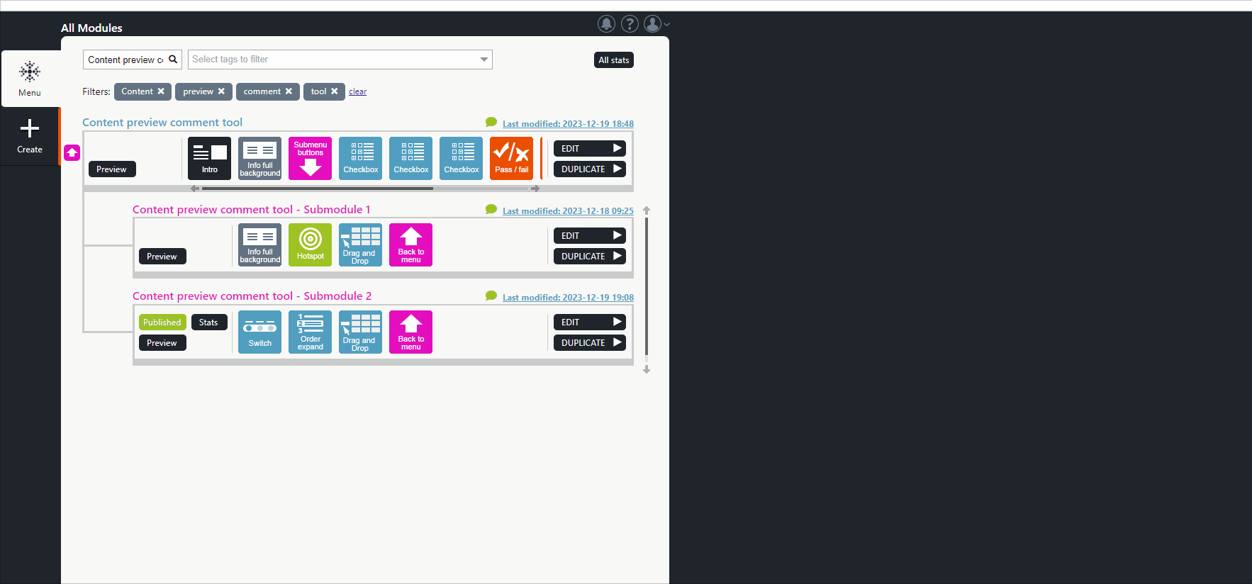
How do you resolve or delete a comment?
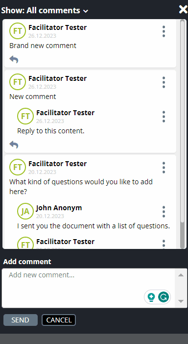
Anonymous users

Parameter ” Enable preview sharing for this main module and its submodule ” Share module preview window.

8.11 Diploma & Printables…
The Diploma & Printables feature is an updated and extended version of the Send diploma element.
The benefits of the Diploma & Printables feature are:
- The trainee will only receive a diploma after completing the course (reaching the Finish element). This ensures that the trainee does not close the course after receiving the diploma from the Send diploma element before completing the course.
- You can choose a diploma template from the available ones and define its content.
- The course no longer needs a diploma element for the participant to print a diploma for themselves.
In the Finish element (the last element of the module), the course participant can open the course diploma in a new tab or email it.
Activating the Diploma & Printables Feature
The Diploma & Printables feature can be activated from the drop‑down menu that opens when you click the gear icon in the module’s editing view.
Enabling Diplomas for Participants
In the Diploma for Participants pop‑up window, the facilitator enables the feature by selecting Enable participant diploma for this module, located in the upper-left corner.
Below this activation button, the facilitator can:
- choose one or more customized diploma templates,
- edit the diploma title,
- edit the diploma content text.
The participant’s first name, surname, and completion date are always included automatically.
Customizing Participant-Facing Texts
On the right side of the pop‑up window, the facilitator can edit:
- the text displayed to the participant,
- the labels of the buttons shown to the participant,
- the title and content of the email associated with the diploma.
Allowing Participants to Enter Their Name Manually
When Enable participant diploma for this module is active, the facilitator may also enable the option If the participant’s name is not found, allow them to write their name.
When this feature is enabled, the participant can manually enter their name, which will then appear on the diploma.
How the Participant’s Name Is Retrieved
The participant’s name is typically retrieved from authentication data or from a Form element.
If the manual-entry option is enabled and the name cannot be found when the participant reaches the Finish element, fields will appear allowing them to enter their name manually.
The name entered by the participant is not stored in the statistics, ensuring anonymous use. It is used solely for generating the diploma.
Note!
- Course participants always have the option to download the diploma’s PDF file by opening it in a new tab or sending it by email. They can also send an email to more than one address by adding more than one email separated by a comma or by sending it separately.
- The duplicate module will have the same Diploma & Printables settings as the original one.
- An audit trail will be left if the Diploma & Printables setting is turned on or off for the module.
- In preview and publishing modes, a course participant’s diploma print dialogue can be hidden by clicking on the X icon in the upper right corner of the print dialogue. The diploma icon will replace the dialogue. Click on the diploma icon to see its contents again.
- You can change the name of the diploma at any time by updating the ‘module name’ in the Diploma Texts field.
In the Finish element, users can print, download, and send their diplomas by entering their email addresses in the EMAIL field
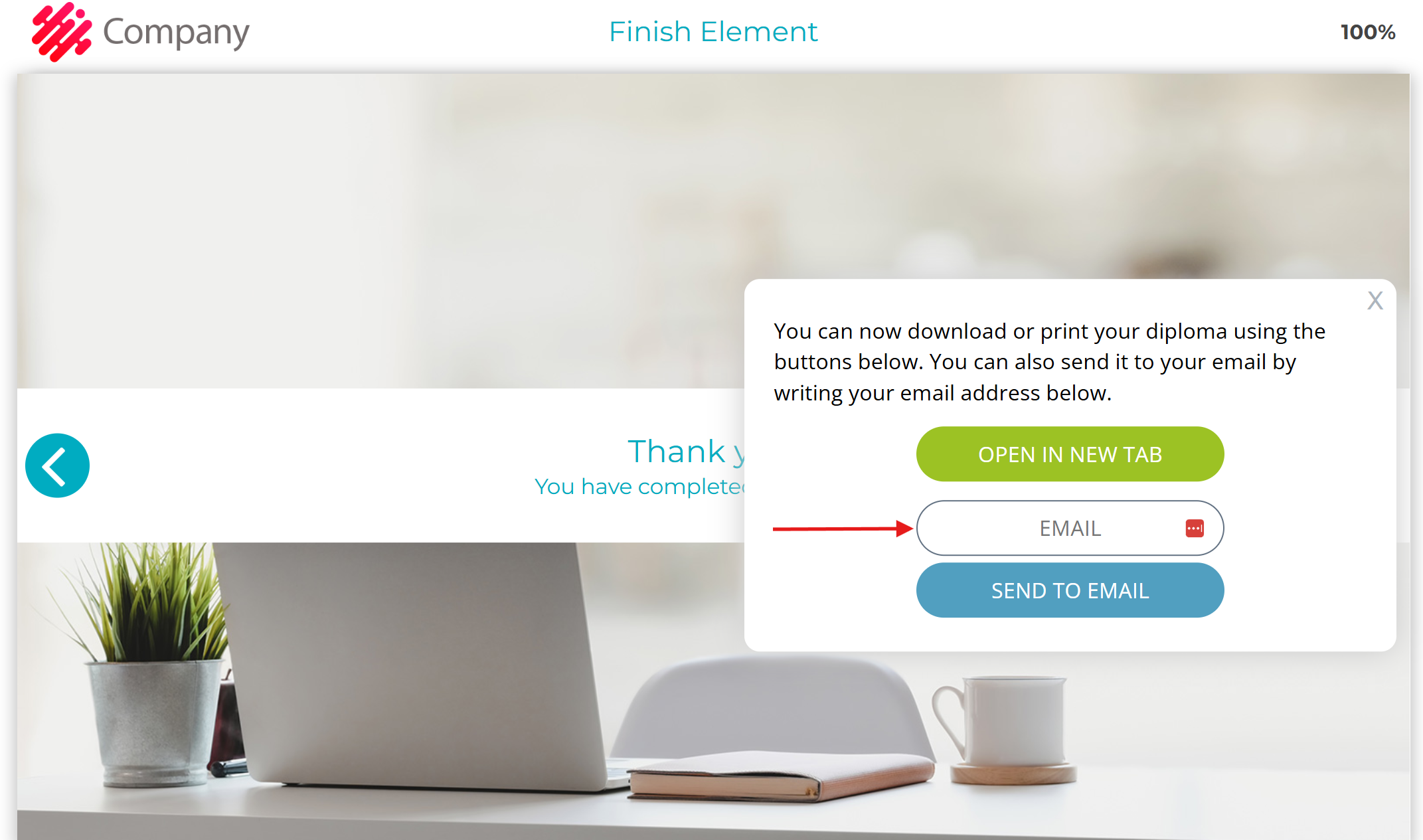
Where can you activate the Diploma & Printable feature?
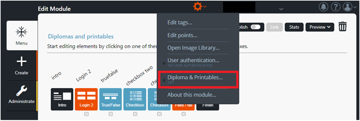
“Diploma for Participants” – Settings
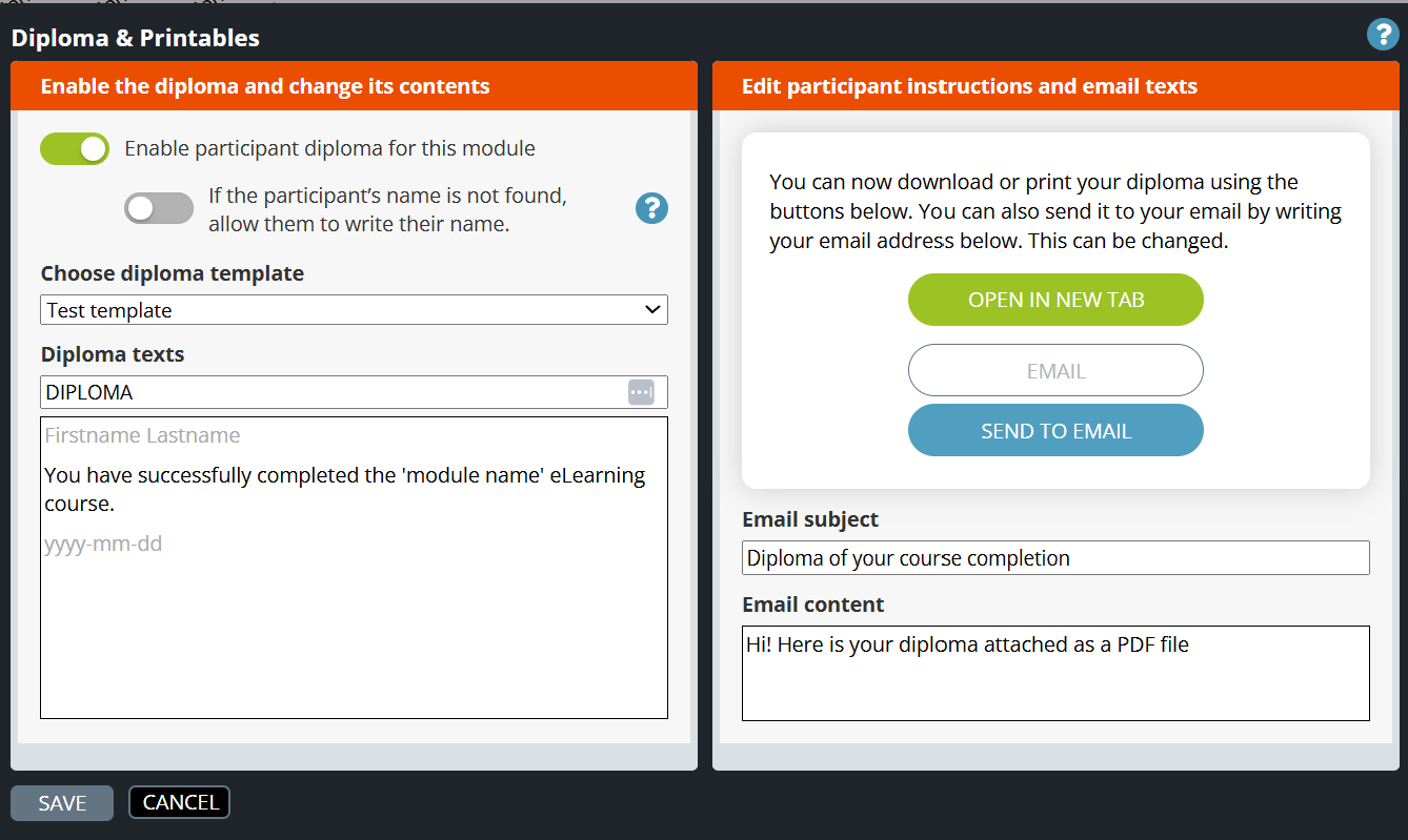
“If the participant’s name is not found, allow them to write their name” – Settings
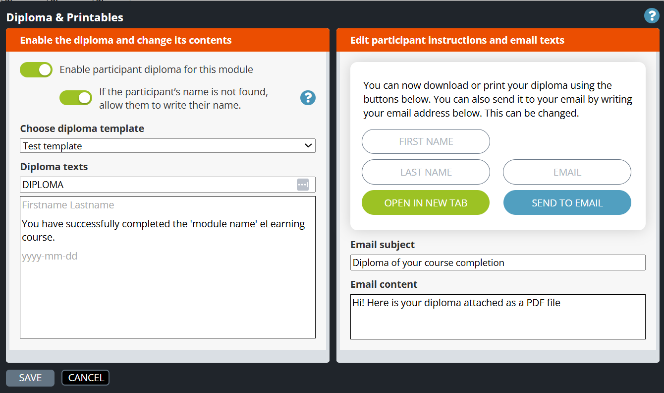
“If the participant’s name is not found, allow them to write their name” – Feature activated
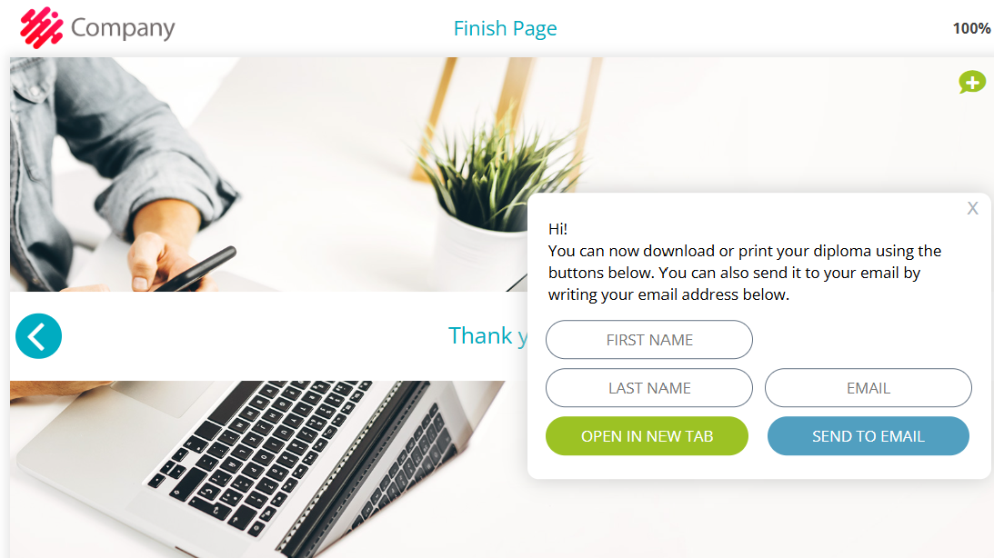
8.12 Element locking
“Locking the elements” means that facilitators with the locking element rights can block other facilitators from editing certain elements.
The user Administrator can lock/unlock any element.
How do you lock an element?
Click on the gear icon at the top of the element and select Lock Element or Unlock Element.
The lock will appear on top of the locked element in edit mode.
ADMINISTRATE TOOL SETTINGS
If the Facilitator’s “Element Locking” value is “View” in the Administrate tool, they cannot edit the module; they have to duplicate it to edit it. Once a module is duplicated, its locked elements can no longer be moved or edited, but the facilitator can add new elements. In this case, the facilitator cannot lock/unlock any elements.
If the Element Locking value in the Administrate tool is set to ” Edit“, the facilitator can:
- lock any element
- edit, delete, unlock and change the position of locked elements.
How do you lock an element?
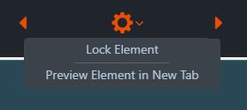
The lock will appear on top of the locked element in edit mode.
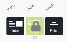
Administrate Tool Settings
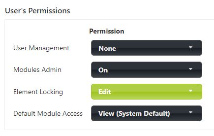
8.13 Group modules
You can add modules to a module group so that course participants can complete any language modules in the training. This means that the Nagging (Participants & Reminders) settings are shared with modules in the same module group, including the email addresses added to the Nagging and Nagging reminder settings. Other settings, such as User authentication, Expiration settings, and statistics, are still module-specific.
Module Group and Nagging editing instructions
Add a module to a module group as follows:
- Open the module to be added to the module group in Edit mode
- Select "Module Groups…" from the top wheel menu.
- Create a new group for the module by selecting "Add to new group" or add the module to an existing group by selecting "Add to existing group."
Edit the Nagging (aka Participants and reminders) settings as follows to add the necessary email addresses and enable Nagging auto-reminder:
- Open the module to be added to the module group in Edit mode
- Select "Nagging…" from the wheel icon.
- Select "Add…" to add any missing email addresses of the course participants to be reminded.
- Enter the email addresses in the text field for the different lines and click "Add participants."
- Edit the Nagging automatic reminder settings by clicking "Automatic Reminder Settings…".
- Turn on "Use automated email reminders" and edit the reminder interval in the drop-down menu "Send reminders until course completed every" and the maximum number of reminders in the drop-down menu "Max. number of reminders per user".
- Then, enter the email's subject in the "Subject" field and the content of the email in the large text field below. For more information on editing the content, including how to use variables, see the question mark icons at the back. For example, the module address replaces the field. If the module is linked to MyCourses, we recommend replacing with the MyCourses course link. Such a course link lets the user choose which language versions to take.
Hungry for more information? Below are more questions and answers.
What link can a Builder course participant use when there are several language versions of the training?
When there are multiple language versions, we recommend providing the trainee with a link to choose between the language versions before the actual training. The link should lead to the place where the language versions are linked—for example, a link to a Landing page or MyCourses course.
It is essential to use this link in reminder messages for features such as Nagging and Expiration so that the course participant can find the place to complete the training.
When the language versions of the training are linked to MyCourses, we recommend providing the course participant with a MyCourses course link. Where the language versions of the training are linked to the Landing Page module, we recommend that you give the course participant a direct link to the Landing Page module.
What is the difference between a MyCourses course, a Landing Page training button and a Builder Module Group?
The MyCourses course, Landing Page training button, and Module Group are ways of grouping different modules (e.g., language version modules) into a single entity. When one of the modules linked in this way is completed, the whole is considered completed.
- In MyCourses, when a module linked to a course is completed, the MyCourses course set is considered completed.
- When a module linked to a Landing Page training button is completed, the training button will appear as completed.
- When modules in a Module Group are completed, Builder features such as Nagging will consider the whole as completed, and the completion of the whole will no longer be remembered.
How do MyCourses course links work?
When a course participant opens a MyCourses course link, they will be asked to log in to MyCourses if they are not already logged in. They will then see a language selection dialogue for the MyCourses course, where they can choose the language they wish to complete the course.
How do I send a reminder message to MyCourses course participants who have not yet completed a MyCourses course with two or more language versions?
Builder modules linked to a MyCourses course should be grouped using the Module Groups property. The Nagging reminder settings should be configured for this group of modules so that the reminder message contains a link to the MyCourses course.
Group Modules & MyCourse – Example
Group Modules & Landing Page – Example
Group Modules – Settings
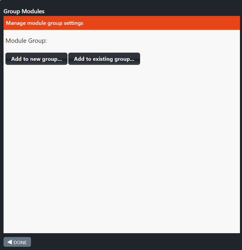
Here is an example of a situation where a module has been added to a module group called “Group Modules Euro.”
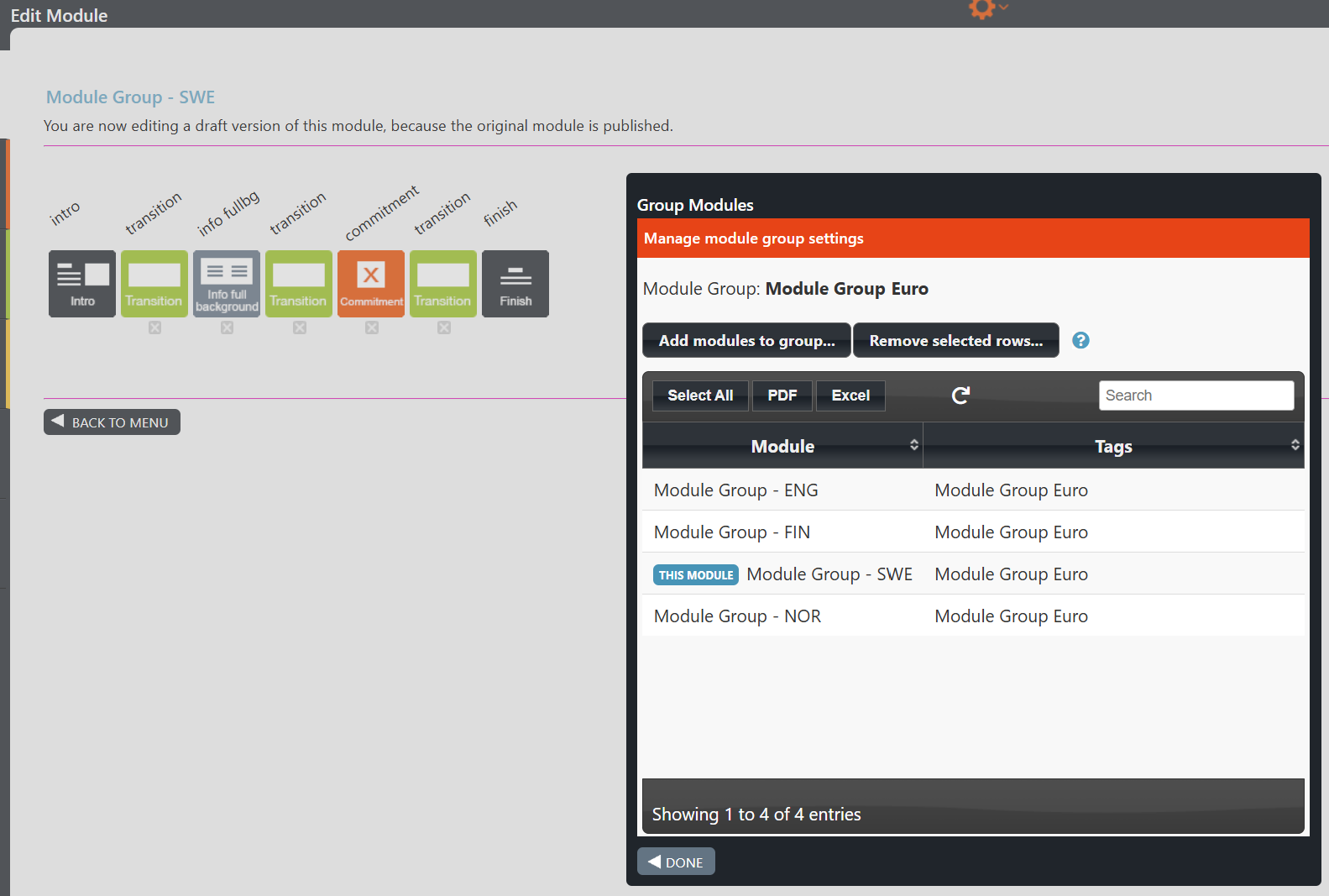
Participants & Reminders – Settings
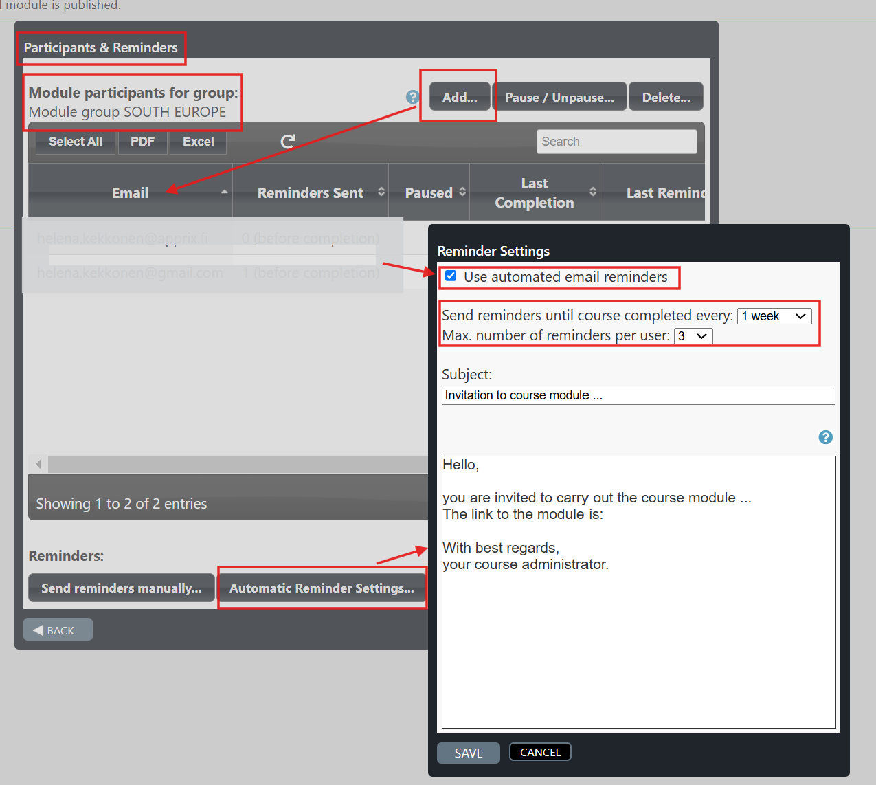
8.14 Summary Reports
The Summary Reports view aims to combine modules’ performances in one place so facilitators can monitor them.
The access rights are granted in the Administrate –> Users tool.
Note! The facilitator can also grant external users access rights to the Report tool.
The external user facilitator can be set in the Administrate → Users tool to Module Access = None and Summary Report = On, in which case they only have access to the reporting.
When this option is enabled, a new Reports button will appear in the Builder All Modules tab.
Once the Reports button is clicked, the reporting window opens. The Filters button in the top left corner of the window allows the facilitator to select several filters.
The filters are customer-specific. They can be, for example, Emails (the email address of the person completing the course), Modules (only data from published modules are available in the reports), Date Range (the date range of completions), or Finished (if selected, it shows only those completions that have completed the training; if not selected, it shows all completions, including incomplete ones).
Once the facilitator has set the filters and obtained the desired report, they can download it in CSV or Excel format.
Note!
A more advanced version of Summary Reports is the Extended Reports feature.
More information on this feature can be found here:
8.8 Extended Reports
Access rights to the Summary Reports tool are granted in Administrate → Users.
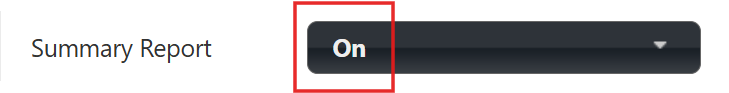
The Reports button will appear once the Access Rights for Summary Reports are granted.
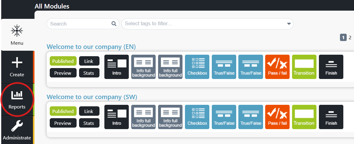
An example of available filters in the Reports tool
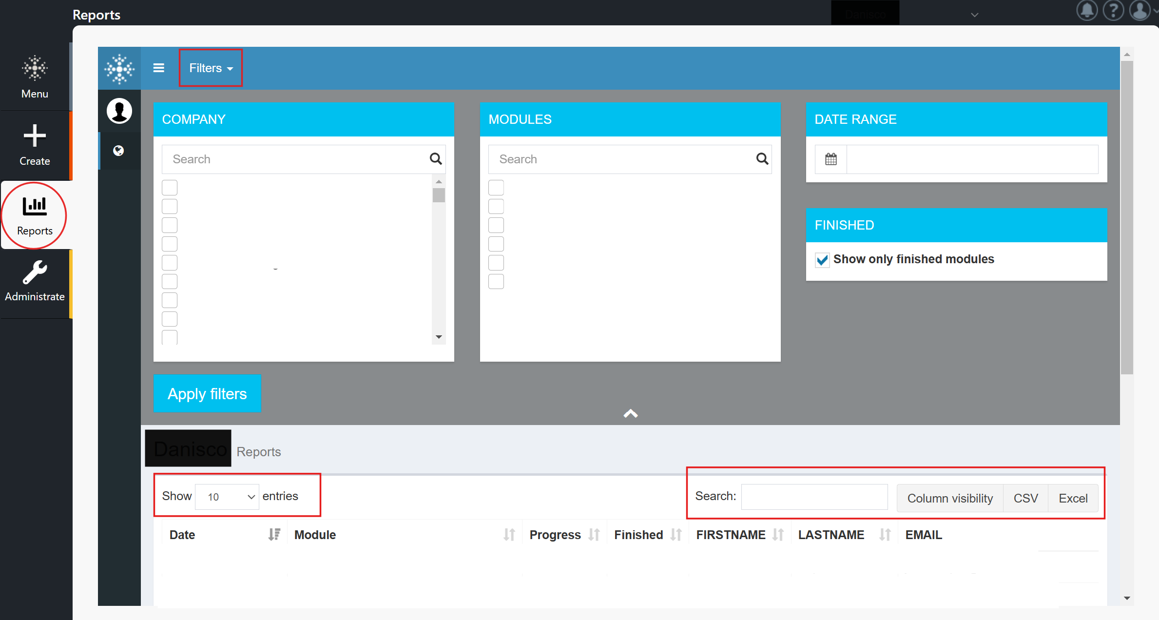
8.15 Publish Settings
What is the Publish Settings feature?
Publish Settings is a tool that allows you to define and save important metadata for your training modules. This data is used in module management, reporting, and integrations with other systems. The data to be collected is defined on a customer-specific basis during the tool’s implementation.
With this feature, you can:
- Enrich data: Collect course-related information that isn’t directly tied to learning content but is important for administration.
- Automate data transfer: Automatically send course completion data to external systems, such as HR or LMS platforms.
- Improve reporting: Generate more detailed and versatile reports when additional information is linked to courses.
Instructions for using the feature
When publishing a training module, you first select the training type. Each type has its own customised form with fields relevant to that specific type.
For example, “Internal Training” may show different fields than “External Training.” By filling in these fields, you ensure all necessary data is saved with the course.
- Open Publish Settings:
When you publish a module by clicking the Publish button, the Publish Settings dialogue opens automatically. You can also fill in the information in advance by opening the dialogue via the gear icon in the module’s Edit mode. - Select training type:
Choose the most appropriate training type for the situation. For example, “Internal Training” may show different fields than “External Training.” Filling in these fields ensures all required data is saved with the course. - Fill in the fields:
Fill in the mandatory (*) and relevant optional fields on the form. - Save:
Save the settings and publish the module. The data is now stored with the module and used according to the defined specifications.
Creating custom training types and fields
The system is flexible, and your organisation can create training types and data fields tailored to your specific needs. If you feel the current options need new functionalities, please contact us!
For further information, please click the link.
Example: “External Trainings”
Enter the information for training management and reporting purposes: Content verification date, Owner, Purpose of use.
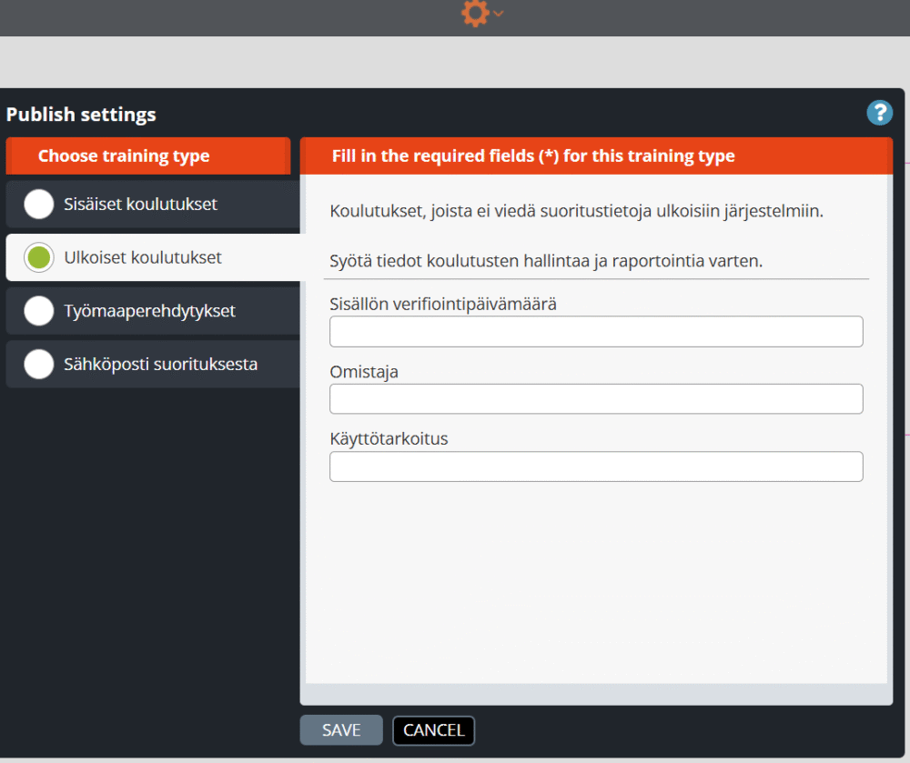
How do you choose in a module the training type?
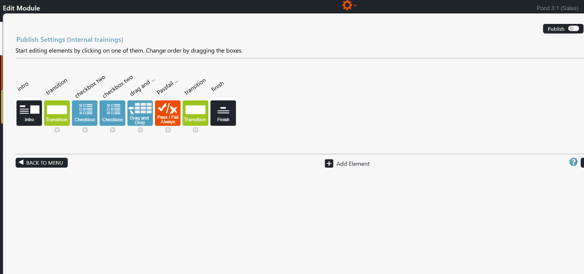
8.16 Apprix AI Wizard
Apprix AI Wizard offers a fast and effortless way to build new online courses.
Once you enter the basic course information and upload your materials, the tool automatically transforms them into an interactive and engaging course structure.
The goal is to reduce manual workload by 70–80%, allowing you to focus on reviewing and refining the content rather than creating everything from scratch.
Through the link below, you can access the AI Wizard user guide, which helps you make the most of the tool efficiently and smoothly.
For further information, please see the AI Wizard user guide
I Want to Report a Problem or Give Feedback
Couldn’t find what you were looking for? Please leave us a contact request via the contact form below. Please be as specific as you can when describing the problem so that we can start investigating the problem as swiftly as possible.
Wish to leave feedback instead? Great! Your feedback is important to us, as we strive to continuously improve our services and operations.
You can also reach us by email by sending your request or feedback to helpdesk@apprix.fi.